PL Studio applies Moroccan-inspired palette to London townhouse
Interior design office PL Studio has transformed an east London townhouse using colours and graphics that take cues from the Jardin Majorelle in Marrakesh.
The three-storey, new-build house features similar shades of blue, green and yellow to the Morrocan villa that was once home to artist Jacques Majorelle.
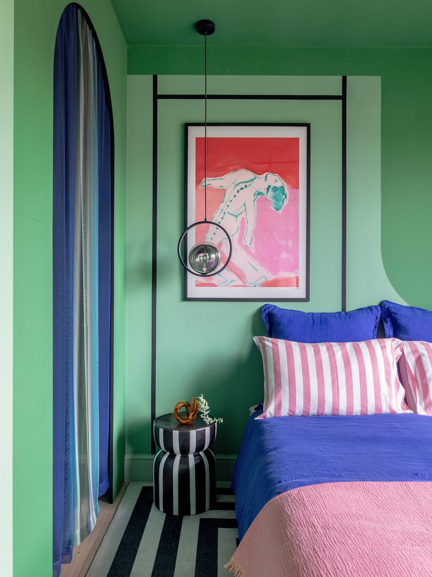
Further green tones allude to the villa's verdant garden, while soft pink hues bring a sense of overall "warmth and joy" to the palette.
PL Studio designed the scheme for creative couple Tom Lalande and Julian-Pascal Saadi, who live in the house with their chihuahua puppy, Sasha-Lee.
The studio founders, couple Sabrina Panizza and Aude Lerin, felt the design should reflect their clients' love of colour.
"Although we admired the architecture and loved how the townhouse was beautifully filled with natural light, we felt that overall, the property was lacking character and positivity," said the pair.
"We wanted to create a home that reflected our clients' personalities and joyful spirit, a home filled with positive energy."
Lalande and Saadi had recently returned from a trip to Marrakesh, which led this to becoming the starting point for the design.
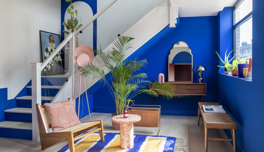
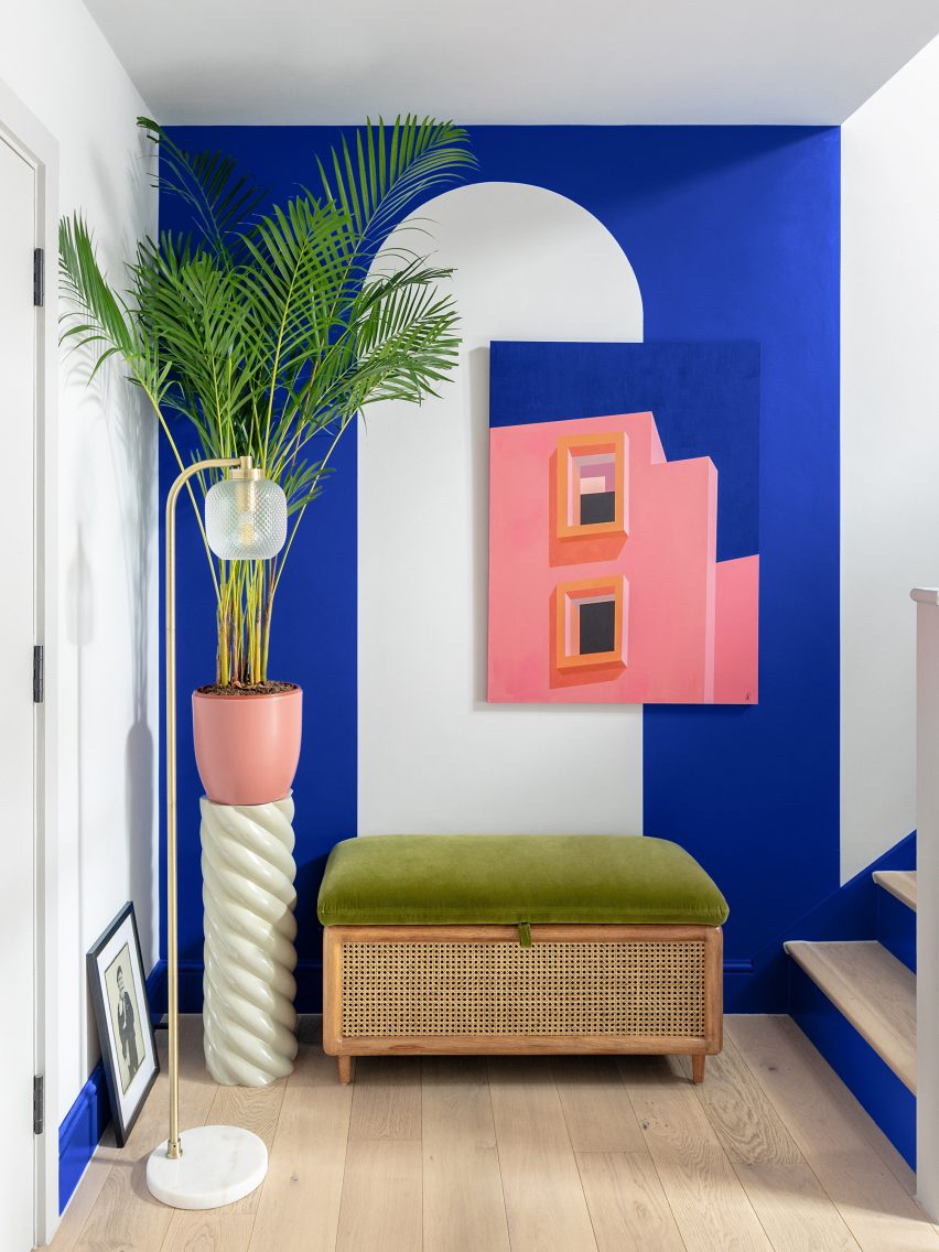
The reference is most evident in a reception room at the house's entrance, which features cobalt blue walls, a colour-block rug, plants and a Tom Dixon Etch pendant light in gold-toned brass.
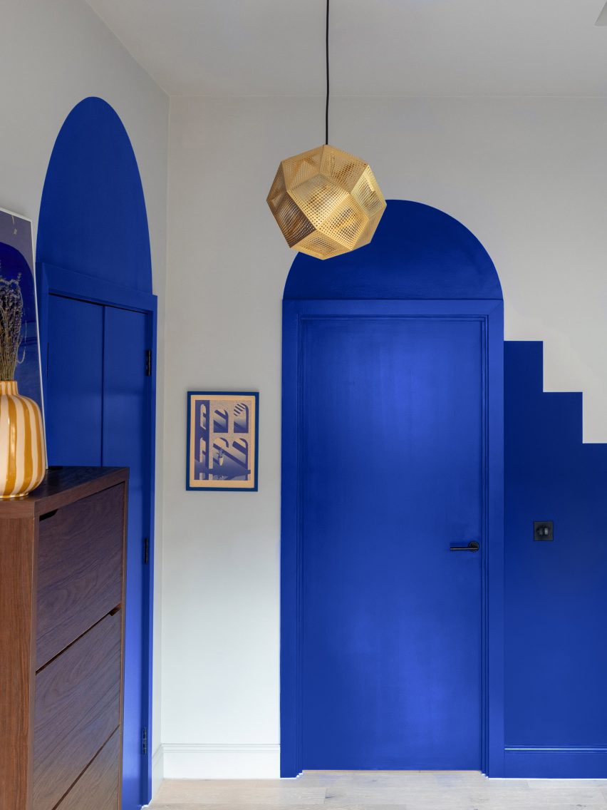
The effect is heightened by paint graphics that include arched openings – both real and illusionary – and stepped blocks that create the suggestion of extra staircases.
As Saadi works as a psychologist, this room primarily serves as a waiting room for his clients.
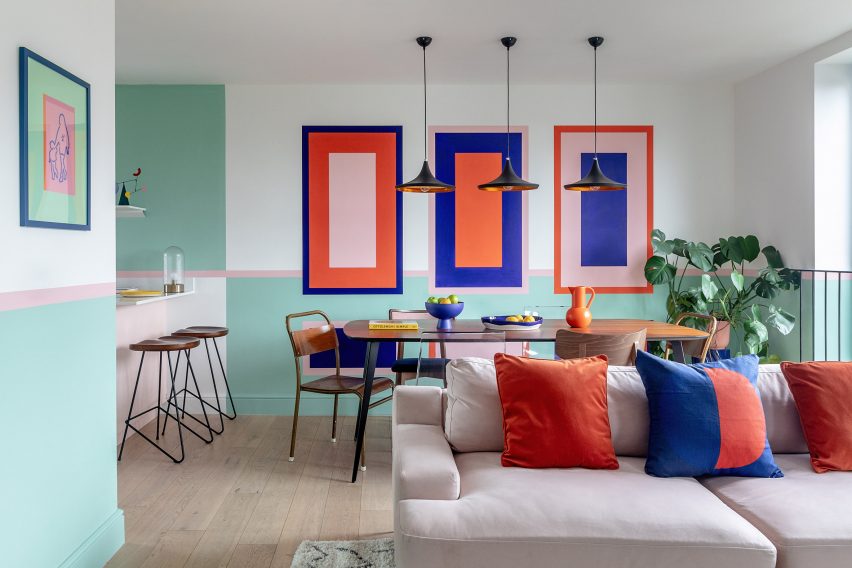
The couple's main living space occupies the uppermost floor, where an L-shaped room gives the pair a combined kitchen, dining area and lounge.
Geometric wall graphics tie these three spaces together but also highlight the divides between them. The most striking of these is a triptych of picture-frame-style blocks that frame the dining table.
"Our clients didn't have a clear idea of what they wanted, but they had a strong desire to be surrounded by pieces of art, colours and objects that would give them good energy, which is so powerful," said Panizza and Lerin.
"They were not afraid of mixing different shades and colour combinations, so we went for bright, bold, and fearless!"
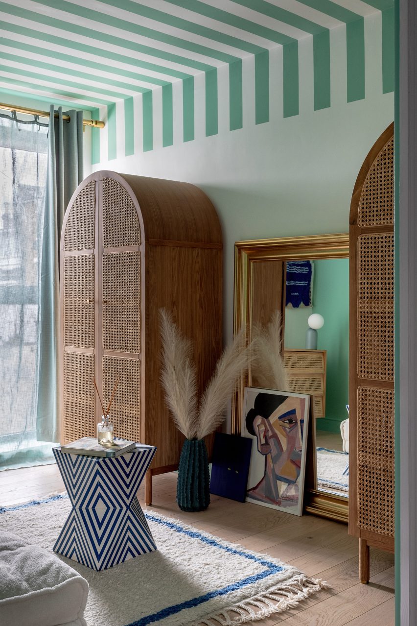
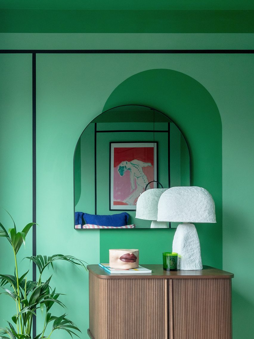
The main bedroom, located on the middle floor, uses subtly different shades of green to create colour depth. This is offset with monochrome stripes and pops of pink and blue.
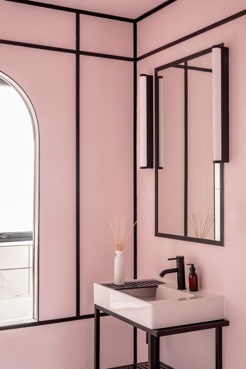
Also on this floor is a guest bedroom that doubles as a dressing room, featuring a striped ceiling that looks like a market stall awning and a pink bathroom framed by black linear details.
Arches feature throughout these spaces, in the form of mirrors and wardrobes as well as wall graphics.
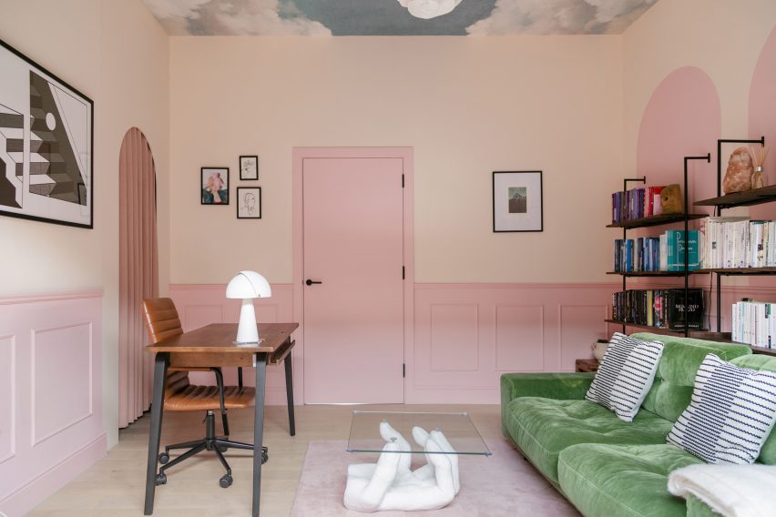
Saadi's ground-floor office takes the place of a third bedroom. This room has a different character from the rest of the house, with details inspired by surrealist art.
Key features include a sculptural table in the shape of a hand and ceiling wallpaper depicting a cloudy sky.
Panizza hopes the "kaleidoscopic" project can serve to inspire people who see London's new-build homes as characterless compared with the city's older properties.
"We want to show it is absolutely possible to create a home with lots of personality and character. It just takes a bit of courage," she told Dezeen.
The photography is by Taran Wilkhu unless otherwise indicated. Top image is by Aude Lerin