Herman Miller unveils first rebrand in over two decades
New York design studio Order has created a nostalgic new brand identity for Herman Miller that harkens back to the mid-century modern heritage of the American design brand.
Last updated at the end of the 1990s, in the era of Web 1.0, the branding previously featured the "computer-friendly" FF Meta font and the company's enduring M logo from 1946, emblazoned on a red circle.
Tasked with bringing this identity into the 21st century while staying true to Herman Miller's legacy, Order took inspiration from the brand's own history – specifically the modernist branding that was introduced by graphic designer John Massey in the late 1960s.
Much like this predecessor, the updated logo now features a Helvetica-style typeface, while the swooping M symbol was once again freed from the confines of its circular backdrop so it can be used as a graphic design element rather than just a trademark.
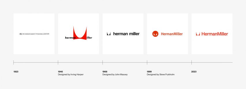
"The M symbol has stayed consistent through every iteration of the identity since Irving Harper drew it in 1946, so changing it was never an option," Order design director Garrett Corcoran told Dezeen.
"As we looked at its role over time, we saw early uses embraced it as both an identity mark and in the full visual language. However, in the 90s it evolved to the circle, which created some limitations around its use."
"Removing the circle was a way to again celebrate the symbol in its simplest form and allow it to seamlessly integrate with other brand elements like typography or photography," Corcoran continued.
The Herman Miller wordmark is now styled in the Söhne typeface by Klim Type Foundry – a modern homage to the Helvetica originally used by Massey.
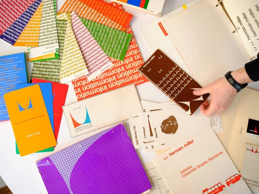
"John Massey introduced Helvetica as the typeface of Herman Miller's new corporate identity in 1968," explained the company's brand creative director Kelsey Keith.
"That turn toward corporate is a key period in the history of Herman Miller," she added. "The introduction of the Action Office AO1 and AO2 under Robert Propst, with the help of George Nelson, invented the modern office as we know it."
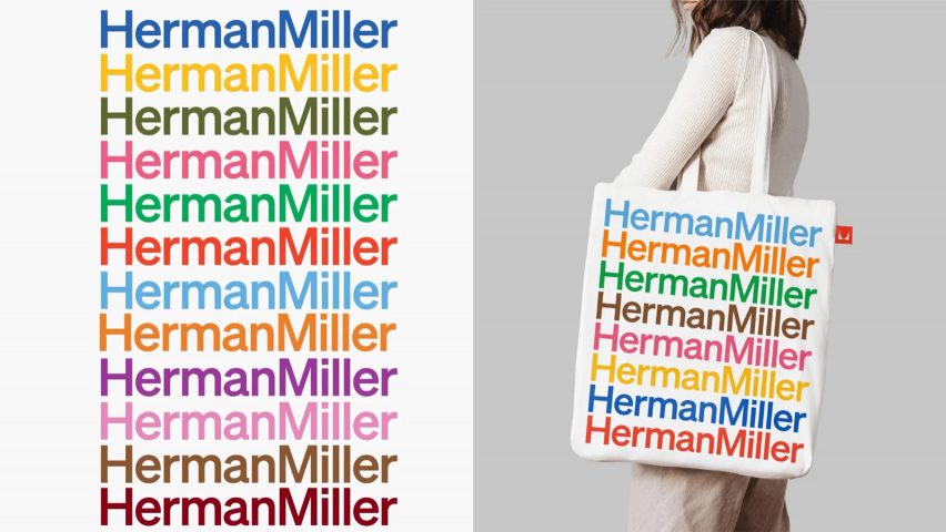
Combined with an expanded colour palette, Keith believes the new typeface will give Herman Miller more freedom to play with the individual elements of its identity.
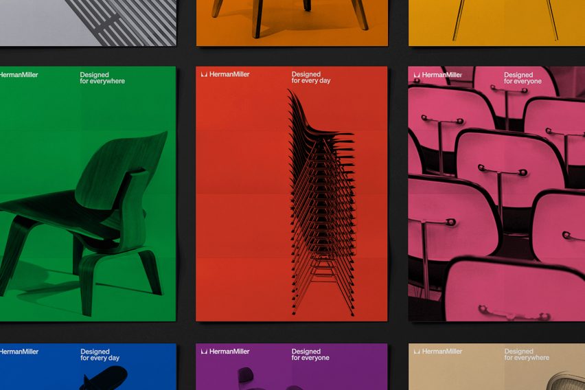
Much like in Massey's mid-century modern branding, the typography and the M motif can now be used separately or together as graphic elements across a range of different mediums, whether printed onto a tote bag, a catalogue or the side of a truck.
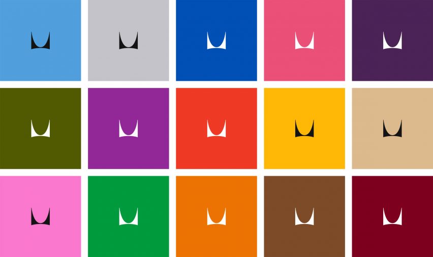
"From a brand point of view, we required a lot more flexibility than we had had previously in our brand identity, such as the ability to scale from a handheld mobile phone screen to a physical space, like a retail store or showroom," Keith explained.
"There are elements of the Herman Miller identity that I hope are more legible to the public because of this new design system: boldness, joy, tactility, respect for the past with an eye toward the future."
The rebrand comes on the heels of Herman Miller celebrating its 100th birthday last year.
Since its founding in 1905, the company has worked with some of the most important designers of the day, from Isamu Noguchi and Charles and Ray Eames to contemporary greats including Yves Béhar and London studio Industrial Facility.