Studio Libeskind encloses Maggie's Royal Free with slanted walls
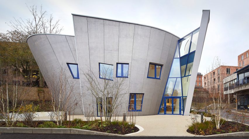
Curving walls and windows placed "like notes in a melody" define the latest Maggie's Centre, designed by architecture firm Studio Libeskind for the Royal Free Hospital in London.
Situated to the side of the hospital's car park, Maggie's Royal Free features a bold, sinuous shape that aims to draw visitors into its warm and inviting interior.
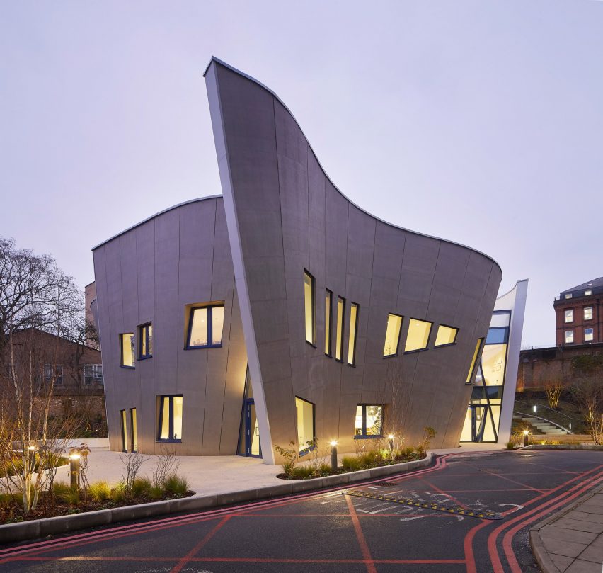
The curved building is London's fourth Maggie's Centre, joining designs by Steven Holl Architects, Ab Rogers Design and RSHP that hope to provide support to cancer patients in a more calming and homely environment than a traditional hospital.
Studio Libeskind's three-storey building has a steel structure clad in prefabricated timber panels that grows and widens towards the top, aiming to maximise floor space on a restricted site.
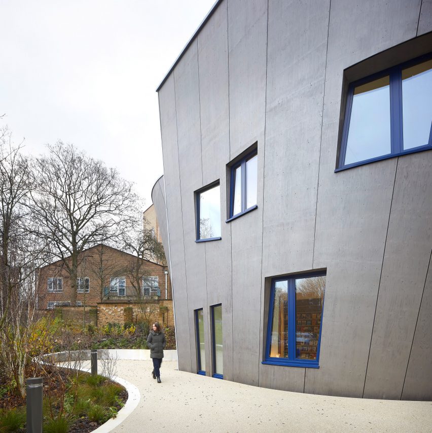
Reaching 11.4 metres in height, Maggie's Royal Free was designed to have a more intimate feel than the neighbouring concrete hospital.
"It's designed from inside out to provide continuity, light and a scale that people will feel good in," studio founder Daniel Libeskind told Dezeen. "It's about the level of intimacy and that kind of melody that goes throughout the building and unifies it as a Maggie's."
"It's a balance between public and private functions," he added. "I wouldn't say public and I wouldn't say domestic – it's a hybrid. You know you're in a different space in this big complex of buildings around you."
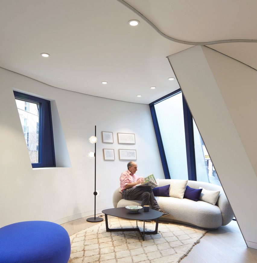
Geometric windows of different shapes and sizes puncture the building's laminated veneer lumber (LVL) facade, creating a collage of views into and out of the building.
"It changes your orientation to the whole site so you're not dominated by the big box of the brutalist hospital and by everything you've seen coming here," said Libeskind.
"[The windows] were decided like notes in a melody. You can't say why there is a B minor in a Mozart aria at a particular point. It's not explicable but it's just the right note."
The main entrance to Maggie's Royal Free is marked by a glazed opening between two curving walls. Two side entrances, one in the kitchen and another in the lounge area, were added to offer more discreet entryways.
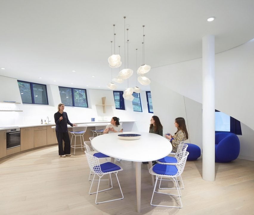
As with all Maggie's Centres, the kitchen is intended to be the main focus of the interior. The open-plan space follows on from the double-height lobby by the main entrance and contains bespoke furniture that follows the curved shape of the building.
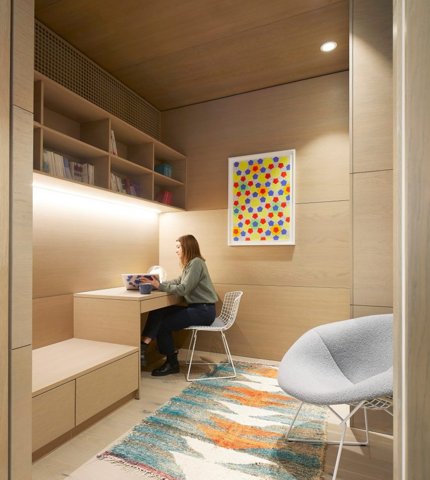
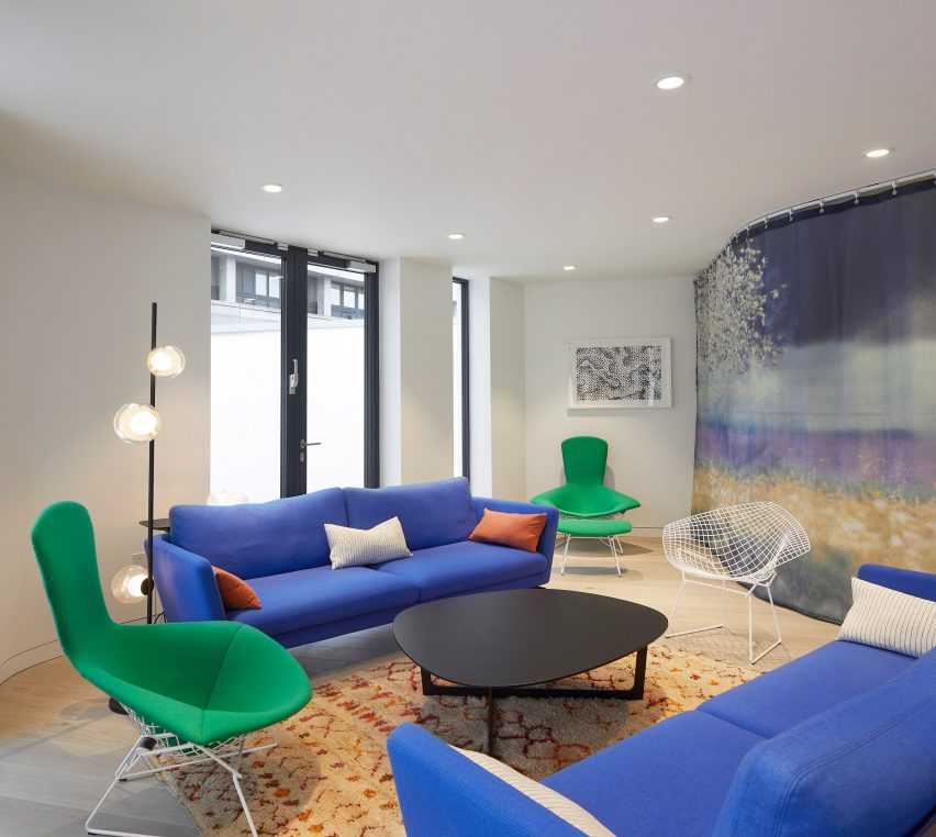
The communal kitchen and lounge area were arranged around a central core containing a library, private counselling room, elevator and toilets. Curtains can be drawn to separate the open-plan communal spaces.
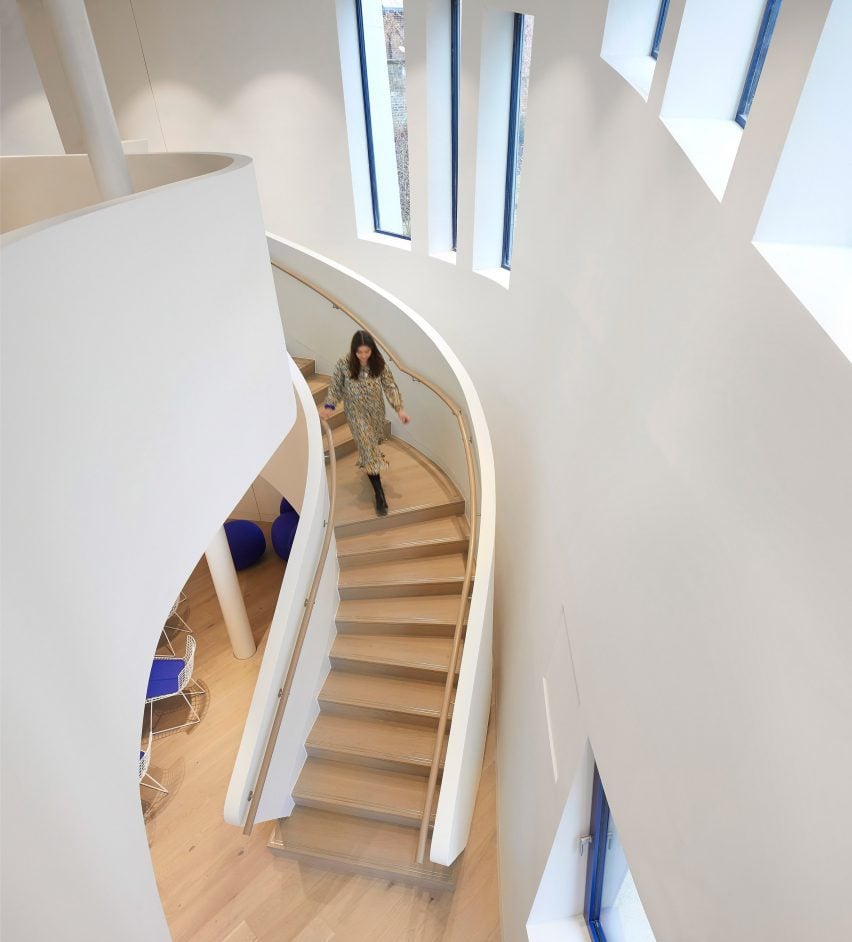
A curving double-height staircase nestles into the exterior wall and leads to the floor above, which houses additional counselling rooms and a lounge that can also be used as a yoga space.
The second floor features a seating area that opens onto a roof terrace wrapped around the perimeter of the top level, with swooping parapet walls adding a sense of privacy.

Garden designer Maggie Keswick Jencks established the Maggie's charity alongside her husband, architecture critic Charles Jencks, after she was diagnosed with breast cancer.
Keswick Jencks died in 1995 before the first Maggie's Centre was completed and Jencks continued his wife's legacy for decades before passing away in 2019.
Libeskind says he feels a personal connection to Maggie's Royal Free because he was close friends with the couple.
"I had a very personal approach [to the design] because Maggie and Charles Jencks were very good friends of mine," he said. "This is probably the last project discussed in detail with [Charles]."
Libeskind was one of the first architects who was asked to design a Maggie's Centre when the charity was founded. But over the years, issues with two other site locations meant the projects fell through.
When the site at the Royal Free Hospital was proposed, Libeskind was keen to begin working on the project despite its inconspicuous location.
"I was given this site and they said: 'Why don’t we just wait to get a site on the street, a very visible site?'" the architect explained. "I said: 'No, let's take this site right now, it's available.' And it turned out to be a great site."
"It's definitely a different building than I would have done 25 years ago," Libeskind added. "Times change and your understanding of architecture also develops. I think my original building was more of a box, more linear and kind of more functionalist-looking."
Maggie's chief executive Laura Lee told Dezeen that the opening of Maggie's Royal Free has prompted the Royal Free Hospital to increase its cancer care facilities and create a new centre in the adjacent car park.
"What is incredible is that Daniel has inspired the hospital to think about their own environments and how they are looking after people with cancer," she said. "They've now set themselves a mission to build a new cancer centre opposite to our front door."
"Not only do we have a building that can do the care that Maggie's needs, but Daniel has inspired the hospital to think about how its built environment can help support people with cancer and those working in it."
Maggie's Centres previously completed in the UK include a mirror-clad building in Southampton by British studio AL_A and a plant-filled timber structure in Leeds by Heatherwick Studio.
Other recent projects by Studio Libeskind include an angular social housing block in New York and the Dutch Holocaust Memorial of Names, which features a labyrinth of brick walls.
The photography is by Hufton and Crow Photography.
Project credits:
Design architect: Studio Libeskind
Associate architect: Magma Architecture
Landscape architect: Martha Schwartz Partners
General contractor: Sir Robert McAlpine
Structural engineer: Expedition
Mechanical engineer and electrical engineer: Buro Happold
Fire consultant: Buro Happold
Furniture procurement consultant: Coexistence
Light fixtures: Bocci