"The buffet must be epic" says commenter
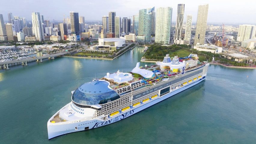
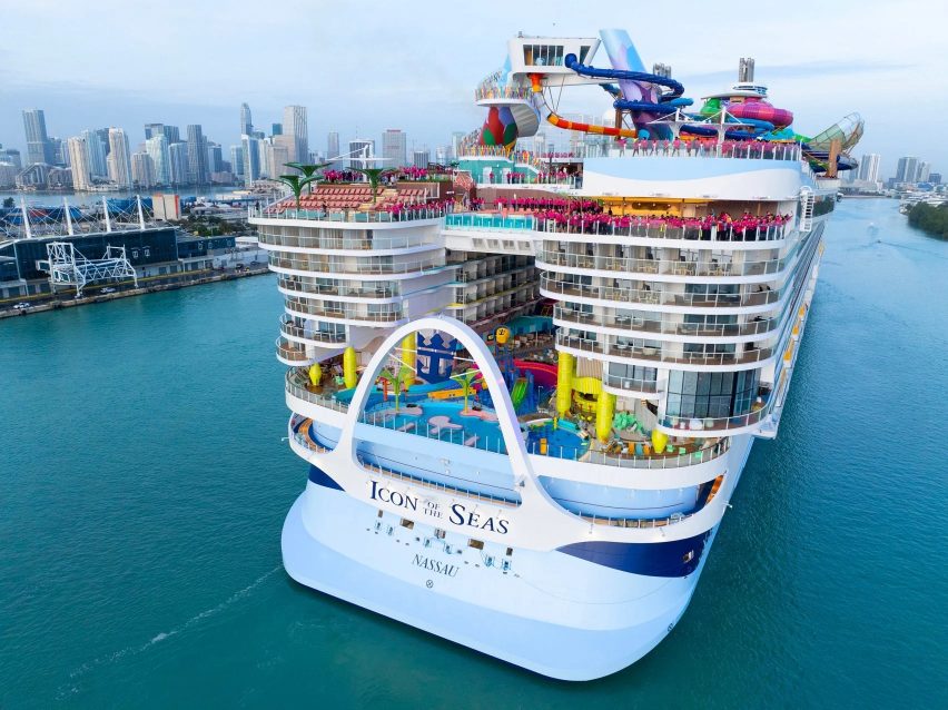
In this week's comments update, readers are discussing the news that the world's largest cruise ship has set off on its maiden voyage amid controversy over the environmental impact of its new fuel.
The 20-deck-high Icon of the Seas, which has room for 7,600 guests and 2,350 crew, set off from Miami last month for its first cruise in the Caribbean.

"The stuff of nightmares"
Dezeen readers were quick to question the rationale. Henry felt it was "a physical embodiment of the madness of our species". Cezary Marek was also far from impressed, calling it a "grotesque and pointless waste of resources".
For Alfred Hitchcock, it was "the stuff of nightmares". They continued "I can't think of many things worse than being trapped on a huge floating, gimmicky hotel full of imbeciles".
John Lakeman was in the same boat and thought that "it sounds like a nightmare vacationing with 7,000 people!"
However Frank Lloyd Wrong raised the point that "the buffet must be epic".
Would you voyage on the world's largest cruise ship? Join the discussion ›

"Sublime"
Also attracting interest in the comments section was Japanese architect Junya Ishigami's one-kilometre-long Zaishui Art Museum on a lake in China, which features openings that let water flow over the museum floor.
Readers had mixed opinions.
"Poetic," wrote Trewus, while Matheus called the project "sublime" and Mark Zudini commented "blurring the boundaries, beautiful".
"Does anybody else believe this guy is the architect doing the most amazing architecture in the last, say, five years?" asked impressed commenter Anarc.
However, other readers were unconvinced about how well the building would function as a museum. "This structure cannot be a museum" wrote Leo, with Dik Coates agreeing: "for long-term storage, museums need to have a pristine environment".
What do you think? Join the discussion ›

"How is architecture like this still being commissioned!?"
Another project that got readers talking this week was Studio Libeskind's design for Maggie's Royal Free Hospital in London, which is intended to provide support for cancer patients.
Commenters were unanimous in their response to the design.
"Gosh, it looks so dated, cold and really quite horrible," wrote Alfred Hitchcock. "I thought Maggie's Centres were meant to be warm, comfortable and welcoming – you would probably want to avoid this one".
Rick Bradner thought it was "dreadful". They went on to suggest that "the stark cognitive dissonance between this architecture and its supposed end users is striking".
Commenter J Hardman was in disbelief, asking "how is architecture like this still being commissioned!?". Cezary Marek agreed, writing "joyless for me, and rather predictable".
Do you agree? Join the discussion ›
Comments Update
Dezeen is the world's most commented architecture and design magazine, receiving thousands of comments each month from readers. Keep up to date on the latest discussions on our comments page and subscribe to our weekly Debate newsletter, where we feature the best reader comments from stories in the last seven days.