Chai Guys Portobello cafe interior evokes "the colour of spices"
Local studio SODA has used warm colours and natural materials to create the first store for tea brand Chai Guys on Portobello Road in London's Notting Hill neighbourhood.
The studio drew on the "informal nature" of drinking masala chai tea when designing the interior for the cafe – the first one for the Chai Guys brand, which has previously operated from market stalls.
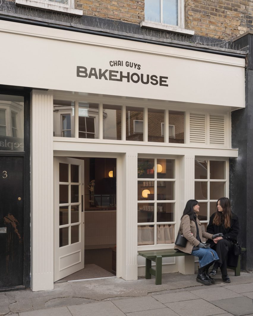
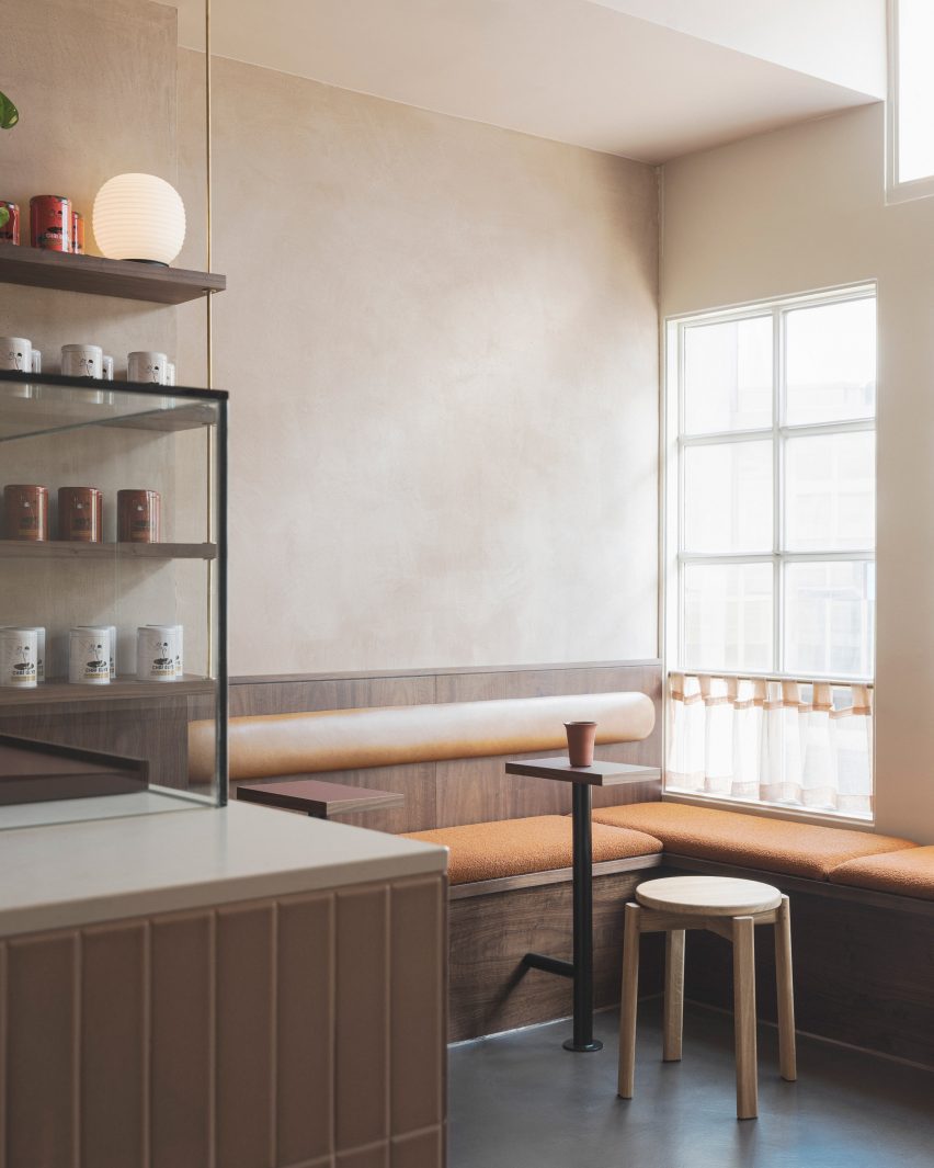
"We wanted to keep true to the informal nature of drinking chai by creating a grounded space with low-level seating where there is always room for one more by pulling up a stool," SODA interior designer Matilde Menezes told Dezeen.
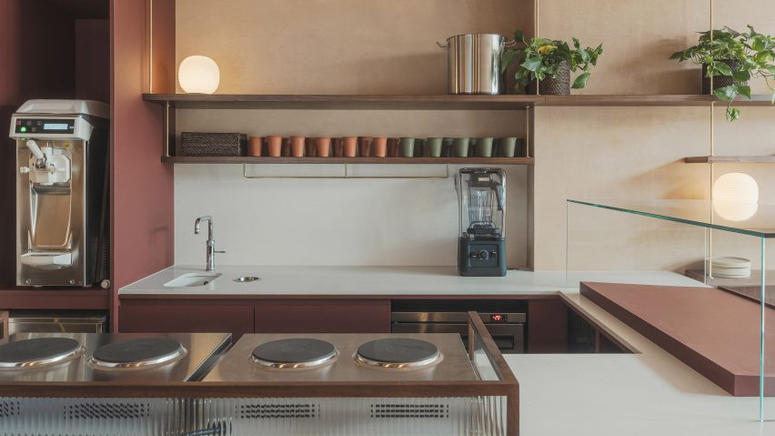
"The counter was kept quite low, too, to showcase the act of serving chai, which is quite theatrical."
The Chai Guys Portobello cafe comprises a seating area and a front-of-house desk where the tea is prepared, as well as a bakery at the back that sells pastries.
As many of the visitors will be getting takeaway drinks, Menezes says she wanted to provide "an impactful impression that was simple and subtle at the same time".
The studio also aimed for the 55-square-metre space to be a peaceful refuge from hectic Portobello Road and to reference the Chai Guys branding.
"The brand is a modern take on chai with its black dynamic typography layered over clean and minimal design," Menezes explained.
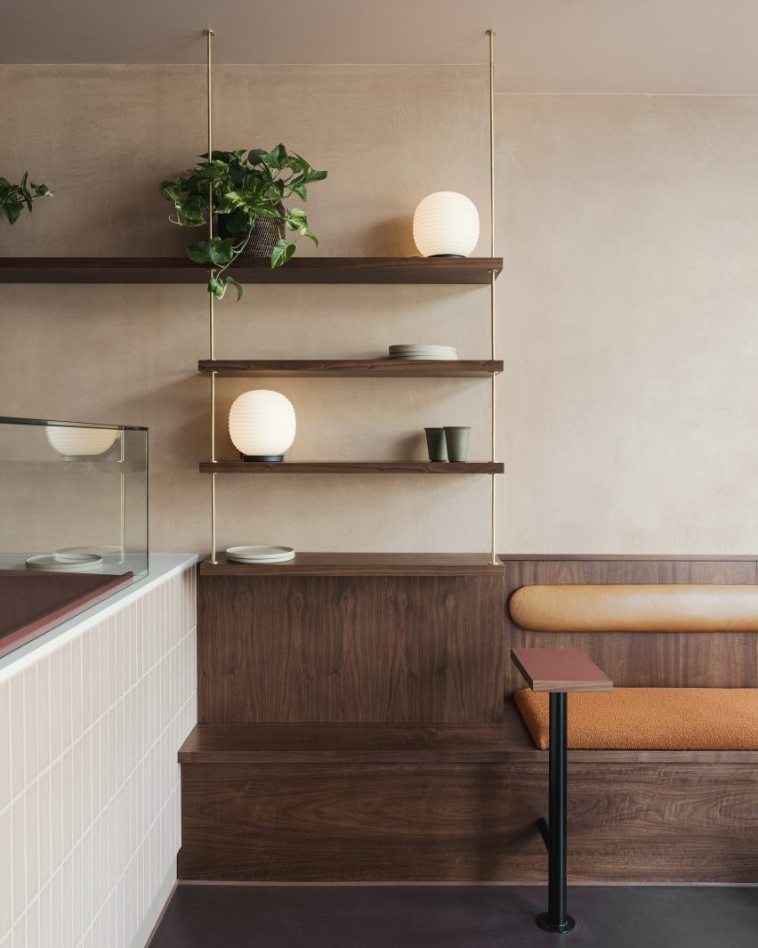
"We wanted the colour palette to sit back and let the branding and product be the main event in moments such as the counter, the shopfront, and the retail shelving," she added.
"In areas where the branding wasn't present, we wanted the palette to evoke the colours of the spices and standalone as a direct but understated reference to chai."
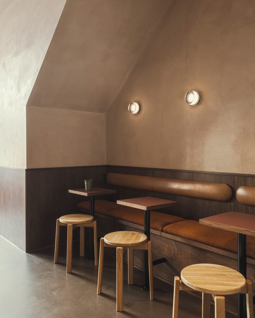
The studio chose to work mainly with natural materials for the interior, which features walls in Clayworks plaster.
"Clayworks is non-toxic, has low embodied energy and carbon, is breathable, passively regulates humidity and is produced in the UK," Menezes said.
"On top of this, the handmade quality of each stroke and lived-in quality complemented the aesthetic we were trying to achieve."
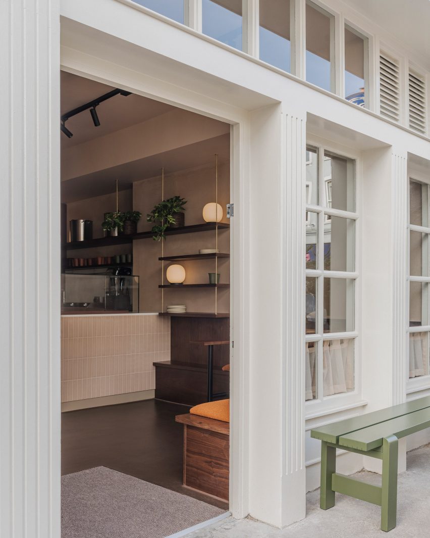
SODA also clad the walls in timber panelling and chose boucle and leather for the seating, adding to the store's tactile feel.
"Timber has its innate grain and richness, leather ages and provides sheen and the boucle appeals to the touch and is quite striking in the Masala tone," Menezes said.
"All these tactile touchpoints were selected to be resilient in a high-traffic commercial space."
Other recent projects by SODA, which was founded by Laura Sanjuan and Russell Potter in 2012, include a colourful interior for The Office Group and a theatre with a revolving auditorium.
The photography is by Pierce Scourfield.