Google Campus by Jump Studios
Internet giant Google will run this shared workplace for startup technology companies that interior designers Jump Studios have just completed in the area nicknamed Silicon Roundabout in Shoreditch, London.
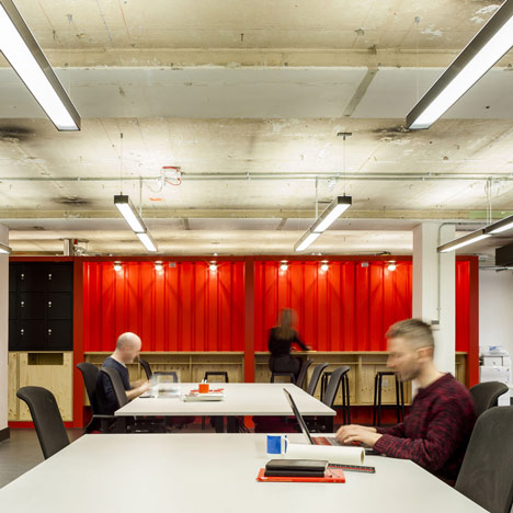
Occupying a seven storey building, the Google Campus contains a series of flexible open-plan workspaces and lockers that accommodate hot desking.
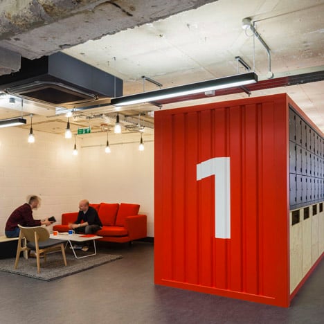
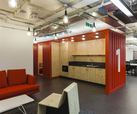
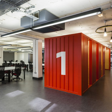
Informal meeting rooms and small kitchens are contained within shipping containers, as are the lockers.
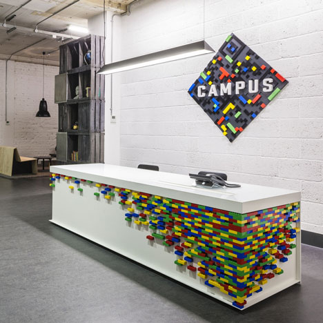
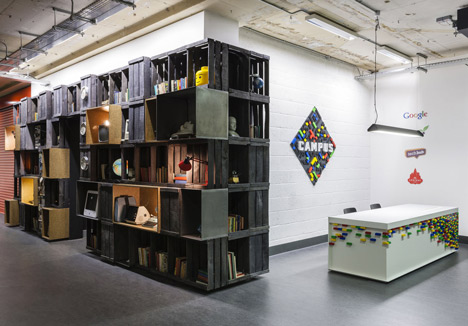
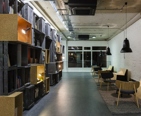
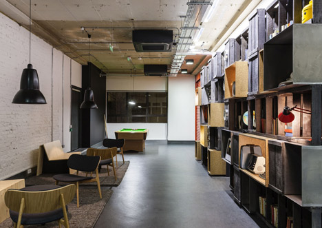
At ground level is a reception desk decorated with multicoloured Duplo bricks, beyond which a wall of reclaimed fruit crates provides shelving for books, magazines, pin boards and clocks.
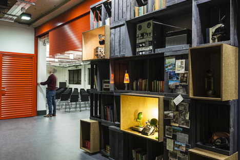
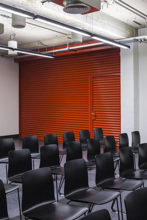
Red industrial shutters separate the reception from a presentation room at the back, which can also be subdivided into two.

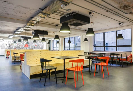
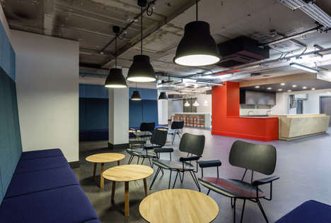
A cafe filled with plywood furniture and a workshop for non-members occupies the lower ground floor.
In the past we've also featured Google's UK offices, as well as their engineering headquarters. See all our stories about the company here.
Photography is by Gareth Gardner.
Here's some more text from Jump Studios:
Google Campus
Google Campus is a seven storey co-working and event space in the centre of London’s Tech City, otherwise known as Silicon Roundabout. The project, run by Google UK aims to fuel the success of London’s tech start up community.
Working with partners Seedcamp, Tech Hub, Springboard and Central Working, the primary function of Campus will be to provide office space for startup companies, but the facilities will also host daily events, offer regular speaker series with leading technology and entrepreneurship experts, hold networking events and run a constant mentoring program where Google staff will share their experience and expertise with residents.
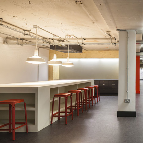
Non-residential registered users will have access to the cafe and co-working space on the lower ground floor.
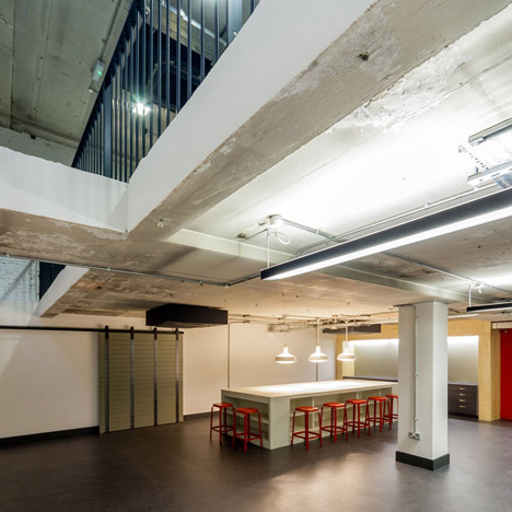
The design challenge was to take an unprepossessing seven-storey office building and to create an interplay between dynamic, open, social spaces and more intimate working hubs, with flexibility to accommodate a shifting workforce and a diverse program of events.
Much of the architectural focus has been on opening up and connecting the ground and lower ground floors programmatically to play host to a series of socialized spaces, from reception and informal meeting areas to theatre, cafe and workshop spaces.
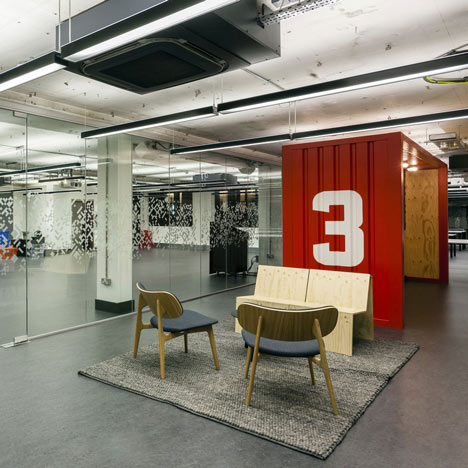
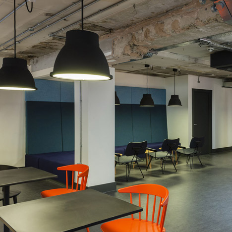
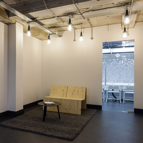
Furthermore the overall look and feel of the building was designed to reflect the nature of the future occupants of the building: young start-ups who are just about to kick off their careers rather than well established corporate companies. By stripping back the building to its core, exposing all services, revealing the existing structure of ceiling slabs and columns and combining this with utilitarian and inexpensive materials such as linoleum and plywood a raw aesthetic has been created not dissimilar to a garage or workshop.
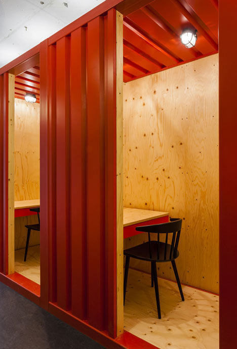
This low-tech environment has then been furnished with several autonomous objects, which emanate a strong presence in the space:
In the reception visitors are welcomed by a reception desk partly made from multi- coloured Lego bricks – a nod to Google’s founders who always had a special fondness for the Danish toy building blocks – in an otherwise unbranded environment.
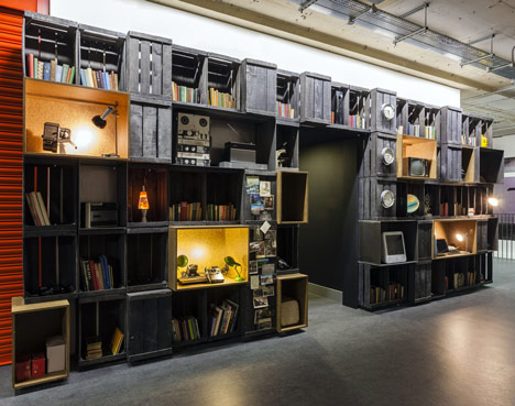
A large inspiration wall made from reclaimed vegetable crates dominates the holding area. The wall can be used as shelving for books and magazine or to display objects and artefacts that help tell the story of the building and its inhabitants. The first exhibition installed for the launch of the building revolves around iconic objects from the world of communication and consumer electronics.
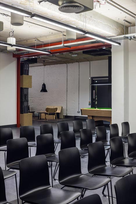
Towards the rear the holding area opens up to a large presentation room offering seats for up to 140 people. The two spaces can be subdivided by means of a bright red roller shutter which contributes to the industrial aesthetic of the environment.
The loading bay next to reception has been converted to accommodate up to 40 bicycle stations to encourage cycling.
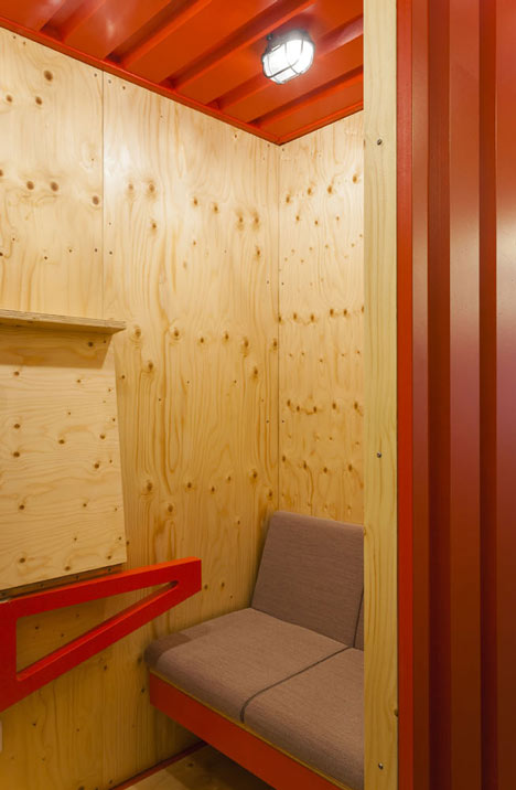
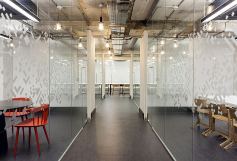
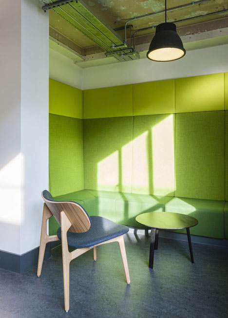
Working areas, which occupy the upper five floors of the building, are open plan. They incorporate multi-functioning container units that separates circulation from the main office space and offer hot desking, personal lockers, recycling stations, video conferencing / meeting booths and a micro kitchen. It is complemented by a soft seating area facing the micro kitchen, along with an upholstered nook offering respite from the hustle and bustle of the working areas. Large panels upholstered in a neutral grey fabric along the walls improve the acoustics of the space and double up as pin-up surfaces.
Access to both the top floor flat roof and the lower ground floor courtyard has been introduced to offer up an enhanced experience of the building. The top-floor flat roof has been timber decked and will be used for cinema screenings and social gatherings. Working with landscape artists ‘The Wayward Plant Project’ the lower ground floor exterior space has been transformed into a timber decked patio featuring moss walls and a fern garden, alongside flowers that are technologically enhanced to tweet when in need of water! This external space is open to residents of the building as well as visitors of the adjacent café.
The design of the café follows the same logic and employs the same materials that have been used elsewhere in the building. The coffee bar itself sits kiosk-like in the centre of the floor and divides the space into two separate zones: the café towards the rear featuring bespoke upholstered banquet seating and small benches made from simple, oiled plywood as well as a large mural by graphic artist Luke Embden.
A large workbench for informal workshops and seminars occupies the front of the space. The half-pipe room behind a wooden warehouse door offers a calm and muted atmosphere to brainstorm new business ideas or simply relax after lunch.
Project Details:
Project: Campus
Location: 4-5 Bonhill Street, London, UK
Total floor area: ~2,300 m2
Capacity: ~ 200 desk spaces, 16 meeting rooms of various sizes, 2 presentation and event spaces (130 / 75 person capacity), informal work + break out spaces, café
Project cost: £ 2.2 M
Project Team:
Client: Google UK Ltd.
Architect: Jump Studios (Shaun Fernandes, Markus Nonn)
M&E: Medland Metropolis
Contractor: Como
Furniture: Viaduct Bespoke Joinery: Key Joinery
Construction Materials:
Reception:
desk: MDF, back painted glass, Duplo bricks, painted aluminium
feature wall: reclaimed fruit crates, chipboard, steel
floor: Forbo Marmoleum real
Café:
coffee kiosk: oiled spruce plywood, plasterboard, Formica HPL, Dupont Corian, Egger MFC workshop table: MDF, solid surface material
halfpipe: MDF / plywood, Heuga 731 carpet tiles
banquet seating: MDF base structure, seating pads upholstered in Kvadrat Hallingdal 65 fabric benches: oiled spruce plywood
wall benches: mdf, seating pads upholstered in Kvadrat Steelcut Trio 2 fabric
floor: Forbo Marmoleum real
1-4th floor:
container: MDF, oiled spruce plywood container
benches: MDF, seating pads upholstered in Kvadrat Steelcut Trio 2 fabric teapoint: oiled spruce plywood, Egger MFC, sinks: Franke, taps: Bristan
break out wall: Masterlite Acoustic pro block, painted acoustic paneling: Fabritrak system, upholstered in Kvadrat Remix fabric banquet seating: MDF base structure, seating pads upholstered in Kvadrat Hallingdal 65 fabric
floor: Forbo Marmoleum real
Furniture / Lighting:
Hay, Modus, Very Good & Proper, Branch Studios, Moroso, Bene, Magis Muuto, Luxo, Erco