Ten design projects by students featured in New Designers
Dezeen School Shows: a glassware collection for beverages that accentuates the visual effect of light is included in this school show by New Designers.
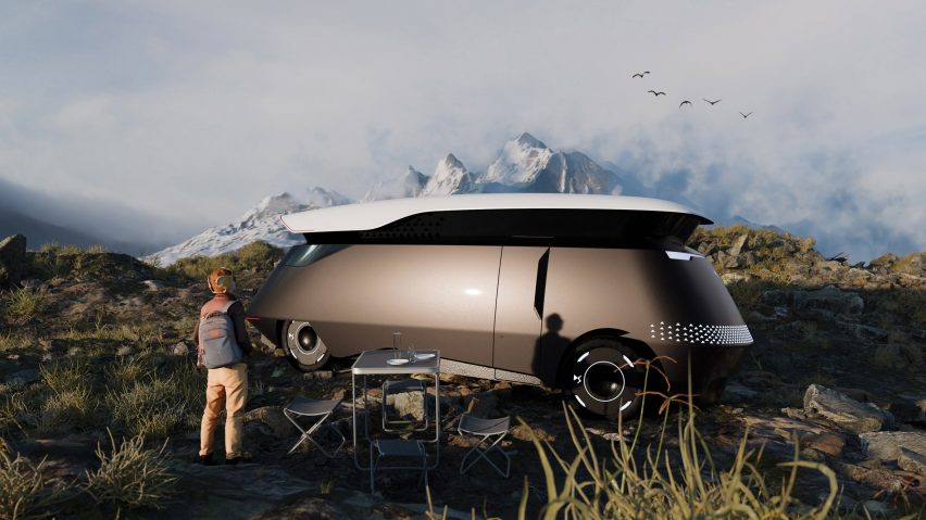
Also included is a redesign of a car that adapts to travelling outdoors and a textiles project that takes cues from the architecture of cathedrals.
New Designers
School: New Designers
Statement:
"The recently concluded New Designers show celebrated the creativity and innovation of emerging talents across various design disciplines.
"This annual event provides a platform for graduating students to showcase their work, highlighting their skills and unique perspectives.
"The 2024 exhibition offered a glimpse into the future of design, featuring ground-breaking concepts and cutting-edge techniques.
"The show not only serves as a launchpad for the next generation of designers but also reinforces the importance of creativity and innovation in shaping our world.
"Save the date for the next edition of New Designers, running 2 to 12 July 2025."

Reluctant Hero by Adrian Henry
"The Reluctant Hero is a CG character sculpted in ZBrush and textured in Maya – Mickey is a character designed as an experimental piece for video game content creation.
"The purpose of this project was to discover new techniques, utilising industry-standard software, for texturing, modelling and above all, storytelling.
"With little to no experience in 3D prior to university, I wanted to push myself to learn the key steps in the industry pipeline for developing the props and assets we see in video games – following a stylised approach, I developed these pieces to incorporate deep and immersive designs into a 3D world, and even made the character playable in a video game engine!
"The idea behind my project, story-wise, is loosely based on the persona of a worn-down and respected handyman reaching retirement, and as a new threat emerges in his town, Mickey is the last hope for the folk who have looked to him for years.
"He throws together some make-shift weapons from his array of tools and gizmos and takes to the garden to fend off the marching wave of evil, mutant hogweeds – it's time to nip this in the bud, one final time."
Student: Adrian Henry
School: Nottingham Trent University
Course: BA (Hons) Animation

Exposure by Alisha Beaven
"My publication, Exposure, reveals the everyday patterns beyond our sight by exploring the germs and bacteria that live amongst us.
"The bacterial images used in this book were grown from samples I took from kiosks in McDonalds."
Student: Alisha Beaven
School: Nottingham Trent University
Course: BA (Hons) Graphic Design
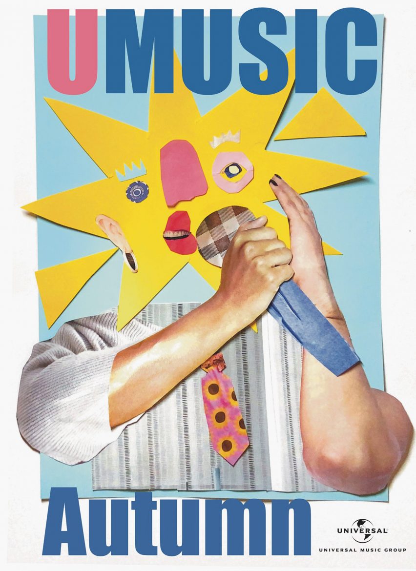
UMusic Autumn poster by Alanna Sloss
"This poster design was part of my submission to the D&AD New Blood awards – I selected the brief from Universal Music, who asked for a series of posters and other promotional material for their annual 'Umusic' event.
"I created a series of six posters using paper collage techniques, as well as in-venue branding, email invitations and merchandise designs.
"Using collage for this project was a challenge for me as someone who feels more comfortable with other digital and analogue techniques, and for a while, collage had been one medium that I had not quite grasped.
"Throughout the process, it took a lot of convincing for me to feel confident in this work but in the end, it is some of my favourite illustration work I have ever created.
"I am someone who likes to take risks and challenge myself often and I am grateful for this project as it is a reminder to myself why it is so beneficial to do so."
Student: Alanna Sloss
School: Cambridge School of Art, Anglia Ruskin University
Course: BA (Hons) Illustration
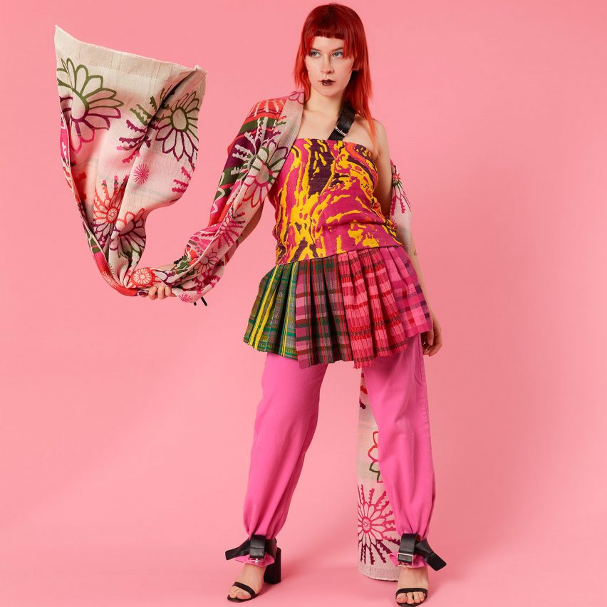
Colourphilic by Georgie Hollingworth
"Colourphilic seamlessly merges biophilic design and contemporary textiles, drawing inspiration from cathedral architecture and nature found at the Eden Project.
"Through handloom and digital techniques, it translates nature's hues into serene designs.
"Vibrant colours and textured yarns weave narratives of tranquillity, inviting tactile exploration within my designs."
Student: Georgie Hollingworth
School: Winchester School of Art, University of Southampton
Course: BA Textile Design
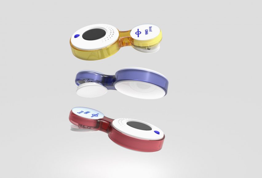
Boost by Anahita Shafiei Baghini
"Boost is a package solution consisting of three products: a wearable monitor, a 'thank you' button and a breakroom surface lamp with a touchscreen projector.
"Boost ensures that underground train drivers receive their daily dose of vitamin D3 by providing artificial sunlight exposure.
"At the same time, the device also monitors iron oxide levels within their working environment to document long-term particulate matter exposure."
Student: Anahita Shafiei Baghini
School: University of Leeds
Course: BSc Product Design
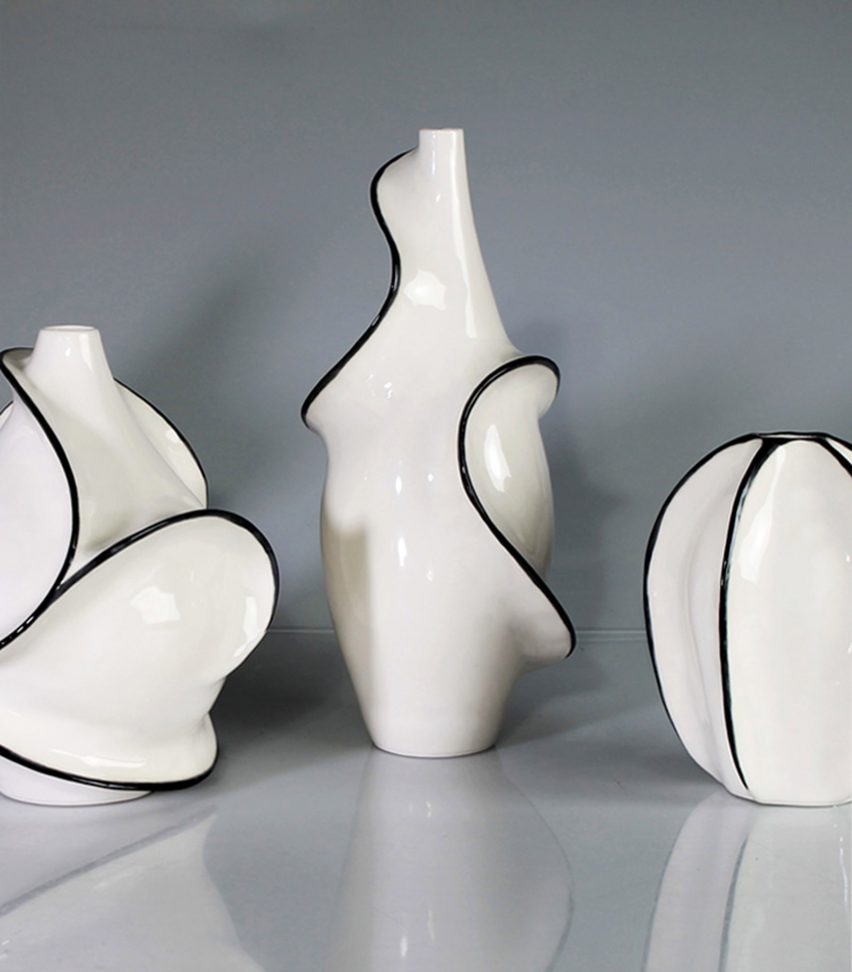
Continuation by Emily May Scott
"I produce thrown vessels, as I enjoy the refined and symmetrical forms I can achieve with this technique, as well as the tactile nature of throwing clay.
"I then create plaster moulds from these forms and use them to slip-cast my pieces before adding ridges of decoration that flow around the vessels.
"My inspiration for the pieces in this collection stems from my interest in natural forms, fluidity and quality of line, as well as adding movement, life and dynamism to otherwise static vessels.
"As I made each piece in this collection, I enjoyed seeing the basic forms slowly morph and extend, gradually adding depth and movement as the lines wind around the vessels and lights."
Student: Emily May Scott
School: De Montfort University
Course: BA (Hons) Design Crafts
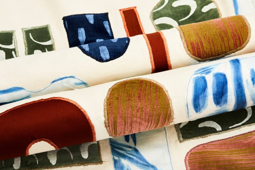
Mountainous Landscapes by Abbie Millard
"This collection is inspired by my trip to Snowdon – I used the contours of the mountains alongside the architectural shapes from the local village to create a collection of hand-rendered and digitally printed designs for interior spaces.
"I have been influenced by the Scandinavian concept hygge which has informed my selection of materials and processes, resulting in an interior collection that focuses on wellbeing."
Student: Abbie Millard
School: Arts University Bournemouth
Course: BA (Hons) Textiles
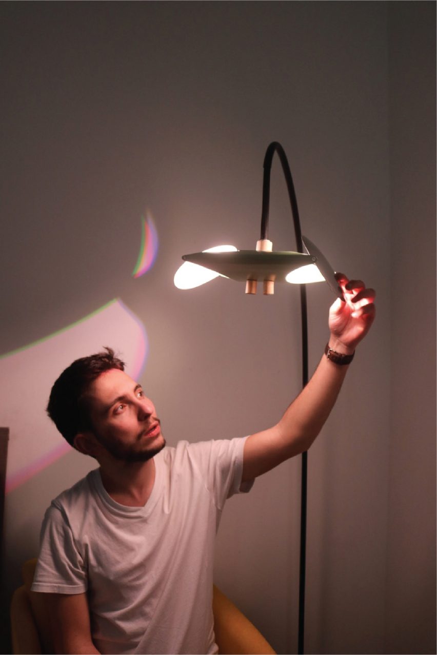
Theia: Nature-Informed Lamp Design by Joseph de Ferranti
"Through the way it refracts, reflects and casts shadows, natural light is an astonishing phenomenon that we are deeply connected to as humans.
"Theia intends to replicate aspects of this experience through the ambience it brings to a room and the design of its hand crafted aluminium body.
"Theia houses two powerful LEDs which cast light onto two reflective discs, which can be rotated to adjust the type of reflection and what direction the light projects.
"The lower faces are white to reflect a solid functional light, and the upper halves are mirrored stainless steel, casting a reflection that emulates the interaction of water and light.
"Through increasing the natural ambience of our indoor areas, Theia intends to be a practical solution to the reality of our predominantly indoor lifestyle – it does not only intend to provide the benefits of biophilia to our mental health but also to remind us of positive associations with nature, encouraging us to spend time in it when we get the opportunity."
Student: Joseph de Ferranti
School: Edinburgh College of Art
Course: BA (Hons) Product Design
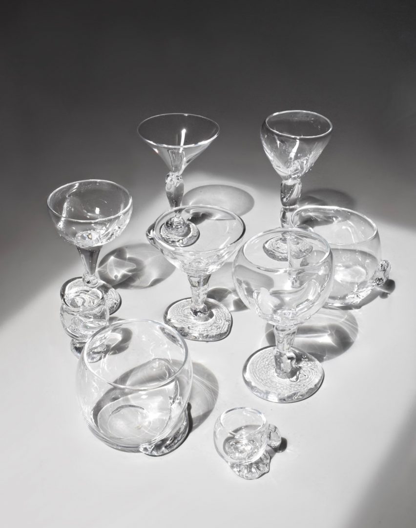
Blurring The Boundaries by Charlotte Laithwaite
"Throughout my work, I have explored the interplay of light and colour to create functional art that serves as playful objects, sparking conversations among users.
"My design concept incorporates intangible elements like light, which interact dynamically with my glassware.
"Through deliberate design, I've crafted pieces that capture and reflect light, enhancing the visual experience and creating captivating interplays between the glass and the liquid it holds.
"Each glass in the collection is meticulously crafted to embody the journey of mixology and illuminate the drinking experience.
"By integrating innovative materials and lighting elements, these glasses transcend traditional design, offering a unique exploration of how light interacts with beverages and enhances the sensory enjoyment of cocktails."
Student: Charlotte Laithwaite
School: Manchester School of Art, MMU
Course: BA Product Design & Craft
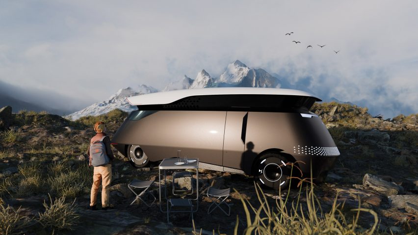
Citroen DS Grandeur by Ollie Rommelrath
"The luxury Citroen DS Grandeur embodies the concept of a land yacht, designed for adventurous journeys.
"Its sleek exterior and expansive interior redefine sophisticated travel, while also evolving Citroen's brand DNA for a new segment."
Student: Ollie Rommelrath
School: Staffordshire University
Course: BA (Hons) Automotive & Transport Design
Partnership content
This school show is a partnership between Dezeen and New Designers. Find out more about Dezeen partnership content here.