Sam Jacob gives "soft brutalist" University of Kent building a modern makeover
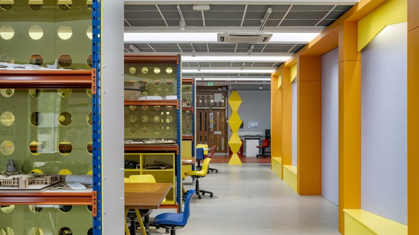
Architecture studio Sam Jacob Studio has refurbished a 1960s building at the University of Kent in Canterbury, England, using playful architectural references and bright colours to add layers of "wit and delight" to the existing interiors.
The project provides teaching spaces for the university's School of Architecture, Design and Planning, which is part of a campus designed by William Holford that opened in 1965.
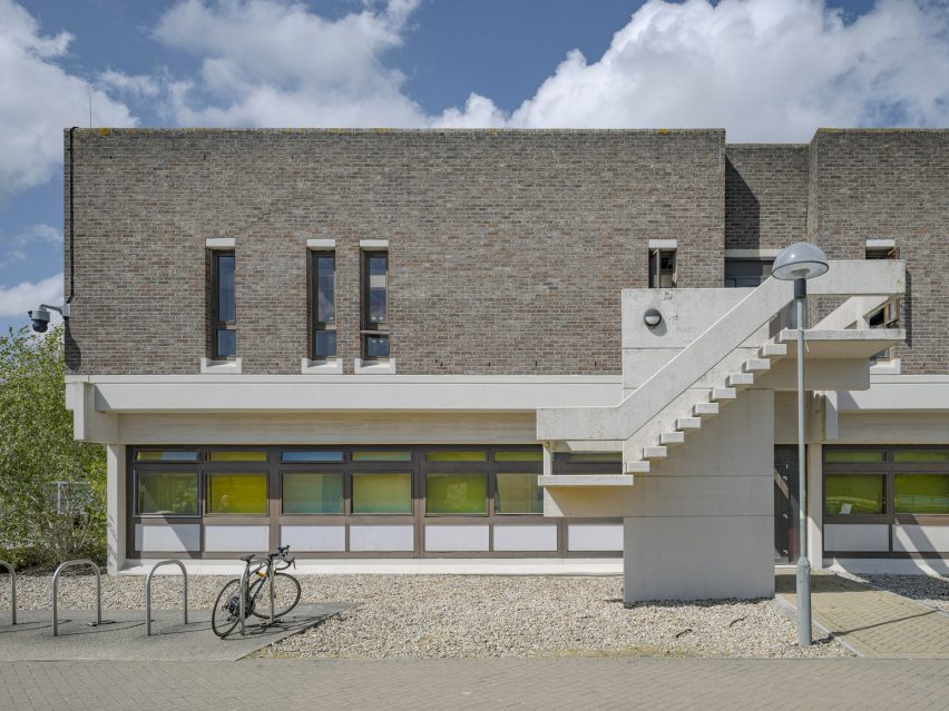
Sam Jacob Studio (SJS) looked to retain what it described as the "soft brutalist" character of the brick and concrete Marlowe Building when reorganising the existing interior.
The Marlowe building originally housed the university's physics department, which featured a series of cellular offices on the ground floor and a top-lit lab space above.
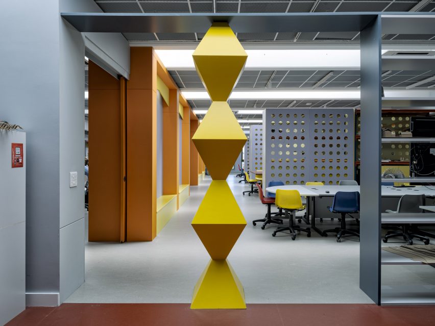
Following a detailed consultation with faculty and students, Jacob and his team defined a strategy that balances areas dedicated to specific year groups and subjects with the ability to transform and open up the spaces.
The team at SJS said it was interested in "what happens between the logic of architecture and the happenstance of creative working".
They based their design on a variety of famous creative spaces including the Bauhaus school and Paul Rudolph's brutalist Yale Art and Architecture Building, as well as The Factory created by artist Andy Warhol in New York City.
The architects gutted the existing interior to expose the concrete ceiling alongside the building's structure and services, which were retained as the backdrop for a series of minimal interventions targeted at fulfilling the space's new role.
"This is a project that reveals the intrinsic qualities of the 1960s building, while also contrasting a more fluid contemporary character," the studio said.
"It is an architecture that invites inhabitation rather than imposing order, that recognises character, wit and delight as part of an essential role of architecture."
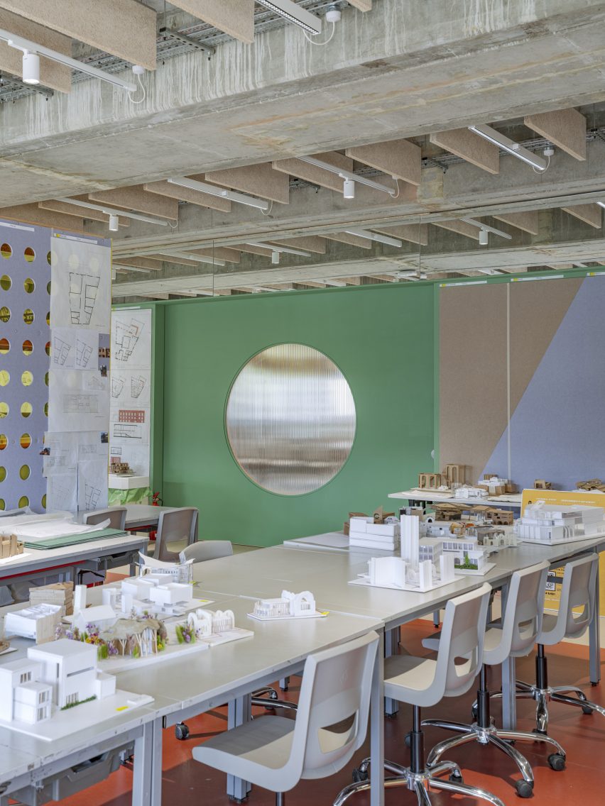
SJS worked as much as possible with the existing spatial layout, adding just one wall to the ground floor and two on the first floor so that the interiors can evolve to meet different future requirements.
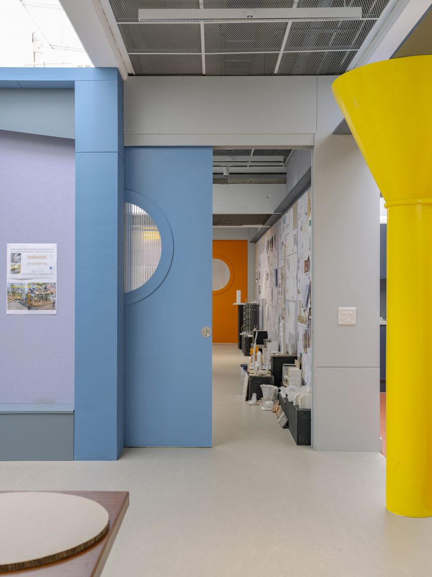
Rather than functioning merely as static partitions, the walls are activated by incorporating moving components that can be used to adapt the layout of the studios.
Large sliding doors with polycarbonate portholes allow some of the spaces to be separated, while pivoting wall sections can be opened or closed depending on the desired layout.
The partition walls incorporate full-height pinboards for displaying work. These surfaces were given a more dynamic appearance by cutting the boards diagonally from corner to corner.
The standard-height pinboards are topped with a shelf, onto which adjustable lights are clamped to allow illumination of the students' work. Mirrored panels above the shelf create the illusion of a continual space.
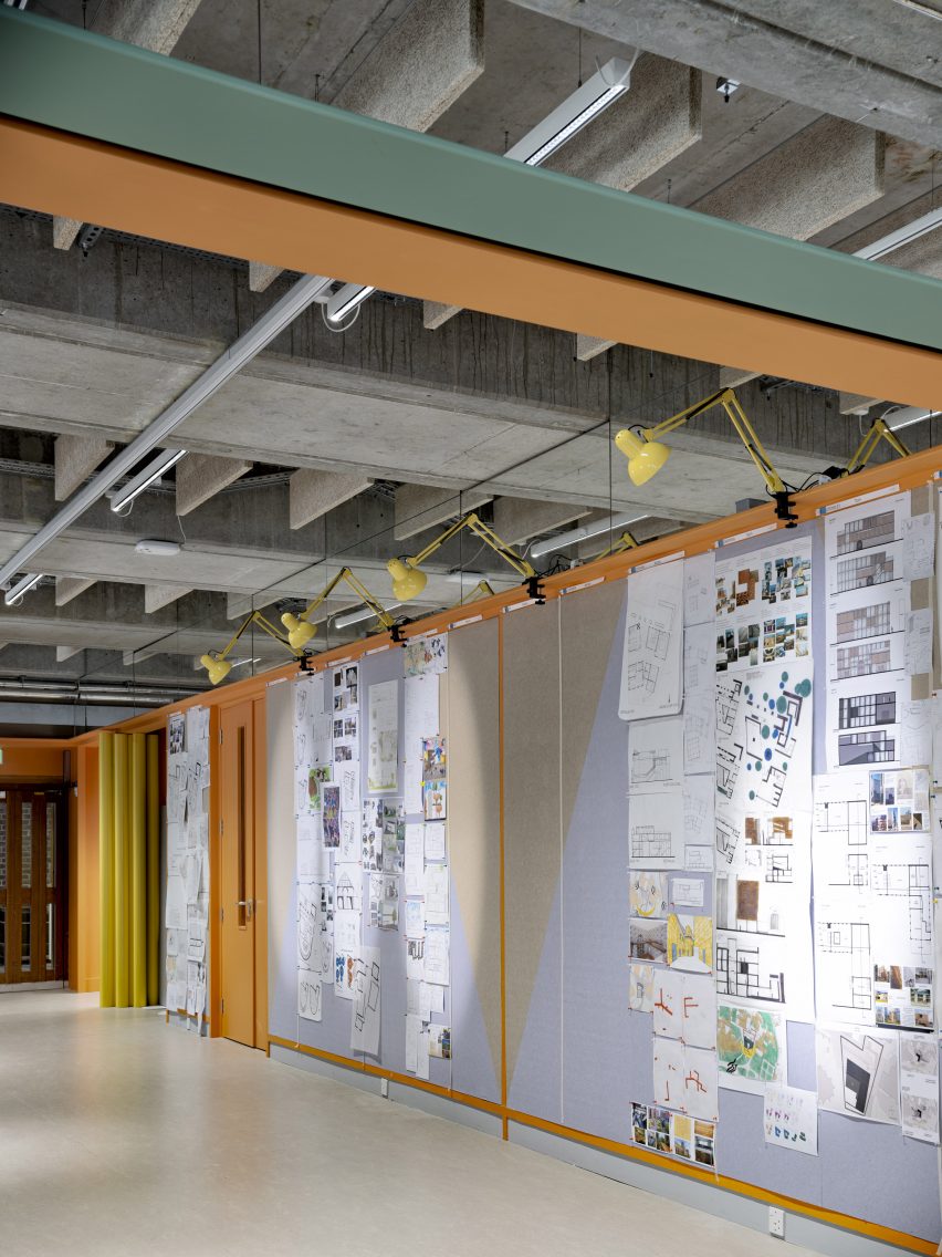
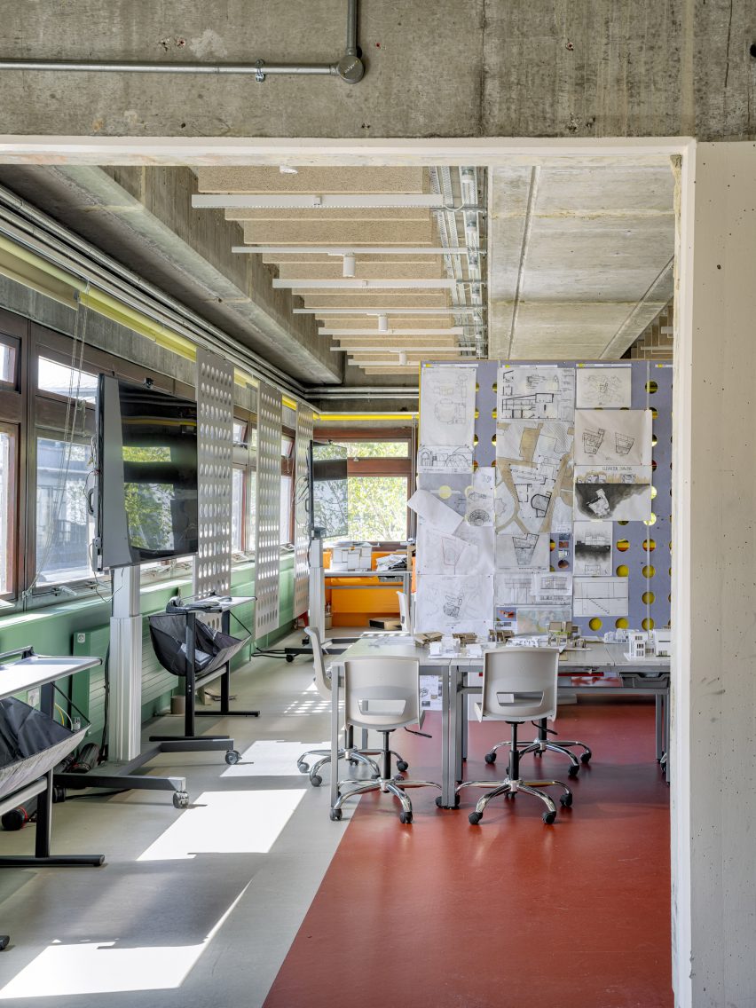
The studio can be customised further to suit different working modes by rearranging freestanding elements including drawing boards, easels, screens and moveable storage units built using standard warehouse shelves.
Existing furniture was reused wherever possible, while doors salvaged during the strip-out were converted into desks, with yellow laminate pieces added to fill in holes where the locks and vision panels were once located.
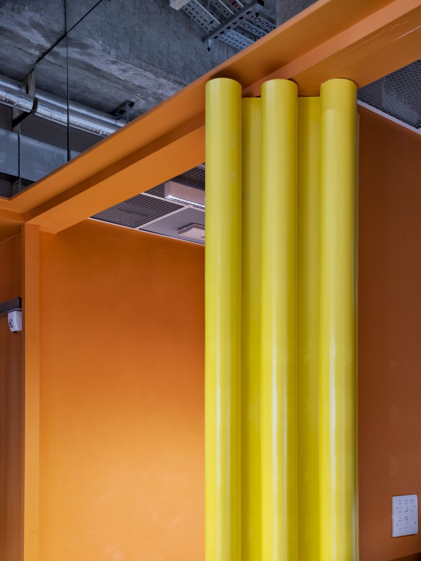
The interior incorporates several explicit architectural references, according to SJS, including a colour palette based on Le Corbusier's 1959 paint system.
"A series of columns used to define thresholds act as 1:1 models of, variously, Canterbury Cathedral, Brancusi and James Stirling, like a library of other architectures inhabiting the school," the team explained.
To prevent sunlight from overheating the studios, a series of coloured window blinds was added along with moveable perforated pinboard panels that help to control privacy. This creates a changing topography that animates the building's exterior.
Sam Jacob established his eponymous studio in 2014, having previously worked as part of the radical architecture collective FAT for over 20 years.
Previous projects by SJS include a new entrance at London's V&A museum made from hundreds of glass tubes and a brightly coloured studio and office for designer Yinka Ilori.
The photography is by Timothy Soar.