Reigo and Bauer uses diamond-shaped cladding for angular Toronto house
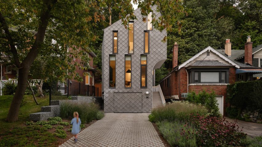
Local studio Reigo and Bauer has completed a Toronto house clad in diamond-shaped panels that present a "quiet tension of that contrast" between the cladding's decorative and minimalist qualities.
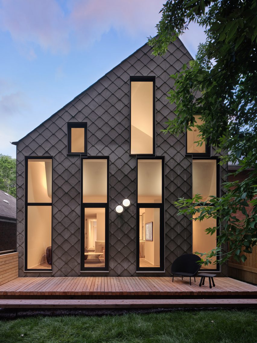
Called Neville Park, the three-level house sits on a narrow lot in an East End Toronto residential neighbourhood. It is characterised by a tall profile with a sharply sloped rooftop and off-set rows of elongated windows framed by black-painted aluminium casing.
According to Toronto-based studio Reigo and Bauer, the brief was to design a well-connected space for a family of two adults and two children and make it comfortable while catering to the client's "contemporary" taste.
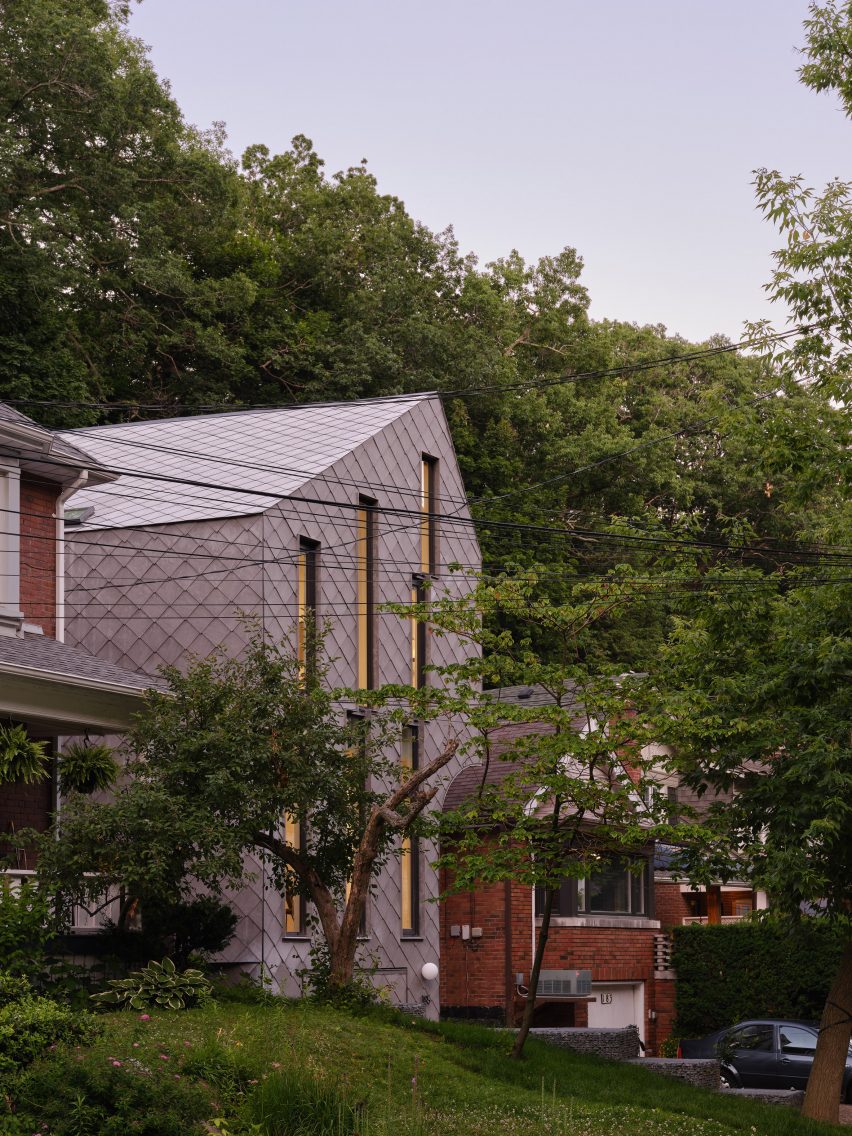
The site slopes from the street to the back of the lot where there lies a thick grove of mature trees, whose form Reigo and Bauer said influenced the final slope of the roof.
But the architecture studio said the form is also practical – the slope allowed for the off-set stacking of floors, so that long windows and steep ceilings create a greater sense of internal space for the second-storey bedrooms.
"The slope of the roof was studied to create pleasing internal volumes while still working within the height limits of the zoning," studio founding partner Merike Bauer told Dezeen.
"The steeper pitch allowed the upstairs rooms with compact footprints to feel lofty and more spacious."
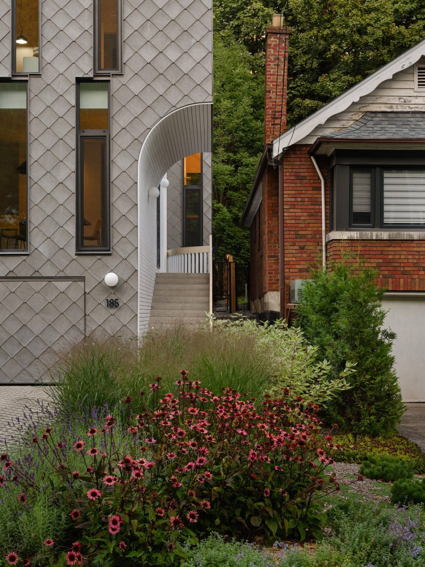
A practical move that also creates visual interest is the half-barrel cut-out on the entry side of the building to make room for the entry steps that begin at the garage level.
Another vertical cut-out on the side was placed around the door and runs the height of the structure.
The negative space on the envelope also created more vertical planes on that side of the building.
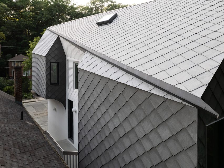
Bay windows were placed on the sides and look out from the face at nearly 45-degree angles to avoid direct lines of sight with the neighbouring house.
The diamond-shaped panels that clad most of the exterior carry through the sharp-angled design language of the house. Made of fibre cement, the panels have a grey tone and a scale-like appearance.
According to Bauer, the cladding was chosen because it has both minimalist and decorative qualities.
"The slates provided excellent technical performance, while also representing a very traditional type of roof cladding," said Bauer.
"We're often drawn to traditional materials and methods of construction that can be realized in unconventional applications," she added.
"The diamond shape, for instance, was selected for its decorative nature, yet installed as it is, uniformly over the roof and walls, even the garage door is more minimalist in its first reading. I love the quiet tension of that contrast."
Inside, the angles of the exterior are reflected in curved and faceted ceilings.
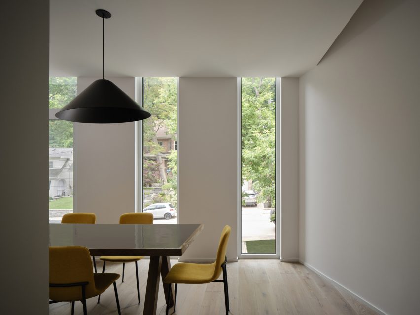
The street-facing dining room has windows that run past the ceiling, which has a gap on one side where it meets the wall.
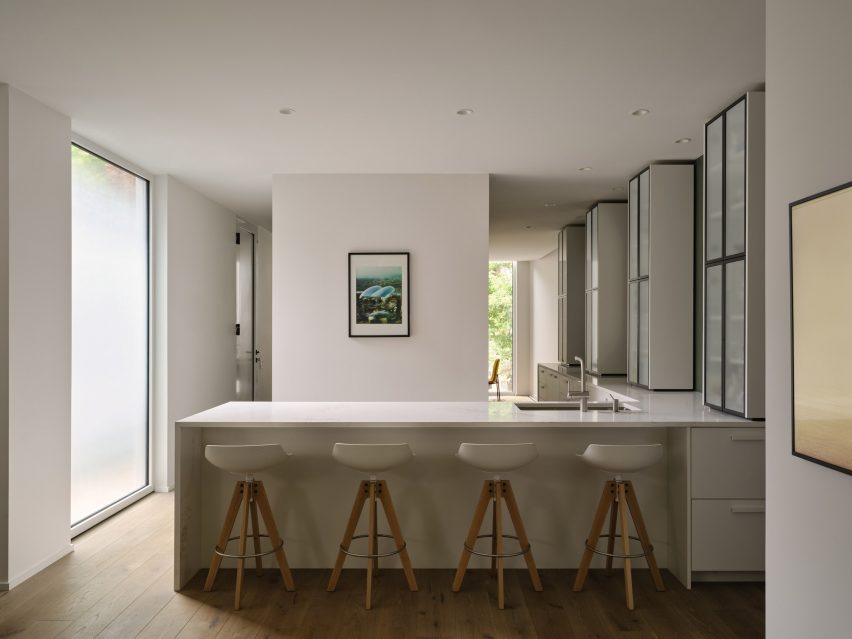
This ceiling plane runs back over the kitchen and to the rear-facing living room, where it curves up to meet with the top of the window panes there, giving the whole primary floor a sloped impression.
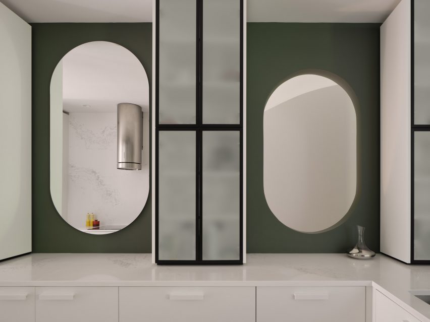
The kitchen sits in between the dining and living room and also acts as a passage between the two spaces. To bring in additional light, a series of "pill-shaped" openings were cut between the cabinets on the green-painted wall that runs between the kitchen and the staircase.
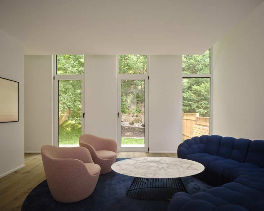
More colour was used for the furnishings in the living room, which features a deep-blue Elkin sofa by furniture brand Mobilia. The living room looks out over a fenced backyard.
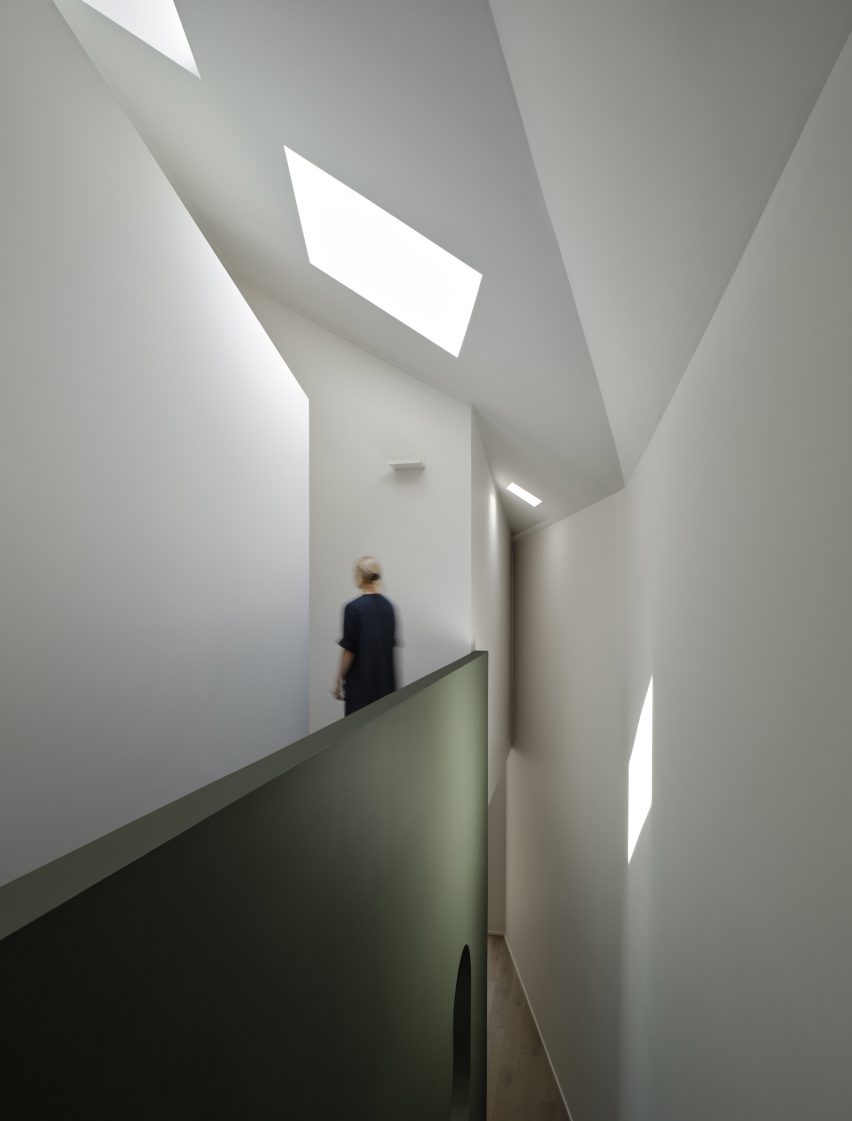
In the upstairs hallways, angular ceilings and skylights bring in light. The gap seen in the ceiling in the dining room opens up slowly as it leads towards the staircase, creating a double-height space that allows further light to filter downstairs from the skylights. The design gives the upstairs passageway the character of a mezzanine.
The centre of the second-storey plan holds bathrooms with doors facing towards the bedrooms on the periphery. Above this central volume, another void has been included between it and the roof plane.
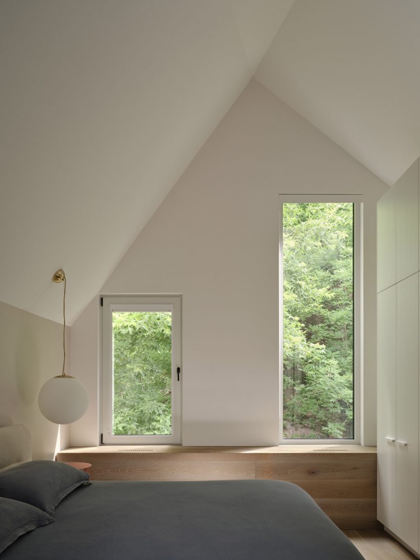
The bedrooms are also characterised by sloped, angular ceilings as they stack within the narrowing roof profile, with the master on the street-facing side and the two smaller children's rooms on the front.
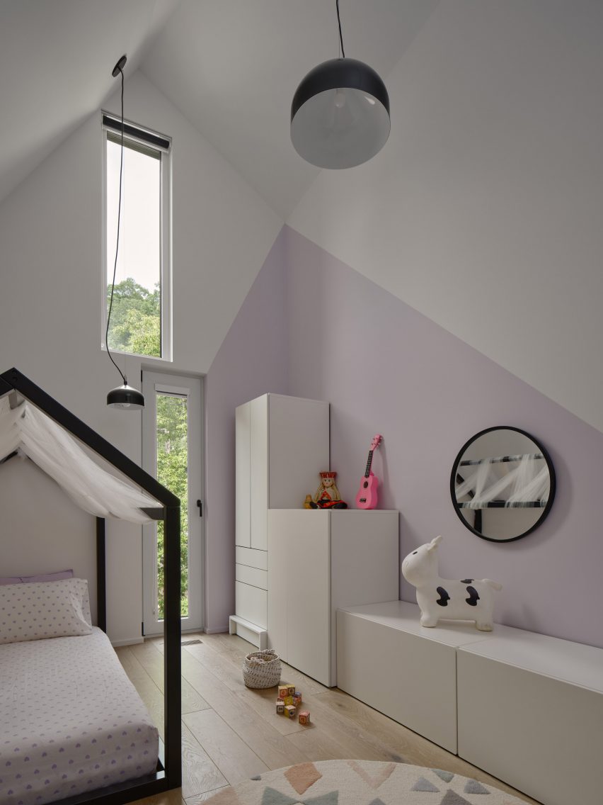
One of the children's bedrooms sits directly under the primary slope, with two stacked windows. The other has a single rear-facing window and a window provided by the vertical cut-out on the southside of the envelope.
Another bathroom was placed on the garage level below grade.
Other recently completed houses in Toronto include one by Partisans with a "pixelated" brick facade and a "raw and unvarnished" prefabricated home.
The photography is by Doublespace Photography.