Renzo Piano Building Workshop completes "big cube" in Paddington
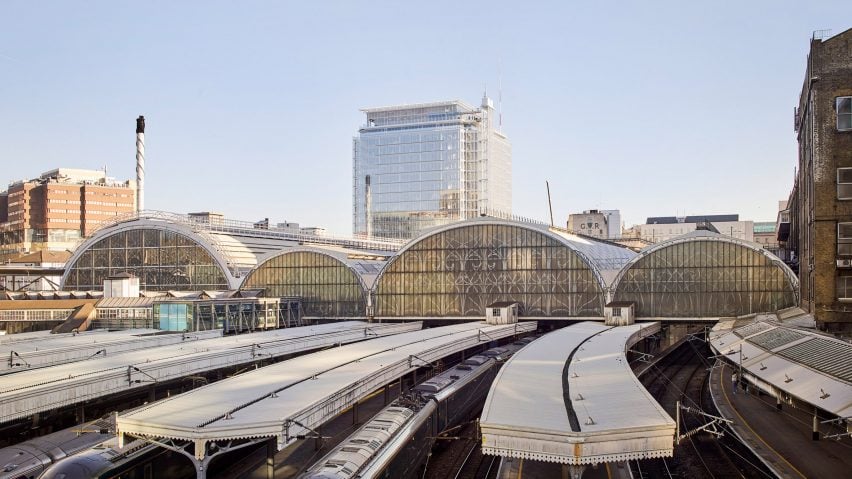
Curtain walls and an exposed steel structure define Paddington Square, a contentious mixed-use building in central London by architecture studio Renzo Piano Building Workshop.
Ten years in the making, the building takes the form of a 55- by 55-metre cube, elevated on a podium of public amenities including an entrance to the London Underground.
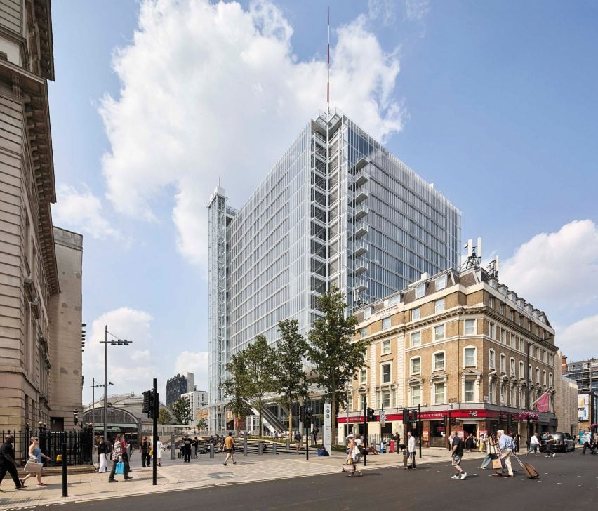
While the bulk of the 18-storey building is for private office use, its base also incorporates shops and eateries, while two street-level lifts provide access to a public rooftop restaurant.
According to Renzo Piano Building Workshop's project architect Joost Moolhuijzen, these public-facing elements of Paddington Square are the most "essential" part of the project.
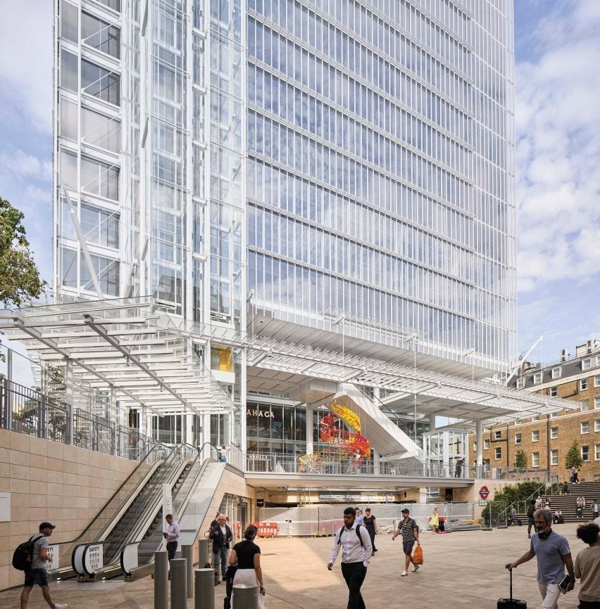
These spaces form part of a wider strategy by the studio to enhance the public realm outside the adjacent Paddington station by maximising "permeability and accessibility", Moolhuijzen said.
This goal has also been met through the rerouting of an old road in front of the site around the building and efforts to reduce the visual impact of its facade.
"The difficulty was that we knew it was going to be a very big building," Moolhuijzen told Dezeen during a tour of the building.
"Its footprint is 55 by 55 metres, it's lifted off the ground by 12 metres, so it's a big cube, so how could we relate it to the scale of the street?" he continued.
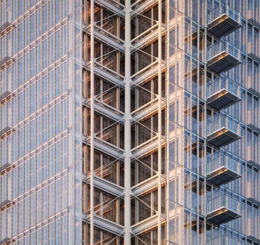
"By articulating the building, by exposing its structure and working really hard on the facades to make it more subtle, more lacey than typical curtain walling that you'd see in Canary Wharf, I think we managed to give it a sensitivity and depth to the building that really help to integrate it with the site."
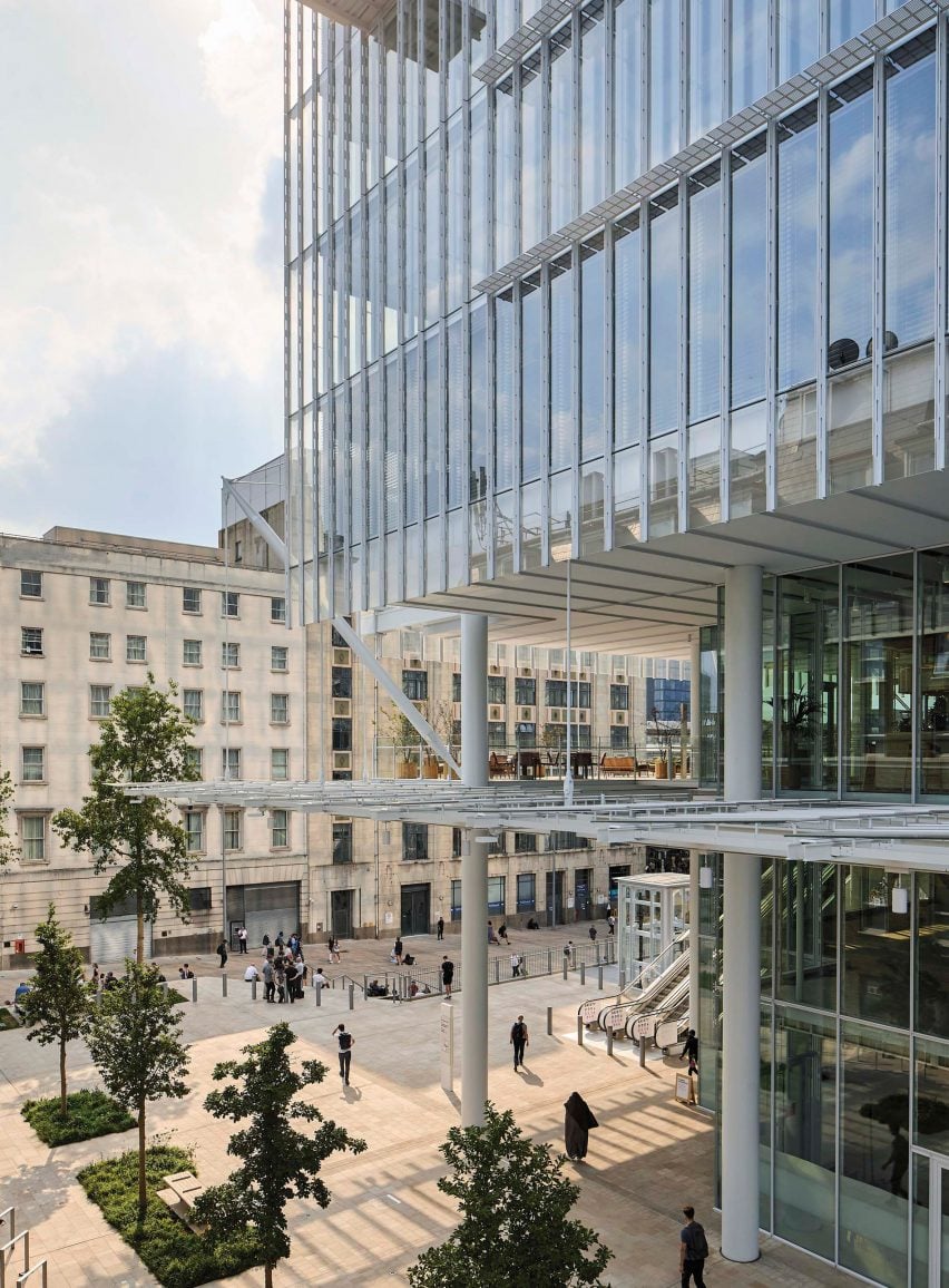
Paddington Square has been a contentious project. First revealed in 2015, it originally took the form of a 224-metre cylindrical tower, but its height was slashed and its formed reimagined following a backlash from critics.
However, its 75-metre-tall redesign also received opposition over fears of how it would impact the conservation area surrounding London's Paddington station, and its construction was briefly put on hold following a petition for a public inquiry into the plans.
However, despite this, Moolhuijzen believes the final outcome is a success.
"We've kept our promise," Moolhuijzen said. "When you go through planning, you promise something, you promise it to the planners, you promise it to the local community, you promise it to London at large, and I feel we have kept that promise," he continued. "I think it actually came out better than that promise."
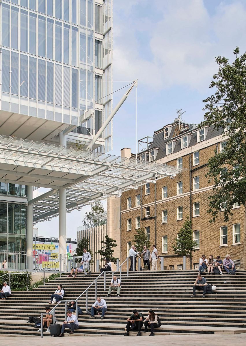
Paddington Square is distinguished by its uniform double-layered curtain wall facade, which is externally ventilated. Curtain walls were chosen to ensure outward views and maximise light throughout the interior of Paddington Square due to its deep floor plates.
To help reduce the visual scale of the cube, its mullions were positioned close together across the facades, meaning the glass is concealed when viewed from certain angles.
Between the two layers of glass are perforated blinds designed to reduce solar gain and minimise the energy demand of the offices inside. When the blinds are shut, their perforations help to maintain sightlines.
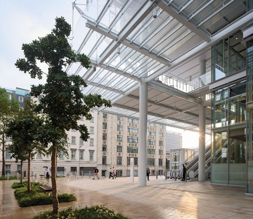
According to Moolhuijzen, the facade is also intended to emulate the "lacy" architecture of the adjacent Paddington station by engineer Isambard Kingdom Brunel, which opened 160 years ago.
"Some inspiration for this building was some elements of Brunel's station," said Moolhuijzen. "The arches and details [of the station] are like a lace, and there's something like that in the facade [of Paddington Square]," he continued.
"Though the language of the buildings is completely different, the station's a station, and it's a different era, the play with light and the detail to give depth was something we wanted to achieve," added Moolhuijzen.
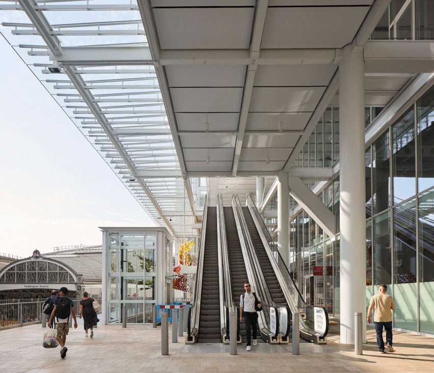
The visual impact of Paddington Square is also reduced through the addition of balconies on one side and the raising of the square above a public plaza – a move that the team describes as having a "floating" effect.
Where an old and dilapidated post office once stood, a residential-scale structure containing a bar has been added. Described by Moolhuijzen as a "bookend building", it is hoped to bridge Paddington Square and the surrounding residential buildings.
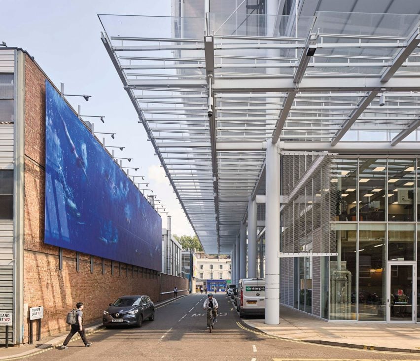
A significant yet inconspicuous structural detail of Paddington Square is that its structural columns, which run up through the building, slope inwards on the lowest three levels.
This means they are set back from the facade at plaza level, which Renzo Piano Building Workshop designed to maximise space for gathering.
Inside Paddington Square are 14 floors of offices, owned by the project developer Great Western Developments. Each floor is accessed by a lobby raised within the podium, where there is also a gym for the employees.
On the top floor is a rooftop restaurant, opening in 2025, with access to a terrace with views over the London skyline. On one corner is a transparent floor looking down to the street.
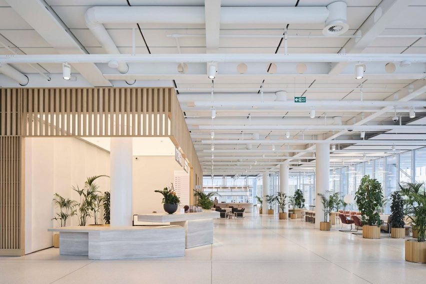
As part of the project, Renzo Piano Building Workshop also introduced a subterranean entrance and ticket hall for the London Underground, accessed from within the podium. It has increased the former station's capacity and step-free access.
Above and around the ticket hall are a series of shops and eateries, lining a walkway that cuts diagonally through the cube with views into Paddington station.
Renzo Piano Building Workshop is the eponymous studio of Pritzker Architecture Prize-winning architect Renzo Piano, which he founded in 1981. Today the firm has offices in Genoa and Paris.
Elsewhere, the studio also recently completed a cube-shaped courthouse in Toronto that is stacked on top of a giant atrium.
Cubes are a popular shape in architecture, with other examples including the Berlin Cube in Germany by 3XN and the Mukaab skyscraper that is under development in Saudi Arabia, which both featured in our roundup of 10 impressively geometric cube-shaped buildings.
The photography is by Hufton + Crow.