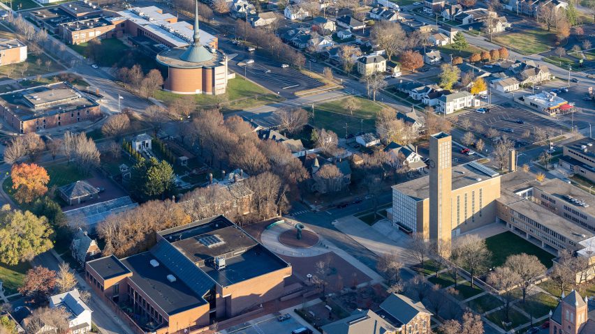
Columbus was built as "an exemplary mid-century city"
The mid-century modern architecture in Columbus, Indiana, is a physical reminder of the post-war belief in design as a tool for progress, says critic Matt Shaw in this interview for Dezeen's mid-century modern series.
A small town in the American Midwest, Columbus underwent a remarkable wave of building after the second world war that has made it world-renowned, with civic structures designed by modernists such as IM Pei and Eero Saarinen.
Driven by the Cummins Engine Company, which has its headquarters in Columbus, the city saw an almost unprecedented level of architectural consideration in a single place that reflected post-war optimism in the power of design to reflect a more prosperous society.
"Living monument to design"
"Columbus was built as an exemplary mid-century design city, with its most fervent period from 1954-1974," Shaw told Dezeen.
"The city is a living monument to design excellence as a tool to make a place better. It illustrates how leaders in Columbus enacted many of the progressive ideas from Lyndon Johnson's Great Society program of the 1960s to create a more egalitarian and prosperous society for all people."
Shaw recently released a book with photographer Iwan Baan called American Modern that presents archival material, "lesser-known stories" and interviews with residents of the now-iconic city, where he grew up.

According to Shaw, Cummins Engine Company president J Irwin Miller's drive started with a need to house workers but ended up becoming a reflection of general trends in design operating at a small scale.
After building housing, Miller went on to invest in civic architecture for the growing town, providing institutions with lists of architects to pick from.
Firestations, schools and churches fell under the program, the latter highlighting what Shaw said is a "spiritual undertone" to the initiative.
"I love the spiritual undertones of all of it. It isn't about taste," he said. "It's about building a place better for a community."
Columbus showcased, according to Shaw, an ethos of an "individual's responsibility to the public realm", which was possible on a small scale at a time when federal bureaucracy was becoming more and more unable to carry out life-improving projects.
"The ideal American city"
"[Civic responsibility] is key to the Columbus project. Once they realized they could build a place better through architecture, it became a moral imperative to some extent," said Shaw.
"Cummins invested heavily in the civic infrastructure needed to make it a top place to live. It was also a spiritual quest to make the ideal American city."
Today, many of the structures are still maintained by the Landmark Columbus Foundation, though most of the preservation remains at the discretion of private owners.
Regardless, Shaw believes that Columbus is an important record of a specific era in American and mid-century modern history.
"It is an important and unique project because the legacy of the architecture is that it remains a physical reminder of a quest for excellence, which would have been forgotten about if not inscribed in the city itself and its surroundings," he said.
"People remain very invested in making Columbus a good place, even as the world changes and new challenges arise."
Read on for Shaw's commentary on seven paradigmatic projects highlighted in his book.

Lincoln Center Ice Rink (now: Hamilton Community Center & Ice Arena), 1958, by Harry Weese and Dan Kiley
"Initiated by ardent park and landscape design supporter Clarence Hamilton of Hamilton-Cosco, the ice arena is designed to mimic a mountain chalet, complete with a fireplace for warming up after skating."
"It was the first in a string of recreation and landscape projects spurred by the Hamiltons, inspired by Miller and Cummins."

North Christian Church, 1964, by Eero Saarinen
"In 1959, a group of parishioners including Miller started a new congregation, which became North Christian Church. Eero Saarinen designed the church, Girard the interiors, and Kiley the landscape."
"Saarinen wrote of the hexagonal, theatre-in-the-round church: 'I want to solve [this design] so that as an architect when I face St Peter, I am able to say that out of the buildings I did in my lifetime, one of the best was this little church, because it has in it a real spirit that speaks forth to all Christians as a witness to their faith.'"
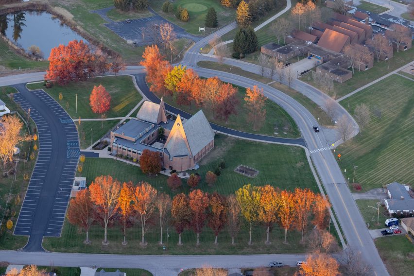
First Baptist Church, 1965, by Harry Weese and Dan Kiley
"Weese famously proclaimed, 'I would rather be right than contemporary' when discussing this chunky slate-roofed brick church."
"He originally proposed concrete, but the congregation preferred the softer natural materials. Weese called First Baptist's simple forms and warm materials 'fresh combinations of old ingredients appropriate to present problems.'"
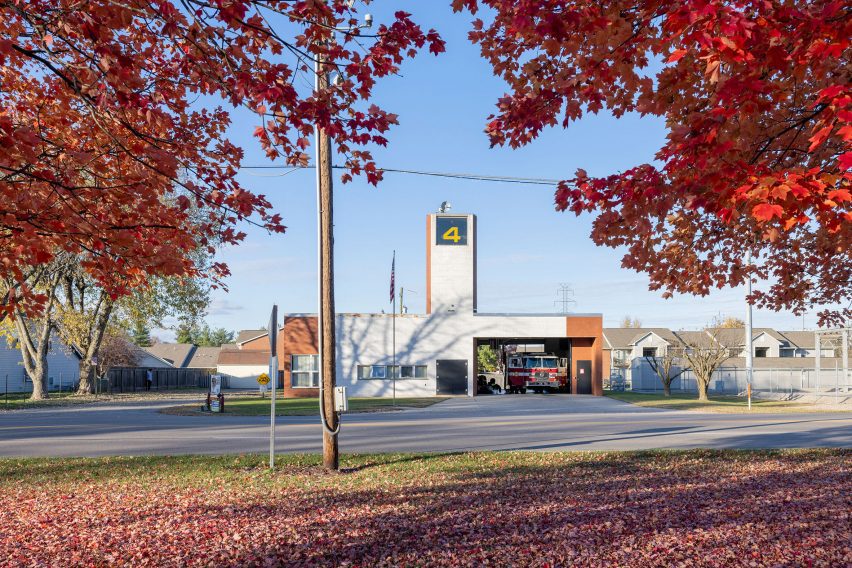
Fire Station No 4, 1968, by Robert Venturi
"Fire Station No 4 was designed to be a monument in a future suburban neighborhood. Its simple brick structure was very different from many of the modernist buildings being built at the time, which happened to endear it to the local building committee at the fire department."
"The garage, living quarters, and a tower for drying hoses are tucked behind a single, white-glazed and redbrick facade that acts as a sign marked with gold '4' – a humble gesture meant to give a sense of civic-ness."
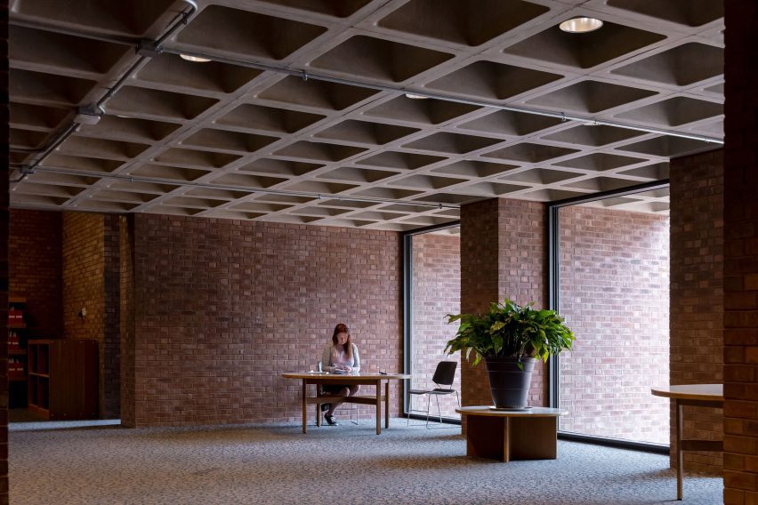
Cleo Rogers Memorial Library, 1969, by IM Pei
"The simple brick structure's tall windows frame views of Eliel Saarinen's 1942 First Christian Church tower. An innovative waffle-slab ceiling system hides the utilities above, while nooks provide quiet reading and study areas."
"Henry Moore's Large Arch sculpture anchors the plaza in front of the library. Architectural Forum called it 'a physical center in the best architectural tradition...an urbane statement of the town's civic aspirations in brick, concrete and bronze.'"

L Francis Smith Elementary, 1969, by John Johansen
"Organized in three wings around a central courtyard, Smith's hallways are brightly colored metal tubes that form a theatrical circulation system with views to and from the courtyard."
"Smith was described in a 1969 issue of Architectural Forum as a half-step toward an 'open school,' a progressive educational concept of the late 1960s and early 1970s that originated in the UK and favored 'student-centered' learning."
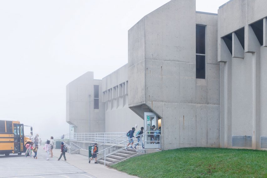
Southside Junior High School (now: Southside Elementary), 1969, by Eliot Noyes
"A brutalist elementary school, Southside's interiors are covered in warm wood. A central commons area flanked by the library is the heart of the building."
"Southside is designed like a city and laid out around a central, double-height 'commons' with a grand stair that serves as a central hub for interaction with larger shared spaces like offices, a cafeteria, gym, and theater on each side. Classrooms radiate outward along four hallways."
The photography is by Iwan Baan.

Mid-century modern
This article is part of Dezeen's mid-century modern design series, which looks at the enduring presence of mid-century modern design, profiles its most iconic architects and designers, and explores how the style is developing in the 21st century.
This series was created in partnership with Made – a UK furniture retailer that aims to bring aspirational design at affordable prices, with a goal to make every home as original as the people inside it. Elevate the everyday with collections that are made to last, available to shop now at made.com.