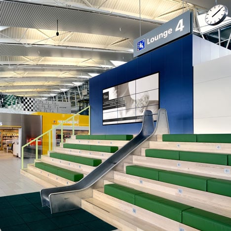
Schiphol Departure Lounge 4 by Tjep
The departure lounge that Dutch designers Tjep. have just refurbished at Amsterdam's Schiphol airport includes a slide to keep children occupied while they wait.
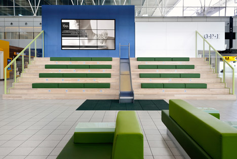
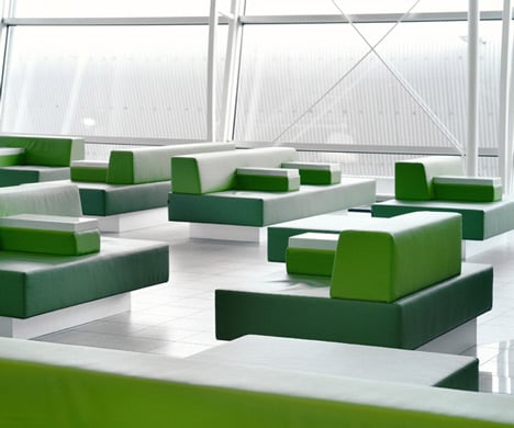
Either side of the slide, wooden bleachers and green cushions line the edge of the main waiting area, which is furnished with bright green sofas designed by Atelier Van Lieshout (see our earlier story).
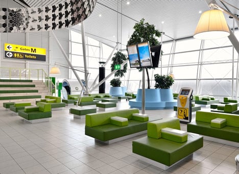
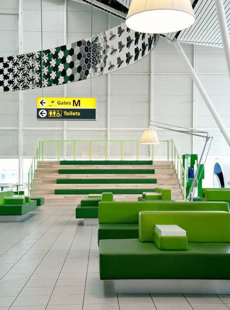
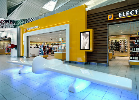
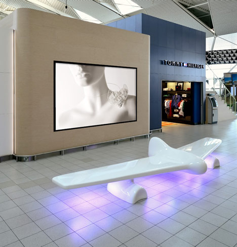
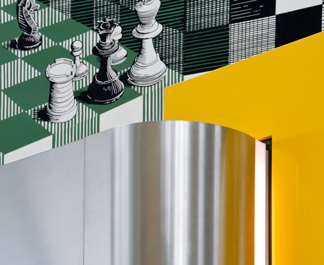
Other benches are shaped like aeroplanes and a banner of artworks by M.C. Escher winds like a ribbon below the ceiling.
Tjep. also completed the interior of the neighbouring Departure Lounge 3 at the end of last year, which included a greenhouse that raises into the air and a serving counter shaped like a giant bit of cheese - check it out here.
We've featured a few buildings with slides inside them on Dezeen, including offices for toy brand Lego and a house in Tokyo.
See all our stories about slides ».
Photography is by Mike Bink.
Here's some more information from the designers:
Our second collaboration with Schiphol Airport has resulted in the redesign of Lounge 4. The project consists of the design of two retail sections and a waiting area.
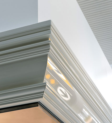
The starting point of the project was to convey the feeling of a cozy neighborhood rather than a huge international airport. This resulted in the suggestion of a shopping street composed of a variety of buildings. For the seating area we integrated Joep van Lieshout's sofa design for Lensvelt, spread out like a beautiful fresh green grass landscape. Two prominent stands offer differences in level for people like to have an overview. And kids will find a wonderful integrated slide.
Because the lounge does not have a view on planes we added a couple of specially designed plane benches. For those who know what it feels like to desperately seek a socket to power up your mobile device at an airport we have integrated more than 100 power sockets in the scheme! And finally the original ribbon-like M.C. Escher artwork integrates beautifully in the aesthetics of the lounge.