Typefaces by Wim Crouwel for The Foundry
Dutch graphic designer Wim Crouwel has created two new typefaces for London type company The Foundry, based on his work for exhibition catalogues and posters from the 1960s and 1970s.

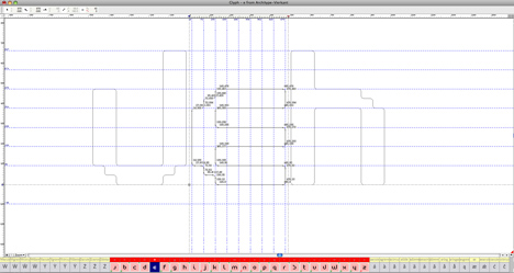
Architype Ingenieur (above and top) is a grid-based font that comes in four weights, including a dot matrix.
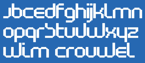
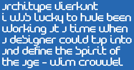
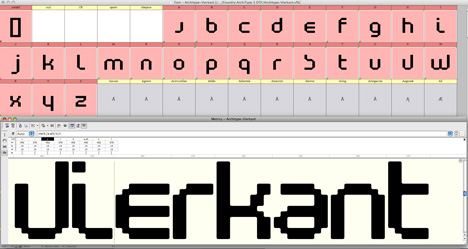
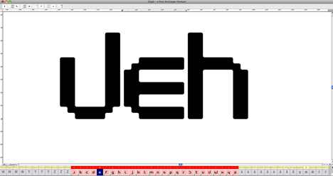
Architype Vierkant (above and below) is related to his controversial New Alphabet of 1967, which only used vertical and horizontal strokes in response to early digital display screens.
Dezeen interviewed Crouwel about his career to coincide with a retrospective of his work at the Design Museum last year. Watch the movie here or below and read more about his work in our earlier story.
Here's some more information from The Foundry:
Foundry Types launches two new Crouwel typefaces
Building on its longstanding collaboration with Wim Crouwel, The Foundry – the London based independent type foundry set up by Freda Sack and David Quay – has launched two new typefaces by the Dutch design legend.
Architype Ingenieur is a four weight family inspired by Crouwel’s late 1950s exhibition catalogues and posters. Available in light, bold, regular and dot, the typeface was inspired by the simplified geometric letterforms Crouwel created for various exhibition catalogues and posters during the late 1950s.
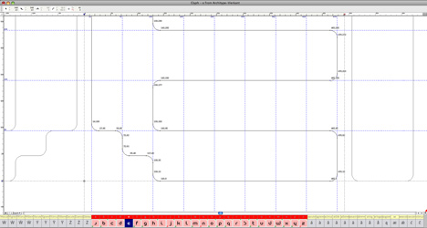
Influenced by his boyhood fascination with naval lettering, Crouwel designed grid-based type with 45-degree angles for the Olanda poster for the Dutch entry to the 1960 Venice Biennale. A subtle variation on this appeared in the 1960 Stedelijk Museum catalogue for painter Jean Brusselmans; and several dot matrix versions followed.
Architype Vierkant has been developed from the letterforms that Crouwel created on the theme ‘typo vision international’ for a 1972 Drupa catalogue. This references many of the experimental ideas which underpin his controversial New Alphabet and Fodor typefaces. This single weight typeface forms part of the Architype Crouwel Collection.
Both typefaces are part of Foundry Types’ newly expanded Architype Collections. The other collections in the series – Architype Konstrukt and Architype Universal – feature typefaces created from the experimental typographic work of artists and designers including Josef Albers, Jan Tschichold, Herbert Bayer, Kurt Schwitters and Theo Ballmer.
All fonts are available to licence direct from the new website www.foundrytypes.co.uk which now offers Opentype versions of all of the Foundry’s typefaces. Designers are invited to submit examples of their work which use the Foundry’s typefaces for inclusion on its new blog.
About The Foundry
Set up in London in 1989 by David Quay and Freda Sack, The Foundry is the trademark of the highly respected typeface library, which is managed and run by Foundry Types Limited. Some of its best-selling releases include Foundry Sans, Foundry Wilson, Foundry Monoline and Foundry Gridnik.
Both of The Foundry’s partners continue to develop new typeface designs to expand the font collection. They bring a combination of traditional and modern approaches to font design and implementation, having worked in every technological stage of type design since hot metal, particularly being involved with the beginnings of digital font technology. Their pre-digital experience and skills lend integrity and quality to their type design.