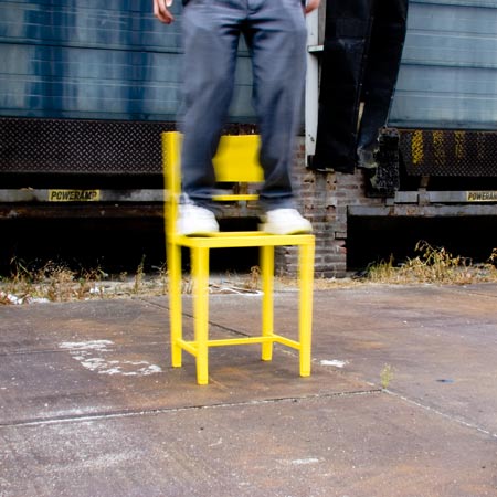
[d3] contest winners at IMM Cologne 2009
Cologne 2009: A Restless Chairacter by Pepe Heykoop has won first prize in the [d3] contest, an international competition for young designers organised by IMM Cologne 2009.
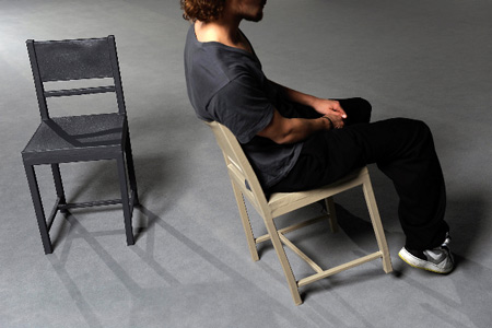
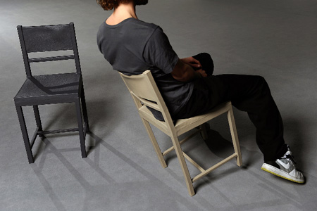
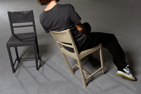
The chair consists of an aluminium frame covered in polyurethane rubber; it has the appearance of an archetypal wooden chair but each joint is flexible, allowing it to twist and move under the user's weight.
827 designs were submitted to the competition and 31 projects were chosen to form an exhibition at IMM Cologne 2009 last week. Below are the other 30 exhibited designs, with captions from the designers.
First prize: A Restless Chairacter: The flexible archetype chair (above) by Pepe Heykoop
The chairacter comes alive while touching it. It’s based upon the wobbly behaviour of an old chair. All the joints of this chair are flexible by turning them into rubber. It refers to an archetype chair that seems quite uncomfortable with its stiff and sturdy look. In fact there is slightly some flexibility in every joint so the archetype chair can be comfortable. Actually it’s even possible to flip over all the way on the back-legs to obey to the dynamic seat of playful people. All of the construction is hiding underneath its flexible skin. Materials: Aluminum, polyurethane rubber.
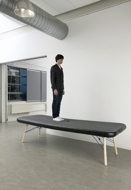
Second prize: Grace table (above) by Philippe Malouin of Studio #60
Grand furniture pieces are marvellous, although rather tricky to transport, handle or store. I admire the capacity of inflatable furniture to decrease its size to modest volumes. Inflatable furniture has disadvantages such as stability, rigidity, the control of its shape etc. Inflatable chairs and couches have been around for a long time. I am trying to move toward this concept from a different approach: inflatable tables do not exist because of the limitations of inflatable furniture, starting with the fact that flat surfaces are difficult to achieve. See our previous story.
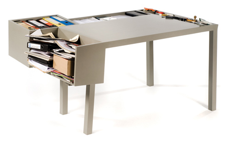
Third prize: Clark (above) by llot llov
Photographer: Lucie Eisenmann
Areas for storing writing materials are grouped around the work surface. This practical item offers various kinds of storage and picks up on the every-day practicalities of putting things down. The desk is seen as blank canvas that is completed by the items on it, which then give it its formal identity. The name derives from the English word ‘clerk’, because clerks work in offices at desks.
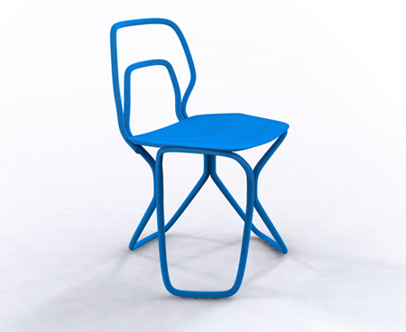
Above: No. 7 (nube) chair by Tomás Alonso
Taking inspiration from Thonet chairs the No.7 reinterprets the traditional bent wood aesthetic. This idea came from looking at Thonet chairs and from a visit at a wood-bending workshop. When designing, I was particularly interested in finding a balance combining traditional craftsmanship methods with a new visual language, while maintaining usability and comfort as the main parameters in the chair’s proportions. No. 7 has won the first prize in Promosedia International Design Competition 2008—Caiazza Memorial Challenge.
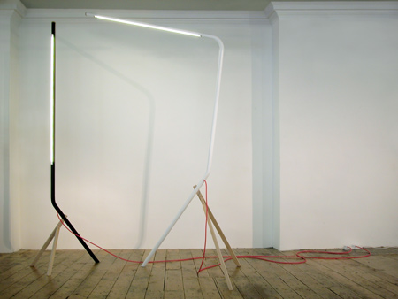
Above: Mr. light series by Tomás Alonso
Aside from being radically more energy efficient and durable than standard fluorescent bulbs, these newly developed LED T8 light tubes allow far more flexibility with the design by reducing the number of components needed to power them as well as by not needing a reflector shade. These lights explore the formal continuity between the bulb and the fixture while playing with the way the materials come together to produce a series of unexpected characters.
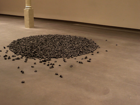
Above: 20/30 by Raphaël Charles
20/30 asserts itself through a strong plastic presence, as a bag of nuggets poured to the ground. This surface proposes a sensory experiment in confrontation between what is commonly known and what is really perceived. Composed of foam polyethylene leftovers that cannot be recycled, it gives a second life to a material without any future.
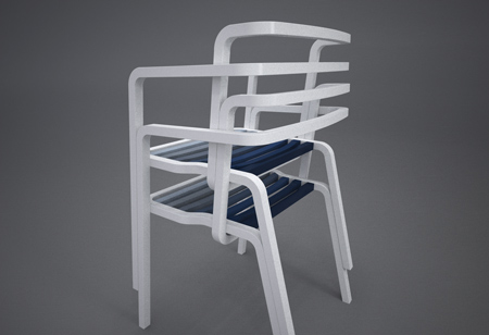
Above: Prater_Chair by Marco Dessi
Prater_Chair: three curves define the seat; the traditional look and feel provide a contrast to the seat surface and are inspired by the historical and cultural crossroads that was and is Vienna.
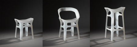
Above: Juan, Pedro and Pablo by Reinhard Dienes Diaz
This chair and stool series in pliable plastic (PP) is manufactured from a two-dimensional machined sheet with varying material strength. Stretching and folding of the sheet create a closed, structurally stable system of tension and compression. The shape of the piece can only be created in this way: from a two-dimensional sheet to a three-dimensional seat. Owing to the plastic used, no material fatigue occurs in either the stool, the chair or the bar stool.
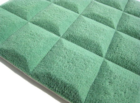
Above: Chocolate Carpet by Philip Edis
Chocolate Carpet is a perspective of light and sound. It is hand tufted, cut and trimmed, creating an architectural clean 3D feeling. When exposed to different lights it seems to change like an optical illusion. The carpet also absorbs unpleasant sounds. The Chocolate Carpet is sprung from the dream of the mysterious and yet favoured substance chocolate—my absolute favourite—being in excess all over the room. Like a landscape.
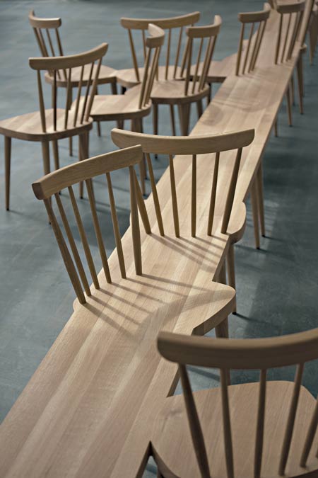
Above: Stuhlhockerbank by Fehling & Peiz GbR
Stuhlhockerbank is a range of seating for public rooms. The borders between individual furniture types dissolve as they merge into one another. Neither form nor function is what matters most here, but rather the communicative quality and the social aspects of a simple item of seating. Over and above the pure ‘usefulness’ of furniture, the items acquire narrative components—they seem at once intimate and surprising, enriched with a sensuous and poetic dimension.
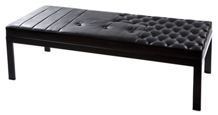
Above: Bench in three types of leather by Anna Holmquist and Chandra Ahlsell of Folkform
With the Bench in three types of leather from the Unique Standard Collection the Swedish designers Folkform combine luxury materials such as vintage leather with fake synthetic leather imitations. Original leather from Danish designer Arne Jacobsen's Swan Chair alternates with synthetic leather and patterns often found in car seats. See our previous story.
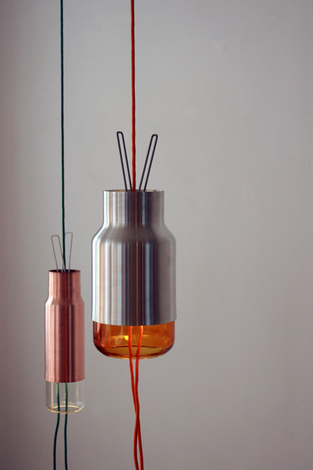
Above: Lantern by Mathias Hahn
The lamps in the Lantern series are made of copper, aluminium and glass and operate within a typological framework, which finds its place somewhere between a floor lamp and a pendant lamp. By means of a clamp mechanism situated inside the lamps, they can be moved as desired between floor and ceiling. With this in mind, the cable is, unusually, fed through the centre of the lamp. See our previous story.
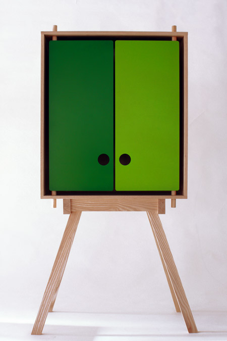
Above: Odd Cabinet by Mathias Hahn
It is an open secret that cupboards are often misused as just somewhere to stow things away—spontaneously and untidily. Referring to the inside and outside circumstances, of chaos and order, the powder-coated doors manufactured in sheet steel allow a fleeting glance into the interior world of the cupboard —or, as the case, may be, into the user's love of order. The flat doors of the Odd Cabinet are hung on simple hinges of wooden dowel and enhance the cupboard's direct visual appeal.
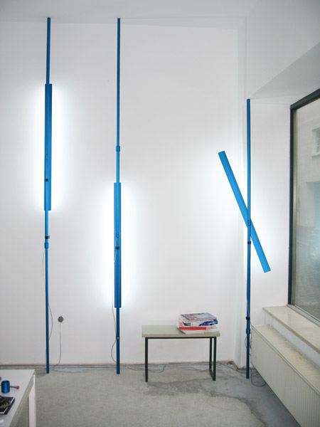
Above: Supercool by Konstantin Landuris and Horst Wittmann of Hansandfranz Designstudio
Supercool is an adjustable lamp that can be wedged between floor and ceiling. Thanks to a continuously variable telescopic support, to which the light source is attached, the lamp fits all room layouts and room types. To save space, supercool can be erected near a wall and can illuminate the surrounding area both directly and indirectly, depending on how the shade is angled. The light source is also adjustable for height and can be rotated.
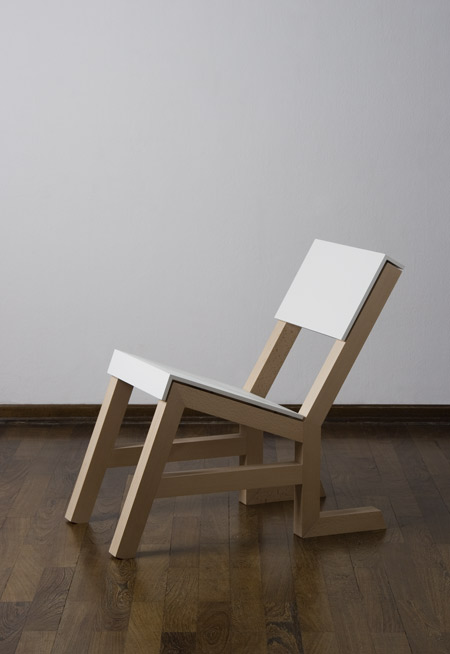
Above: SitzLiegeStuhl/ReLegs by Jennifer Heier
The idea for the design was to create a chair that reflected the idiomatic expression ‘to go down on bended knees’—a chair that can be used in two different positions. In the upright position it has all the qualities of a chair, on which one can sit normally. By twisting the rear feet, its position can, however, be changed so that it can be used as a recliner. Thus an interesting interplay emerges: before the user can make her/himself comfortable, the chair must go down on its knees.
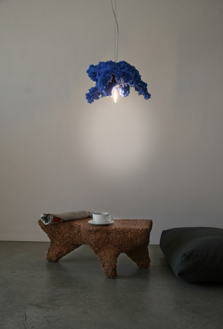
Above: Fridtjof + Kirsten by Johannes Hemann
Storm boxes, in which the wind generates shapes as a result of simulated storms: with the help of compressed air, adhesives and heat, shapes are created because of interference effects which occur inside the box. Only indirect influence can be exerted on the design of the individual shapes by changing the parameters such as material, heat, type of adhesive, wind direction or size of box. At the end of the design process a shape has emerged; the material has survived the storm and stands as symbol of ‘the calm before the storm—the calm after the storm’.
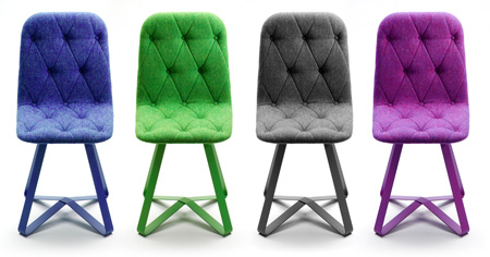
Above: Diamond Chair by Benjamin Hubert
An occasional chair focusing on material detailing in bute fabric upholstery and veneer production. Working in conjunction with bespoke upholsters, veneer manufacturers and metal engineers. Diamond Chairs bring together a number of different materials and crafts, to create a chair that focuses on quality of material and detailing. Upholstered in bute tweed on walnut and oak veneered backs with a powder coated cnc bent steel frame. See our previous story.
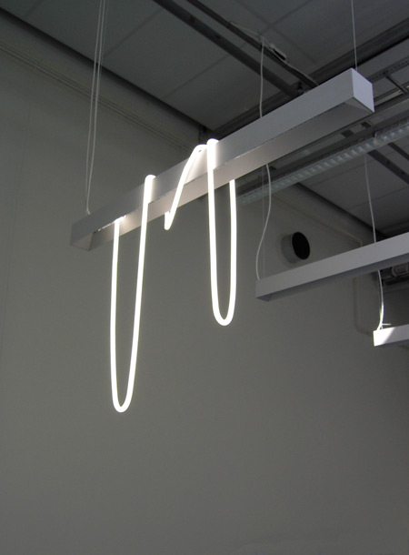
Above: A New Proposal by Pernilla Jansson
My work is a playful investigation of things that surround me. Using everyday objects, sometimes existing, I create new visual constellations. My inspiration springs from situations and normal choices that end up becoming abnormal and unexpected for the casual observer. A New Proposal is one part of my Master project ‘To disturb the established order’. The installation springs from a fantasy I had during a moment at school, what if‚…? I would like to see A New Proposal hanging in a big office together with ordinary armatures.
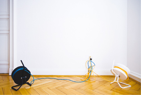
Above: CORDULA by Stephanie Jasny
The building site serves as the source of inspiration for the design of the CORDULA lamp. Items designed for the building site stand out because of their peculiarly rational construction. At the same time the requirements for durability and safety are extremely high. Their simplicity, a far cry from contemporary minimalism, was the starting point for the design. The aim was to bring an object from the building site into the sitting room without, at the same time, denying its origins.
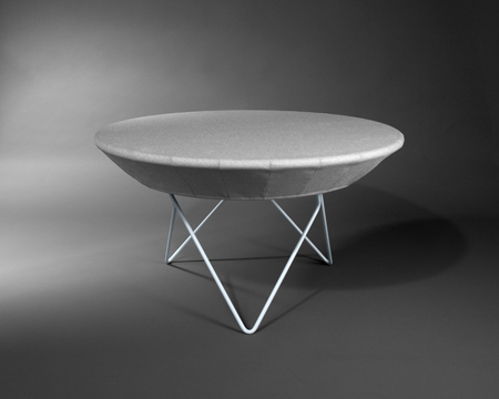
Above: Ross Well by Marcel Kieser and Christof Spath
The side table Ross Well proves experimentally that a table does not always need a tabletop. The table covering is made of a robust fabric that is stretched to create high structural stability and replaces the traditional tabletop. By changing the interchangeable tablecloths, Ross Well is able to appear in many different robes. A table where more things than just glasses and magazines may sit comfortably.
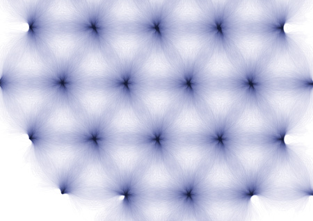
Above: URBAN CAMOUFLAGE by Chae Young Kim
The mathematical structure of nature, for example fractal structures that explain the concept that the basic elements construct the entire structure of nature, has been an important motif for the design of URBAN CAMOUFLAGE. For the wall panels, diverse structures of trees were expressed by linear illusions that are all created by computer graphics with the mathematical principles. It delivers the unique impression of hand drawings along with the keen digital emotions at the same time.
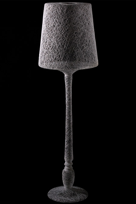
Above: Wrapped by Pierre Kracht
Memories fashion our lives, yet fade with time. We want to hang on to them, secure them for the future, though this can only ever be an aspiration, for their true content remains ephemeral. Things become witnesses of their own history, their corporeality acts like a host. Their bodies are wrapped in thin string so that in the end they disappear; dissolve completely. Thus only their external forms remain in the usual place in the room, a mere hint, a shadow of what they are. Because they are no longer there, they both question and confirm their purpose and function.
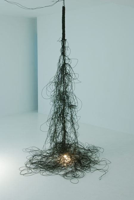
Above: Knot—beyond the inevitable by Kwangho Lee
From the ancient times, making a knot was out of necessary, inevitable behaviours. Humans invented many ways to make knots and were then able to hunt, fish, build houses or transport things. Like in the past, we are still associated with such behaviours, things that we must do to live, things that we do with habit. When this collides with one's memory, it brings a new meaning, a meaning with a good reason that's beyond a mere, inevitable behaviour. See our previous story.
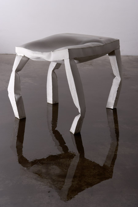
Above: Ich war’s nicht I + II by Kai Linke
Photographer: Klaus Wäldele
The collection (It wasn't me) grew up with the aim of distorting objects without oneself acting forcibly upon them. What emerged were distorted stools for interior and exterior use. The aesthetic form develops in an unregulated manner, looks flawed, imperfect and combines familiar and unfamiliar shapes as it moves.
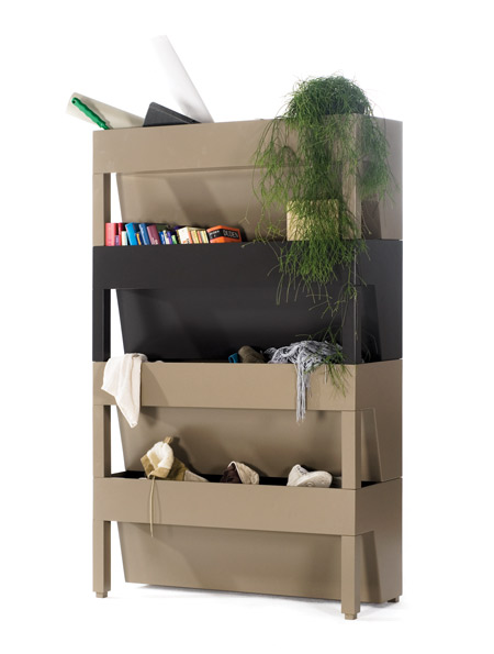
Above: Bill by llot llov
Photographer: Lucie Eisenmann
This piece of furniture picks up on something which people do all the time: just throwing things onto a shelf without thinking. The stackable elements built a shelving unit that offers containers rather than trays for the items to be put there. The storage area looks open, but the contents are not entirely visible from the outside. Things in current use can be stored in the front section, whilst things can be hoarded in the back. The handling is simple and is a far cry from pettifogging tidy structure.
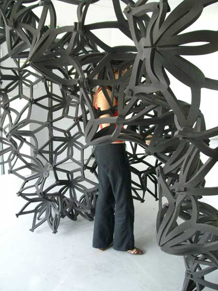
Above: POD by Anaïs Morel and Celine Merhand
POD is a flexible structure made of convertible elements. The user can interact with the structure and make it evolve in three dimensions to become a wall, a hut for children or spaces with infinite forms.
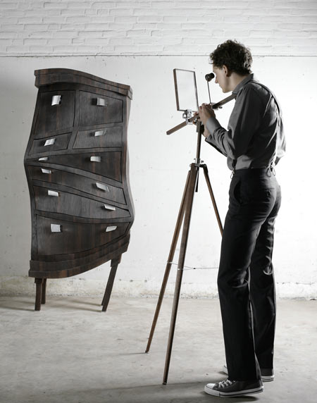
Above: What it is, it isn‘t by Nathan Wierink and Tineke Beunders of Ontwerpduo
Objects are how we perceive them to be. Our minds make things what they are and for us this is reality. Think of a branch hanging in the water. We see, with the refraction of light, the branch under the waterline in a different angle. But we know that in reality the shape of this branch is different. We learned how to see the world. What if there was an instrument that would change the world into something that we find strange? And better, what if this instrument can also chang
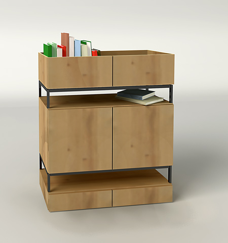
Above: Funtime Error by Studio Proxy
Funtime Error is a tangible symbol of the serial reproducibility of furniture. Normal sideboards provide the raw material from which an unusual type of furniture item, with a variety of surfaces to put things on, emerges as a result of vertically grouping the elements and cutting them to shape. The upper, horizontally cut element can be used as open storage. The middle section can be opened using two normal doors. In the lower section are two drawers.
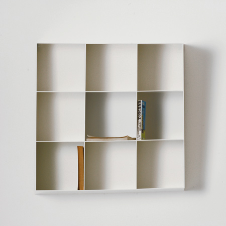
Above: A2 by Maria Ultsch
The slanting shelving unit a2 is all about a new approach to design. It takes its cue from the principle of reversed central perspective: all lines and edges of the shelf come together at a specific point in the room, and only from that point do the slanting lines and surfaces fit together to become rectangular. The shelving unit is simple and innovative, as it plays with human perception in an interesting way.
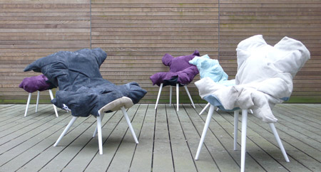
Above: BASTARD by Els Woldhek
The BASTARD is a combination of two only to become one none. It finds his roots in the production methods and the materials of a furniture company. Even though its look on first glance doesn't seem to have any links with the factory and seem to be derived only from me the opposite is true. I developed a method to create a chair with the leftover trash leather from the factory. As the technique of stitching the pieces together follows the outlines of the leftovers. The seed planted by the production methods with the nurture and care from me becomes the BASTARD.
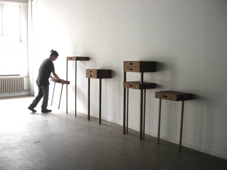
Above: Your level by Ryohei Yoshiyuki
People are used to putting things on different levels, for example, on the desk, the chair, or even on the ground. Basing my work on this behavior, I find it interesting to create new objects that give greater freedom for placing objects in the room. Your level is a drawer system comprising eight easily stackable elements. They stand against the wall and do not need fixing to it. They can be freely combined to create different levels for objects you need in the room.