Tina Manis Associates win Art Fund Pavillion
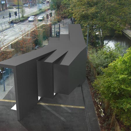
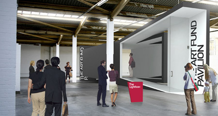
London Design Festival 09: Tina Manis Associates have been announced as the winners of a competition to design a pavilion for The Lightbox Gallery in Woking, UK.

The winning design will be constructed for exhibition at Tent London in September, before it is moved to the gallery.

See the other shortlisted entries and more information about the competition in our previous story.
All our stories about London Design Festival 2009 can be found in our special category.
Here are some more details from Tent London:
--
Tent London and The Lightbox are delighted to announce that The Art Fund Pavilion 2009 will be designed by Tina Manis Associates.
The response to this architecture competition was astonishing, both in the number and variety of entries and their creativity. As a New York based practice, the winner also reflects the international reach of the applications which came from 52 countries.
It was agreed by the judges that Tina Manis Associates’ bold yet elegant proposal best accommodates the intended use of the pavilion as a gallery and is most sensitive to The Lightbox’s site, which will be its home each summer. In the words of the Turner-Prize nominated artist Richard Wilson, there was a “unanimous vote for a striking design that carefully and seriously answered the brief. A clever, clean and witty conundrum of angles guide us in, around, through and eventually to the entrance way of the museum.”
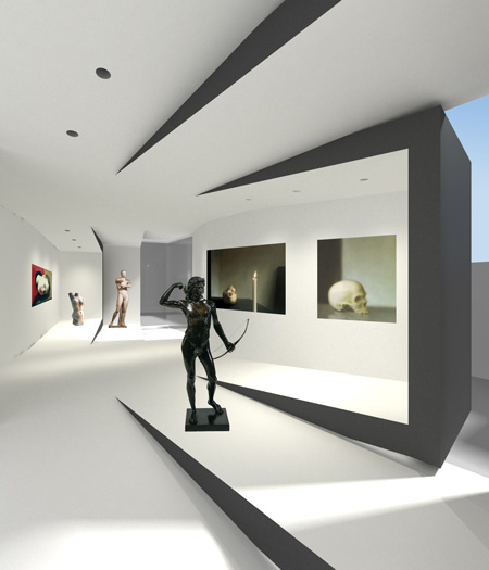
The winning design’s sinuous form perfectly suits its courtyard site, with expanses of windows offering views over the canal and channelling visitors through the space. “The intent of our pavilion design was to use the ramp typology as both a circulation strategy and means to demystify the open plan of the traditional ‘white art box’”, Tina Manis explains. The design functions excellently as a space for viewing art and is itself sculptural thanks to the cantilevered sections.
The structure is made of two identical halves which reflect each other. “Inspired by the inherent beauty of structures and systemized processes found in nature developed a strategy for construction based on the simple tools of creation - mirroring, reflection and symmetry” Manis states.
Tina Manis Associates LLC was started in 2000 after Tina returned from Europe where she practiced with Rem Koolhaas at OMA and with Richard Rogers at RRP. The firms recent work includes the headquarters of TED conferences, a global think-tank; the studio, gallery, and office of internationally renowned artist Takashi Murakami and a number of distinguished residential projects. This commission will be their first European venture and public building.
The winning entry will be engineered and constructed by Facit and launched by and as part of Tent London during the London Design Festival 2009, before taking up residence at The Lightbox. Tina Manis Associates hope that “as a transient entity, the pavilion will act as a sort of three-dimensional postcard or viewport; a means for transporting the experience of viewing artwork across the city.”
A selection of the application boards submitted to the competition are currently on display at The Lightbox until the 12 April 2009.
Quotes:
The Judges
“We felt that the winning entry was architecturally very well considered making the most of the space in front of The Lightbox and the views over the water. The profile in plan deals with the tapering site particularly well, which many entries struggled with. The step changes internally and the angled centre line creates a small and complex series of spaces through a structure that is for the most part orthogonal, making it inherently buildable.” Bruce Bell, Research & Development Director, Facit
“The shortlisted entries were all very strong and the decision was a tough one, but the Tina Manis Associates design stood out above the others for its elegance and versatility. The pavilion will work both as a great exhibition space and dynamic venue for events and is sympathetic to its destined waterside location. I’m looking forward very much to seeing it on display later in the year here in the capital during the London Design Festival.” David Barrie, Director, The Art Fund
“What so impressed me with the Tina Manis Associates design was the absolute compliance to the brief we set, whilst still delivering a very forward-thinking design which pushed our chosen construction technique to its limit; this surely is the essence of real architectural prowess.” Jimmy MacDonald, Director, Tent London
“The winning entry is an elegant response to the canal side site and the brief; creating as it does, an original, unique pavilion form that promises to be a delight to experience.” Julia Barfield, Director, Marks Barfield Architects
“The winning design does everything that we wanted – it is striking and also completely fulfils the brief – we are eagerly looking forward to the launch in September.” Marilyn Scott, Director, The Lightbox
“A unanimous vote for a striking design that carefully and seriously answered the brief. A clever, clean and witty conundrum of angles guide us in, around, through and eventually to the entrance way of the museum. One more asset to this creative quarter of Woking.” Richard Wilson, Artist
“I was most impressed by the way in which Tina Manis Associates developed their proposal for the pavilion in the context of this remarkable site; exploring the relationship to the canal, the street and to the existing Lightbox building. Their winning entry exemplifies a graceful and intelligent approach to contemporary architecture that we at The Architecture Foundation are delighted to support.” Sarah Ichioka, Director, The Architecture Foundation
The Winner
“As a practice that continually tests ways to spatially articulate the intimacies of everyday experiences, the Art Fund Pavilion competition presented an opportunity for us to explore the heightened notion of ‘viewing’ through a dynamic reciprocity between artwork and its surrounding environment.”
“Inspired by the inherent beauty of structures and systemized processes found in nature, we developed a strategy for construction based on the simple tools of creation - mirroring, reflection and symmetry. This language of building is intended to evoke a certain familiarity, allowing one to understand and engage with the art pavilion on a most basic and instinctual level. ”
“The intent of our pavilion design was to use the ramp typology as both a circulation strategy and means to demystify the open plan of the traditional ‘white art box.’ The topographical condition creates a series of frames for art, emphasizing the altered points of view as the audience moves through. As a transient entity, the pavilion acts as a sort of three dimensional postcard or viewport; a means for transporting the experience of viewing artwork across the city. ”
Tina Manis, Director, Tina Manis Associates