Cahier d'Exercices boutique by Saucier + Perrotte Architectes
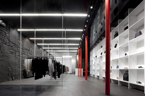
Bright red columns interrupt a monochrome interior inside this fashion boutique in a Montreal warehouse by Canadian firm Saucier + Perrotte Architectes (+ slideshow).
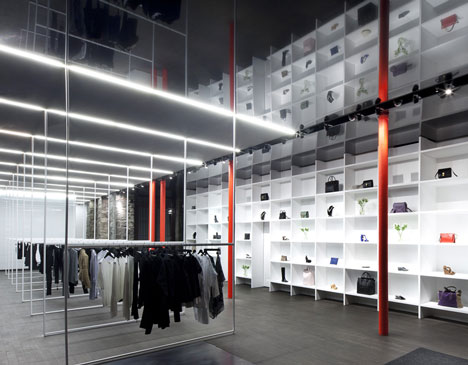
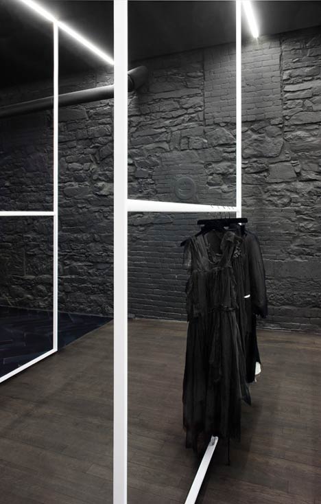
The architects inserted the store into a former industrial building, used in the nineteenth century for producing tissues, leather and fur, and they added black paint to a decaying wall of brick and stone.
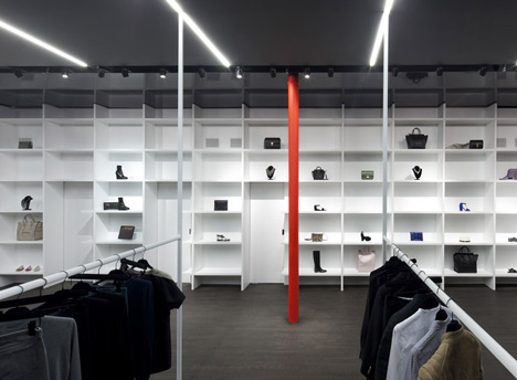
Rectangular steel clothing racks run through the centre of the room, beneath a graduated ceiling that fades from black to white.
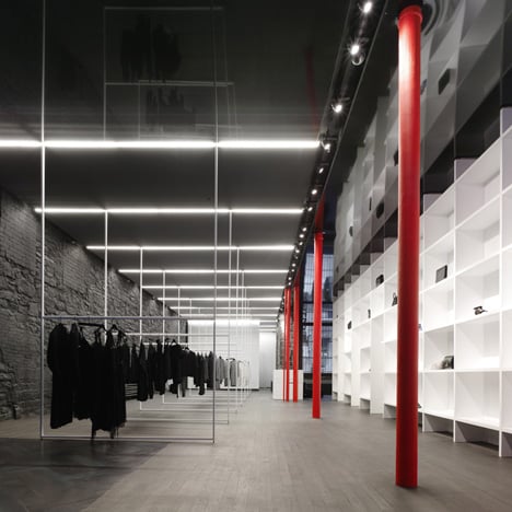
Saucier + Perrotte Architectes explain: "The colour changes gradually from a reflective, latex-like black to a pure diaphanous white, drawing visitors toward a reflective, opalescent mirror that extends the perspective of the space."
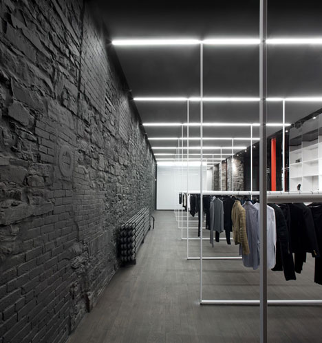
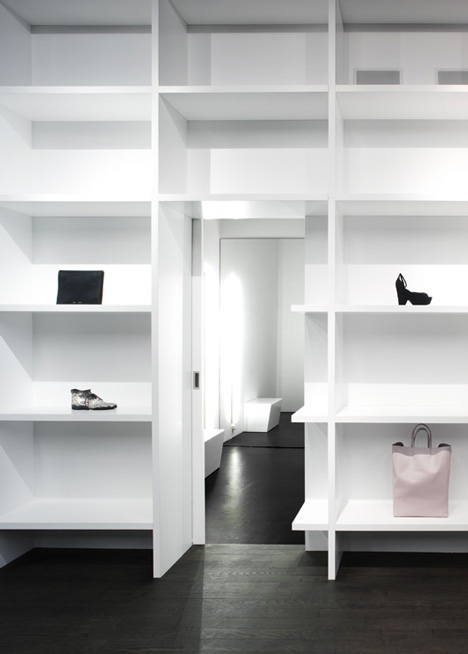
White bookshelves line the wall on the right-hand side of the space and conceal entrances to dressing rooms.
A seating area surrounds a wood-burning stove at the front of the store, over a steel floor with a herringbone pattern.
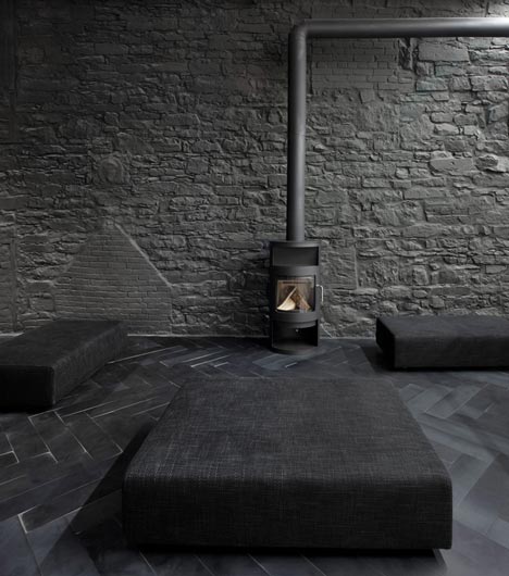
"This metallic floor at the entry invites visitors to discover the exclusive clothing within and relax in the warmth and comfort of the fireplace," say the architects.
In other retail design news, Fabio Novembre recently completed a Hong Kong boutique, while Schemata Architects have developed a new store concept for Japanese brand Takeo Kikuchi.

See more stories about shops »
Photography is by Marc Cramer.
Here's some more information from Saucier + Perrotte Architectes:
Cahier d'Exercices
Cahier d’Exercices is located at the entrance level of the historic Ross warehouse-store. The stone façade, its cast iron columns, and an expansive brick wall (punctuated with pieces of wood and metal) that runs the length of the store recall the 19th Century building’s industrial past as a retailer of large tissues, leathers and furs.
Crossing the threshold, the visitor is invited to explore the boutique by the clever use of a "degradé" — or gradient effect — on the ceiling. The colour changes gradually from a reflective, latex-like black to a pure diaphanous white, drawing visitors toward a reflective, opalescent mirror that extends the perspective of the space.
Placed at distinct intervals and delicately suspended from the ceiling, the racking system was custom designed by the architect to permit the clothing displayed to be perceived as a changing and evolving building material. Slightly reminiscent of the sculptural work of artist Fred Sandback, the straight, clearly defined profiles of the racking serve to sequence the gradient of the space.
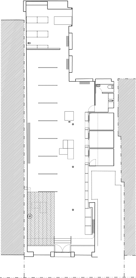
Above: floor plan
A veritable cabinet of curiosities, the seemingly out-of-scale shelving evokes notions of femininity and aspects of secrecy and privacy. Large fitting rooms are hidden from view, accessed by crossing through secret doors in the sculptural shelving system, which displays jewellery, footwear, and accessories. Details like the oval cross section of the racking also add a touch of the femininity, as do moments of phosphorescent vermillion red amid the store’s mostly black and white colour palette.
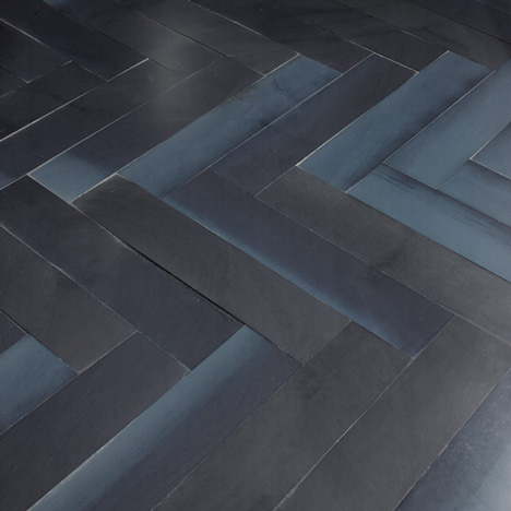
The store's entrance is neither wholly masculine nor feminine in character; its floor, composed of chevrons in cold rolled steel, recalls herringbone textile patterns and historic hardwood floors while making original use of steel as a material in a retail space. This metallic floor at the entry invites visitors to discover the exclusive clothing within and relax in the warmth and comfort of the fireplace.
Location: Montréal, Québec (Old Montréal)
Client: Cahier d’Exercices
Architects: Saucier + Perrotte architectes
Program: Women Fashion Boutique, Office space, Fitting rooms, Storage space, Kitchenette
Construction cost: N/A
Total area: 1 600 sq.ft.
Materials: Herringbone blue-steel flooring, white mirror glass, mirror, Extenzo ceiling, steel clothing racks