Stockholm Furniture Fair installation by Gert Wingårdh and Kustaa Saksi
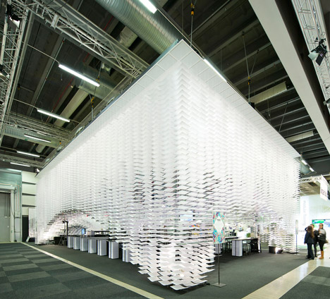
Stockholm 2013: talks at last week's Stockholm Furniture Fair were held beneath an installation of 11,000 patterned paper sheets by Swedish architect Gert Wingårdh and Finnish artist Kustaa Saksi.
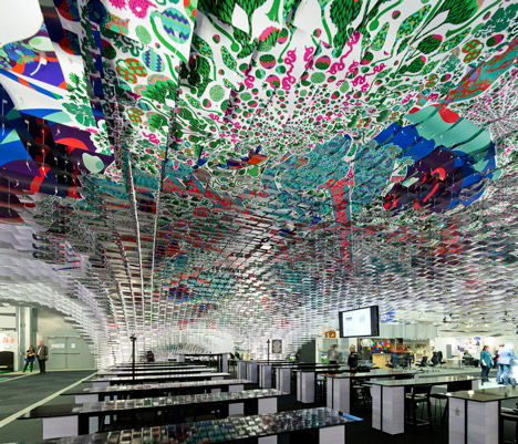
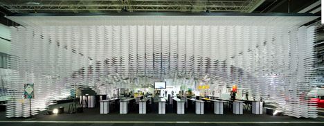
Wingårdh and Saksi staggered the pieces of paper up from the corners of the rectangular area to create a dome accessed by an arch on each side.

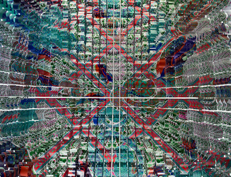
Saksi's illustrations covered the underside of the A3 sheets so the patterns could only be appreciated from underneath. At each corner the paper was threaded onto lengths of string, which were hung closer together than the length of the sheets so each piece of paper buckled into a wave.

Towards the centre of the dome, multiple layers were printed with the same illustration to create a 3D visual effect when viewed from directly underneath. Around the periphery, columns of white sheets extended up to the ceiling to create translucent walls.

Inside, mirrored table tops balanced on a total of 700,000 sheets of A4 paper in rows facing a larger, higher table at one end for a panel to sit at.
Dezeen editor-in-chief Marcus Fairs discussed topics from a new book he contributed to at the space last week.

Several installations were unveiled during Stockholm Design Week including robotic arms that danced around glass objects, plus Nendo's foamboard mountains and modular lamps - see all our coverage of the event here.
Photos are by Tord-Rikard Söderström.
Read on for more information:
Swedish architect Gert Wingårdh and Finnish illustrator Kustaa Saksi have joined creative forces to design the installation that will set the stage for talks on design and architecture at the fair. They have each started out from their own perspective while adhering to a shared vision.
“From the very beginning, the idea has been to create a spatiality for communication in which furniture and design have a presence in words and images, as well as a physical presence. To explain the concept behind an item of furniture, what you were thinking and how you arrived at the design, gives a deeper dimension to the object. This is something we’ve wanted to focus on more this year and so we’re giving furniture companies a chance to introduce themselves, their products and designers by communicating through a new program item we call Show 'n Tell,” explains Sanna Gebeyehu, the producer of the project.
The design suggests a church interior, with rows of high tables in front of an ‘altar’ where panels hold sway. The table tops are made of a mirror laminate and balance on stacks of A4 paper sheets – 700,000 in total.
The entire dome-like structure consists of stacks of paper sheets that hang from the roof in a Venetian blind-like construction. The lowest sheet in each stack carries part of a gigantic illustration that forms the dome-shaped ceiling.
Preparations for construction have been going on for months and the actual raising of the dome is something of a never-ending task.
“Precision in all the preliminary work is crucial. 1,120 stacks consisting of a total of 11,000 A3 sheets in 44,000 points of attachment are being installed across an area of 200 sqm and are then gradually hoisted up,” reports Sanna Gebeyehu.