Ipera 25 by Alataş Architecture & Consulting
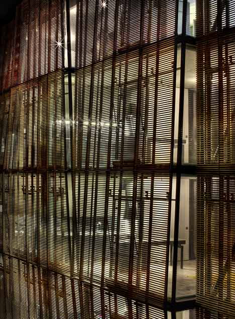
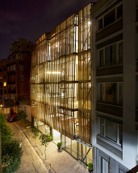
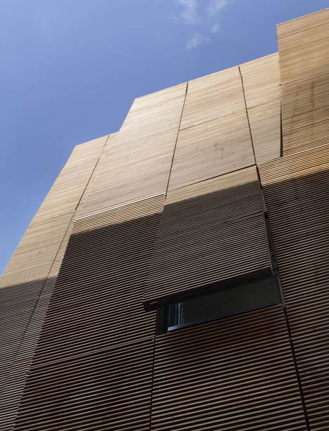
Timber louvres and shutters form a protective shell across the exterior of this apartment building in Istanbul by Turkish studio Alataş Architecture & Consulting.
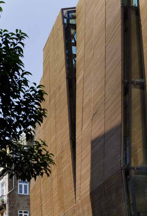
Screening the upper levels of a glazed curtain wall, the timber cladding cloaks the facade of the six-storey-high Ipera 25 housing block, creating a system of solar shading for the nine apartments contained inside.
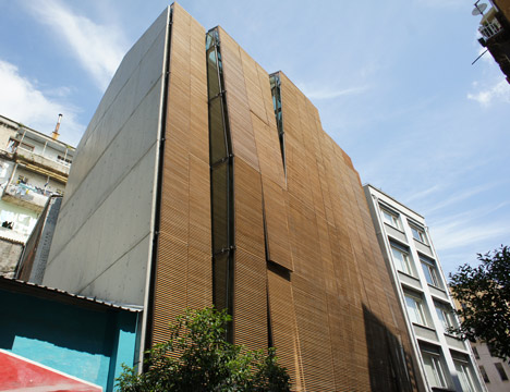
Alataş Architecture & Consulting divided the wall into four long vertical strips, which project forward and backwards at different points to allow slices of glass to emerge from between each of the timber panels.
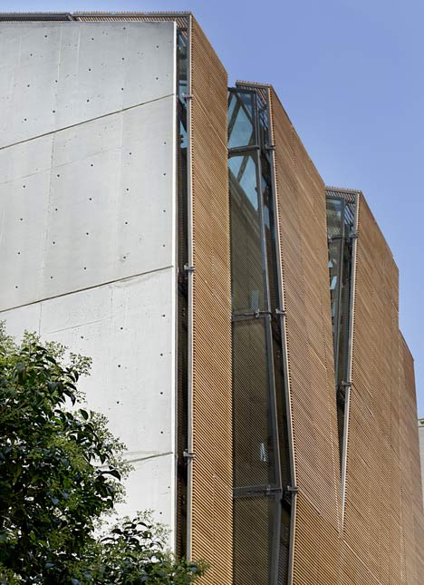
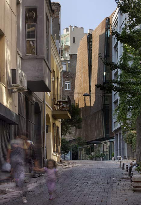
"The fractures and surface variations on the facade - wider than the architectural structures in the area - not only emerge as a contemporary interpretation of the bay windows of the surrounding buildings, but also allow the facade to be perceived in a more fragmented and ergonomic manner," architect Ahmet Alataş told Dezeen.
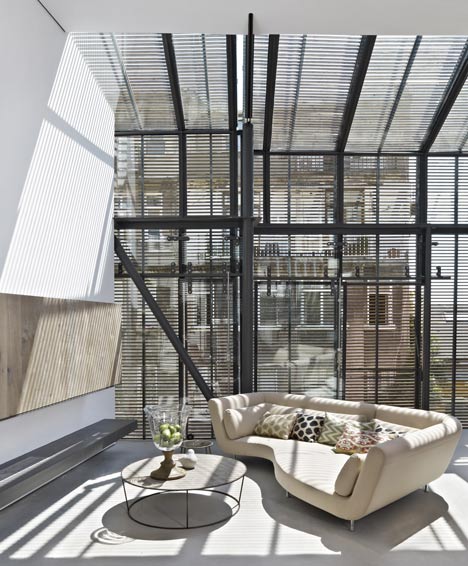
Two one-bedroom apartments are contained on each of the first four floors. Living rooms are positioned at the front of every home and residents can open and close different shutters independently.
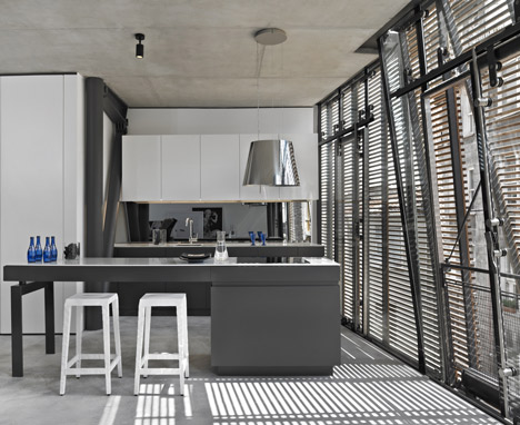
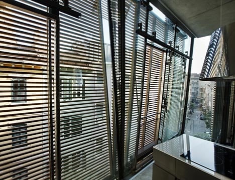
"The wooden elements allow a view of the street and create a bay window effect that establishes a link between home life and life on the street," said Alataş.
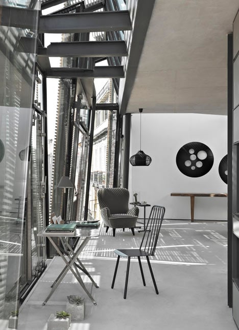
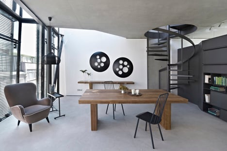
A two-storey penthouse is located on the uppermost floors of the building, beneath an angled ceiling that follows the pitch of the roof.
Other recently completed housing blocks include a building with a pleated facade on the Canary Islands and an apartment block with diagonally stepped floors and ceilings in Japan. See more housing on Dezeen.
Here's some more explanation from Alataş Architecture & Consulting:
The building is located on Tatarbeyi Sokak, is one of the most virginal and underdeveloped streets of the rapidly transforming Galata District under conservation. Comprised of eight 80-m2 studio flats and one 190-m2 penthouse up for sale, it has a total surface area of 1000 m2.
The building is a residential project that extends beyond the conventional codes of the already-built environment, yet manages to reproduce these codes, respecting the existing architectural fabric.
In this regard, it continues to find new solutions to the existing problems of architecture by utilizing contemporary technologies and taking into consideration the newly burgeoning socio-economic structure of the region, as well as the infrastructure, environmental conditions, climate, and solar movements.
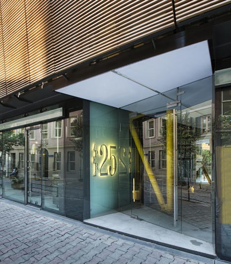
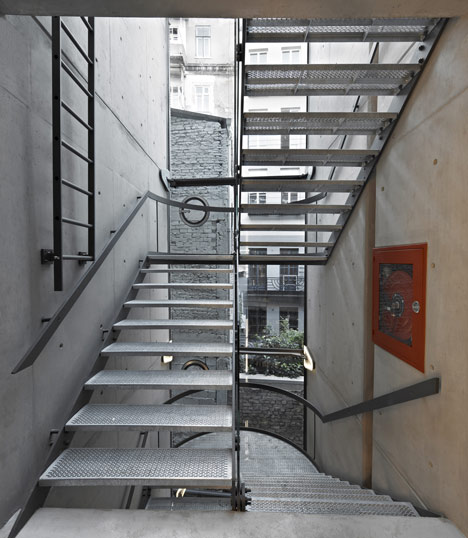
The building is comprised of a wooden shell that covers the largely transparent living area in an uncompromising manner and set between two blind and extremely thin exposed concrete curtain walls.
The wooden components on the front elevation run parallel to the glass facade that evolves into a saddle roof and entirely cover the front and back of the building. Perceived as a gigantic blind facade from one perspective, yet appearing as a translucent veil from the other, the wooden surface also functions as a sun filter.
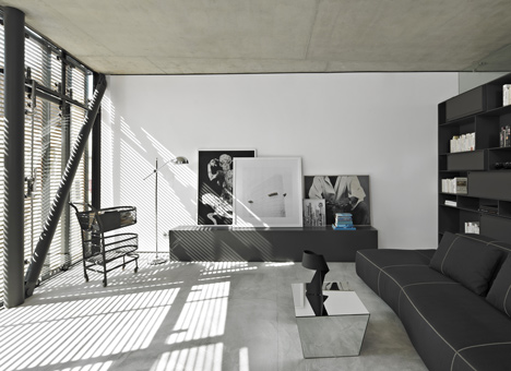
Comprised of parallel horizontal laths that angle at various points, the wooden element divides the facade into four as the middle segments expand outwards, towards the street; leaving the sides exposed, the wooden elements thus allow a view of the street and create a bay window effect that establishes a link between home life and life on the street.
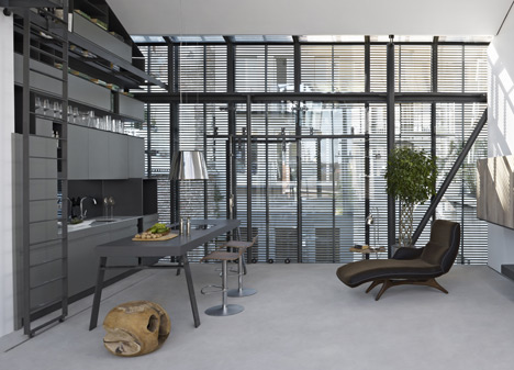
While the building almost disregards the relationship with the street by refusing to repeat the conventional window spans in the neighborhood, it nonetheless revives its place within the context by reinterpreting the traditional bay window structure on the street.
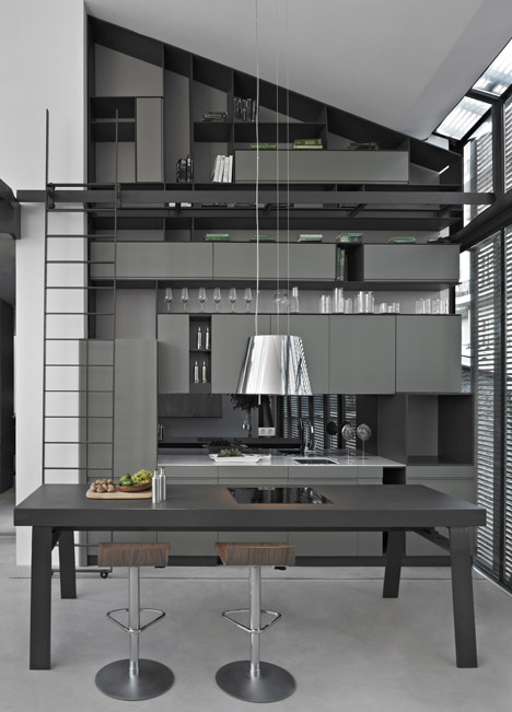
Behind its impressive presence on the street, the building displays a plain and statuesque appearance that simultaneously blends into and stands out against the context without competing with the neighboring historic buildings in its critical approach.
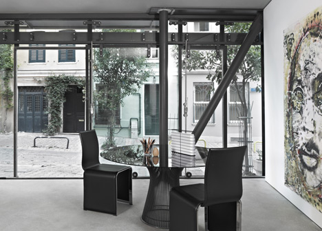
As the design is concretized, the concept of the transparent surface of the wooden veil covering the two facades and the roof between two walls is maintained throughout without any qualms. The dilapidated appearance of the neighbouring building at arm's length is perceived as part of the view and the transparent surface is not even partially compromised.
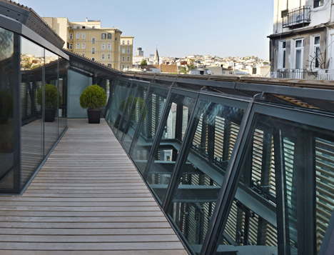
While this attitude and the spatial relationship of the interior and the exterior expands the interior volumes of the 80-m2 flats – born out of the new lifestyle needs and culture – towards the facade of the buildings across the street, the translucent nature of the building's shell allows the street to feel broader and more spacious.
Architects: Alataş Architecture & Consulting
Location: Galata, İstanbul, Turkey
Design Team: Ahmet Alataş, Emre Açar
Architectural Group: Özge Güngör Ülüğ, Dilan Yüksel, Emir Elmaslar, Gabriella Colacicco
Area: 1,100 sqm
Year: 2011
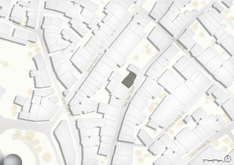
Site plan - click for larger image
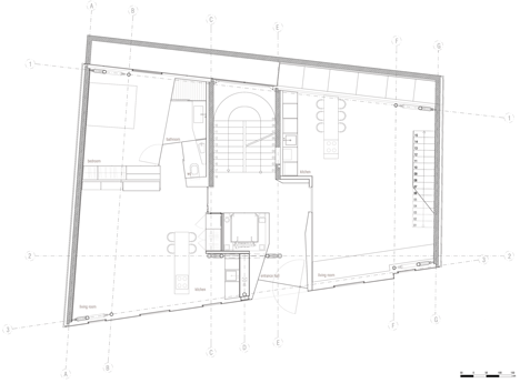
Ground floor plan - click for larger image
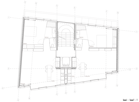
First-third floor plan - click for larger image
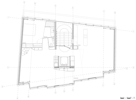
Fourth floor plan - click for larger image
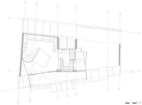
Fifth floor plan - click for larger image
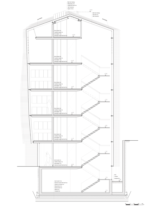
Cross-section - click for larger image