Functional branding by Aekae for QWSTION
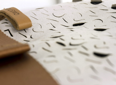
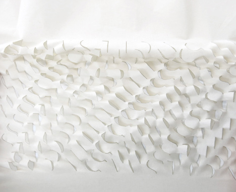
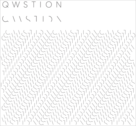
Swiss design studio Aekae has abstracted the logo of accessory brand QWSTION to form textural laser-cut patterns within the outer fabric of these bags.
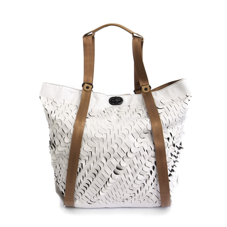
Aekae collaborated with typographer Fabian Leuenberger from EuropaType to explore ways in which QWSTION could subtly apply branding to their products in a more integrated and functional way.
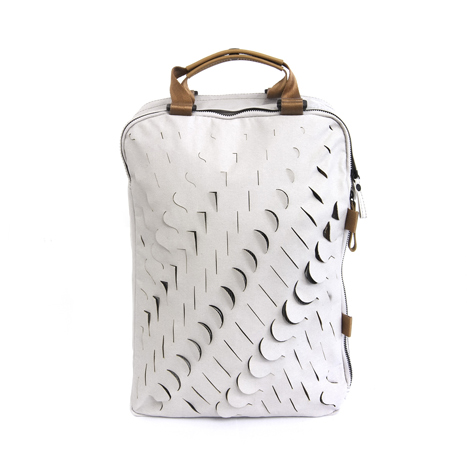
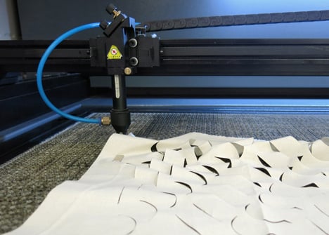
The designers transformed the brand's logo into various patterns, which were then laser-cut into the outer fabric of QWSTION's Oyster Grey Special Edition bags, increasing the stretch of the products through the typographic cuts.
The QWSTION brand was co-founded by Fabrice Aeberhard and Christian Kaegi of Aekae studio, who act as creative directors and industrial designers for the brand.
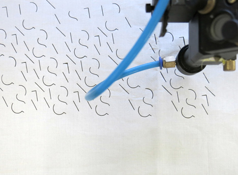
The bags were made by textile laboratory DevelopmentNeverStops as an experiment in branding and are not intended for sale.
Earlier this year we featured these handbags carried by clamping fingers in woven tubes, similar to Chinese finger trap puzzle.
See all our stories about bag design ».
Here's some more information from QWSTION:
A few thousand years ago, artisans were the first to place distinctive marks on their fabrications as signs of quality. At QWSTION, we believe that a product should speak in great terms for itself and a subtle statement of origin is all the branding it really needs. That's why we came up with the concept of functional branding, only placing our name on parts of the product that serve a functional purpose (such as buckles, twist locks, zipper pullers, and rivets).
In correspondence, choosing a typeface that's simple and timeless was crucial. We discovered it in EuropaType’s modern sans serif typeface EUROPA. Run by graphic designer and typographer Fabian Leuenberger, EuropaType is based in Zurich and London. Their approach of developing typeface turned out to be very similar to our approach of designing functional bags: Questioning, refining, and maybe even redefining the shapes of our heritage.
The goal of this collaboration was to push the boundaries of the functionality of branding. Using a laser cutter and bags of the current Oyster Grey Special Edition, we created various patterns based on our logotype. Branding becomes subtle and abstract, and the otherwise stiff material as a result became expandable and enhanced in its utility through the typographical cuts. The products are not intended for sale.