Twin House by Nook Architects
Spanish studio Nook Architects stripped out false ceilings and dividing walls to transform two next-door apartments in Barcelona's gothic quarter into a pair of bright and spacious homes (+ slideshow).
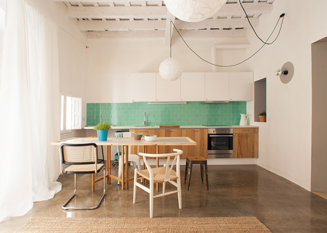
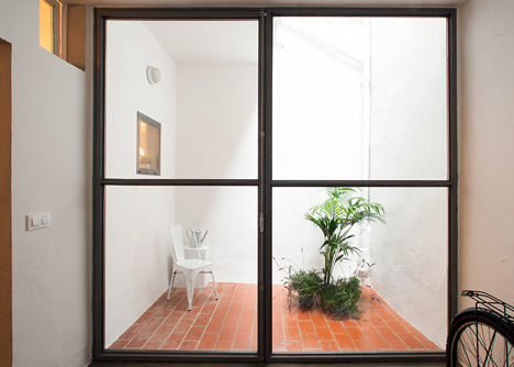
Nook Architects found the two apartments in a poor state, with several adaptations over the years leaving them with a confused layout of compartmentalised rooms and very little natural light.
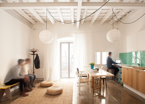
Layers of false ceilings, flooring and dividing walls were removed and the entrances were relocated to give the apartments a similar size and layout.
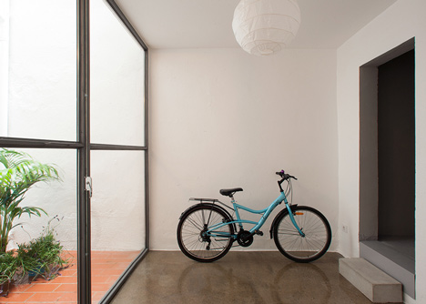
Each apartment is organised into a day zone oriented towards the street and a night zone towards the quieter rear facade.
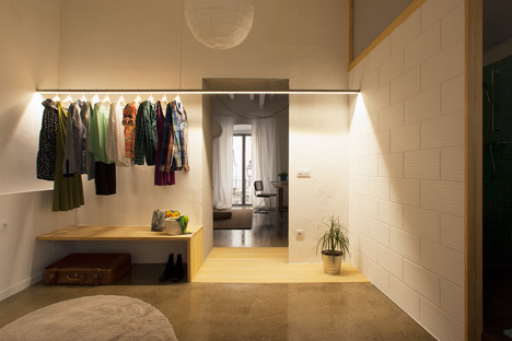
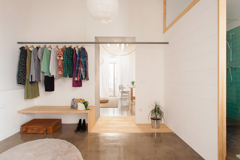
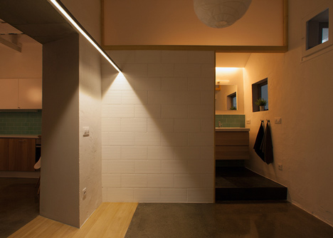
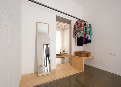
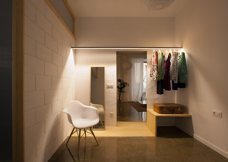
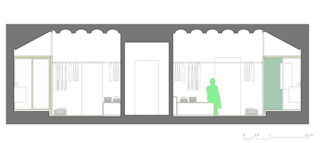
Dividing the two zones is a chunk of wooden flooring, which extends upwards into a bench. Above it is a metal rail that conceals a strip of lighting and acts as a clothes hanger.
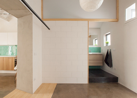
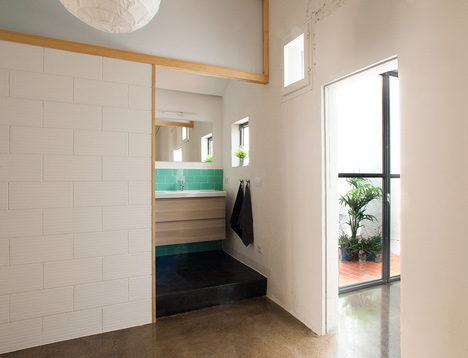
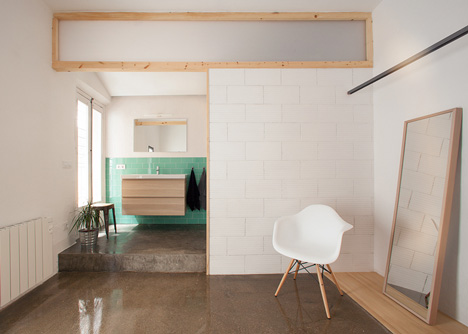
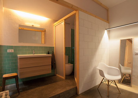
The polished concrete floors give way to unpolished concrete in the bathrooms, which are open to the rest of the space, with the showers and toilets separated by a translucent screen.
Last year the same architects completed another apartment in Barcelona with original mosaic flooring and exposed wooden ceiling beams.
Other apartments in Barcelona we've featured include a renovation featuring furniture that folds out from the walls and another with a spinning mirror and a room dedicated to ironing – see all projects from Barcelona, or see all apartments on Dezeen.
Photographs are by Nieve.
Here's some more information from the architects:
Twin House
Two apartments in Barcelona
Nook Architects
From the historic Gothic Quarter in Barcelona, a project for two adjacent apartments arrived to us, which turned out to be a diamond in the rough.
The dwellings were on a deplorable state; several low quality interventions from different times overlapped each other.
Its distribution was the result of common customs of the past in which the space was highly compartmentalised, generating small rooms with little or no natural light or ventilation.
The first intervention consisted on stripping down the structure, removing layer after layer of false ceilings, pavements, and coatings, added over the years to the original state. Once the essence of the building was restored, we began our final intervention.
The two existing apartments shared the stair's landing. The unfortunate placement of the access doors resulted in two different typologies that could barely be distributed under balanced conditions. By relocating the entries and taking into consideration the original elements that were rediscovered, we created a new space that reclaimed the original spirit.
The original wooden beams were treated to avoid future plagues, and were reinforced with steel elements to limit their strain. The same was done with the floor; a compression layer was added, firming up the girder-slab, and evening out the floor level.
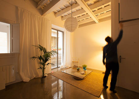
This newly sound space, divided by a thick load-bearing wall, was configured in two zones: the day zone, oriented towards the street and the liveliness of the neighbourhood, and the night zone, located on the posterior, more quiet façade.
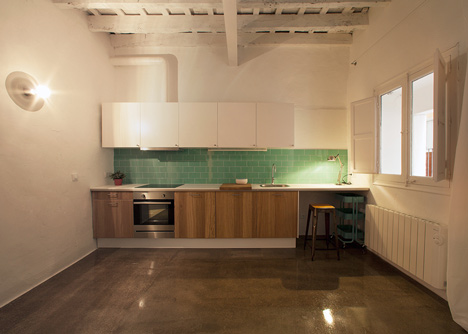
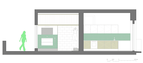
We arranged the basic elements for the functions and commodities of today, like the kitchen and bathroom, in a subtle manner that was respectful to the space. We therefore treated the kitchen as if it were wooden furniture inside the living room, horizontal, with under the counter refrigerator and freezer to avoid any vertical, tall standing units, and white wall-units that camouflage with the background.
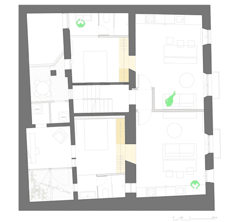
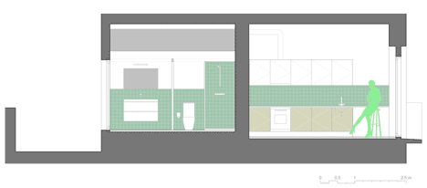
The bathroom was likewise incorporated into the bedroom, leaving the washbasin open to the rest of space, which is only differentiated by changing the floor level. The only compartmentalised elements were the shower and toilet, separated from the rest of the space by a light, and translucent wall.
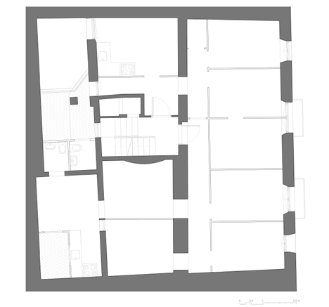
The two wet zones of the house are therefore contiguous and line the median wall of the neighbouring building, minimising the water and sanitary installations. The glazed tiles boost this idea of a horizontal strip that contains the humid zones, simultaneously revitalising the reclaimed envelope.
A wooden plank was embedded into the concrete floor, establishing a threshold between the living room and the sleeping quarters. This plank then folds and lifts up and turns into a night table or a bench. Above the plank, we placed a metal profile that contains lighting and acts like a hanger and support for possible curtain.
Our objective with this refurbishment with such a tight budget was to create an infrastructure that would hint to the user how personalise it later. A carefully studied configuration of polyvalent and proportionate spaces multiplies the possibilities of two very small dwellings with very large potential.
Architects: nook architects
Location: Barcelona, España
Year: 2013
Photography: nieve | Productora Audiovisual
Furniture: Casa Jornet