Evernote by Studio O+A
The new Silicon Valley HQ of data storage company Evernote features a coffee bar in the lobby, staircases with built-in seating and an in-house artist to paint murals on whiteboards. (+slideshow)
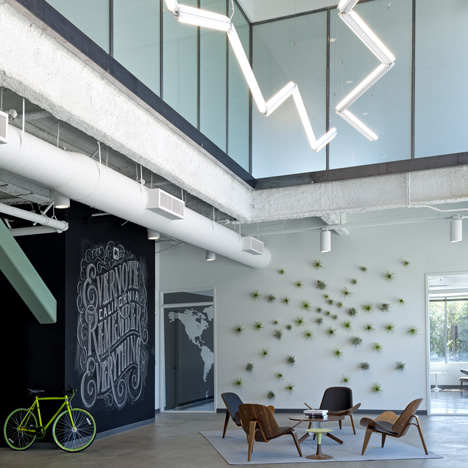
San Francisco interior designers Studio O+A converted a gloomy 90s office building in Redwood City for Evernote, carving out a double-height reception area and adding a broad staircase containing banks of seating to encourage staff to use, and meet on, the stairs.
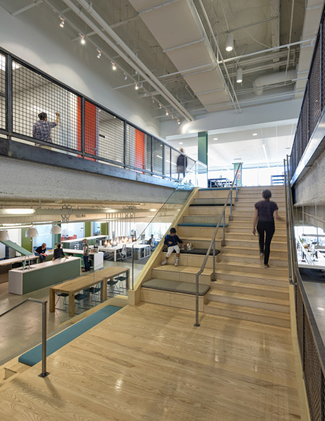
"In their old space they were on one floor," Studio O+A Principal Denise Cherry told Dezeen. "When they moved there was a lot of discussion about how to get interaction between floors. We built an expansive staircase that includes cushioned steps for seating - it’s kind of understood that you’re not supposed to use the elevators."
See more technology company offices including spaces for Google, Facebook, YouTube and Microsoft
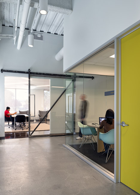
The 80,000 square foot building includes Silicon Valley staples such as a ping-pong table and a gym as well as a variety of different workspaces.
"We put in lots of different types of meeting spaces - formal, informal, collaborative, concentrative," says Cherry. "There is whiteboard paint everywhere. Anywhere you have an idea you can jot it down. And in fact they have an amazing whiteboard artist on staff who creates beautiful murals."
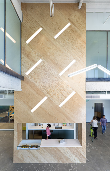
Cherry describes the look of the new space as "Simple, clean, bright, airy. We wanted to create a clean palette for them to layer in their work, much like their product, which creates layers of personal documents and pictures unique to every user."
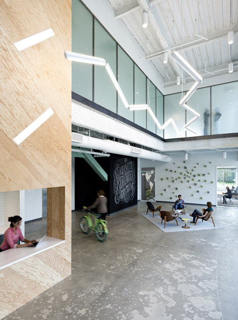
The reception area is the most innovative part of the project, Cherry says. "Evernote doesn’t have a reception desk in the traditional sense. They have a coffee bar in the lobby. The emphasis throughout the office is on circulation - they really want to encourage people to move around, meet with each other, talk with each other so we thought coffee and donuts in the lobby would help with that. The receptionist doubles as a barista."
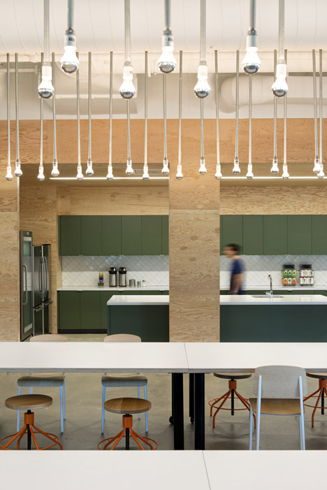
Photographer credit: Jasper Sanidad
Here's some text about the project from Studio O+A:
Project: Evernote
Square Footage: 80,000
At Evernote in Redwood City, California, the strict budget and swift pace of construction helped determine the direction of the design. Evernote is an online data storage company that allows its users to save (and retrieve) everything from Post-It notes to photographs to formal documents in the Cloud. With the company moving into a much larger building than it had previously occupied, and with business booming, Evernote needed to be up and running in its new space with a minimum of downtime. Our challenge was to design an office commensurate with Evernote’s soaring profile—on what was essentially a start-up budget and schedule.
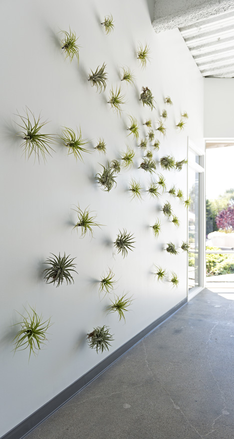
We began with the concept of making the process of construction part of the aesthetic. In a clean and modern context, construction materials may acquire the design impact of richer finishes. Evernote’s coffee bar and break areas are clad with Douglas fir plywood, the texture and grain of which provides its own graphic patterns. Forgoing expensive interior branding, Evernote instead hired chalk artist Dana Tanamachi to draft a wall-sized representation of the company’s identity, complete with its tagline, “Remember everything,” and elephant logo. Low-maintenance, water-conserving plants on an adjoining wall contribute to the reception area’s look of unforced spaciousness.
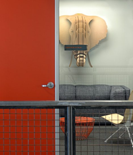
Adding to the informality is the placement of a coffee bar—with fully functioning donut and pastry counter—at the reception station. An echo of Evernote’s mission of turning impulses into lasting archives of information, our design transforms the spontaneous habits of its staff (grabbing a donut on arrival, for example) into a lasting element.
This encouragement of spontaneity is reprised in the white ash stairway that connects the second and third floors. The wide staircase is fitted with cushioned step seating to make it a natural gathering place and area for relaxation. There are other spaces for breaks and informal meetings throughout the office—a large communal dining room; a ping-pong table; a designated fitness center equipped with treadmills, stationary bikes, and other exercise devices; and a series of small, strategically placed snack and coffee counters. The cumulative result of all these break options is an environment that promotes those casual interactions from which so many creative impulses spring.
As befits a work environment attuned to informal collaboration, the finish palette for Evernote is light. White walls and pastel accents mix with blonde wood and lighting that augment the natural brightness of the windows to subliminally communicate the spirit of the company—and turn a tight-budget, tight-schedule build-out into something memorable.
Architect: Studio O+A
Project Team: Primo Orpilla, Verda Alexander, Clem Soga, Denise Cherry, Perry Stephney, Elizabeth Guerrero, David Hunter, Emily Brooks, Kroeun Dav, Alfred Socias, Sarunya Wongjodsri, Alma Lopez, Caren McDonald, Olivia Ward, Jeorge Jordan
Location: Redwood City, California
Client: Evernote
Gross square footage: 80,000
Contractor: DA Pope
Consultants: Vaziri Structural Engineering
Key materials (type/brand)
Carpet: Shaw Contract, Interface Flor; Furniture: Allsteel, HPL, Inscape, Herman Miller; Cabinetry: Caesarstone, Abet Laminati, Formica, Nevamar; Flooring: Bolon, Armstrong, Capri Cork; Lighting: Daybrite, Kirlin, Amerlux, Pinnacle, Prudential, Louis Poulsen, School House, Lithonia, Intense, Omega, Delray
Software used: AutoCAD, 3D Studio Max, Adobe Creative Suite