Browns Focus by Studio Toogood
One level of this London boutique designed by Studio Toogood is bright and minimal, while the other looks like a dark nightclub.
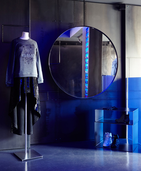
Studio Toogood divided the two-storey Browns Focus store so daywear is displayed in a clean, white space in the basement and eveningwear can be browsed on the darker upper level. "A brilliant-white basement represents daywear and a midnight-blue minimalist ground floor taps into the spirit of dressing for the evening," said the studio.
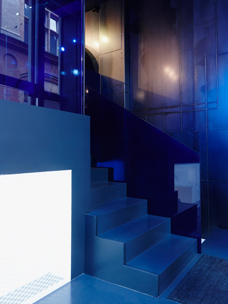
Shoppers step up from street level to the upper floor or descend into the basement, which can be glimpsed through a floor-level window in the entrance.
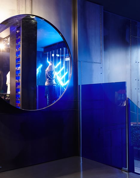
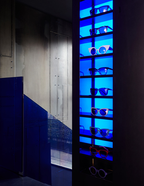
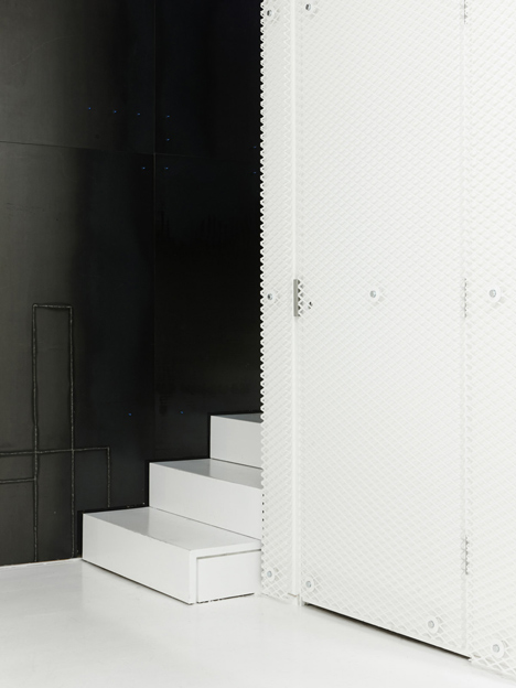
Welded-steel panels, neon lighting and blue-tinted glass are all used on the upper floor to create an atmosphere more like an underground music venue.
Garment rails are formed from metal pipes suspended from the ceiling, bent into rectangles or hoops.
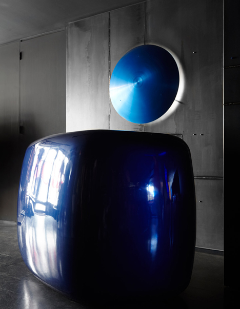
A midnight blue blob serves as the counter and a blue spun-metal disc with a light behind is attached to the wall above.
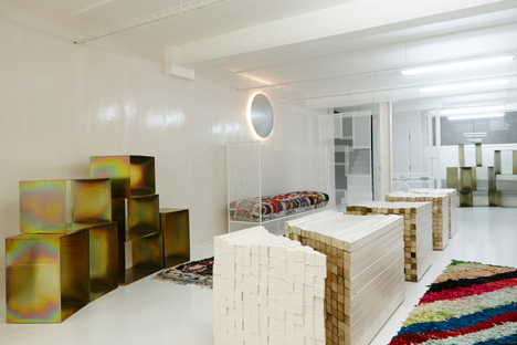
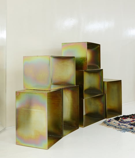
Surfaces in the basement are all white, only broken up by colourful woven rugs and stacks of iridescent boxes.
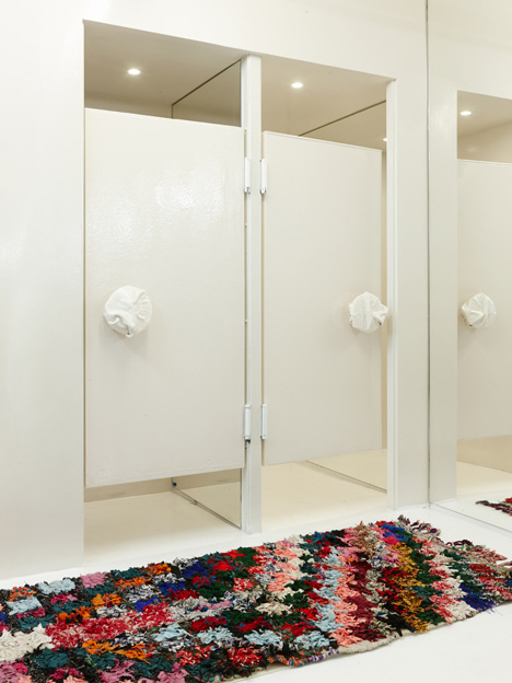
Changing room door handles appear to be made from scrunched-up pieces of paper set in plaster.
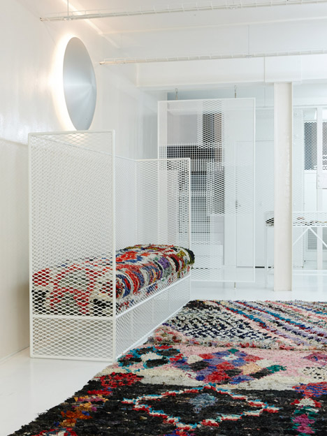
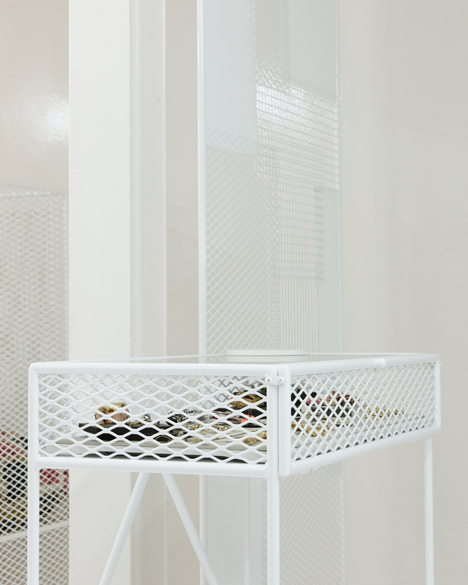
Studio founder Faye Toogood's furniture populates both floors, including vitrines made from metal lattices that are black upstairs and white downstairs.
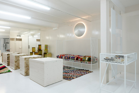
The white mesh is also used for a seat and screens downstairs, alongside display counters built from piles of sawn wood lengths.
We've recently featured another Studio Toogood project: a fashion store that combines raw concrete and colourful fabrics.
Other recent retail interiors on Dezeen include an ochre-coloured boutique in Katowice, Poland, and a UK bakery with a magpie's nest motif engraved into the counter.
Earlier this year we published a laundrette in Barcelona that also looks like a nightclub.
See more retail interiors »
See more design by Studio Toogood »
See more architecture and design in London »
The following text is from Studio Toogood:
Browns Focus by Studio Toogood
Browns Focus, one of the world’s leading destinations for newly discovered talent and emerging designers has been re-launched into a new and extended space with a new interior designed by Studio Toogood.
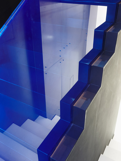
The space, set across two floors, is divided thematically – a brilliant-white basement, representing daywear, and a midnight-blue minimalist ground floor that taps into the spirit of dressing for the evening.
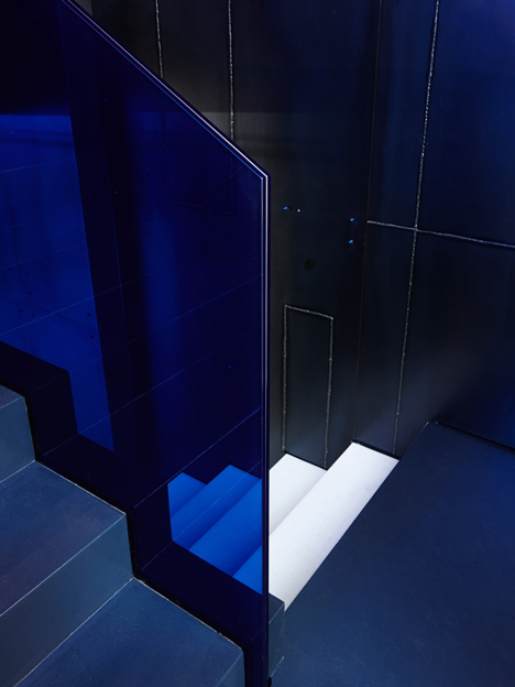
The club-like darkness of the ground floor has a postindustrial feel, with black rubber, welded steel-panelled displays, a graphic constructivist clothes rail and a sophisticated touch of blue-tinted glass.
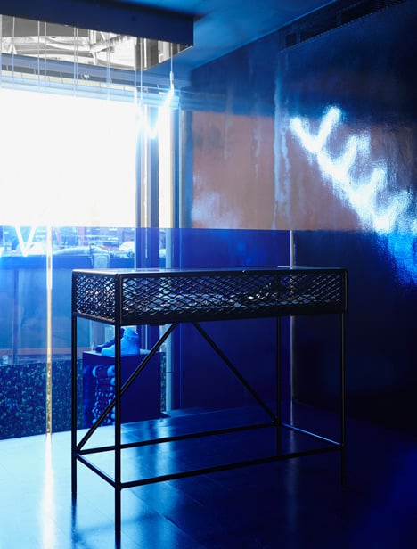
By way of contrast, the area downstairs is glowing white and minimalist; walls of white mesh and rubber with a lacquered floor are offset by irregular display platforms, assembled from rubberised timber offcuts.
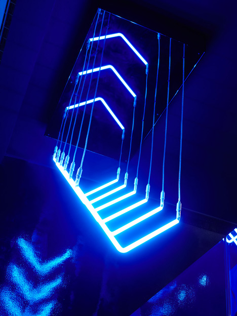
Both floors feature exclusive furniture designs by Faye Toogood, including her iconic mesh jewellery vitrines and a striking biomorphic cash-wrap counter. The result is a carefully balanced retail environment that complements and highlights the brand’s design-led fashion collections.