Wall House by FAR frohn&rojas architects 4
In our final post on Wall House by FAR frohn&rojas, here is a full description of the project from the architects plus drawings, plans and models (plus some of Cristobal Palma's photos again to help make sense of it):
--
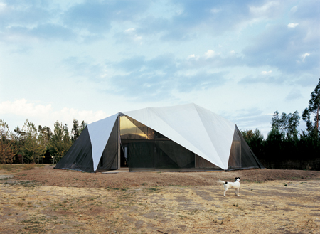
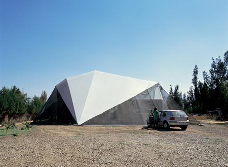
With a limited budget, our office was asked to design a residence for a retired couple in one of the suburban areas that stretch out from the center of Santiago de Chile along the Pan-American Highway.
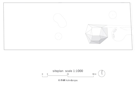
We were immediately curious about the ambiguous nature of the couple’s purchased lot (see site plan above): while technically being part of a suburban subdivision, the development actually projected a highly rural image through its dirt roads, large lots of more than 50,000 square feet, and most importantly its clever use of tall hedges to enclose the lots on their perimeters and provide a high level of privacy.
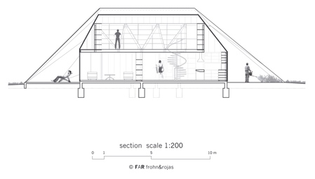
Finding that the hedges, while blocking off any visual connection to the immediate suburban context yet still opening up to views of the distant Andean mountains, could be understood as an outer layer of building skin, they became an intriguing starting point for the project. Using this new understanding of the hedge, we developed the idea of a house based upon a series of separated wall layers which structure the house and progressively fade it out, starting from its solid, innermost core to its soft and delicate encasing.
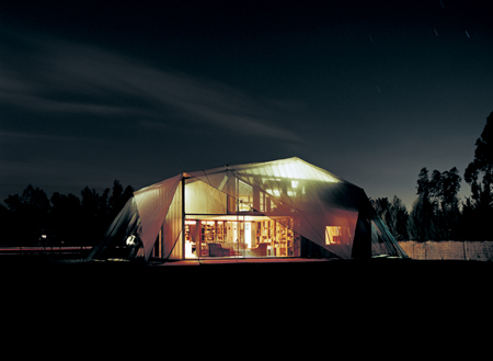
While the “traditional" single family home, regardless of locale, typically establishes a strong separation between interior and exterior through solid walls and clearly defined window and door openings, our design creates a gradual and hazy transition between the two, finally including the exterior in its hierarchy of interior spaces.
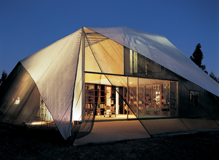
Based on 4 layers, in between which residential activities result, each layer offers its very specific structural, material, functional, atmospheric, or climatic qualities and contributes to an intelligent hierarchy for a limited-budget project: while the innermost zones contain the most demanding functions associated with home (i.e. kitchen and bathroom), the selection of materials and finishes is allowed to ‘roughen up’ toward the exterior. Moving from room to room plays with a perception of moving deeper into or further out, with changes of materiality and lighting providing a range of qualitative experiences and cues.
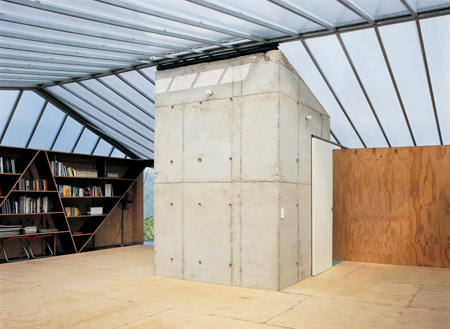
Layer 1: Concrete Cave
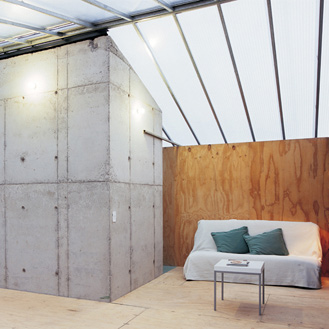
The introverted concrete core forms the first element of the structural system. Containing the house’s two bathrooms, its inside surfaces are fully covered in ceramic tile, allowing it to be an entirely wet zone.
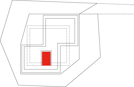
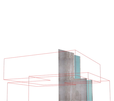
A sturdy and vault-like chamber, this innermost layer is solid, opaque, and shiny-smooth, offering cave-like protection for the most private of domestic activity.
Layer 2: Stacked Shelving
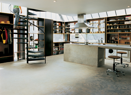
Surrounding the inner core is a pair of upper and lower structural shelving bands, built of engineered wood, formwork panels and plywood, shifted in their relative positions and cantilevering out up to 5.20 meters along the corners.
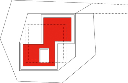
Backed with plywood sheets in select areas while left open in others, the bands set up varying configurations for placement of domestic articles, privacy or openness, and levels of illumination according to program and orientation. The decision to use formwork and plywood as two of the primary materials reflects the specificity of material required by the budget.
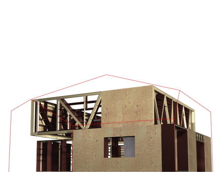
Fully contained within the shelving band in a continuity of spaces are the kitchen, dining and guest room on the ground floor and a work studio on the upper. Through the collocation of objects amongst these shelves, passing movement, pattern and lighting changes fluctuate intermittently.
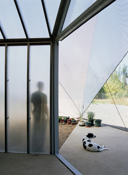
Layer 3: Milky Shell
Moving out to the climate threshold, an upwardly folding translucent skin, or milky shell, of high-insulation polycarbonate panels filters the harsh Chilean sun, registering shadows of trees and outside elements on its surface and flooding the zone with light.

A delicate and vertically laid substructure for the panels, typically used in drywall construction and calling for an almost zero-tolerance assembly, was employed for a seamless reading of the panels.
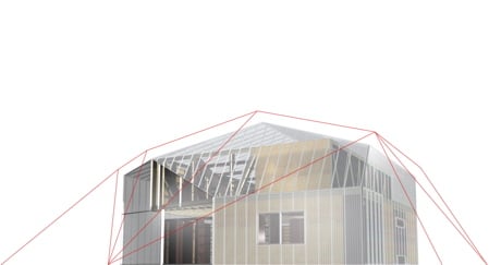
Surrounding the building much like a shrink wrap binds two shifted boxes, this shell creates two partially double-height spaces along the outer corners of the house. Outwardly-focused and filled with an even diffusion of natural light, these two areas include the living room and master bedroom, where expansive sliding glass surfaces extend the spaces outward toward the hedges.
Layer 4: Soft Skin
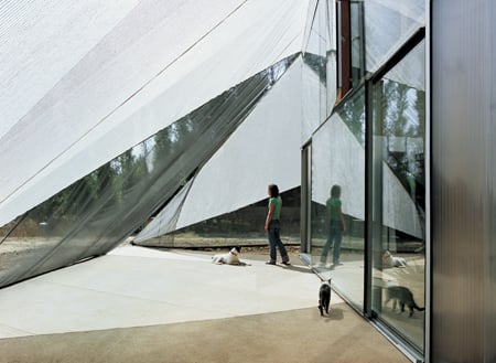
Finally, a soft fabric membrane typically used in greenhouse environments acts as an energy screen, filtering out up to 70% of the solar energy hitting the building, and at the same time creates a protective barrier against the mosquitoes and insects prevalent in the area.
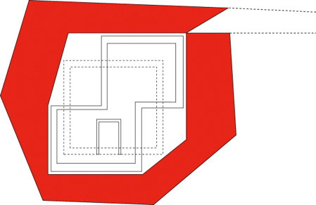
Wrapping itself entirely around the house and logically connecting along the lengths and corners of the polycarbonate skin, this soft casing creates a tent-like screened porch between inside and out, fully open to breezes and varyingly open to views (employing 3 differing degrees of transparency), yet still providing a protective sheath.
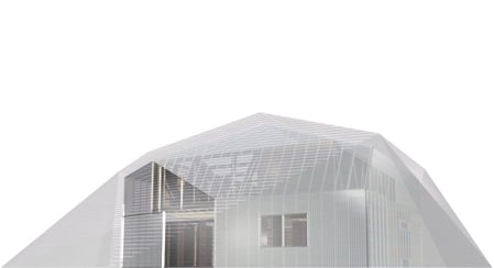
As seen from the outside, the aluminum netting and its folds of connectivity create a crisply tailored, jewel-cut form that changes its luminosity and depth of field depending on time of day and season of year. A fold in the membrane opens the path from the exterior towards the main entrance. Additionally there are three zippers in the skin for easy access from the house into the garden.
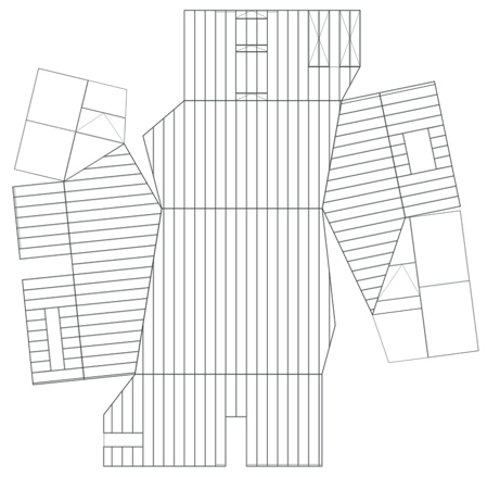
Both the polycarbonate shell (above) as well as the soft fabric membrane (below) are interesting in the context of this project both through their performative and sensual qualities, but showed their extra-value during the construction process as they could be installed in a quasi-“do-it-yourself"-manner by the mostly untrained labor force.
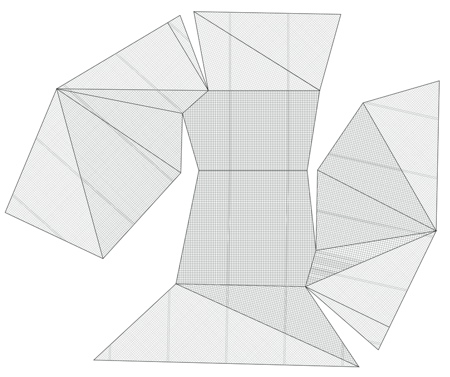
After having passed through the series of different wall-layers from the interior outward, one understands not only the climatic but also the formal and geometric relationship between them. Starting from a simple rectangular core the different layers build upon one another creating increasingly complex geometries. Thus from the inside out the house describes the transformation from a simple box to a diamond-like, light-reflecting shape, which the house is perceived as from the surrounding.

WALL HOUSE
Santiago de Chile 2004-07
Project Team:
Marc Frohn, Mario Rojas Toledo, Amy Thoner, Pablo Guzman, Isabel Zapata
Structural Planning Wood:
Ingewag Limitada, Santiago; Ing.civil. Mario Wagner
Structural Planning Concrete:
Ing. Ernesto Villalon, Santiago
HWAC
Central TechnoPlus / Vaillant, building technology;
Nelson Quilaqueo, Christian Aguirre
