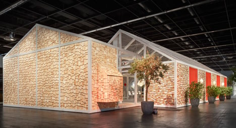
Das Haus conceptual future home installed at imm cologne by Louise Campbell
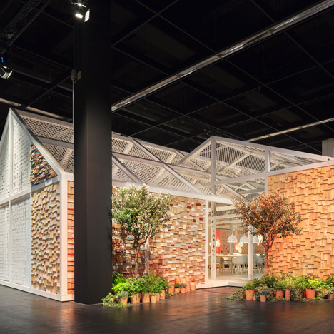
Cologne 2014: two shingle-clad houses converge to form this year's Das Haus home of the future installation at the imm cologne fair by Copenhagen designer Louise Campbell (+ slideshow).
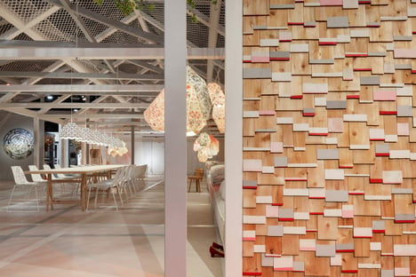
Das Haus is an annual commission that allows a designer to imagine what their ideal future home would be like.
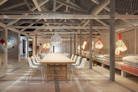
Louise Campbell designed a 240-square-metre dwelling devoid of interior walls, with openings at each end rather than doors.
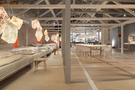
"There are no walls dividing the various zones, only soft textiles that can be rolled up or down as desired," said Campbell.
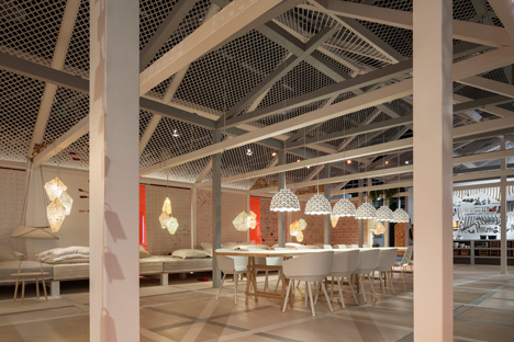
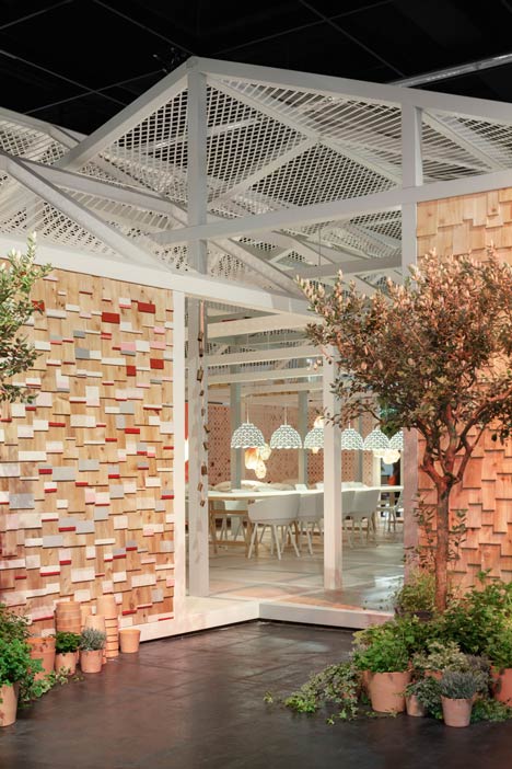
Two timber-framed buildings intersect at an angle to one another, with the exposed beams and columns inside coloured grey and white to distinguish the different structures.
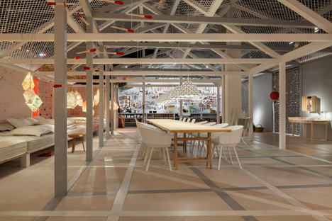
These two elements are designed to represent the coming together of masculine and feminine within the home. A long dining table sits in the centre of where they meet.
"There are no secrets and no pressure – the ideal marriage. Perhaps indeed the ideal house," Campbell said.
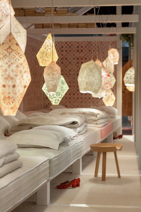
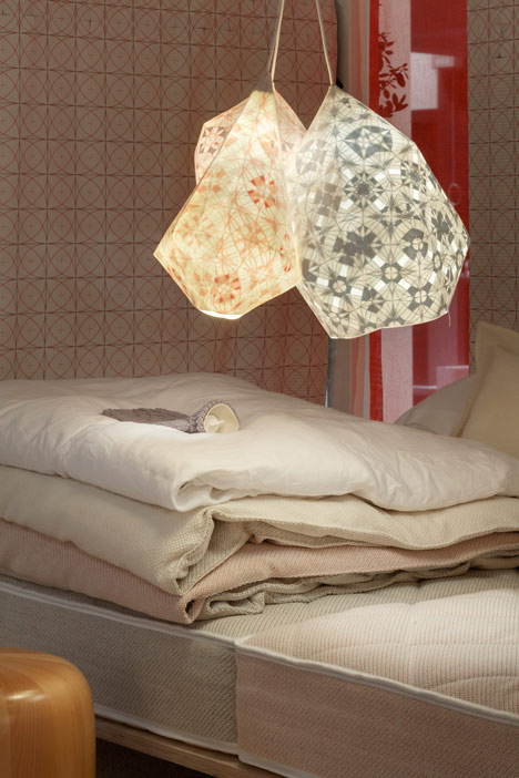
A line of beds for sleeping and lounging runs along one side of the space, in front of patterned fabric panels that line the walls.
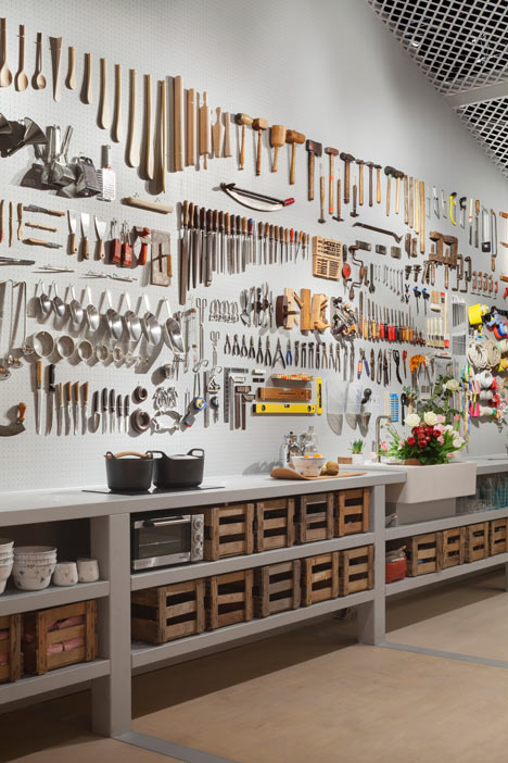
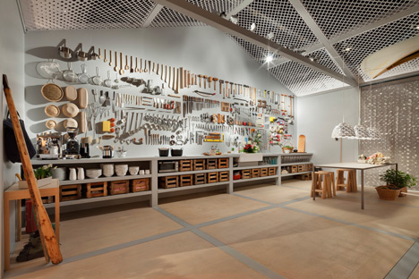
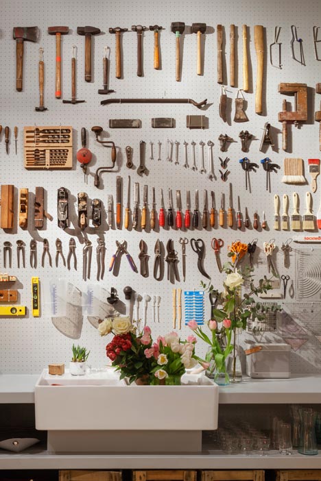
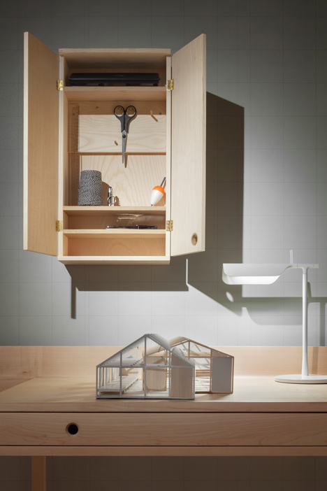
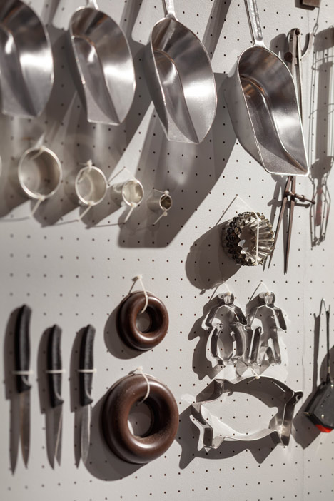
Campbell modelled the kitchen on a workshop, hanging 573 tools on the white pegboard wall behind the counters.
"Personally I feel very much at home here," said Campbell. "Where floral wallpaper in a kitchen would not naturally present itself at the top of my list, plenty of fine tools do. Even so, I'd much rather sleep in an imaginatively decorated space than in a bare white bedroom."
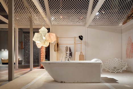
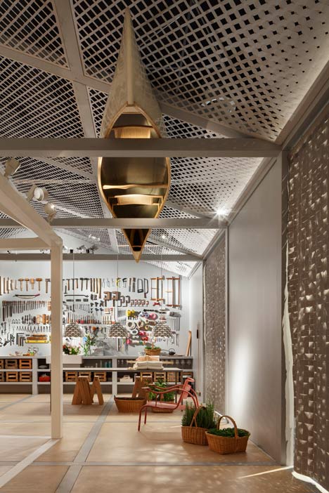
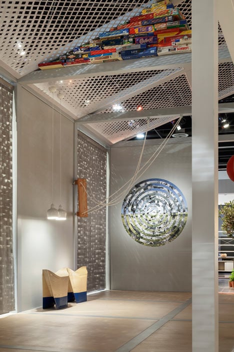
A 100-year-old stoneware bathtub has been placed in the middle of the living area and an upside-down canoe is balanced in the rafters.
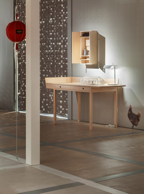
The house is clad in larch shingles with coloured tips and the roof is perforated with a pattern of diamonds, which becomes less open at the top of the walls.
Campbell's design is installed at the centre of this year's imm cologne design trade fair, which continues until Sunday.
Last year's conceptual home of the future was created by Italian designer Luca Nichetto, who installed an eco-friendly environment full of plants. London studio Doshi Levien designed 2011 Das Haus, envisaged as part of a dense urban neighbourhood.
Read on for more text sent to Dezeen by imm cologne:
A house with two sides
» Das Haus – Interiors on Stage 2014 by Louise Campbell: a slow house full of handmade things
» Under the title 0-100. (Made to measure), Louise Campbell sounds the depths between man and woman, reason and emotion
» The very personal vision of a home the Danish designer has created for the imm cologne is unreservedly playful and sensuous
What Louise Campbell has erected in Pure Village (Hall 2.2) at the imm cologne with such incredible passion for detail isn't one house, it's two! Two timber-framed, prototypical houses with an exposed beam structure that look as if they were positioned at an angle to one another on the floor of the hall and then pushed inside one another like a telescope. The posts of one house have been painted white, those of the other a light grey. The rectangular overlap in the middle created by the intersection of the two volumes marks the spot where opposites are reconciled and the two houses merge into one.
Half designer portrait, half visionary blueprint
Das Haus – Interiors on Stage is the simulation of a home at the international interior design fair imm cologne. Every year, the imm cologne nominates a new designer whose plans are then used for the layout and furnishings. The furniture, colours, materials, lighting and accessories chosen by the Guest of Honour add up to an individually configured interior design. But this holistically conceived proposal isn't just meant to be forward-looking; it should be practical as well – and above all authentic. Das Haus is an example of how it is possible to create a world of one's own that becomes an expression of one's own personality. Besides picking up on current interior design trends, the project also addresses the public's aspirations and social change.
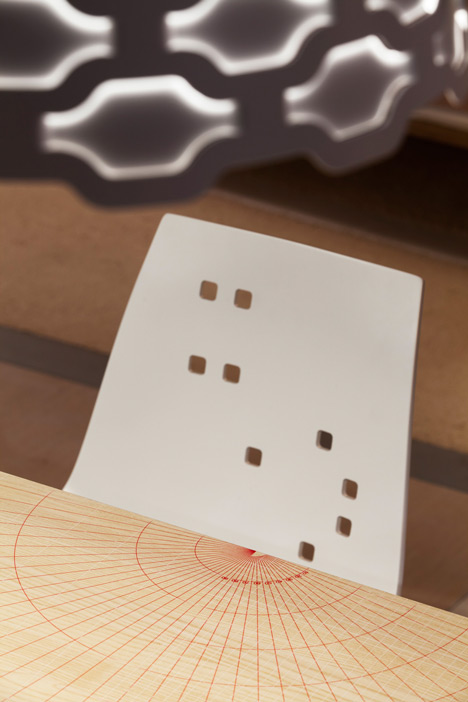
Louise Campbell turns Das Haus into an attractive stage for relationships
The structure, which has a footprint of 240 square metres and is made of wooden beams, larch shingles and lots and lots of fabrics, turns out to be a thoroughly attractive and seductive experimental setup. Louise Campbell wants to figure out how opposites can be reconciled through design. And in her eyes, the biggest conceivable contradiction in our lives is the (in-)compatibility of man and woman, of reason and emotion - which makes a partnership between the two the biggest experiment of all.
"I don't understand why we don't question something as fundamental as love more," explains Louise Campbell provocatively. "What is love? How does a designer approach these questions? By circling around our physical bases through form." She wanted to design Das Haus as a home "for him and her, for slow and fast, soft and hard, light and dark, colour and material, British and Scandinavian – with a tranquil space in the middle where everything fits together with some quirks, but no conflicts." And in this case, "him and her" doesn't just mean male and female, but the masculine and feminine side within each and every one of us.
Interior philosophy: omitting walls gives the other person more space
The Danish designer shows how both "he" and "she" can make themselves very much at home within these contradictions – and does away with various interior conventions in the process: Das Haus is one big, open space, the bed is a 16-metre-wide piece of furniture for sprawling, lounging and sleeping on, the bathtub stands in the middle of the living area and the kitchen is located in the man's domain. In the middle, he and she meet at the big table in harmony. There are no proper rooms; instead, the various areas of the home are defined by the furnishings and accessories.
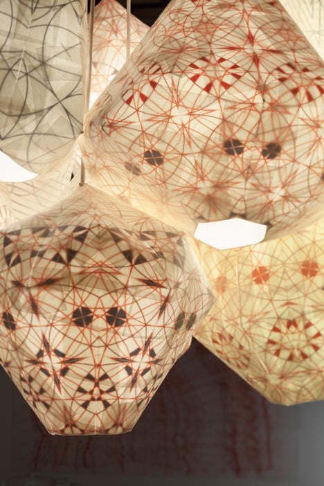
Besides featuring Louise Campbell's own designs such as the LC Shutters lamps from Louis Poulsen and Zanotta's Veryround Chair, Das Haus also contains a variety of products by other designers. Everything else was made by hand in Louise Campbell's Copenhagen studio. And because she felt it was important to include something old as well, a 100-year-old stoneware bathtub was borrowed from the museum collection of Villeroy & Boch AG and set up in the middle of the living area. "There are no walls dividing the various zones, only soft textiles that can be rolled up or down as desired. There are no secrets and no pressure – the ideal marriage. Perhaps indeed the ideal house," says Louise Campbell of her interior concept, in which everything is designed from the inside out.
A tool wall with 573 tools
A large wall surface in the kitchen zone is one of the highlights of Das Haus. For Louise Campbell, the kitchen is both a workshop and a place to cook, and she has thus hung around 573 tools of every kind imaginable on the exterior wall. The big table is used for stirring, mixing, sawing, painting, hammering and sewing. And whilst technology is notable only by its absence, the house contains the instruments required for every conceivable kind of handicraft. Finding the right measure – the right balance between reason and emotion, perfection and cosiness, technology and craftsmanship, hectic activity and total relaxation – is a key theme for Louise Campbell, both in her design and in her version of Das Haus, which is why she has so aptly named it: 0-100. (Made to measure).
A playful house that exudes sensuousness
"Personally I feel very much at home here," says Louise Campbell of her Haus. "So where floral wallpaper in a kitchen would not naturally present itself at the top of my list, plenty of fine tools do. Even so, I'd much rather sleep in an imaginatively decorated space than in a bare white bedroom."
Louise Campbell's house is a celebration of physical existence in the here and now. Digital projections are entirely absent. The warm lighting, exquisite textiles, comfortable rest zone and many playful details and accessories are a reminder of what is truly responsible for the quality of our homes and lives. Louise Campbell exemplifies this attitude by lending a willing hand with the construction of Das Haus, stapling, painting and draping as it takes shape. By celebrating classical sensuality and all that is handmade, her interior concept is the diametric opposite of the technophile tendencies that have become so widespread in today's world. The designer cites Lewis Carroll's Alice in Wonderland, Sherril Jaffe's Scars Make Your Body More Interesting, Jane Austen's Sense and Sensibility and The Cure's Wild Mood Swings as the sources of her creative inspiration.
Das Haus 2014 is a beacon of feminine design
By creating a low-tech house with open spaces that can be used flexibly to provide scope for all its occupants’ (contradictory) facets, Louise Campbell is continuing the Das Haus – Interiors on Stage series with a design that is just as remarkable as its predecessors. In 2012, Anglo-Indian designer team Nipa Doshi and Jonathan Levien were in charge of the new format's debut, staging what was effectively an organically evolved space that permits communicative interaction between occupants and cultures. In 2013, Italian product designer Luca Nichetto created the next instalment of the design event as an elegant ensemble open to nature on all sides. Das Haus is located within the Pure Village format, which has been given a spacious new home in Hall 2.2 at the 2014 event.
