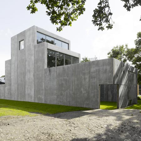
Four Boxes Gallery by Atelier Bow-Wow
Japanese architects Atelier Bow-Wow have completed a gallery in the grounds of the Krabbesholm Højskole college in Skive, Denmark.
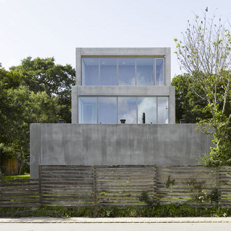
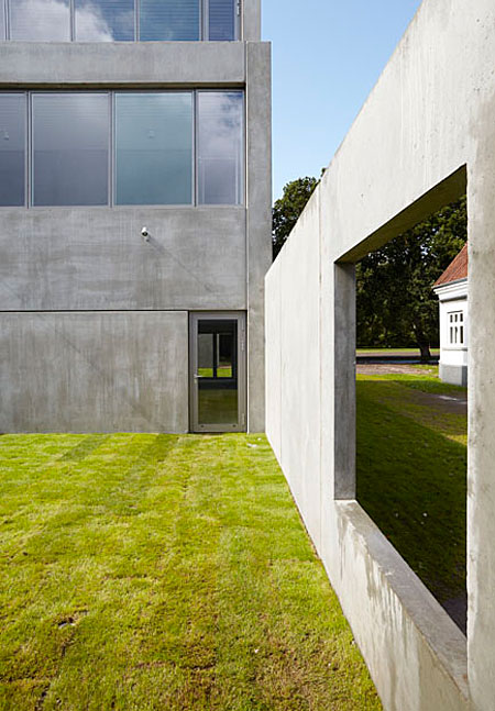
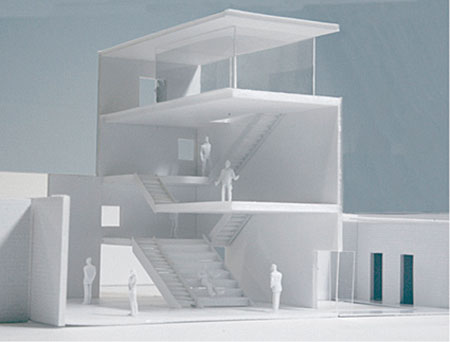
The three-storey building is conceived as four stacked boxes.
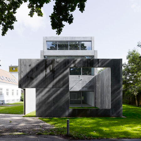
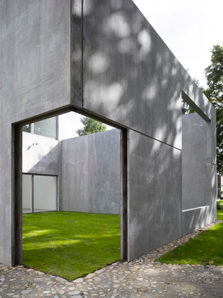
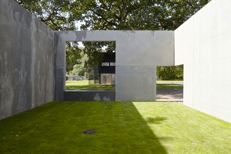
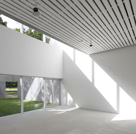
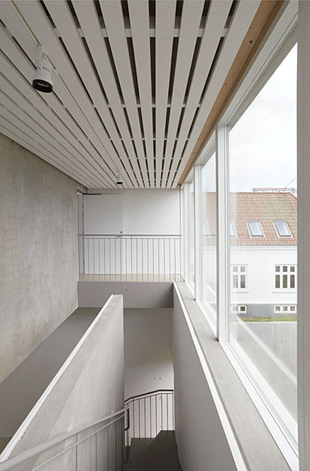
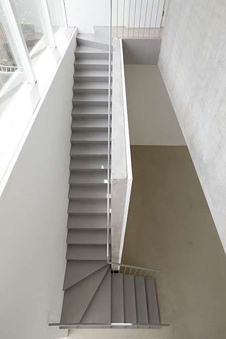
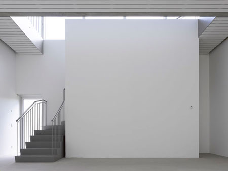
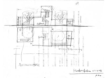
Concrete walls enclose outdoor exhibition spaces on the ground floor, while two more boxes on the ground and first floors form interior galleries.
The third floor houses a workshop for artists in residence.

The facilities will be used to exhibit work by both students of the Krabbesholm Højskole and invited artists.
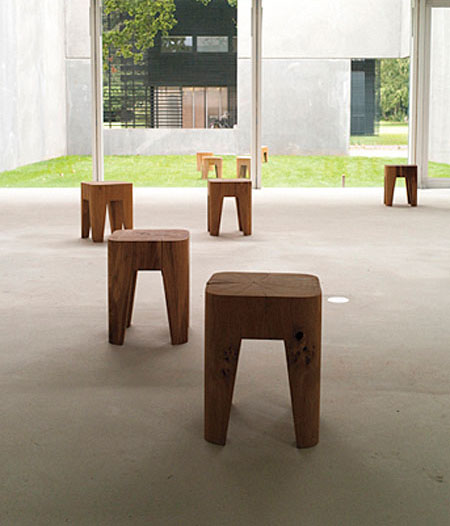
Solid wood stools designed by Copenhagen architect Morten Emil Engel furnish the spaces – see our previous story.
Here's some more information from Krabbesholm:
--
FOUR BOXES GALLERY
Krabbesholm is pleased to announce the opening of Four Boxes Gallery, a new exhibition space designed by Japanese architects Atelier Bow-Wow.
In the following text Danish architects Rikke Lequick Larsen (R) and Tanja Jordan (T) have interviewed Momoyo Kaijima (M), the female half of Atelier Bow-Wow, about the creation of the building and Bow-Wow’s approach to architecture.
After the interview there is a small text about Krabbesholm Højskole.
An ascending bento box
Rikke Lequick Larsen and Tanja Jordan
On the green lawn of Krabbesholm, between the white-washed facades of the Craftsmen’s School and the redbrick Idé-Pro factory stands a new building designed by Japanese architects Atelier Bow-Wow. It is a building that is quintessentially Japanese, yet also strangely oversized and villa-like, and it extends with its clear-cut concrete edges the built vocabulary of the school. Like an upwardly striving bento box in which each individual room has grown out of the whole, the building supplements the creative workshops, residential facilities and common rooms of Krabbesholm by adding long-awaited exhibition facilities to the complex. Here both students from the school and artists invited will exhibit their works. The building is named the Four Boxes Gallery because of its layout: outdoor galleries and a light big indoor gallery make up the two lower boxes of the building. The middle, third box is a smaller exhibition room, and the fourth box at the top is a private workshop area for artists in residency.
In Japan a dinner of rice and fish/meat is called a bento meal. This is not served on a traditional dish, but in a “bento box” designed specifically for the meal. A bento box with individual compartments for different ingredients is available both as a cheap mass-produced product and as an exclusive example of fine craftsmanship. Characteristically to both low-cost and the expensive bento boxes, are the compartments’ mutual relationship, where smaller and bigger spaces supplements each other and together form a tempting frame for the meal.
Just like an actual bento box, the Four Boxes Gallery endeavours to present its contents as elegantly as possible by providing a simple structure. The objective was not to design a signature building that craves attention, but rather to provide optimal settings for exhibiting art. And like the best bento boxes, the building is a remarkable and beautiful work of art in its own right, despite the focus on content.
Atelier Bow-Wow’s approach to architecture is uniquely observant and listening, which is evident in the final building at Krabbesholm. Architects Rikke Lequick Larsen (R) and Tanja Jordan (T) interviewed Momoyo Kaijima (M), the female half of Atelier Bow-Wow, about the creation of the building and Bow-Wow’s approach to architecture.
R+T Momoyo, could you tell us about your initial experience with Krabbesholm and how the project came about?
M Sure. We participated in a small exhibition at Krabbesholm Højskole regarding a new art centre in relation to CPH Kunsthal. At that time we were informally asked to submit a proposal for a new gallery building at the school. We were delighted, but it was indeed very hard for us to make a proposal, as we had little idea about what a Danish ‘højskole’ really is. Since I am a visiting professor at ETH in Zurich, I am often in Europe, so I flew up to Skive to see the school with my own eyes. This led to our fascination with Krabbesholm and the Danish ‘højskole’ concept. I could not help falling in love with the place: the fjord, the Danish landscape, the industrial harbour, the timber frame building, the manor house, the students, the teaching philosophies and the incorporation of modern architecture into this idyllic setting.
Before we began preparing our design proposal, we had long discussions with principal, Kurt Finsten, about the needs and specific wishes for the new gallery space. We learned that Krabbesholm badly needed a new exhibition space for the display of student works and for exhibitions by invited artists. Given the variety of subjects taught at Krabbesholm and the very diverse artistic production to be displayed, it became important to us – and to the school – to have a flexible gallery with both dark and light areas so that any media could be presented in the best possible way. In other words, there was an apparent need for a flexible yet simple gallery building able to cater for different needs and uses.
While we prepared our first proposal in Tokyo, a delegation from Krabbesholm came to visit us and to our surprise showed great interest in a tower building, that we designed some years ago. This led to the proposal of a concrete tower at Krabbesholm. The tower design was submitted to the local authorities in Skive for building permission. However, the authorities were not sympathetic to a high structure at the historic site of Krabbesholm, their reason being that it clashed too much with the manor house and its surroundings. Thus the initial project stranded.
T Momoyo, did that surprise you? I mean, you must have been aware that Krabbesholm is a historic site and must have taken this into consideration when preparing your design? How do you think the tower could have complemented the historical context?
M Of course we thought about the context. However, the proposed tower was a way of establishing a dialogue with the large silos in the harbour area that are very close to the new gallery. To us, the Krabbesholm context is as much the gritty harbour nearby as it is the picturesque manor. Nevertheless, the authorities’ negative response to the proposal forced us to change the scheme, but it was important to us to remain faithful to the school’s wish for a building that would not be like any of its other buildings. We were selected because we were expected to add a unique building to the Krabbesholm building complex. So we never completely abandoned the idea of a distinct, notable structure, but made a compromise in terms of the building height and designed a ‘four boxes gallery’ composed of boxes stacked upon each other. We sort of squeezed – in a controlled manner, of course – the tower downwards and allowed it to spill out. This proposal was approved by the authorities and is the one now realised at Krabbesholm.
R What do you think about the finished result, seeing your sturdy yet elegant concrete building standing erect at the campus?
M Seeing the final result today, I truly believe that we created a building that is simple, powerful and suitable in its context. This has very much to do with the stark concrete that contrasts with the rest of the school. At first, we contemplated designing a concrete building cast in situ to retain that reference to the harbour silos I mentioned before. However, we were advised to use prefabricated concrete, since it is affordable, faster to use and easier to work with during the Danish winter. In Japan, prefabricated concrete is expensive, so this was a great opportunity to challenge ourselves in prefabricated matters. Prefabrication defines the building you are creating to a great extent. Heights and spans can only be of certain lengths and widths, which presents a mathematical challenge that is very different from casting concrete ‘freely’ on site.
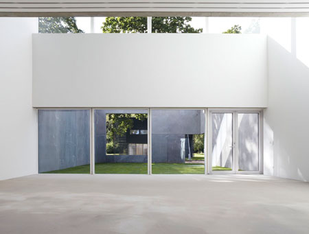
T It sounds like you are saying that the Four Boxes Gallery is the most rational building designed by Atelier Bow-Wow to date, and in that sense different from your earlier buildings. However, it still stands out as an alien structure at Krabbesholm. For example, the proposed trees inside the courtyard clearly emanate from a Japanese tradition and could be said, perhaps, to imitate an urban setting in Tokyo. How does this fit into a rural setting in Denmark, and how did you tackle the Danish heritage in your design for Krabbesholm?
M We cannot eradicate our own special character. We will and should always be Atelier Bow-Wow. However, this does not mean that we are not aware of Danish traditions and ways of doing things that are different from ours. We are in fact balancing on the edge between ‘the new that we see’ and ‘the old that we know’. So the proposed gallery building is different from European architecture, but it is not entirely Japanese either. That is our way of dealing with cultural differences. I think this in-between position is exactly why we have an ongoing debate on whether to include the trees or not in the outer galleries, since that is not finally decided. You are right when you point out that they are very Japanese in the way they are staged, but they are still Danish trees that grew at the site long before we arrived.
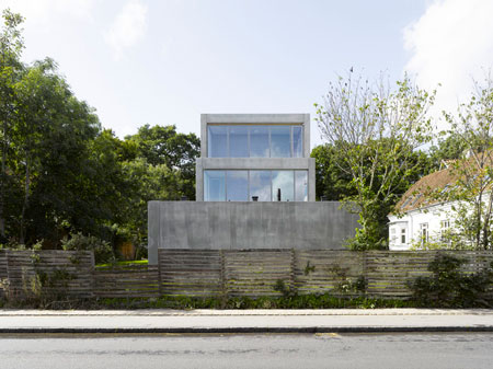
R Now that we are talking about adapting to the Danish context versus the Japanese, I would like to ask you why your building, like the guesthouses designed by the American-Cuban artist Jorge Pardo, needs a wall around its outdoor territory. All other public buildings at the school stand ‘unprotected’ on the ground. Why did you find it necessary to enclose the courtyards, and why are the walls meters high?
M In Tokyo we would never have built such a wall, since it encloses too much. But in this case, where the building does not only contain indoor spaces but also outdoor courtyards for exhibiting, we decided that those outdoor areas also needed some sort of protection, just like a normal interior. It was not because we wanted to create any semi-private setting like you suggest, but because the courtyard called for physical borders.
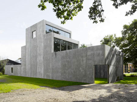
T That makes sense. However, talking about lines of demarcation of private space, indoors or outdoors, your building puzzles me. Most of the buildings you have designed to date are private dwellings, clearly showing your passion for individual spaces. This is also what you investigate in your research books entitled PET Architecture and Made in Tokyo. How does that relate to Krabbesholm and the intimate spaces and almost private-residence appearance of your building? Can the Four Boxes Gallery be seen as a private space, given the fact that it serves as a public building?
M No, not at all. Actually, the building was initially referred to as a workshop, which suggests an unfinished space in the sense that ongoing work is constantly transforming the architecture. Our intention with the building is to expose and present the process of creating. We will be pleased if our building is read and used independently by its users, because our aim is for the subject to define the building autonomously. However, that does not in any way make this public building private. It is in fact a building that should be brought to life by its collective use.
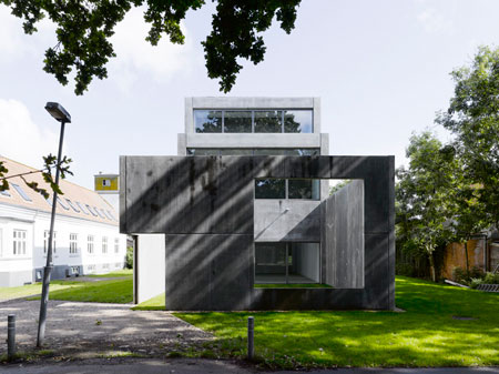
R Are you saying that the building should be read as a framework for occupancy, within which students and artists themselves will generate meaning and significance?
M Indeed. We tried to capture different lifestyles and needs of the users in a simplified yet abstract building. Therefore it was also – to refer back to your previous question – of great value to us that the space is comfortable for both private and public use.
T Your building features architectural variation as you progress through it and seems focused on diversity in terms of spatial qualities. Is that a fair observation?
M Our main interest was to express a spatial relational composition. This is no different from our previous buildings and our research work. Thinking in terms of three-dimensional complexity is essential to us in our design. When we design for clients, we try to capture their ideas in a spatial composition, working as spatial translators of the client’s wishes. Secondary issues are then overlaid onto the composition as a complimentary element. That is what makes the building come alive. What we actually did at Krabbesholm was to create a spatial relationship on which we superimposed a hierarchy of light. This creates a simple yet beautifully complex architecture. In fact, we refer to this fusion of space and light as ‘gap spaces’, which are the leftover spaces in between the four boxes of the gallery that bring light into the building.
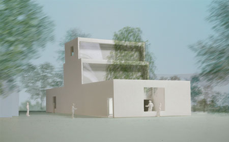
R Since you mentioned ‘gap spaces’ yourself, I have to ask you to elaborate on this. In PET Architecture and Made in Tokyo you write about gap spaces, but in a very different way. In those books, gap spaces are the small urban cracks in between buildings that can be filled with another, very small building. However, at Krabbesholm your notion of gaps suddenly becomes leftover vacuums in between the four boxes of the building.
M Gap spaces are certainly one of our darlings, but also something that originate from the regulations with which we must comply as architects. When we talk about gap spaces in Tokyo, it is not some architectural jargon we are fancy using, but a concept we simply cannot ignore. At Krabbesholm, the context is rural rather than urban, and the building regulations are very different. Consequently, it does not make sense to talk about gap spaces in the same way as we do in Tokyo. Yet, we did actually try to create an outdoor gap by placing our building very close to the adjacent Idé-Pro factory, but they objected and we had to move the building further away. Instead, it became obvious to us while detailing the gallery that the narrow interior spaces between our four boxes can be seen as a new kind of gap space, since they constitute negative space in between bigger volumes from where the sky can be glimpsed, just like exterior gap spaces in Tokyo.
T When you traverse through the building, it seems as it has been devised from the inside out. However, when you talk about it, you seem to be more concerned with the totality of the building as thought from the outside in. Nevertheless, the building has very precise window cuts, although they do not honour Krabbesholm’s obvious picturesque views of the garden or the fjord, but instead frame distinct and surprising views. It is as if you choose to frame the densest places that can be found at Krabbesholm with the intention of creating some kind of urbanity in this relatively rural setting.
R And to supplement that, the top studio has no window facing the park, which is part of the social space of the school. You make this residential area extremely private by opting out a window to the social realm. Nonetheless, I see this as a great quality, since a resident at Krabbesholm is ‘exposed’ almost constantly. The fact that you create a sanctuary at the top – from which residents do not notice the school – emphasising that views are also about what you do not see.
M We did a study to map the different views from the Krabbesholm buildings. In the private work space at the top, the wall was very important to us. It was crucial for us to ensure that there would be a whole wall without openings on which artwork could be created or displayed, rather than connecting the isolated workshop visually with the public space of the park. And the same goes for the galleries: walls and exhibition spaces were our primary concern. As we state in our book Post Bubble City, we do not see views merely as picturesque scenes. Views can be too obvious and thus overwhelming to both architect and user. To us, a good view is not as fascinating as an interesting view, ‘interesting’ meaning ‘unconventional’ in this context.
T That makes a great deal of sense. However, I also hear you saying indirectly that your design is very much affected by the client’s input. In other words, that the given programmes and required functions are more important than, for example, framing a nice view. This is a pragmatic approach to architecture. However, it is striking to learn how little you emphasise your design and your architectural desires. You simply avoid proposing ultimate propositions that cannot – or should not – be changed.
M Dialogue is everything to us. We of course design the spatial composition ourselves, but we learn by listening to the client. Dialogue enables us to observe, which means everything to Atelier Bow-Wow. That is also why we have been so preoccupied with anonymous architecture in Tokyo, because it very honestly renders visible the immanent requests of its users.
R You sound very modest.
M Well, maybe I am. But that is because we are not interested in design solutions as such, but in finding a good answer. To get good answers, you need to ask good questions. That is why I am always engaging in a dialogue with our clients. Discussions are essential to us in improving our design. It goes back to what we call the “common language” of architecture, where dialogue is a mediator between user and designer. Since we as architects communicate with society through space, we must be in a constant dialogue with representatives of society; otherwise, what are we communicating? Sharing ideas through talk, rather than the architect being superior, is our mantra.

T When you talk about your building, it seems as if you pay attention to every single aspect of the process, rather than talking about the simple striking proposition with the clear concept, as other architects often practice. It is rather similar to your notorious method of drawing, where you put all details into one drawing rather than leaving out details in order to make a simple compelling representation that stands alone (see Atelier Bow-Wow’s book Graphic Anatomy). Is it a Japanese tradition, accumulating knowledge and putting it into one statement?
M No, it is a Bow-Wow tradition.
R And it comes from your innate need to observe, does it not?
M I never really thought of that, but yes, that is correct.
R Momoyo, allow us to sum up here at the end of the interview, since the discussion now seems to be pinpointing something quintessentially Atelier Bow-Wow: the way dialogue and observation are crucial elements of your practice. Atelier Bow-Wow is difficult to define by style, as your buildings do not seem to have a common architectural language. It is easier to define you by your method, your profound thoughtfulness and your partly theoretical approaches to architecture. Atelier Bow-Wow appears to be raising questions rather than giving answers. Your gallery building at Krabbesholm is perhaps not the only possible answer to the question of how to add a new building to the school, but it is truly a unique building that brings further the questions that you yourselves must have raised during the process. As visitors to the school, we have to ask ourselves what circumstances brought this graceful ascending bento box to rural Krabbesholm. Now we know. Thank you.
KRABBESHOLM HØJSKOLE
Founded in 1885, Krabbesholm is an old college rich in tradition. Occupying a special niche between a high school and university, Krabbesholm College is a Danish højskole which teaches subjects associated with art, architecture and design.
The højskole is a social experiment in which social interaction is crucial to its students’ education, and teaching is anti-authoritarian and opposed to the narrow structures of the established educational system. As a result, subjects at the højskole are never taught for their own sake, and the strictly professional is not viewed as interesting in itself. Instead, the topics taught must be wider in scope and take as their point of departure the individual and the fundamental issues of human existence.
The spirit of experimentation animates Krabbesholm College’s interest in collaborating with artists, architects and designers from both Denmark and abroad. New ideas often developed in concert with visiting artists result in projects of great importance to the students and the school. One such project is a photo house built in cooperation with the Californian architecture school SCI-arc. Another yielded plans by Lars Tingskov Mikkelsen and Yvette Brackman for furnishing students’ rooms. A third a guest house by Cuban-American artist Jorge Pardo. A fourth project called “The Idea of a Chair” has elicited contributions from some fifteen artists, architects and designers, including Ulrik Heltoft, Jason Dodge, Martin Boyce, Jorge Pardo and Chris Thurlbourne. And a fifth project is a book series of 20 books – including books on Anton Vidokle, Jorge Pardo and Michel Auder – designed to recapitulate some of the many stimulating projects occasioned by Krabbesholm College.
Krabbesholm Højskole
Krabbesholm Allé 15
7800 Skive DENMARK