Henry Wilson Studio converts former bakery into Sydney Aesop store
Australian firm Henry Wilson Studio has transformed a former Sydney bakery into a retail space for skincare brand Aesop, exposing the original sandstone walls (+ slideshow).
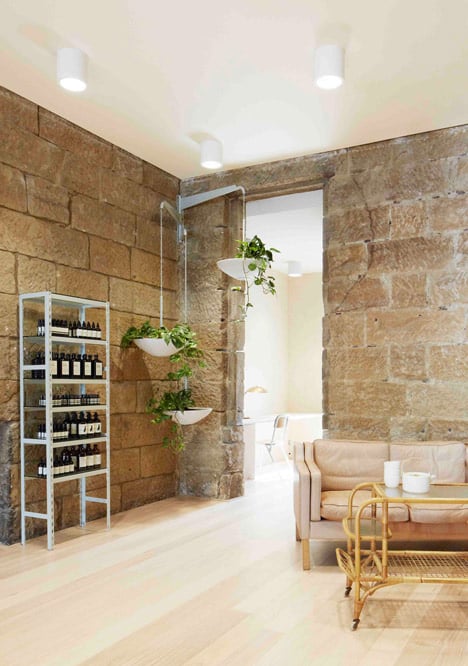
Henry Wilson Studio removed the space's former fit out, revealing the stone walls, fireplaces and previously hidden doorways.
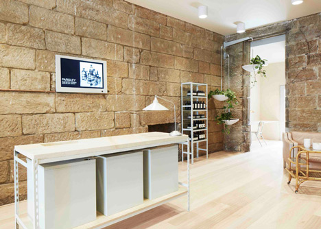
Designer Henry Wilson told Dezeen the brief was quite open, and they tried to retain and expose as much of the existing building as possible in an attempt to reference the history of the area and of the building.
"My self-assigned brief and discussions with founder Dennis Paphitis were about reworking 'off the shelf' components [that are] Australian-made wherever possible," Wilson explained.
"Before Aesop took over the space it was a bakery," he added. "Prior to that, locals in the area tell me that it was once one of Balmain's first pubs and even a brothel at some point."
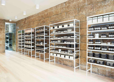
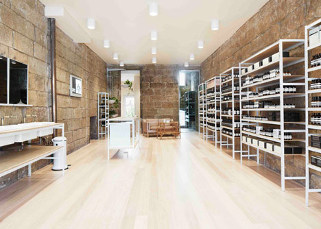
The designers chose a pale colour palette for the interior to compliment the yellow of the original sandstone walls and make the most of the natural light that floods in from the street front and rear windows.
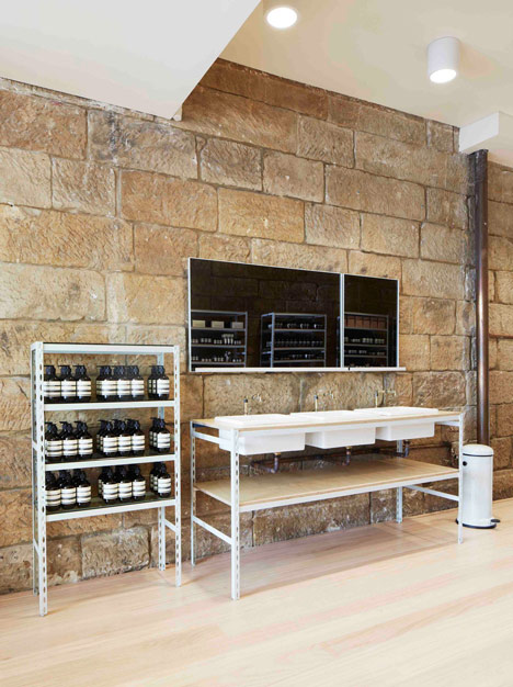
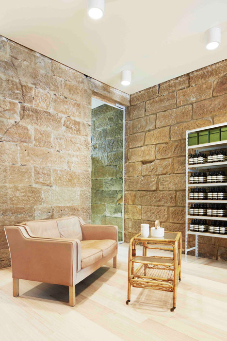
"The stone walls are typical for buildings of the area, and of that era," said Wilson. "Sydney sandstone is unique in its yellow colour and grey veins. It's soft and easy to work and the evidence of the primitive tools and unskilled labour can be seen in all the original blockwork."
A series of industrial metal shelving units have been added to display Aesop's products and line one wall of the store. Smaller versions are used elsewhere, with some of the shelves replaced by sheets of bottle green glass.
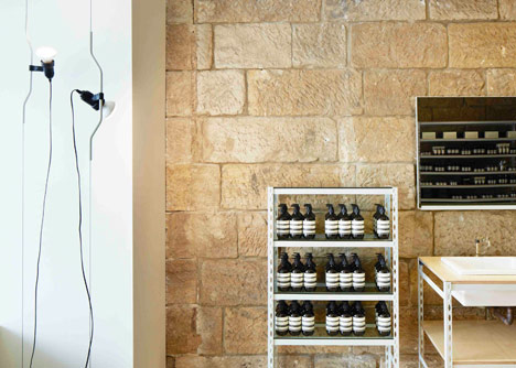
A row of sinks and mirrors are set against the opposite wall, along with the cash register which is also fixed on top of a newer slab of locally-sourced sandstone.
Hanging plant baskets, cane furniture and exposed copper pipes also feature in the interior.
This branch joins a long list of unique Aesop stores completed by various architects and designers. Dezeen spoke to the brand's founder Dennis Paphitis about why no two stores are of the same design in an exclusive interview.
Here's a project description from Henry Wilson Studio:
Aesop Balmain
The concept for the design of the Balmain Aesop store came from an understanding of the suburb, the existing materials and the context of the address. The aim was to present a space that was as familiar and utilitarian as the backyard shed, with a contrast that is the sophistication of the Aesop product and brand.
The history of Balmain and the neighbouring Cockatoo island is one of work, grit and industry. Much of this has moved on now, though, the legacy still resides in the buildings and foreshore.
The design of the Aesop store draws from these materials, colours and shapes. Removing the former fit out revealed raw sandstone walls, fireplaces and hidden doorways which have been retained and exposed as reference to this building history and place.
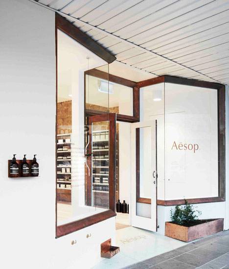
Detailing of the Balmain store centred around durability both visually and physically.'Off the shelf' industrial components presented in an alternative way than that of their original purpose, provide solutions for interior fittings such as shelving and sink frames.
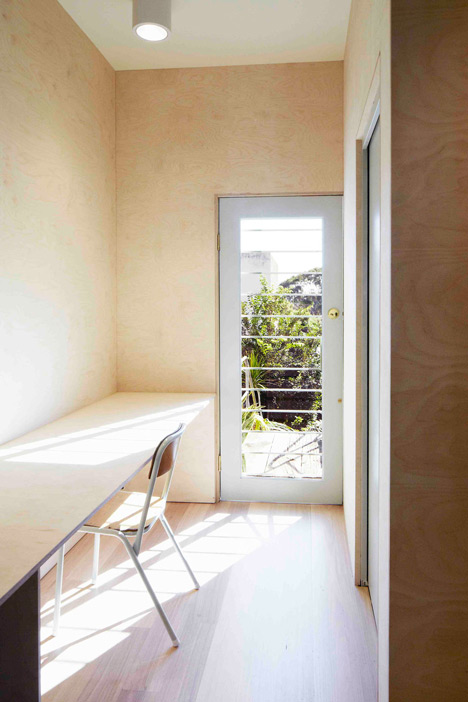
This 'reworking' extends to the vintage furniture and customised lighting. Tinted concrete terrazzo references the foyers of apartment buildings built in Sydney in the middle of the century. Pale Australian timbers and a light colour pallet has been chosen to emphasise the natural light from both directions.