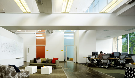
Facebook Headquarters by Studio O+A
San Francisco designers Studio O+A have completed the headquarters for social networking website Facebook in Palo Alto, California.
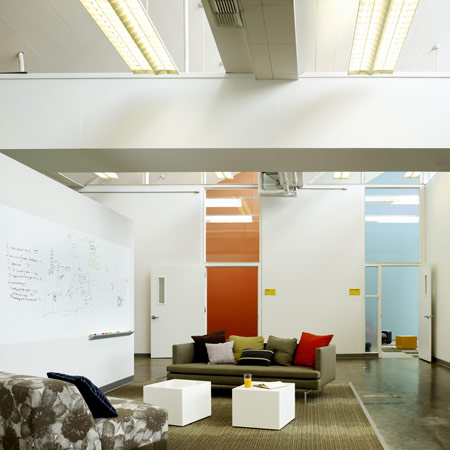
Located in a former laboratory constructed in the 1960s, the building houses over 700 employees.
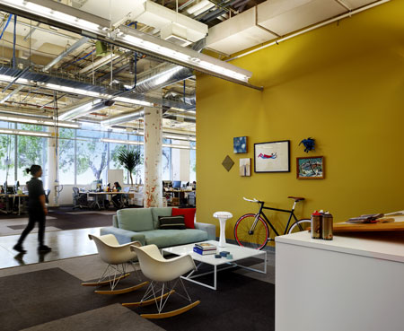
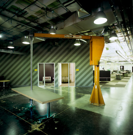
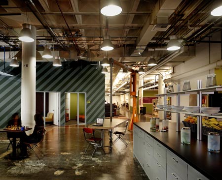
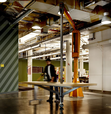
The designers re-used many of the former lab benches and equipment for the new offices.
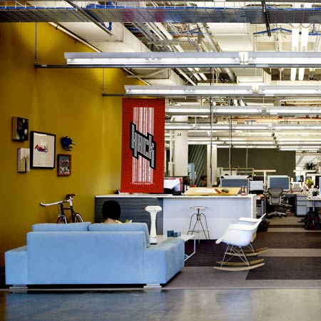
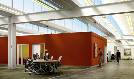
The design uses colour-coding to differentiate between teams within the open-plan space.
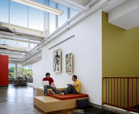
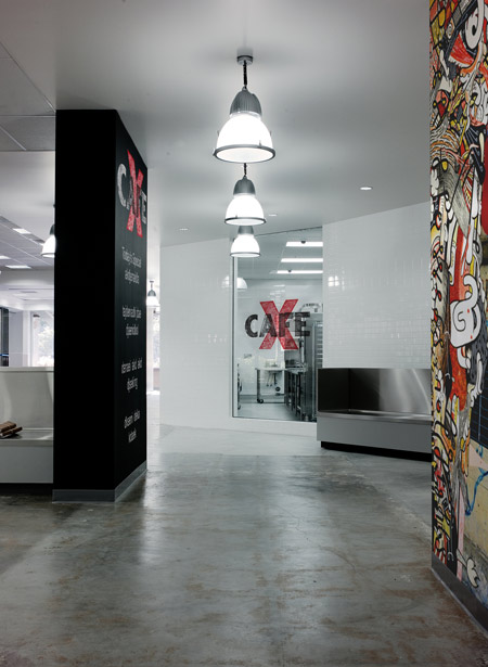
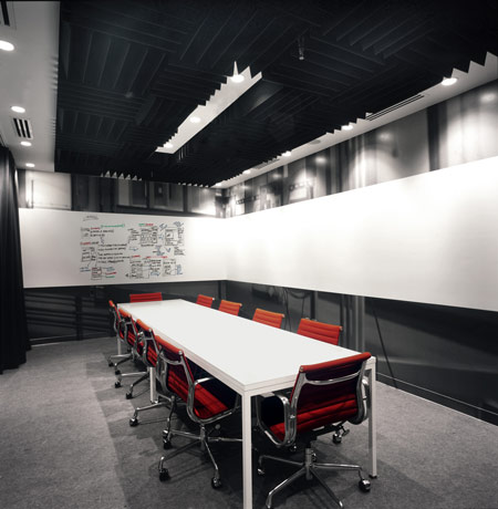
Some walls are left unfinished so that employees can add writing and artwork to them.
The Facebook website itself was used to consult employees about the new design and to keep them up to date about its development.
Here's some more information from Studio O+A:
--
Facebook Headquarters
Palo Alto, California
Employees of Facebook recently moved to a new headquarters that facilitates interaction and connection, reflecting the company’s mission as a social networking website provider.
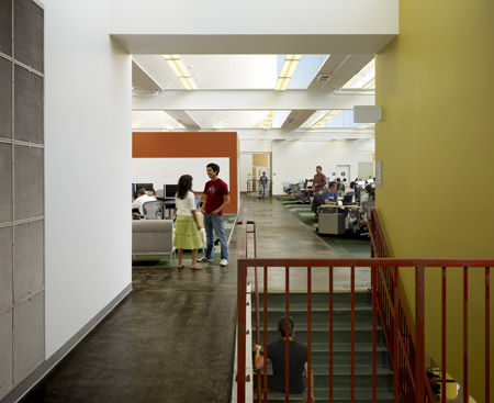
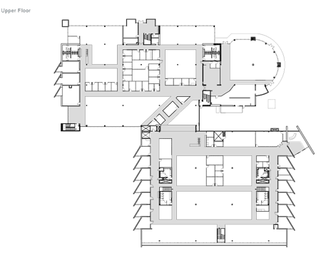
Formerly a laboratory facility for high-tech manufacturer Agilent Technologies, the 150,000-square-foot structure at Palo Alto’s Stanford Research Park brings together more than 700 employees originally scattered throughout 10 locations in and around downtown Palo Alto.
The design of the space relied heavily on input from the users, appropriate for a flatly structured company that weights every employee’s opinion equally. O+A designers interviewed employees about what they wanted from their new headquarters.
The Facebook platform was used to conduct company-wide polls about design decisions, post construction photos and updates, and keep everyone informed of the thought process behind the project.
An advisory board of employees from every department collaborated with the design team on the design process, from space planning to finishes to final move coordination.
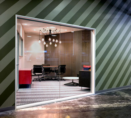
Because the new facility houses employees coming from various locations, the company wanted to maintain each division’s distinct identity. The design takes its inspiration from the patchwork nature of Facebook users and employees, bringing together seemingly disparate elements to form a cohesive pattern and using color and interior spacing to create neighborhoods within the open plan space.
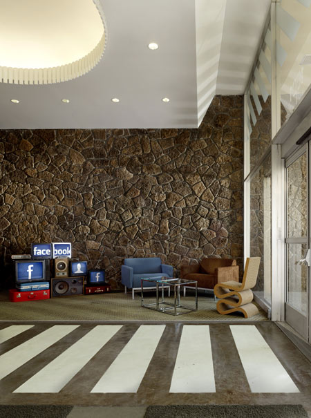
The company’s executives sit in central areas, accessible to all employees. Large lounges and open spaces provide venues for the community to come together.
A kitchen and café continue Facebook’s tradition of providing gourmet meals to staff at all hours, while drinks and snacks are available at micro-kitchens throughout the headquarters.
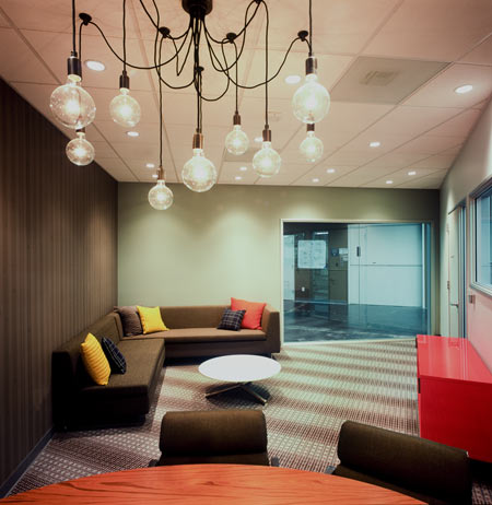
Reflecting employees’ desire for a green headquarters, the facility is the first commercial project completed under Palo Alto’s 2008 Green Building Ordinance, making extensive use of existing architectural features, recycling millwork from the original lab, and repurposing industrial components for post-industrial use.
Other sustainable features include high recycled-content carpet and energy-efficient lighting.
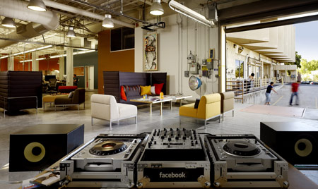
The design goal for the new facility was to maintain the history and raw aesthetic of the building and create a fun dynamic appropriate for the company’s youthful staff.
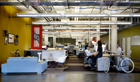
Many walls and spaces are left unfinished: employees are encouraged to write on the walls, add artwork, and move furniture as needed, allowing the building to evolve continuously.

A bright orange industrial crane, left over from the building’s previous user, was repurposed by San Francisco sculptor Oliver DiCicco to support a table surface from its heavyweight hoist, offering maximum maneuverability. Referencing the industrial aesthetic of the building, a felt canopy spreads up one wall and onto the ceiling, defining a central meeting area that can double as an impromptu auditorium.
Mounted on threaded rods of varying length to achieve an undulating effect, the canopy absorbs sound and is penetrated at intervals by overhead lighting. An outdoor basketball court and indoor ping-pong table offer opportunities for recreation. And it is not unusual to see employees zipping along the concrete floors on two-wheeled skateboards.
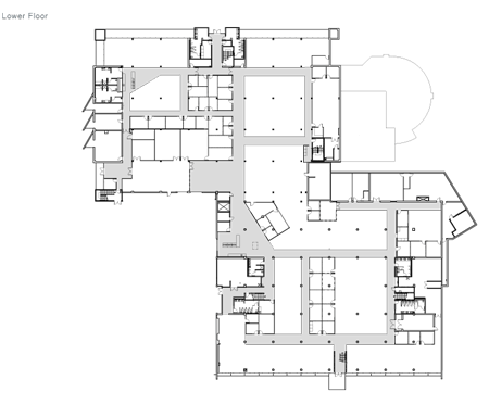
Click for larger image
Designers: Studio O+A
Studio O+A is a San Francisco interior design firm serving companies nationwide. Founded by Primo Orpilla and Verda Alexander during the dot-com boom of the early 1990s, the studio began with a mission to bring sophisticated SOMA design to Silicon Valley start-ups and the venture firms who supported them.
Click for larger image
That start-up mentality is still a key feature of the Studio O+A aesthetic, but through the years, the firm’s mission has broadened to include a range of services for a client base that includes such major American corporations as eBay, Levi Strauss, and Williams Sonoma. Earlier this year, Studio O+A was recognized by the International Interior Design Association with an award for its remodel of the San Jose hairstylist W’s Salon.