Smiljan Radić's Serpentine Gallery Pavilion looks like a crude model "made by a giant"
Movie: Chilean architect Smiljan Radić says he wanted his pavilion to have the qualities of a giant hand-made model in this movie filmed by Dezeen at the unveiling of the 2014 Serpentine Gallery Pavilion on Tuesday.
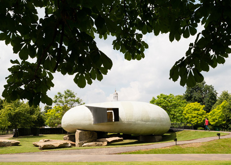
"Yesterday was the first time that I saw the pavilion finished," says Radić. "It was really impressive because it felt [as if] a giant had made this model for the park - a giant with his own hands modelling this big building for the park. That is great for me. That is really beautiful."
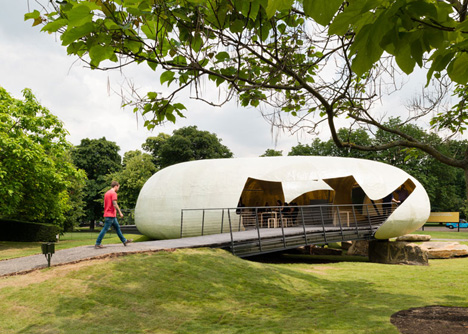
Radić's pavilion, which consists of a doughnut-shaped fibreglass shell resting on stacks of quarry stones, is the realisation of one of his own models made out of masking tape. He says it was important for him to translate some of the qualities of that model into the final building.
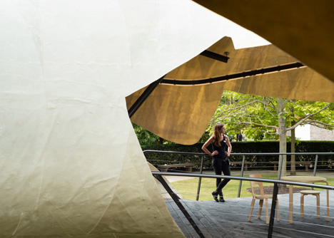
"This [pavilion] comes from a small model that I made with masking tape," he says. "The texture [of the fibreglass shell] comes from there. When you do a model you always have to refuse some ideas because they are too sophisticated when you change the scale. But here we changed not so much. You feel like you're inside a big model."
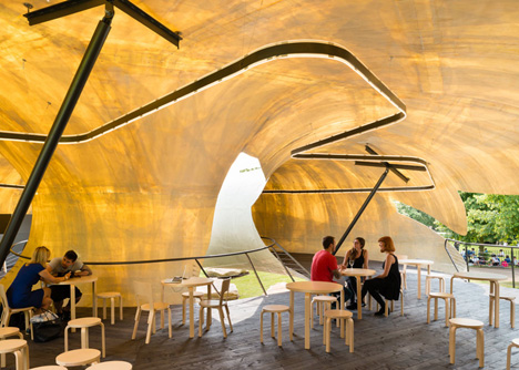
The key to achieving this effect, Radić says, is the rough, unfinished texture of the fibreglass.
"I worked with unfinished fibreglass because you never see it that way," he explains. "Everything is a little bit crude. And for me the texture of the material [has] a hand-made [quality]."
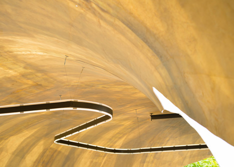
The imperfections in the fibreglass, which is just 10 millimetres thick, allows light to permeate the shell of Radić's pavilion. The structure is also broken up by a series of irregular openings to provide views out to the surrounding park.
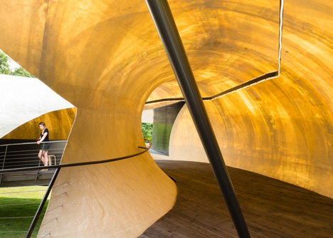
"From outside you will see an opaque volume, like a refuge," he explains. "But from inside you can see that it is translucent. There's [also] a relationship to the landscape, with a lot of holes so you can see the landscape of this beautiful park."
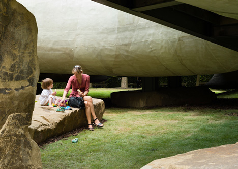
The thin, translucent fibreglass structure contrasts with the large, roughly-cut rocks, which form the base of the pavilion. Radić says this juxtaposition was inspired by eighteenth-century follies, ornamental pavilions popular in the gardens of the wealthy in Europe, which were often designed to look like ancient, even ruined buildings.
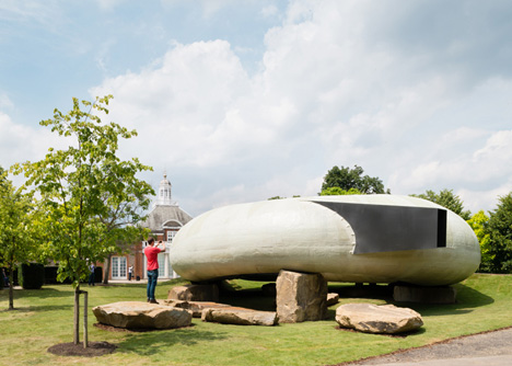
"A folly would always give you a sensation of extravagance, ambience, atmosphere," he explains. "I used some elements that you could find in those kind of follies. For example, the stones, which always means 'primitive', something permanent. That is the joke of the folly - they work with the idea of [being both] permanent and ephemeral."
Photographs used in this story are by Jim Stephenson, unless specified. All video footage in the movie is by Dezeen.
