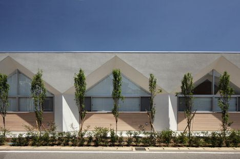
Soichi Yamasaki's Japanese nursery features house-shaped windows and faceted ceilings
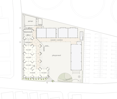
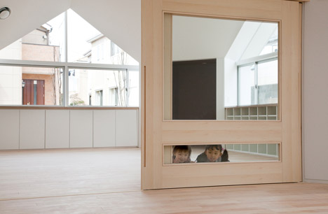
Behind the house-shaped windows of this nursery extension in Kashiwa, Japan, architect Soichi Yamasaki has slotted small square rooms between octagonal play areas (+ slideshow).
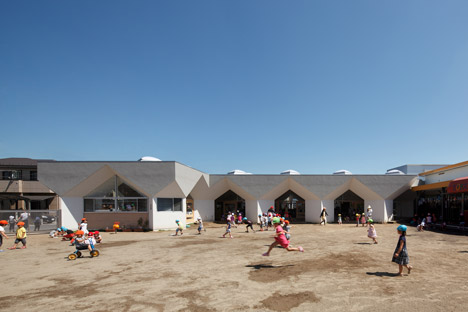
Tokyo-based Soichi Yamasaki – whose past projects include a house with a playpen for dogs – designed the extension as a continuation of an outdoor corridor that lines one side of the nursery playground.
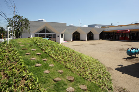
The new building sits perpendicular to the existing structure and contains five playrooms, an office and a new entrance.
The rooms facing the playground open onto a loggia-like decked area, which is sheltered beneath an angular roof structure.
To minimise the need for intrusive columns inside the building, the architect used a framework of vertical beams that branch out to form pentagonal and hexagonal surfaces.
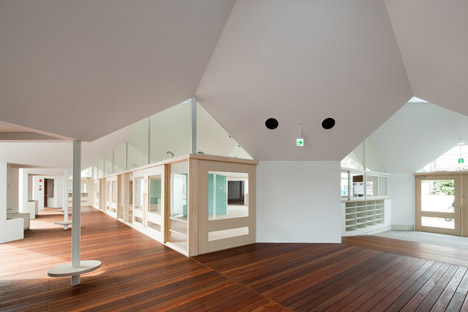
Square spaces, formed where the beams meet the ground, are used for storage or as additional play areas to supplement the main rooms on either side.
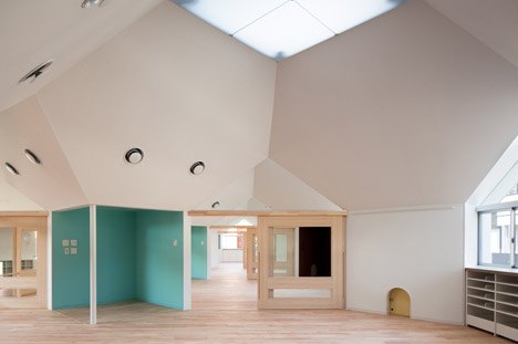
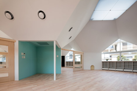
"The small boxes not only support as a structure, but also contain necessary functions for nursing, such as a storage space for chairs and tables, restrooms, shoe cupboards and so on," said Yamasaki. "Children love such small spaces."
Slender columns at the corner of these spaces incorporate circular seats, where children can perch to change their shoes.
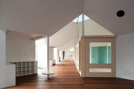
Large spaces used as the main playrooms can be closed off with sliding doors if required, or left open so children can move freely around the building.
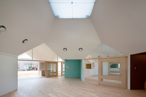
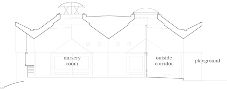
The polygonal ceilings above the playrooms culminate in translucent square panels that allow natural light to penetrate and enhance the daylight entering through angular windows.
LED light sources are integrated behind the translucent ceiling panels so artificial lighting appears from the same direction as natural light.
The shape of the room helps to maintain ventilation within the nursery during the summer months, when warm air is channeled towards the peak of the ceiling to be released through the roof lights.
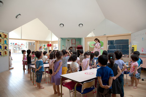
"In summer, warm air is discharged through the top lights, and fresh and cool air is provided from windows below," explained the architect.
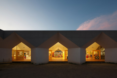
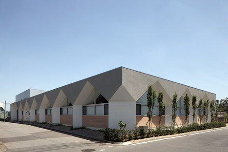
The building's exterior features the same angular aesthetic as the interior, with the external edges of the square walls protruding from the facade. This modular design means that further rooms could be added in the future.
Photography is by Kai Nakamura.
