Robert Storey Studio uses lurid colours to illuminate Nike presentation space
Set designers Robert Storey Studio used the bright colours of Nike's womenswear range to inform the brash interior of this New York presentation space for the sports brand (+ slideshow).
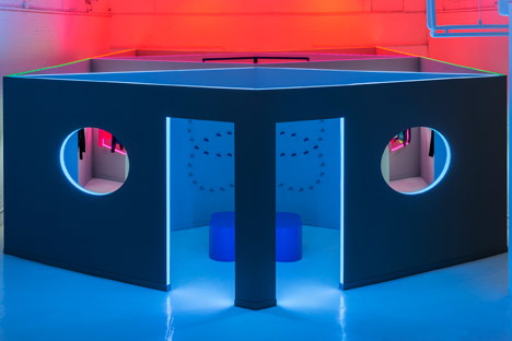
The symmetrical design by Robert Storey Studio for the Nike Women's Fall Holiday Presentation 2014 was formed from a sequence of two rhombus-shaped rooms fitted beside a pair of hourglass-shaped spaces.
Temporary walls were installed within an exhibition space on Mulberry Street, where exposed bricks and ductwork are painted white.
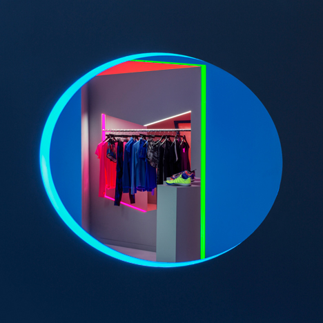
"I love to design symmetrical spaces so came up with the idea of an hourglass-type shape in which to immerse the audience and enhance the narrative," Robert Storey told Dezeen.
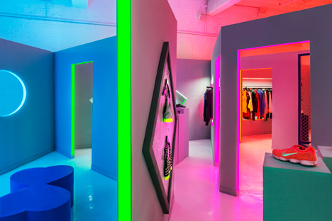
He worked on the project with creative director Jen Brill, who divided the Nike collection into pro bra, train, run and live sections she called "stories".
"I decided to take this literally and create a route for the audience to follow using a visual narrative of light," said Storey. "I cut out shapes from walls and made plinths, which directly reflected in the collection's design."
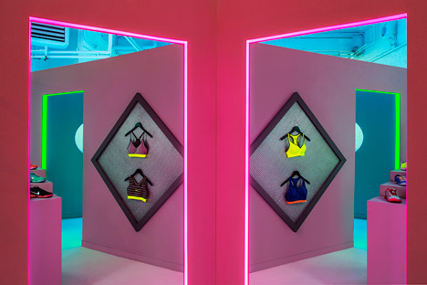
Doorways between the rooms and geometric openings in the walls were edged with fluorescent lighting, moving through blue, green, pink and orange.
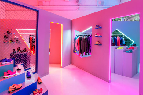
Some of the gaps were filled with wire mesh panels, while others featured clothing hung on metal rails.
"The space was designed with materials which I felt were sporty, feminine and urban; chain-link fences, brushed metal, gloss paint and iridescent lighting," said Storey.
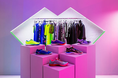
Stepped podiums displayed shoes, which were also supported on the walls by coloured pegs.
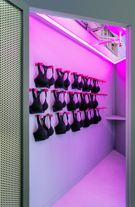
Diamond-shaped frames backed with metallic sheets displayed luminous sports bras, which were also hung from rows of pegs elsewhere in the pop-up.
"I think the installation was really intriguing and playful because of the symmetrical doorways and immersive lighting so made the viewer want to explore both the collection and the space," Storey said.
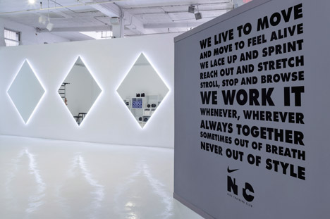
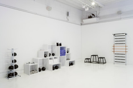
In place for a week in March, the temporary space also included an all-white gym space for selected visitors to work out while trying the merchandise and a fitting room for bespoke sports bra measuring.
Photography is by David S Allee.
Project credits:
Client: Nike
Designer: Robert Storey Studio
Creative Director: Jen Brill Studio
Construction: Aaron Somers Studio