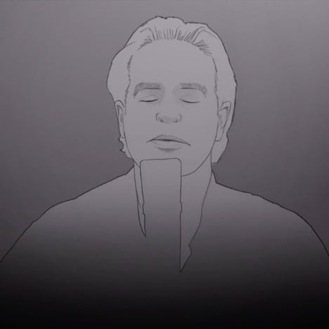
Stefan G Bucher animates Wesley Stace in his music video for Goodbye Jane
Dezeen Music Project: American illustrator Stefan G Bucher created an homage to the music video for Take on Me by A-Ha as the starting point for his collaboration with singer and songwriter Wesley Stace, AKA John Wesley Harding.
Graphic designer and illustrator Stefan G Bucher had been a fan of Wesley Stace for over 20 years, before a meeting after one of the singer's concerts on the tour for his latest album – his first published under his real name – led to a conversation about working on a music video together.
"I told him that I'd love to do some animation for him should he ever have need. To my great surprise and delight, he said 'Yes! As a matter of fact, I need animation right now!'" explained Bucher.
A director, Matt Grady, and a camera crew had already recorded footage of the band performing a number of songs from the album in a recording studio, and was looking for additional material to edit into the tracks and create a different look for each video.
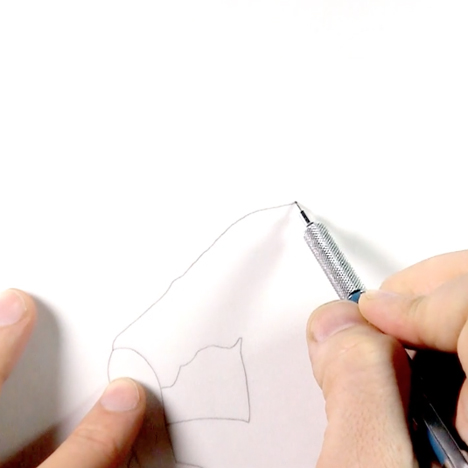
Bucher had been experimenting with hand-drawn animation, filming himself and using the footage to create a sequence where his head transformed into a monster.
"I started the animation by tracing my head on transparent paper — a homemade version of rotoscoping — and then morphed myself into monstrous shapes," said Bucher. "This is the piece that I showed Wes."
"For me, it would be an homage to the classic 80s video for the band A-Ha, directed by Steve Barron. It was one of the videos that made me want to become an artist. I asked Wes, 'Don't you want, don't you deserve, to have your own version of Take On Me?'"
Together, the singer and artist chose the track Goodbye Jane, with the idea that the animation would get darker in colour as the song progressed to represent the character "disappearing" into his own memories.
Rather than go for the standard minimum 12 frames per second for the animation, Bucher chose 10 frames per second to enhance this effect.
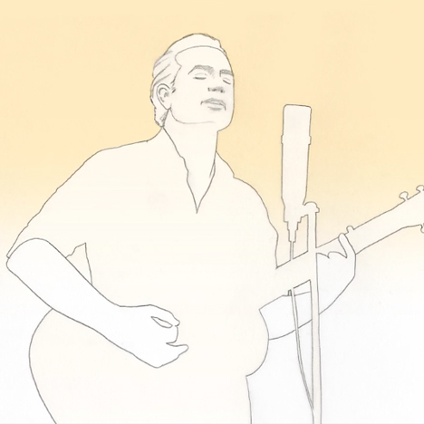
"The idea of the video was to create the dreamlike feeling of memories through the simple pencil art and through the low frame rate," Bucher told Dezeen. "It gives the whole thing a really languid feeling that complements the bittersweet, wistful feel of the song."
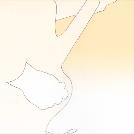
Originally, the video was intended to feature live-action film footage during the verses and animation during the choruses, but after seeing the first 100 frames of the animation, Stace suggested that the entire track be animated.
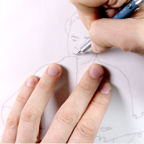
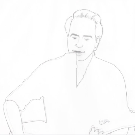
Bucher made prints of the original footage with one frame equating to one print out. These were traced with velum paper overlays.
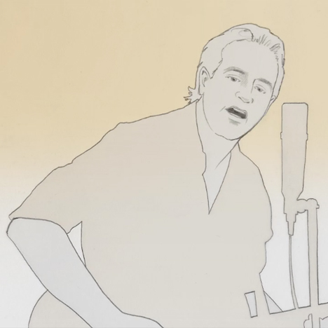
"The trick was to figure out the minimum amount of detail to bring the performance alive on paper," said Bucher. "Too few lines, and the animation becomes too abstract to make sense. Too many lines, and faces start looking wrinkled, and everything vibrates from frame to frame. A little vibration in the lines is the great appeal of this method, but too much would be frantic."
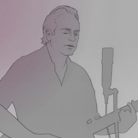
Bucher decided to leave out most of the detail from bodies and instruments, to keep the focus of the action on the faces of the musicians.
He originally planned to spend a month on the project – three weeks on pencil work and additional time for scanning and arranging the frames in After Effects. The project actually took three and a half months. The final stack of tracing paper weighed 12 pounds.
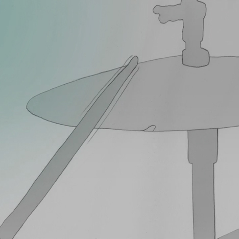
The original footage of the musicians – including lead guitarist David Nagler and bassist Eddie Carlson – had been shot on a handheld camera to give the footage a documentary feel. But once stripped down to a simple animation, this created a shake that "made it look as if I was drunk at the scanner" according to Bucher.
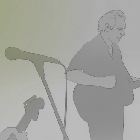
Rather than stabilise the footage, or arrange for it to be re-shot, Bucher drew all the frames and used After Effects to stabilise them in post-production. This required further editing and re-drawing of some of the images.
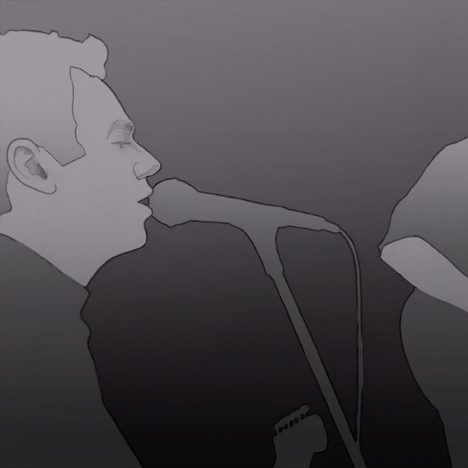
"While working on all of this I began to notice that I didn’t like some of the edits between shots," said Bucher. "So I added a few of my own camera moves in After Effects."
"By this point I was propelled by a mixture of obsessive-compulsive madness and embarrassment for not planning the whole thing out better from the get-go."
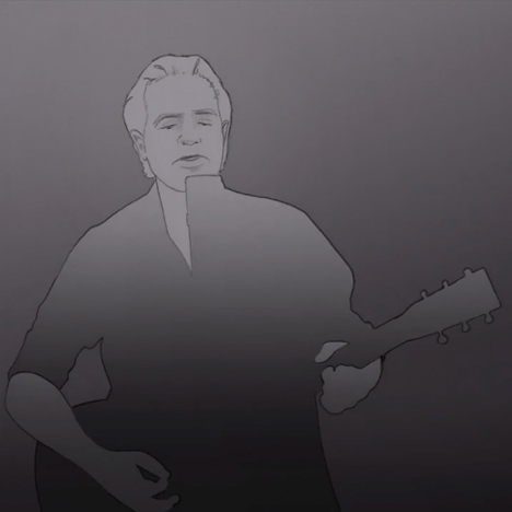
Adding colour to the footage also proved to be more complicated than he expected. The scanner had picked up particles of dust which affected the layering of colours on the computer and had to be cleaned up manually.
"Each clean-up pass allowed me to notice another level of little dancing dots, and led to two more weeks of removing over 20,000 individual grains of dust one by one," said Bucher. "I know that figure, because After Effects automatically assigns a number to each correction."
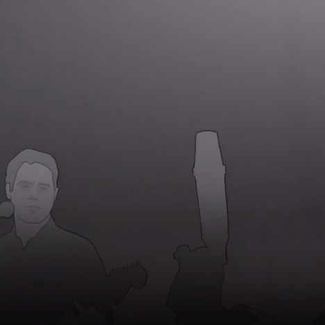
Bucher felt that he couldn't show his client the work in progress as it was too "dispiriting".
"I waited to get everything right, and my client was kind enough to let me. I gambled. Getting the enthusiastic thumbs up from Wes was a serious relief and a genuine delight," he said.
"In the process of making this video, I listened to Goodbye Jane hundreds of times, and I still love it. That’s the mark of a great song."