RIBA Regent Street Windows Project 2014 returns with 15 new installations
London Design Festival 2014: architecture studios have collaborated with retailers to create 15 bespoke shop window installations on London's Regent Street (+ movie).
"The RIBA Regent Street Shop Windows Project pairs architects and retailers to design exciting installations in flagship stores," explains RIBA London director Tamsie Thomson in the above movie, which was produced by Dezeen for the RIBA.
"We hope this project will really challenge people's ideas of what an architect can do."
The project features a range of different approaches to window displays, with some architects choosing to draw inspiration from Regent Street itself.
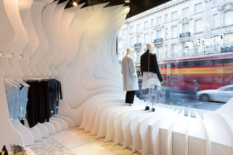
Among the participants is Atmos, who collaborated with Topshop to create a white ribbed "canyon" designed to represent the millions of people who shop along the street every month.
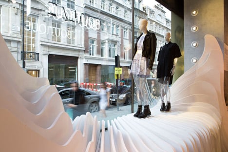
"Our installation is a celebration of the flow of humanity that surrounds this shop and carves out great canyons of opportunity," explains Alex Haw of Atmos. "The installation takes the quiet space of the shop and oozes it outside into the public realm, effectively drawing you in."
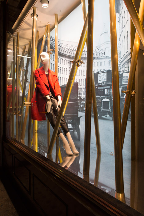
The window display for Hobbs by Donald Insall Associates pokes fun at the repairs currently being undertaken along much of the street by incorporating scaffolding poles into the design.
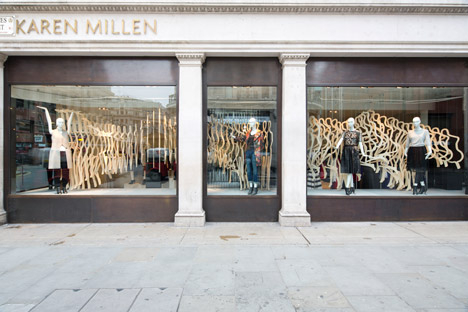
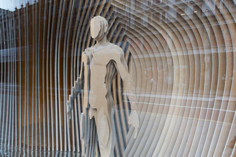
Other retailers asked the architects to focus directly on their brand. Emma-Kate Matthews collaborated with Karen Millen to produce a series of wooden silhouettes that fill all of the stores windows.
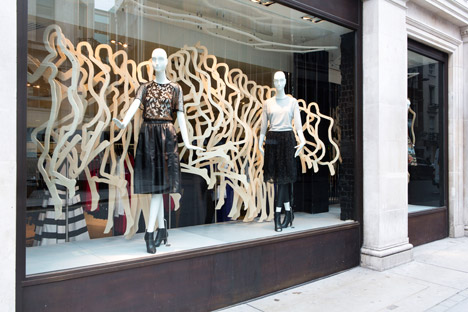
"My installation depicts the journey of the Karen Millen woman through London," she explains. "It's really interesting for retailers to work with architects, because architects look at spaces in a different way."

Al-Jawad Pike collaborated with Penhaligon's on an installation that draws on the history of perfumery.
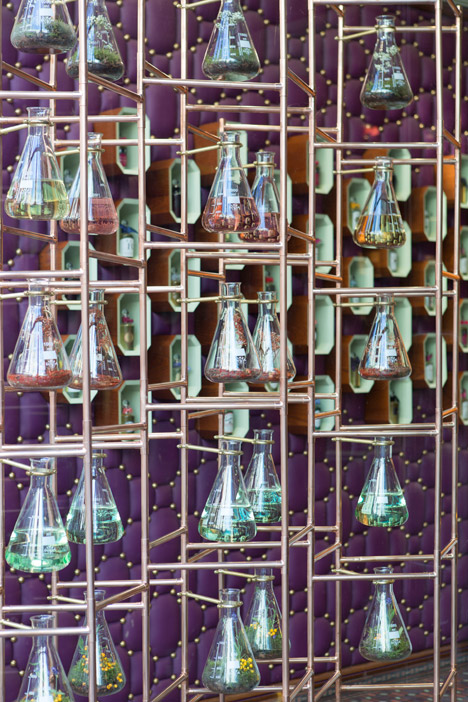
"Our installation is a collection of ingredients that Penhaligon's use in the fragrances, held within a collection of blown glass vessels," explains co-founder Dean Pike. "This installation has been an exciting opportunity for us because of its fantastic exposure on Regents Street and working alongside a great brand."
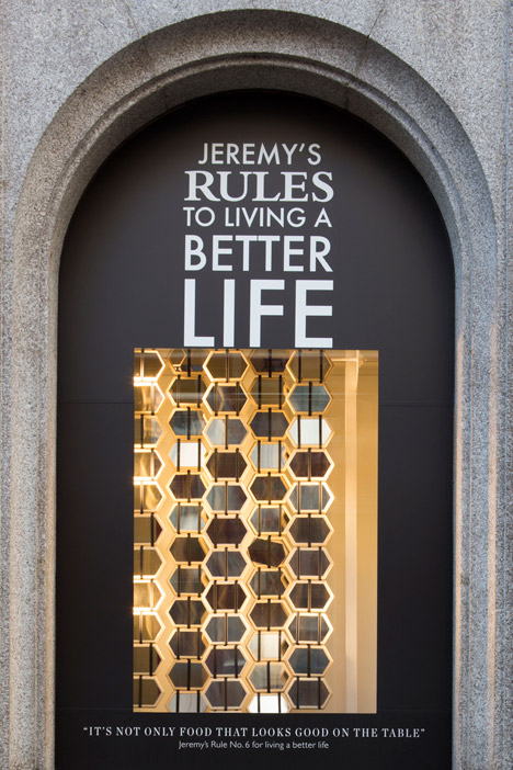
Some architects chose to focus on the latest collections of their partner brands. Jerry Tate Architects worked with Hackett to produce two large Jacob's Ladders – toys consisting of blocks of wood connected by ribbons – which seem to cascade down when a block is flipped.
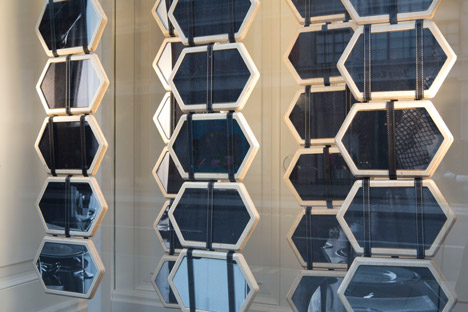
"Hackett were very interested in representing the two key campaign messages from this season: their premium menswear, but also the sense of humour behind that," explains Steve Wilkinson of Jerry Tate. "Our Jacob's Ladder will be turning over about 2.5 million times over the next month."
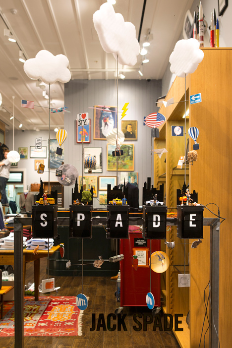
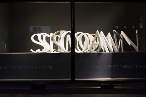
Designers who took a similar approach include Mobile Studio, who created a kinetic installation featuring images from Jack Spade's new collection, while Make have created a 3D-printed optical illusion for Banana Republic, which reveals the company's tagline for this season when viewed from certain angles.
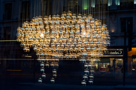
Squire and Partners created two chandeliers in the shape of a mythic golden fleece for American tailors Brooks Brothers.
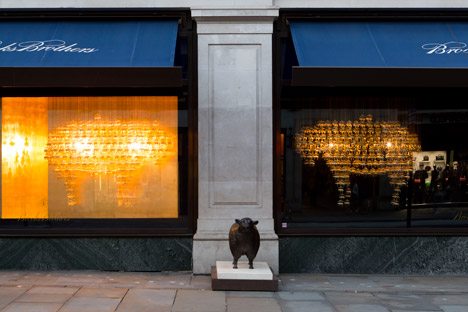
"Each chandelier is made from 360 hanging golden fleece, the symbol of Brooks Brothers," explains partner Tim Gledstone. "We couldn't find a model of these golden fleece, so we had to take old engravings from the Brooks Brothers' collection and 3D model those."
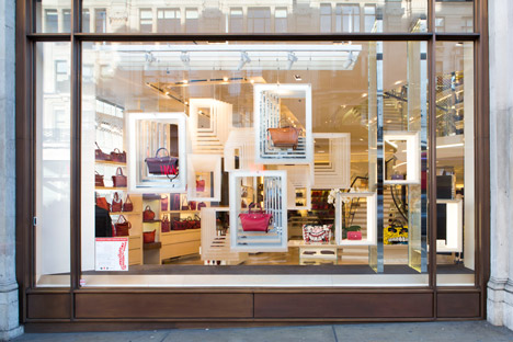
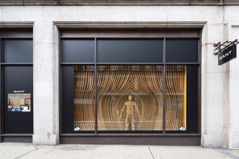
Squire and Partners are one of the more established practices who took part in the prjoect this year, along with Sybarite, who collaborated with Gant to create a window display out of cardboard reminiscent of the hull of a boat and Brisac Gonzalez, who created a window display for Longchamp.
The project also features installations by upcoming studios.
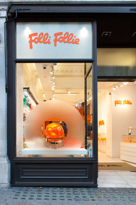
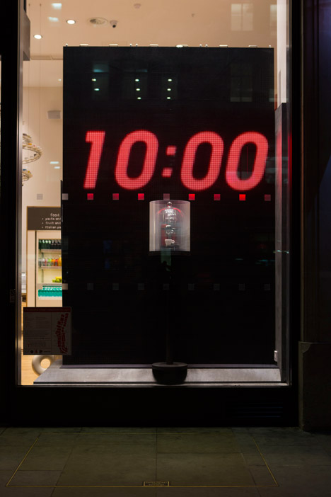
The younger architects involved include Raw Architecture, who worked with Illy Caffé to create a digital installation counting out the time it takes to make a perfect cup of espresso, as well as Denizen Works, who cast products by accessories brand Folli Follie in large resin balls.
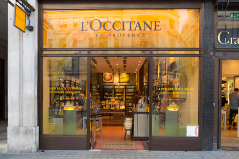
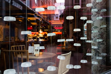
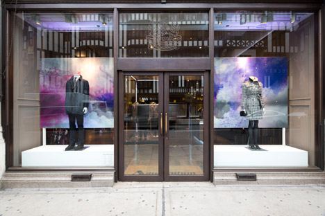
Other installations include Edgley Design's chandelier for Tibits, made from recycled wine bottles from the restaurant's cellar. Studio Emulsion created an abstract representation of the Helichrysum flower for L'Occitane, which is used in many of the company's products, while vPPR Architects played on the latin meaning of fashion brand Aquascutum's name by creating a window full of clouds.
The project is a great opportunity for architects to showcase their skills to the millions of Regent Street shoppers, but Thomson believes the collaboration is good for the retailers too.
"At a time when high streets are under threat from online shopping, this is a great opportunity for retailers to differentiate themselves," she says. "[The installations] create reasons for people to actually come into the store."
Photography is by Agnese Sanvito.
