RH+ creates daycare centre with a crumpled facade
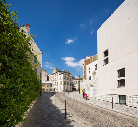
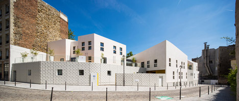
A crumpled white shell patterned with tiny perforations wraps around this cluster of small-scale buildings by French studio RH+ that form a children's centre in Paris (+ slideshow).
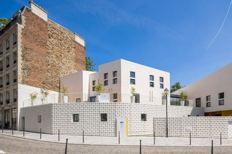
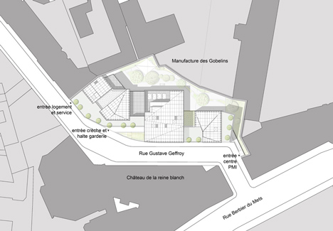
RH+ designed the nursery to occupy an undeveloped piece of sloping land on Gustave Geffroy Street, in the south of the French capital.
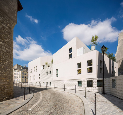
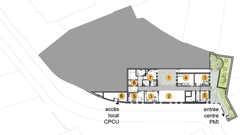
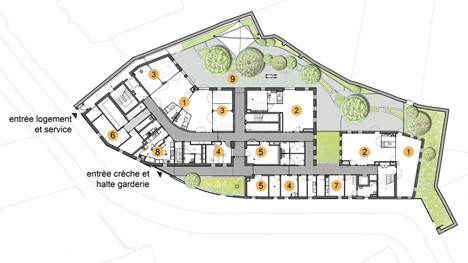
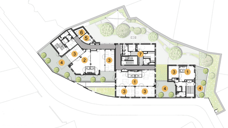
The centre provides educational, play and health facilities for children aged up to three years old and their mothers, as well as housing for nursery staff.
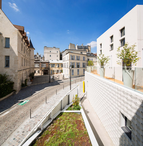
"The main idea was to design several small volumes instead of a bigger one," the architects told Dezeen. "This goes with the spirit of the Gustave Geffroy street, that gives the impression of being in a small town instead of Paris."
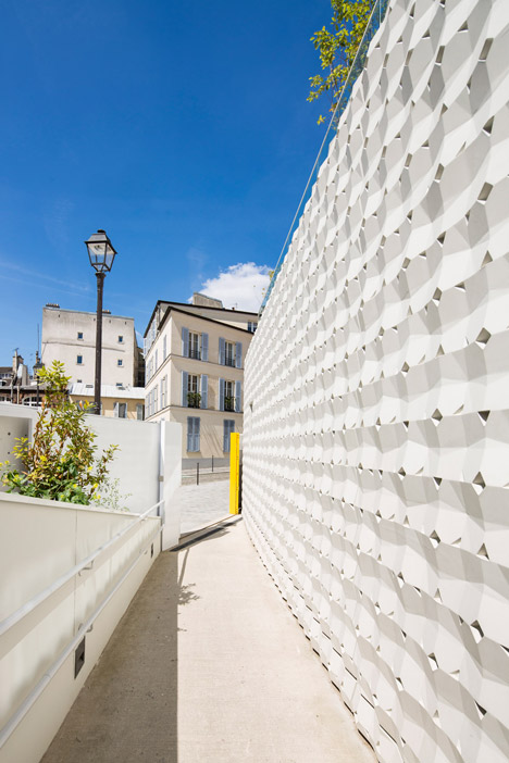
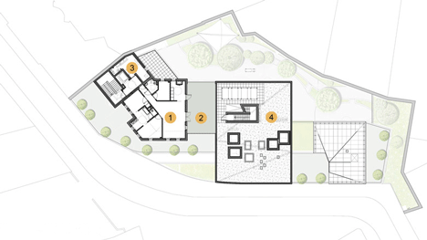
The centre comprises a series of small buildings that are designed to blend in with the differing roof levels of nearby structures.
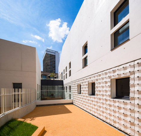
Three individual blocks house a community nursery and daycare centre with a capacity for over 100 children, as well as a healthcare centre for both infants and mothers, and on-site accommodation for the nursery manager.

A crumpled shell made from white fibre-reinforced concrete in an egg-box style arrangement surrounds the buildings. The architects designed the textured material to contrast the smooth facades of the main volumes.
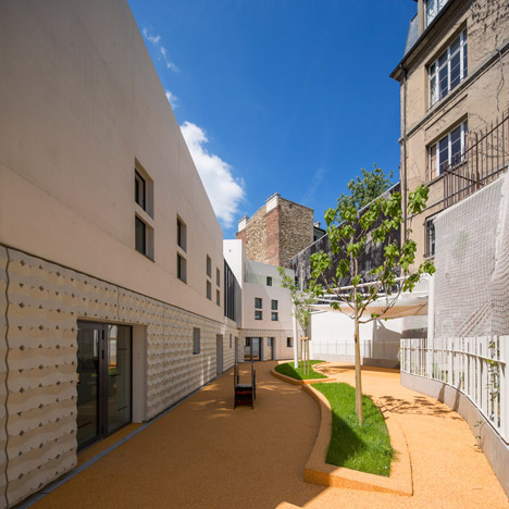
"We wanted to create a material that interacts with the sun and the changing lights that also creates a link between the three facilities," said the architects, whose previous projects include a university library with a timber-latticed facade in French Guiana.
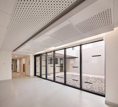
Perforations in the facade allow light to filter through to the interior spaces, while maintaining privacy from the street.
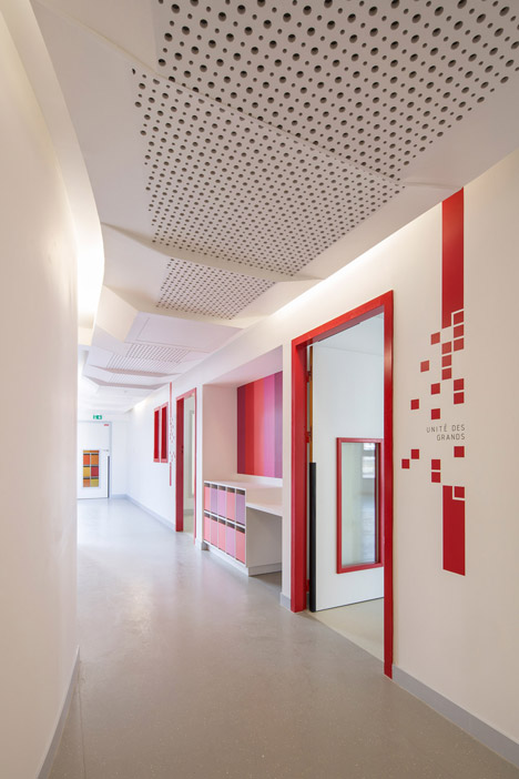
On the interior, the architects have continued this textural theme with slabs of ceiling plaster that have tiny holes punched through the surface. The plasterwork provides an acoustic absorbent for the space, and conceals overhead cabling, lighting and air conditioning units.
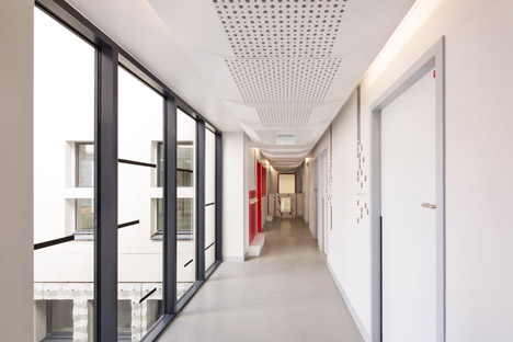
Spaces for children in three age bands, ranging from three to 36 months, are marked by a change in the colour of architectural elements, mosaic tiles, furniture and signage. The architects used a spectrum of oranges, yellows, and light and dark red to differentiate the areas.
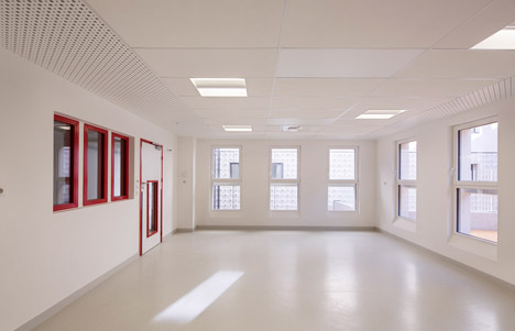
"Each category has its own colour, to help children to recognise their sections," said the architect.
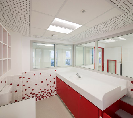
Large panels of glazing allow nursery staff to overlook terraces, play areas and nurseries.
"In a first instance it responds to a programatic requirement, as it is compulsory for a nurse to always have views of the other rooms and watch the children," said the architect.
"But, we pushed the idea further to have an impression of an open space instead of a series of rooms. It contrasts with the opacity of the outside of the building."
