Peter Barber uses a "collage of materials" in hostel for homeless people
London office Peter Barber Architects has remodelled a Victorian sheltered housing scheme in the city, employing different types of brick and render to indicate where new additions meet the original buildings.
Peter Barber Architects oversaw the refurbishment and expansion of the Mount Pleasant housing project – a centre for homeless people that aims to improve the quality of hostel accommodation.
The original building on the site, which occupies a narrow London lane called Mount Pleasant, was locally listed but there was a possibility it could be removed to make way for the new facility. The architects argued for it to be retained and adapted to meet modern requirements.
"While it wasn't a masterpiece, it was a good building that created a nice edge to Mount Pleasant," architect Peter Barber told Dezeen, "and also there was the ecological argument for working with existing buildings rather than knocking them down."
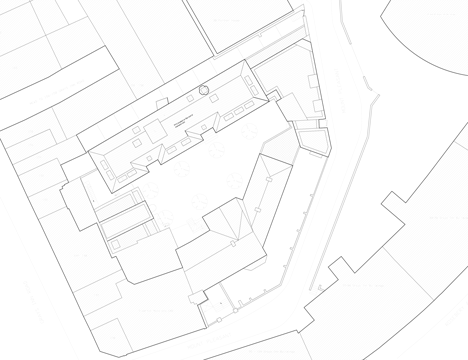
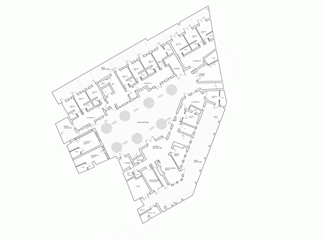
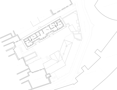
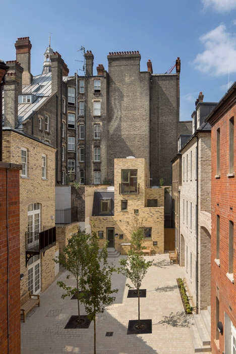
The H-shaped plan of the original hostel resulted in two cramped courtyards and included separate wings for men and women that were no longer necessary. The architects removed the central section to create a large central courtyard that functions as the main circulation space and social area.
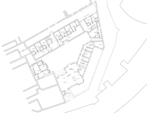
Communal facilities including day rooms, a counselling space, a laundry and a shared kitchen are positioned around the courtyard at ground floor level to encourage chance encounters between the hostel's occupants and their support staff.
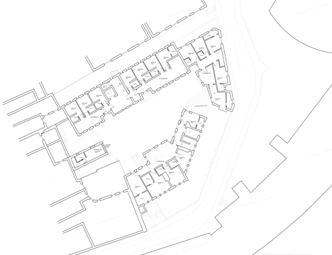
En suite rooms are spread throughout the buildings that encircle the courtyard, including two new additions at either end that contain shared living, kitchen and dining spaces for the hostel's more independent users.
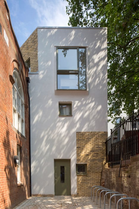
The addition of a new building along the plot's street-facing edge reinstates the line of a terrace that previously fronted the lane, according to 18th century maps.
Together with another new building at the opposite end of the site, the new structure fills the gaps in the facades to completely surround the courtyard.
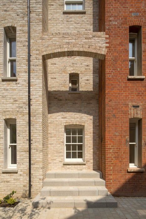
"As well as removing the middle section of the existing hostel we've added the two buildings that stand sentinel at either end to really complete the courtyard so it feels almost like an outdoor room," said Barber.
To help connect the new additions with the existing parts of the hostel and surrounding buildings including an adjacent mansion block, the architects introduced various types of brick that merge with the original walls.
Uneven joins emphasise the points where a yellow brick resembling traditional London stock and another paler brick used for the new structures meet the existing red and brown brick buildings.
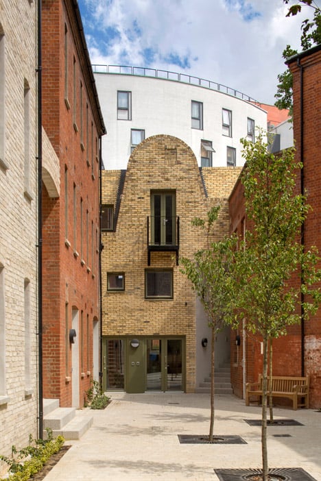
"I was interested in the collage of these materials and in the blurring of the old and the new," Barber added. "I like when you get old buildings that have been added to so it becomes a bit of a puzzle to figure out where the old ends and the new begins."
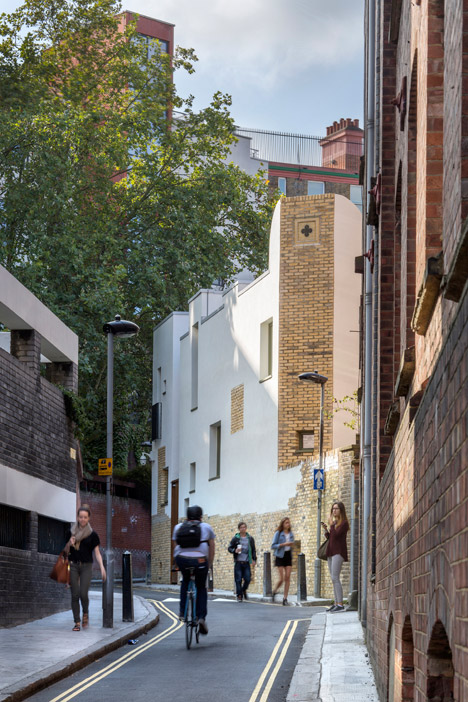
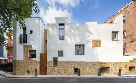
The external facade of the new addition on Mount Pleasant features a line of brick at its base indicating the position of a preexisting wall that had to be replaced.
An irregular line joins the brick with a white render applied to the surface above that references a building on the opposite side of the street. A square section of exposed brick that resembles a blocked up window was added as a visual detail.
Photography is by Morley von Sternberg.
