SAU Taller de Arquitectura's Casa Migdia features sliding screens and a moveable wall
This house in Spain has triple-layer facades that allow varying degrees of light and privacy, and features a bedroom that can be hidden or revealed with the help of a sliding wall.
Casa Migdia is a single-family home in Granollers, designed by Spanish studio SAU Taller de Arquitectura in response to a brief that called for plenty of natural light and spaces that could potentially be enlarged in the future.
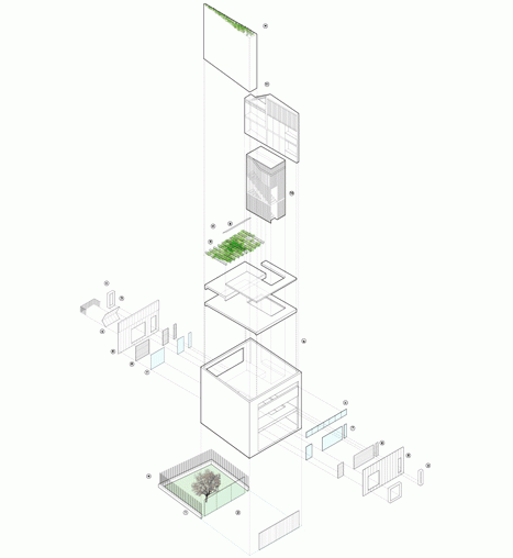
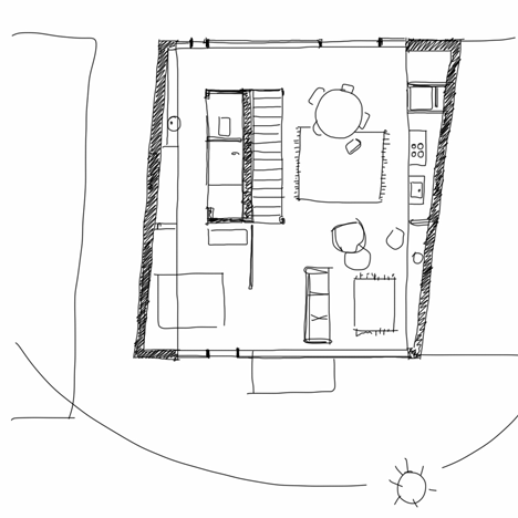
The plan is organised around a central service core that contains the staircase, storage and a bathroom. This allows the rest of the floor space to be left open, so it could easily be extended to the front or rear.
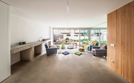
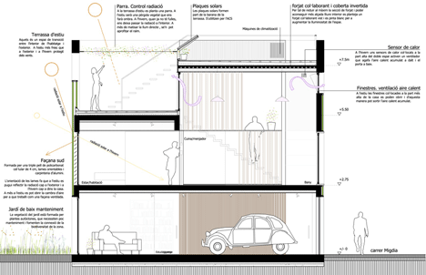
A garage on the ground floor connects directly with a family room, which is flanked at the far end by glass sliding doors that open out to a garden. A bedroom is also located on the other side of the central core.
Behind the staircase on the first floor is a dividing wall that conceals utilities accommodated on the opposite side.
This wall also forms one side of a passage leading to a master bedroom, which can be closed off completely or partially from the adjacent lounge, thanks to a set of sliding double doors that create a partition.
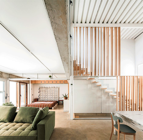
The building has awkwardly angled side walls to make the most of its plot. These are squared off inside by filling the resulting spaces with cupboards and other storage options.
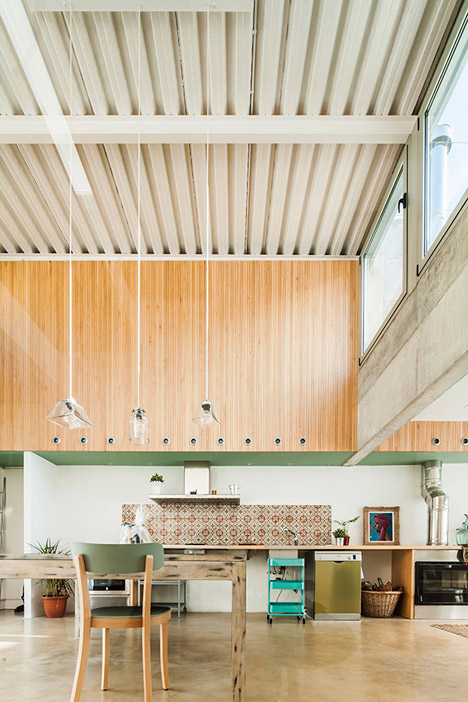
The kitchen, which is accommodated in a double-height space featuring clerestory windows, is partially nestled into one of these angular gaps.
North and south-facing walls oriented towards the street and the rear courtyard are formed of translucent polycarbonate, allowing daylight to permeate the interior from both sides.
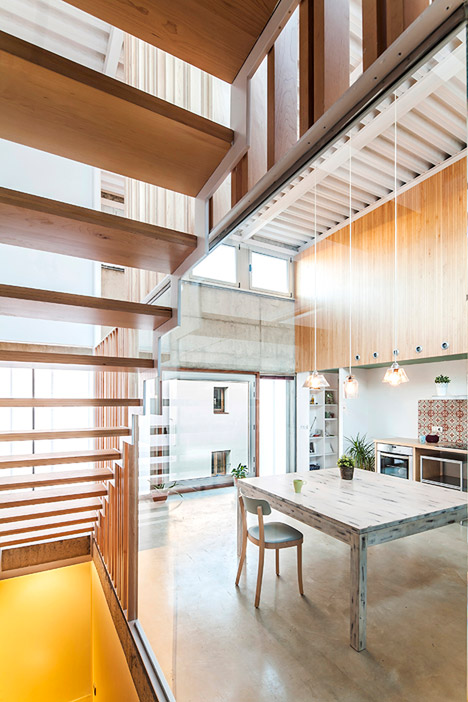
The four-centimetre-thick cellular polycarbonate surfaces form the first of three layers that create adjustable insulating wall systems for the two facades.
Double glazing used for the inner surface leaves a gap into which aluminium louvres are slotted. On the south-facing end, these louvres can be angled to reflect sunlight away from the interior during the summer months and direct it into the building in winter.
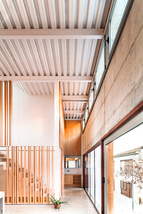
"The two main facades had been thought as a triple skin," said the architects. "They act as a filter to improve internal light, temperature and comfort conditions."
"We have worked with neutral and rough materials: concrete, glass, polycarbonate, maple timber... trying to create a non contaminated space which allows the inhabitants to bring their own colour and personality with their chosen furniture, vegetation, paints, lamps, racks," they added.
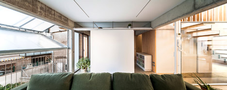
A section of the translucent opening at the rear of the house folds upwards to open the interior to the elements and provide access to a balcony.
Two roof terraces situated on top of the bedroom and the stairwell provide different types of outdoor space.
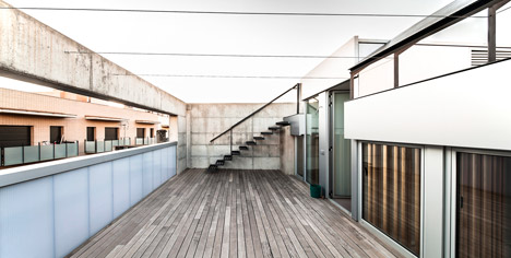
The higher terrace is exposed to the sun, while the lower one is covered by a pergola that vines will gradually populate to create a shaded and more private area.
Photography is by Andrés Flaszjer.
