Yellow mesh box sits atop Ateliers O-S's truck-driving school building in France
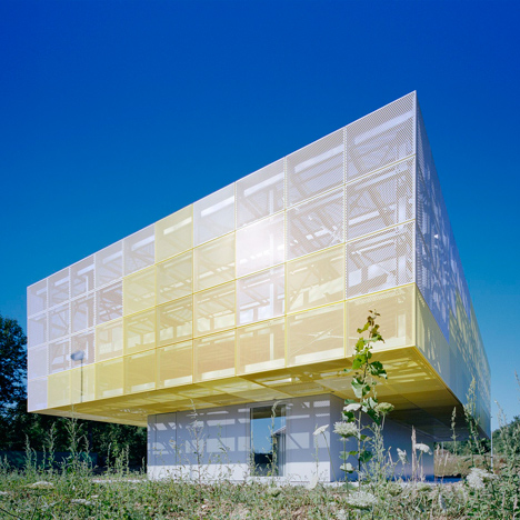
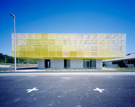
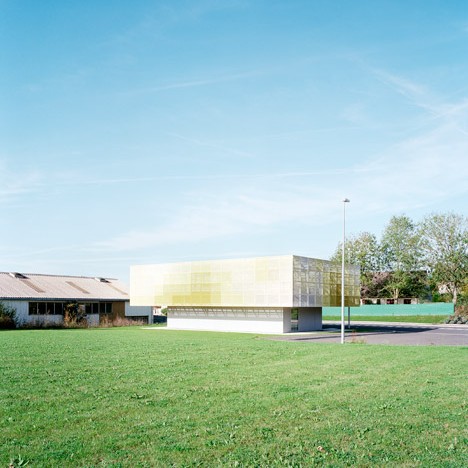
Pupils at this school near Paris take lessons on driving large trucks in a building topped with a perforated aluminium canopy, designed to evoke the look of a petrol station (+ slideshow).
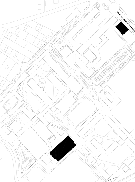
The classroom pavilion is one of two interventions by local firm Ateliers O-S Architectes as part of ongoing improvements to the Lycee Des Metiers Georges Cormier technical high school, which is located in a rural area in the commune of Coulommiers.
The firm also extended a workshop for vehicular maintenance and repair – one of the school's areas of specialism.
The two facilities are located in separate areas of a campus originally designed in 1969 by French architect Émile Aillaud, which comprises concrete structures decorated with green or blue mosaic.
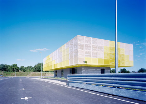
Both the new teaching building and the workshop reference the pixellated mosaic surfaces of Aillaud's design through their panelled facade treatment.
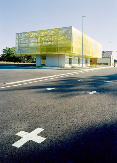
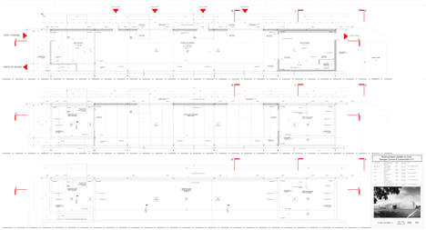
The classroom block is located alongside a new car park and track for test-driving heavy trucks. Its top-heavy form gives it a significant presence and a sense of scale that matches the size of the vehicles moving around outside.
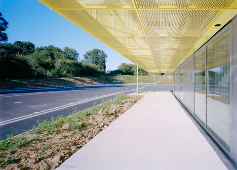
"The building is like a control tower facing a driving track that is part of the design," architect Gaël Le Nouëne told Dezeen. "The classrooms are in a visual relationship with the track."
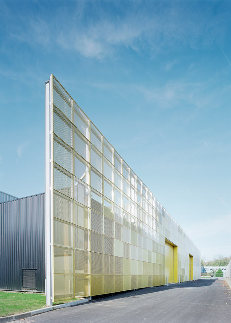
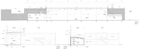
The cantilevered canopy is intended to evoke a petrol station or a highway toll point and provides a sheltered waiting area between the track and the classroom.
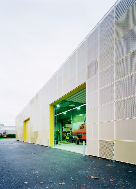
The aluminium panels also complement the campus's industrial aesthetic and allude to the material used by students when repairing the bodywork of vehicles.
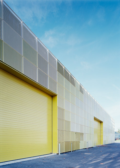
Mesh surfaces lighten the structure's overall aesthetic, while the application of paint in various shades of yellow evokes the hue of typical farm machinery such as tractors and diggers.
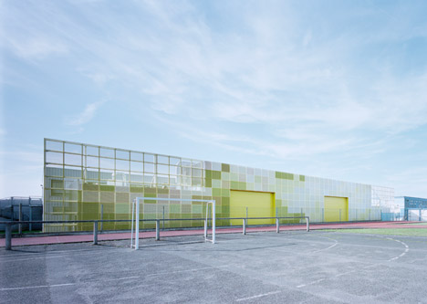
A screen made from perforated rectangular panels extends along the entire frontage of the workshop building, uniting the solid volumes and outdoor mechanical plant areas.
The extension allows partial views through its mesh surface and introduces colour to maintain a feeling of consistency with the rest of the campus buildings.
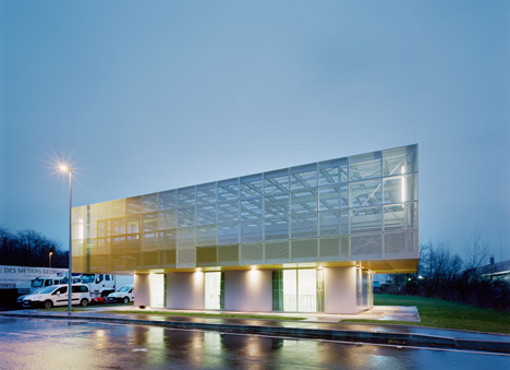
"The extension is like a screen facade that hides the technical amenities," suggested Le Nouëne. "It is designed as a new facade that enhances the existing building, like a filter, giving it unity."
Photography is by Vincent Baur.
Project credits:
Project team: Vincent Baur, Guillaume Colboc, Gaël Le Nouëne, Aurelie Louesdon (design phase)
Consultant: Betom
Building companies: Canard, Aimedieu, Missenard Quint, Colas
