Gablepack by AND features a facade of house-shaped windows
House-shaped windows of different sizes protrude from the facade of this mixed-use building in South Korea, offering clues about the "three-dimensional puzzle-like composition" of rooms inside (+ slideshow).
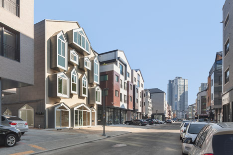
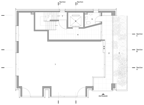
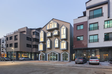
Designed by South Korean studio AND, the four-storey building contains a shop on its lowest level, while the three floors above accommodate five apartments – some single storey and some double storey.
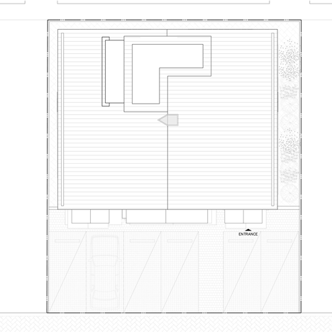
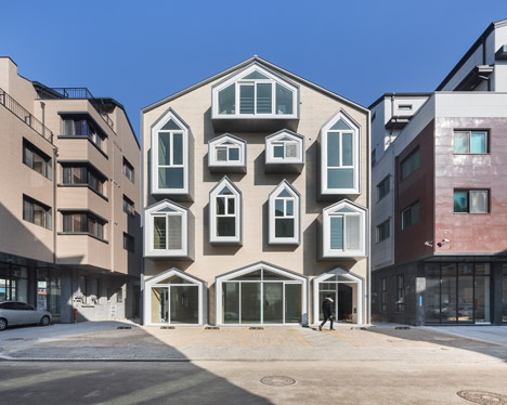
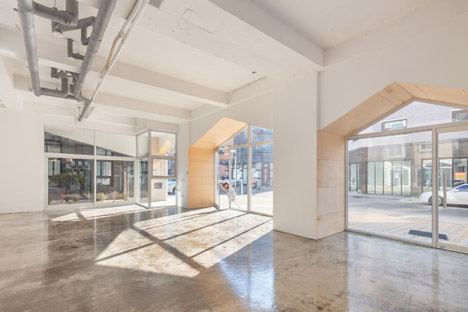
Unlike most of its neighbours, the building has a gabled profile. This is mimicked by the shopfront and the apartment windows, which project outwards to create what looks like a grid of tiny houses and prompted the name of the structure, Gablepack.
"Instead of only applying a gable roof shape in the exterior, we decided to actively use the gable form to improve the interior space," explained architects Eui Jeong and Tae Lee.
"We applied the gable form in the living spaces of the units, in the balconies, and on the windows," they said. "Thus, all the units have spacious floor-to-ceiling height and balconies with an open view."
The building is located in Gwanggyo, a new town in development just outside the South Korean capital Seoul. According to Jeong and Lee, the design is a reaction against the current influx of multi-storey blocks that look the same on the outside and often contain some residences that are very small.
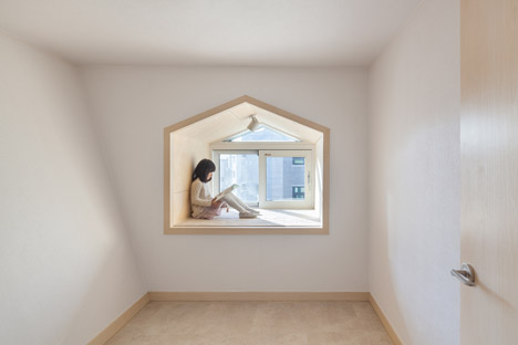
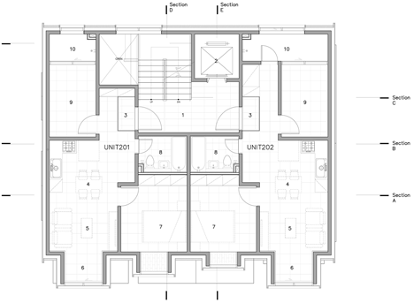
In contrast, all of the apartments inside Gablepack are the same size – 66 square metres.
"Due to the descriptively written local codes and the economic desires of the owners to maximise rentable square metres, most of the buildings in the area have structurally similar designs," said the architects. "Instead of following this 'architectural formula', the Gablepack proposes five residential units that are all similar in size."
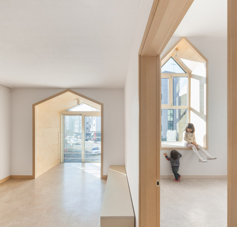
"Therefore, all the units can have two reasonable size bedrooms and a living room," they added. "It reflects the rental demand of the area, as most of the tenants in the area are families, usually a couple with a child. It creates a better return for the owner."
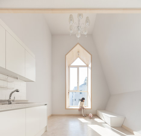
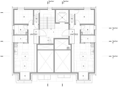
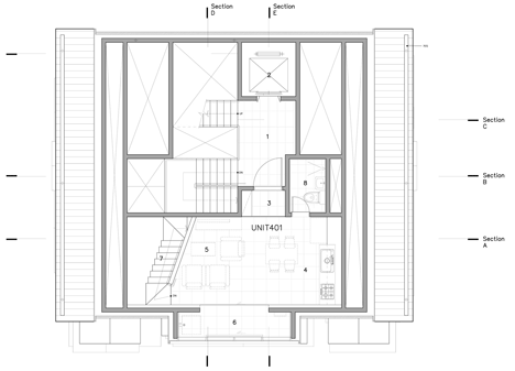
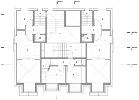
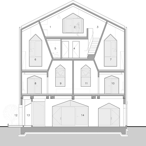
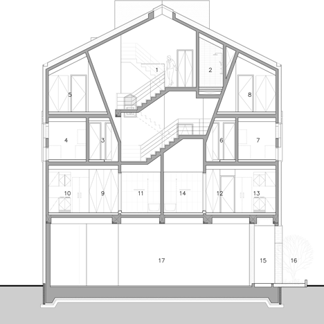
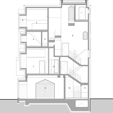
To make this possible, the building actually has the height of a five-storey structure. Inside, it contains what the architects describe as "a three-dimensional puzzle-like composition".

Two single-storey flats occupy the first floor, both featuring a double-height living space, while a trio of two-storey residences are spread out over the two split-level floors above. The windows offer the best understanding of this layout.
"The protruded balconies and the windows are all different in sizes, responding to the different characters of the units," said Jeong and Lee.
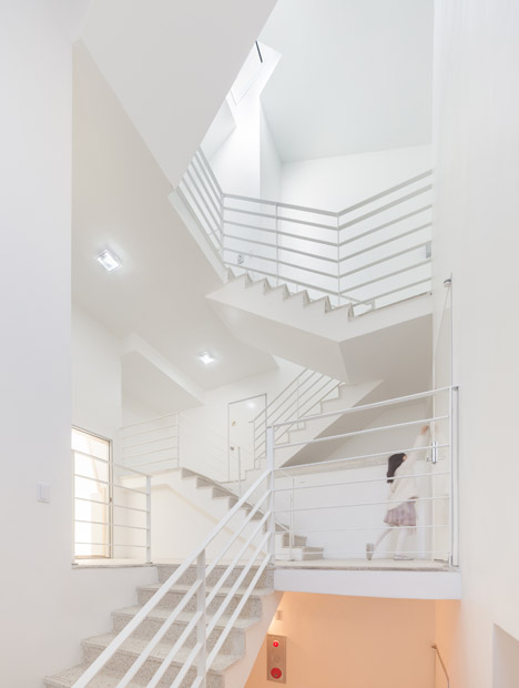
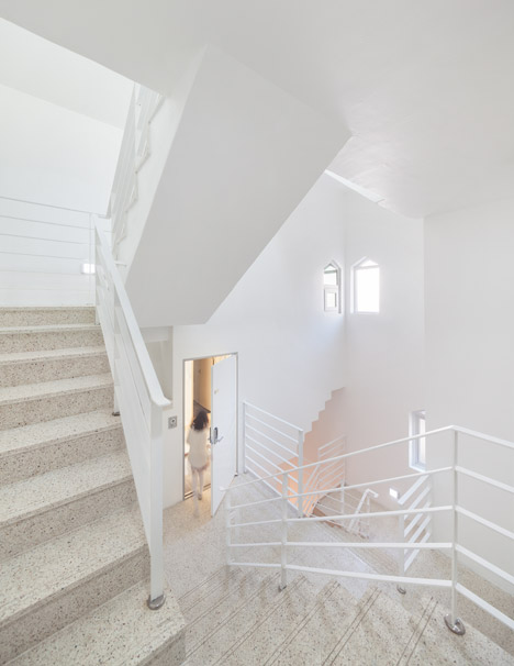
The residential entrance is situated on the right-hand side of the facade. It leads through to a generous hallway filled with natural light, thanks to a skylight above the stairwell.
Each home features a minimal finish of white walls and fittings, tiled floors and pale timber joinery, designed to offer new residents a blank canvas to decorate and furnish.
Photography is by Kyungsub Shin.
Project credits:
Architect: AND (Architecture of Novel Differentiation)
Structural Consultant: THE Structural Engineering Co.
