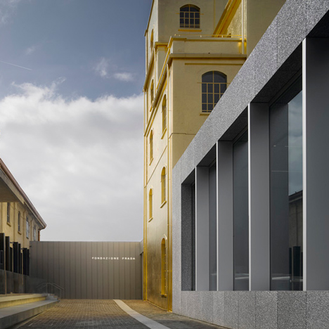
"This is not a refurbished building, this is Goldfinger's mansion"
Comments update: readers have described OMA's new arts centre in Milan, which is partially clad in 24-karat gold leaf, as "sublime" and "ridiculous" this week – read on for more on this and the other most commented stories on Dezeen.
Bling-bling: Rem Koolhaas' firm converted a century-old distillery into an arts centre for Fondazione Prada, adding two new buildings.
Kap was among the fans of the project, calling it "modestly beautiful with a clear reference to both the site's past and its future."
But it was Koolhaas' description of gold as "a cheap cladding material", that caught the attention of most commenters.
"It may be when you have Prada as a client," wrote Ivan Capitani. "This is not a refurbished building in Milan, this is Goldfinger's mansion, good only for the third film in the James Bond series."
James agreed: "It's a humble structure dressed up to go to a fancy dance."
"Perhaps using gold as cladding was a sensible choice, but I can't help thinking it was a stipulation from the client who was uncomfortable at not having something 'bling' about it." Read the comments on this story »

A league of their own: this week the Massachusetts Institute of Technology was named the world's best university for architecture in an annual worldwide ranking. The Royal College of Art was also named the world's top design school, but readers are suggesting that the scoring system is a waste of time.
"I wonder how anyone could rate and compare the actual quality of education without spending enough time in each of the schools," argued one commenter.
Some went further to discredit the findings: "This is a joke. Hong Kong Polytechnic University (ranked 12th) doesn't even have an architecture programme."
"Does anybody still believe this laughable type of PR marketing propaganda?" asked Hybrids. Read the stories and comments »

BIG deal: BIG is reportedly in talks to redesign the final tower at the World Trade Center site in New York, potentially ousting Foster + Partners from the project.
"I just think the Norman Foster proposal was the best looking of the 'lesser towers'," said Brennan Murray. "But if they do replace Norman, I look forward to seeing what they would do with the site."
Others were upset at the thought of BIG working on the sensitive project.
"They'll still propose a design that sticks out like a sore thumb and twist some fake 'context' into it," argued James M.
"It would be an absolute travesty to not see Foster's proposal realised," added Joe. Read the comments on this story »

Clickbait? Japanese studio Nendo reinterpreted the simple wooden door, but despite appreciating the "beautiful craftsmanship" commenters weren't convinced by the designs.
"I'm all for the reimagining of the door," said SteveLeo."But I'm not sure if any of these really work at a practical level."
"Easy, pandering and irrational," agreed Tzaar. "Nendo has become the clickbait of the design world." Read the comments on this story »