Joanna Laajisto references 1940s kiosks for Michel restaurant in Helsinki
Green-painted panelling, shiny white tiles and marble slabs line the walls of this Helsinki restaurant by Finnish architect Joanna Laajisto (+ slideshow).
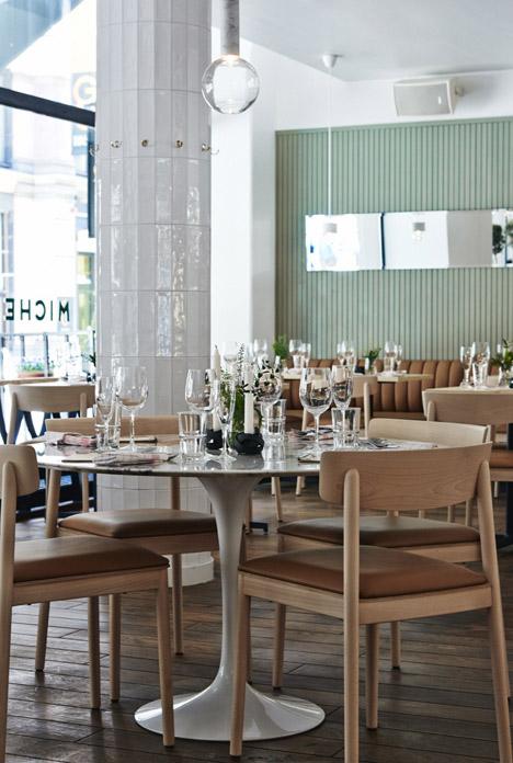
Aiming to create a casual and comfortable interior, Laajisto referenced kiosks that were built in the Finnish capital in the 1940s and 50s with her choice of materials for Michel.
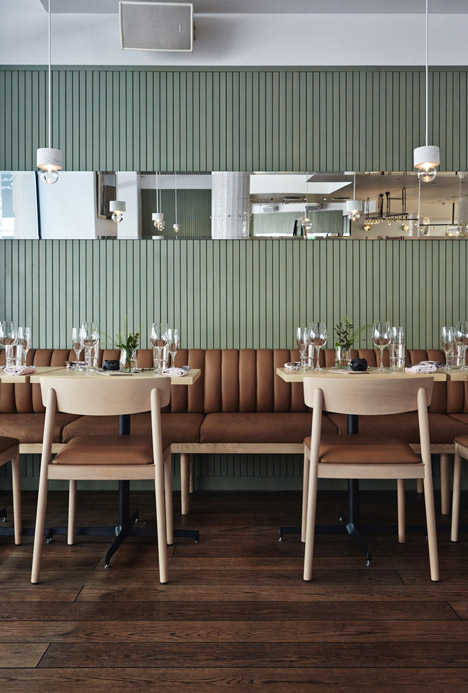
The kiosks were based on a design with an extended canopy by city architect Gunnar Taucher, and often feature wooden interiors and slatted panelling. This is most obviously reflected in the wooden lining used on the walls of the restaurant's dining area.
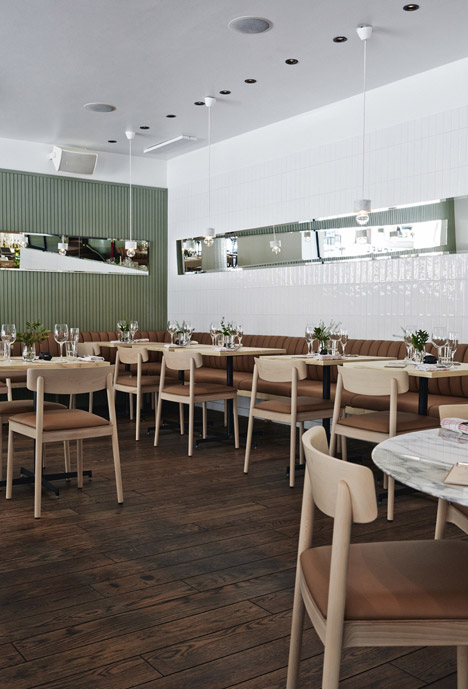
Located in the city's shopping district, the space occupied by Michel was previously a well-known traditional restaurant furnished with dark wooden tables and featuring large red columns.
These were swapped for a lighter colour palette including pistachio green, white and natural wood, using materials intended to appear "light and fresh".
"I wanted to create an intimate atmosphere that suits breakfast, lunch, dinner and cocktails," Laajisto told Dezeen.
"It was important that we wouldn't drive the old loyal customers of König away, but for the place to be timeless and fresh at the same time."
The dining area occupies the ground floor, and some additional spaces are located in the basement.
White tiles now clad the old columns, corresponding with the rest of the walls within the main restaurant area.
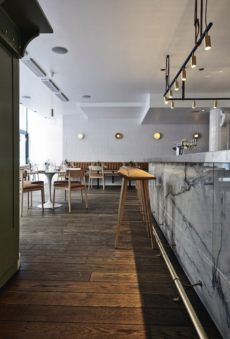
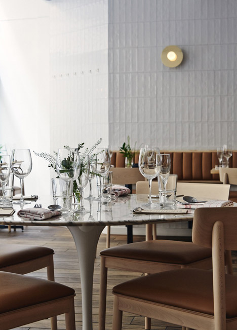
Dining chairs by Valencia-based furniture brand Andreu World are crafted from beech wood and upholstered in cognac leather.
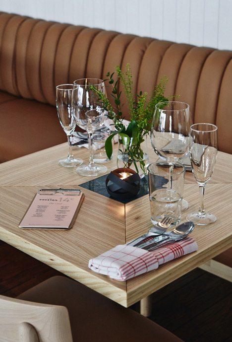
The majority of the tables sit around the edge of the dining room. These were custom made with ash wood and feature green marble insets.
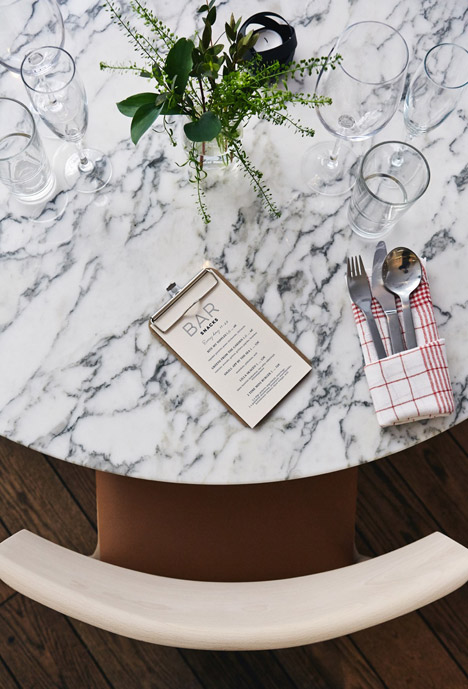
There are also two of the iconic circular marble tables designed by Eero Saarinen within the centre of the space.
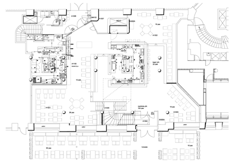
A cocktail bar clad in marble slabs with a stainless steel surface is situated in the centre of the restaurant, with rows of stools are lined up along its outer edges.
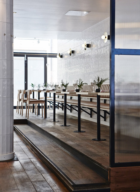
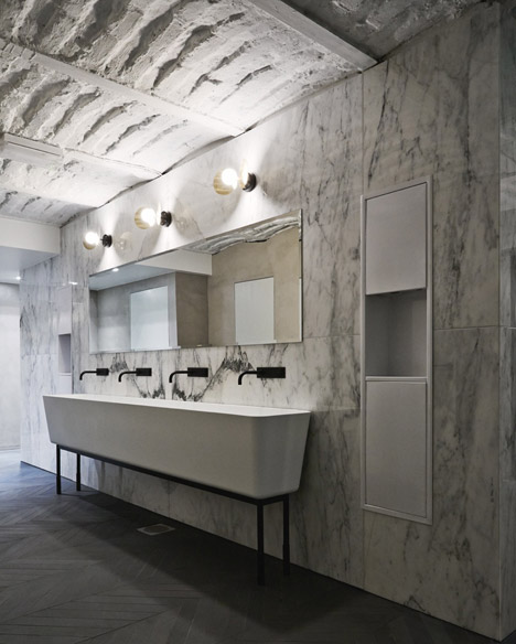
For lighting, brass sconces by French manufacturer Atelier Areti are mounted on the tiled walls of the restaurant and downstairs bathrooms. The rest of the decorative light fixtures are by Swedish manufacturer Rubn and Danish brand &tradition.
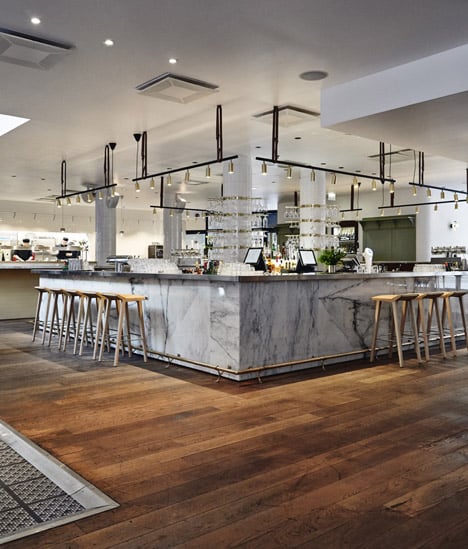
Two of the largest changes to the existing space included the relocation of the kitchen and conversion of the basement area – described by Laajisto as "dark and miserable" – into bathrooms.
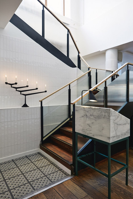
Corresponding with the ground-floor cocktail bar, the walls of the bathrooms are mainly covered in marble. A large trough-like sink by the studio sits underneath wall-mounted taps.
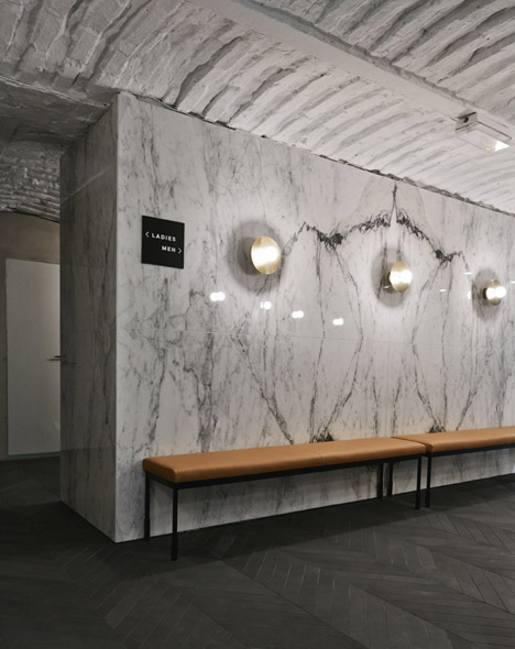
"I wanted to bring something luxurious there," explained Laajisto. "The place feels more like a powder room than a restroom with freestanding sinks, leather benches and dimmed brass sconces."
Photography is by Mikko Ryhänen.
