Tampa Museum of Art by Stanley Saitowitz
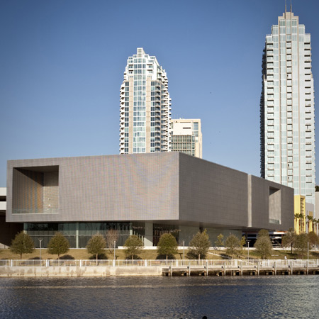
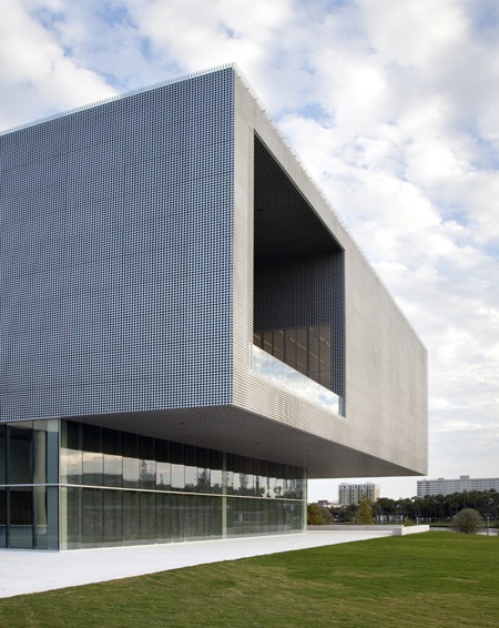
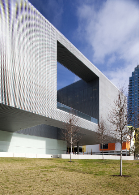
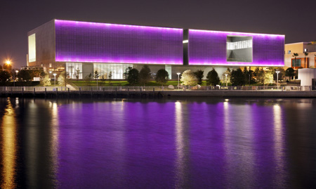
San Francisco architect Stanley Saitowitz has completed a museum in Florida, USA, which is wrapped in a perforated metal skin and cantilevers out from its glazed base.
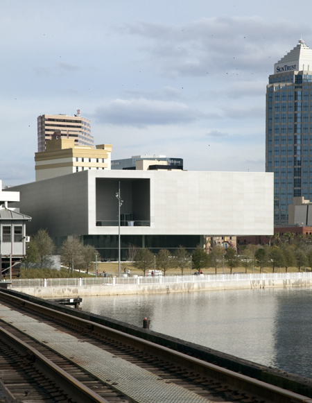
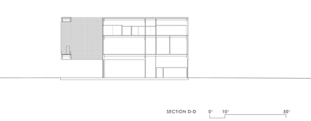
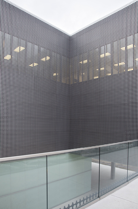
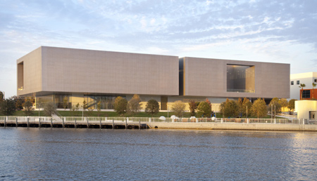
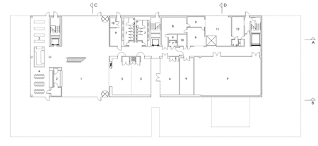
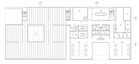
Called Tampa Museum of Art, the building is divided into two volumes, each organised around a courtyard.
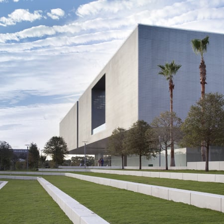
The first contains public areas of the museum and the other is for offices and curatorial facilities.
A cafe and bookstore are located on the ground floor overlooking the water.
The information below is from Saitowitz:
Tampa Museum of Art
Tampa, Florida
Museums began in ancient times as Temples, dedicated to the muses, where the privileged went to be amused, to witness beauty, and to learn.
After the Renaissance museums went public with palatial structures where the idea of the gallery arose, a space to display paintings and sculpture. Later, museums became centers of education, researching, collecting, and actively provoking thought and the exchange of ideas.
By presenting the highest achievements of culture, museums became a stabilizing and regenerative force, crusading for quality and excellence. The role of the modern museum is both aesthetic and didactic, both Temple and Forum.
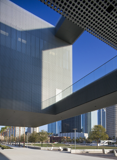
The design of contemporary museum can be characterized by two polar approaches.
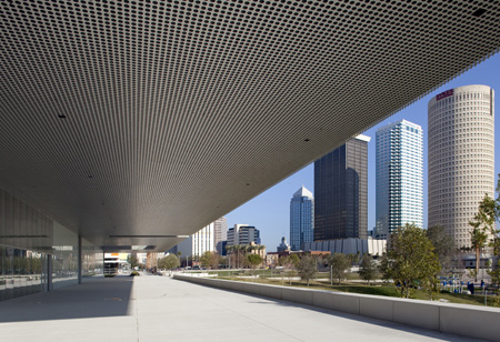
On the one-hand buildings which aim to be works of art in themselves, independent sculptural objects as signatures of their architects.
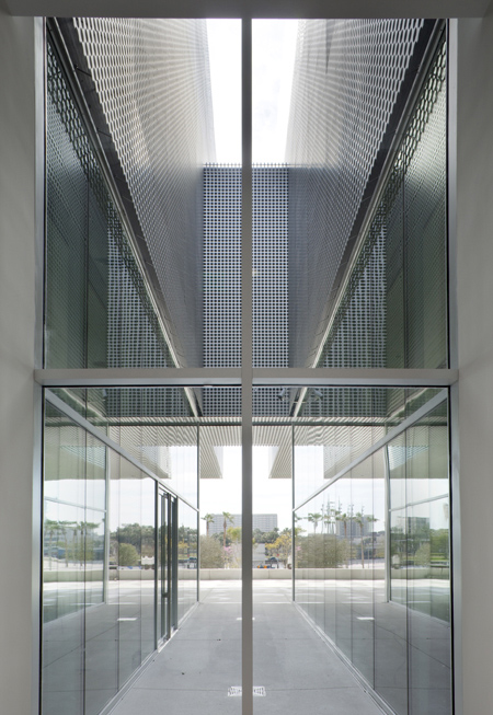
On the opposite end of the spectrum are museums as containers, as beautiful jewel boxes, treasure chests whose sole purpose is to be filled with art, like the Tampa Museum.
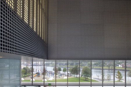
This museum is a neutral frame for the display of art, an empty canvass to be filled with paintings. It is a beautiful but blank container, a scaffold, to be completed by its contents.
We are interested in openness, in unknown possibilities in the future, in Architecture as infrastructure.
We have created compelling space in the most discreet way, avoiding the building as an independent sculptural object, and using space and light to produce form.
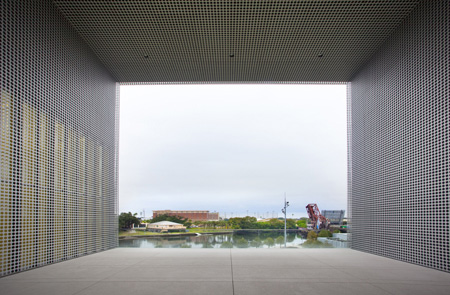
A glass pedestal supports the jewelbox of art above. The building floats in the park, embracing it with its overhanging shelter and reflective walls. It is a hovering abstraction, gliding above the ground.
The building is not only in the landscape, but is the landscape, reflecting the greenery, shimmering like the water, flickering like clouds.
It blurs and unifies, making the museum a park, the park a museum.
The long building is sliced in the center.
This cut divides the programs in two, the one public and open, the other support and closed.
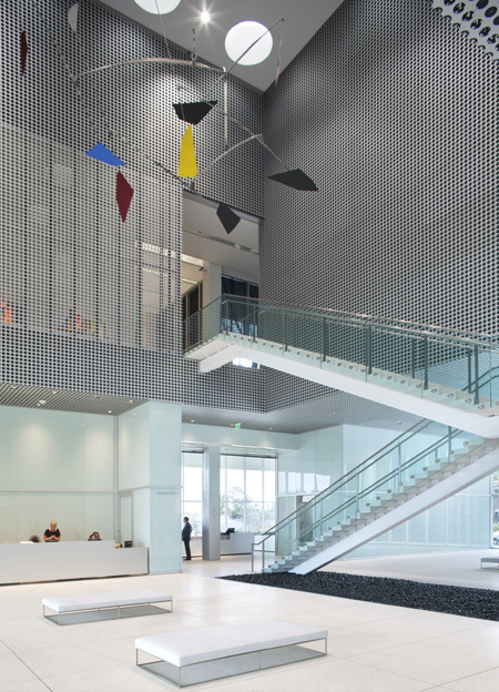
Each of the two sections is organized around a court, one the lobby, the other a courtyard surrounded by the offices and curatorial areas.
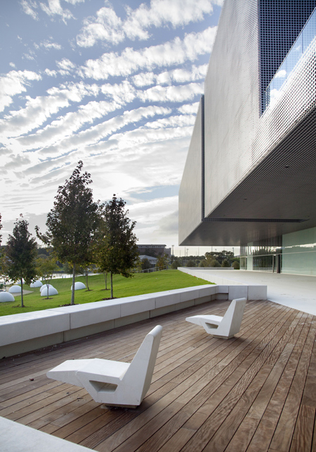
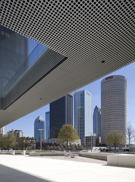
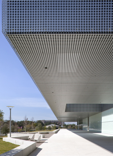
The 40’ cantilever provides a huge public porch for the city, raising all the art programs above the flood plane.
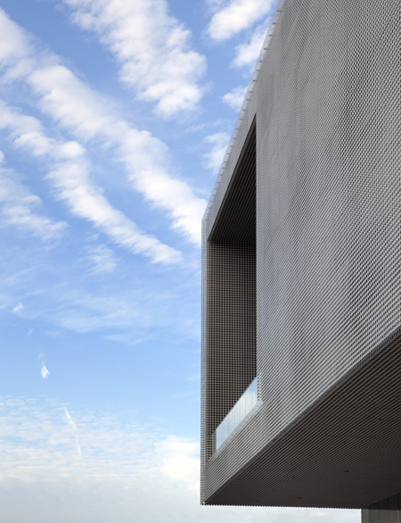
The walk along this porch, flanked by the park, focussed on the river, leads to the lobby. The procession through this quiet and levitating space is the preparation for viewing art.
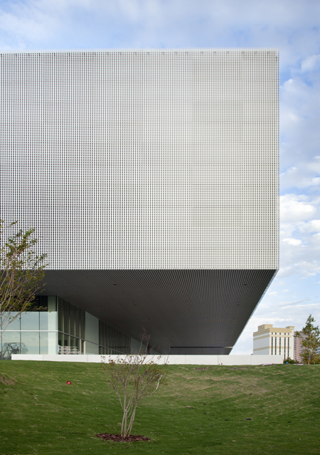
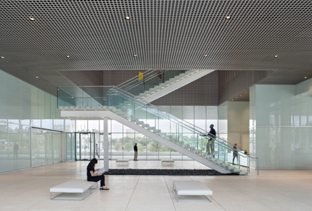
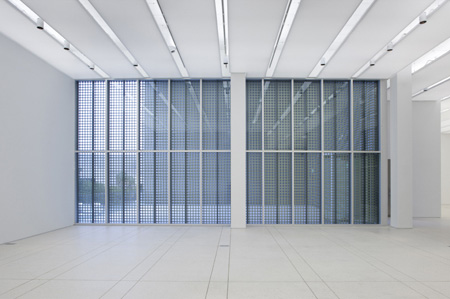
The lobby is at first horizontal, with entirely glass walls, two clear, two etched.
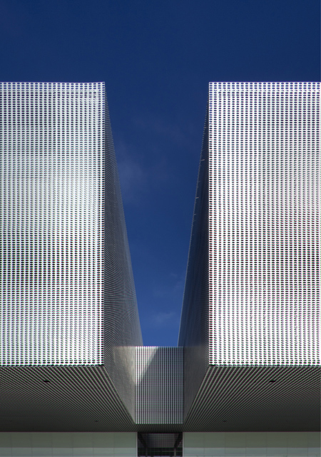
The clear walls allow the site to run through the space, linking the Performing Art Building on the north with the turrets and domes of the University of Tampa on the south.
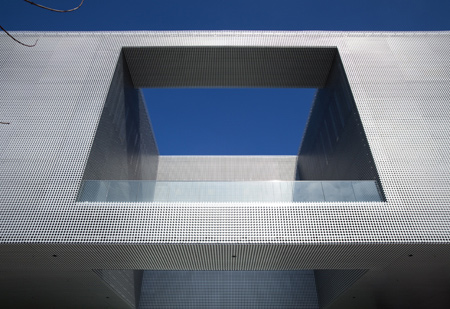
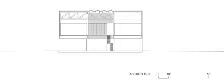
Above the glass, the perforated ceiling wraps from the exterior into vertical perforated walls that turn into an upper ceiling, perforated again by a series of skylights. The galleries are reached from the lobby below via a dramatic cinematic stair reaching up. Below the stair is a bed of river rock.
Off the lobby is a long glass room that houses the café and bookstore in a storefront along the riverwalk.
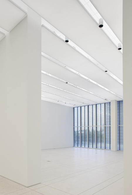
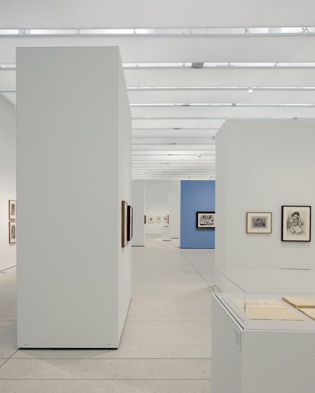
We have built the most expansive and generous field of galleries as instruments to enable, through curation, a world to expose art. They are arranged in a circuit, surrounding the vertical courtyard void.
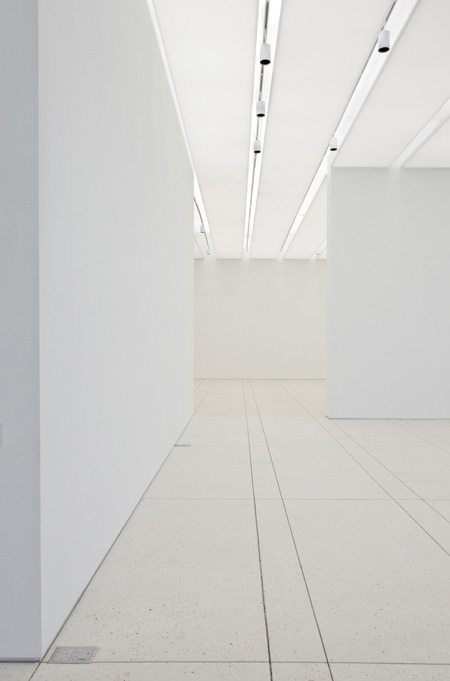
The galleries are blank, walls, floor and ceiling all shades of white, silent like the unifying presence of snow. The floors are ground white concrete with a saw cut grid to echo the illuminated white fabric ceiling above. Linear gaps in the ceiling conceal sprinklers, air distribution and lighting.
The second segment, around the open court, contains all the support for the museum. Offices surround the court on three sides. A bridge on the lower level is a secondary crossing from preparation to storage, a place for museum staff to be outside.

The image of the museum results from the nature of its surface – it does not symbolize or describe. It disengages through neutral form, providing a kind of pit stop in the attempt to represent. It is a moment to savor things in themselves.
By day the surfaces appear to vary almost, but never quite. They are smudged and stammering, with moray like images of clouds or water or vegetation, a shimmering mirage of reflections.

It is an expansive and illusive image of a museum about things we don’t quite know, about things we don’t quite see.
By day, light reflects on the surfaces.
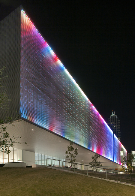
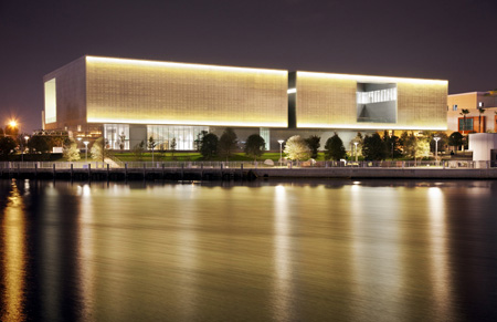
By night, light emanates from the surfaces.

By night the exterior become a canvass for a show of light. The art from within bleeds out onto the walls and escapes into the darkness.

By night it is the magical illumination of the skin changing colors and patterns in endless variations which turn the building inside out, revealing it secrets as it broadcasts light, color and form into the city, duplicated in its reflection in the water.
This museum is both timeless and of our time, an electronic jewel box, floating on a glass pedestal, a billboard to the future, and a container to house works inspired with vision and able to show us other ways to see our world. The museum hovers in the park, a hyphen between ground and sky.
