New Museum of Contemporary Art in New York by Kazuyo Sejima + Ryue Nishizawa/SANAA
The New Museum of Contemporary Art, designed by Japanese architects Kazuyo Sejima + Ryue Nishizawa/SANAA, opens next week in New York.

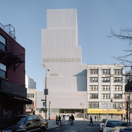
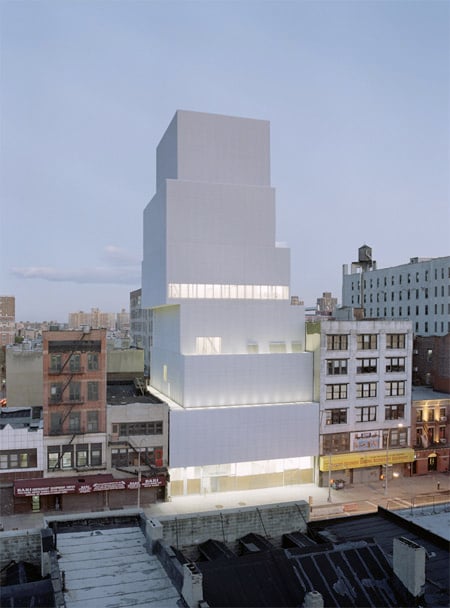
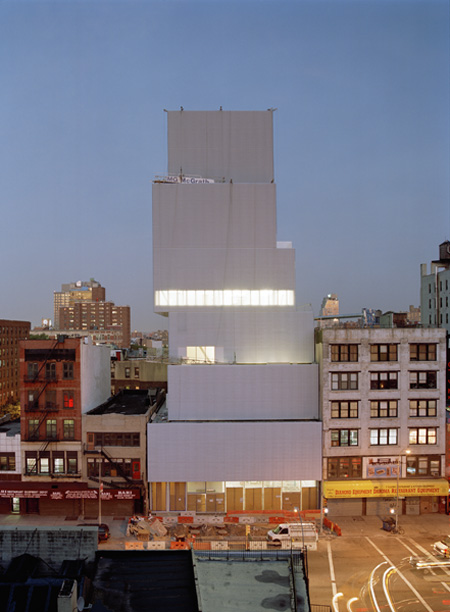
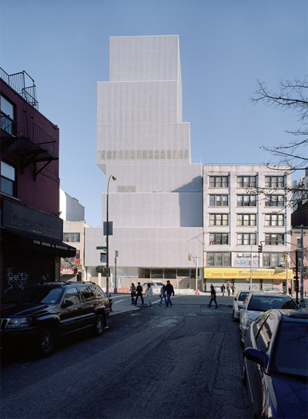
Here are a few recent shots of the building at 253 Bowery, which opens on 1 December, plus a couple of renderings by the architects (last two images).

Photos are by Dean Kaufman. Renderings are by Sejima + Nishizawa/SANAA with site photography by Christopher Dawson.

Below is an statement about the architecture provided by the museum:
--
THE ARCHITECTURE OF THE NEW MUSEUM OF CONTEMPORARY ART
The new New Museum of Contemporary Art, designed by Tokyo-based architects Kazuyo Sejima and Ryue Nishizawa/SANAA with Gensler, New York, serving as Executive Architect, is an eight-story, [nine-level] structure located at 235 Bowery between Stanton and Rivington Streets, at the origin of Prince Street in New York City. The first fine art museum ever constructed from the ground up in downtown Manhattan, the New Museum will open to the public on December 1, 2007, coinciding with the institution’s 30th anniversary.

The New Museum building is intended as a home for contemporary art and an incubator for new ideas, as well as an architectural contribution to New York’s urban landscape. Sejima and Nishizawa, who received the commission in 2002, have described the building as their response to the history and powerful personalities of both the New Museum and its storied site. “The Bowery was very gritty when we first visited it,” they have said. “We were a bit shocked, but we were also impressed that a fine art museum wanted to be there.”

“In the end, the Bowery and the New Museum have a lot in common. Both have a history of being very accepting, open, embracing of every idiosyncrasy in an unprejudiced manner. When we learned about the history of the New Museum we were flabbergasted by its attitude, which is very political and very focused on new ideas, fearless and very tough. The New Museum is a combination of elegant and urban. We were determined to make a building that felt like that.

Amidst a cluster of relatively small and mid-sized buildings of varying types and uses, the New Museum rises 174 feet above street level. As visitors approach the Bowery or from the west along Prince Street, they encounter the building as a dramatic stack of six rectangular boxes.
This distinctive form derives directly from the architects’ defining solution to fundamental challenges of their site: A dense and ambitious program, including the need for open, flexible gallery spaces of different heights and atmospheres, had to be accommodated within a tight zoning envelope on a footprint of 71 feet wide and 112 feet deep.
In order to address these conditions without creating a monolithic, dark, and airless building, SANAA assigned key programmatic elements to a series of levels (the six boxes), stacked those boxes according to the anticipated needs and circulation patterns of building users, then drew the different levels away from the vertebrae of the building core laterally to the north, south, east, or west. The shifted-box approach yields a variety of open, fluid internal spaces that are different heights at every level, with different characters but all column-free.
The New Museum is clad in a seamless, anodized expanded aluminum mesh chosen by SANAA to emphasize the volumes of the boxes while dressing the whole of the building with a delicate, filmy, softly shimmering skin. With windows just visible behind this porous scrim-like surface (achieved with a common material never before employed to clad major building façades), the building appears as a single, coherent and even heroic form that is nevertheless mutable, dynamic, and animated by the changing light of day—an appropriate visual metaphor for the openness of the New Museum and the ever-changing nature of contemporary art.
“It was complicated to organize the architecture around all of the desires,” Sejima and Nishizawa have said. “We knew we could not maximize the entire site with solid architecture, we had to reduce the building’s mass somehow to create space between it and the perimeter. The solution of the shifted boxes arrived quickly and intuitively. Then through trial and error we arrived at the final, ideal configuration. Now we have a building that meets the city, allows natural light inside, gives the Museum column free galleries and programmatic flexibility, and expresses the program and people inside to the world of New York outside.”
FROM THE STREET TO THE ART
Visitors will be drawn into the New Museum by views through a nearly 15 foot-tall plane of clear plate glass along the Bowery, stretching across the full width of the building, named for the Eisenberg and Feinstein families, to include both the public entrance and the entrance to the Museum’s loading area, on the north side of the core, where back-of-house activities and the movement of artworks will be on full view to passersby. Through this clear membrane, visitors will see all of the various functions of the lobby level, a transitional space between the life of the street and that of the Museum. The color and buzz of the Bowery neighborhood give way here to a luminous, pale space, full of daylight washing a palette of white and silver.
“We wanted to make interiors that expose the way they work in a ‘beautiful rough’ way that is appropriate to the Museum and right for the budget and the place,” Sejima and Nishizawa have stated. “We don’t want to hide things behind gyp board, we want to show what the building is made of and maximize the feeling of openness, but do it in a beautiful way inside the parameters of the toughness. This is why the building’s structure and guts are exposed— the ducts, the sprinklers, the fireproofing material—and the view from the street includes everything on the ground floor.”
Gray concrete pavement outside thus gives way to polished gray concrete floors in the grand but intimate Marcia Tucker Hall. This space contains the public information desk; ticketing; coat check; the New Museum Store defined by a serpentine screen of metal mesh; the café and its open kitchen; the stairway down to the building’s lower level and Theater; elevator banks for access to the galleries above; and a luminous, 1,100 square foot glass, Joan and Charles Lazarus Gallery separated from the rest of the space by a soaring glass wall and illuminated by daylight filtering down from the shift of the structural box above. A floating dropped screen of metal mesh softens and abstracts the largely visible functions of the ceiling above it, filtering light from a grid of glowing but delicate florescent tubes.
From the lobby level, visitors may choose a variety of paths upward or downward through the building. Descending by either the open, glass enclosed interior stairway or an elevator to the building’s lower level, visitors will find the 182-seat Peter Jay Sharp Theater—a “white box” theater with a pre-function hall that doubles as a gallery for special projects. This level also houses the Museum’s restrooms (where Bisazza mosaic covers the walls with hotly hued, pixilated hanami cherry blossom patterns—the only intensely colored feature in the building aside from the vibrant green elevator cab interiors); backstage support, storage, and green room areas for the theater; general storage; and mechanical support.
Electrical and mechanical areas, storage for the café kitchen and the store, and a workshop are housed on the mezzanine of the lower level. Visitors who choose to ascend from the lobby level to the galleries above can take an elevator or use one of the staircases situated in the building’s core. SANAA has crafted a fluid, three-level zone of extraordinary galleries on the building’s second, third, and fourth floors —all freed from columns by the structural support of the core, all characterized by unique atmospheres ranging from intimate to grand.
“A museum for contemporary art should be neutral in the character of its gallery spaces, n order to create the widest palette for the art itself, “ SANAA has stated. “With the galleries in this building, we tried to play with dimensions and the way daylight falls in the spaces. This allows the visitor to experience art in slightly different conditions on different visits, at different times of the day, in different spaces, without impeding the qualities of the art.”
The second floor Eugenio López Galleries provides approximately 5,000 square feet of exhibition space with ceilings 18 feet high, skylights tracing the west and north walls of the building, and concrete floors that appear to float via a carefully crafted reveal that runs the full perimeter of the space where the floor meets the walls. The shifting of the structural box at this level has created an additional quiet and unique gallery space on the north side of the core—a volume 10 feet wide and 40 feet long, accessed from either end of the main gallery.
The third floor Maja Hoffmann/Luma Foundation Galleries, with approximately 4,000 square feet of exhibition space, boasts a ceiling height of 21 feet with east and west skylights. On this floor, visitors find the entrance to an exquisite open stairway running 50 feet upward along the building’s north side connecting the third and fourth floors. Off this stairwell is one of the building’s most eccentric spaces: The Shaft, 5 feet by 8 feet, and 35 feet tall, was formed from found footage in the structural shift between the third and fourth floors.
A second landing along this flight of stairs offers views through an enormous, punched single-pane window bringing in sweeping natural light. Visitors arrive at the top of these stairs in front of a large window offering vistas westward across Soho and toward the Hudson—views that provide a momentary break in the immersive experience of viewing art and reconnect that experience to the context of the city and the community beyond the Museum’s walls.
On this level, around a fast corner, is the fourth floor Dakis and Lietta Joannou Galleries. At nearly 3,000 square feet it is the smallest footprint of the Museum’s main galleries but also the tallest and most dramatic. Ceilings here are 24 feet in height in a space graced by a southern skylight that permits natural light of varied qualities to wash through the galleries during the course of days and seasons and be controlled, as in all of the building’s galleries, through a system of shades beneath the glass.
In the galleries, the steel of the architecture is exposed: The diagonal structural beams of the exterior, rendered white with their spray-on fireproofing material, intumescent paint, appear at interludes. “We want the building to show what it is,” SANAA has stated. “This openness is consistent with the openness of the New Museum and the honesty of the everyday businesses along the Bowery.” The structural steel makes frequent appearances throughout the building.
The fifth floor houses the institution’s new Pauline and Constantine Karpidas Education Center, with a wide expansive west wall of glass looking over Nolita and Soho with classroom space, a video editing room; a resource center with computer stations and the Bowery Artists Tribute; and a space for the institution’s revolutionary Museum As Hub global intra-institutional initiative. On the sixth floor are staff offices, kitchen, restrooms, and meeting spaces. Here, operable windows wrap the space on three sides and polycarbonate sliding panels provide privacy.
On the seventh floor of the building, the New Museum will offer one of the most arresting multipurpose spaces in downtown Manhattan: Toby Devan Lewis Skyroom. On this evel, an 11 foot high, nearly 2,000 square foot space for events and special programs is features floor to ceiling glass offering panoramic vistas of the city and an outdoor terrace that runs without interruption around the east and south sides of the building.
The eighth floor of the New Museum building houses mechanical support. Reflecting upon the completed building, five years from initial conception to completion, SANAA has written: “The new building is both part of SANAA and the New Museum. In the time that we have been together, both have changed very much. In some ways we are both bigger, more relaxed, but still always hoping to explore and find new things. The New Museum is intriguing because it is always asking questions and we hope that continues to do so. Our building is an attempt to express that adventurousness and freedom.”