Tapered office building in Seoul avoids overshadowing its neighbours
This office block for a cosmetics company in South Korea's capital was designed by architect Dongjin Kim as a conical volume, to ensure surrounding buildings still get adequate daylight and privacy.
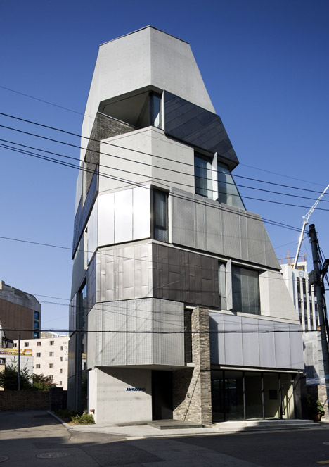
Kim and his studio L'EAU Design Company tapered the office block on two sides to comply with local regulations, which dictated the scale of the building, its distance from the road, and the right of adjacent buildings to privacy and light.
It is a tactic that has been used on office towers in many different cities – notably on Rogers Stirk Harbour's so-called Cheesegrater in London, which angles back to respect views of St Paul's Cathedral.
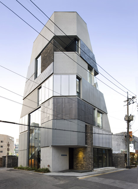
Called Tropism of Wildflower, the Seoul building takes inspiration from the biological phenomenon of phototropism in plants, whereby they turn in response to the sun.
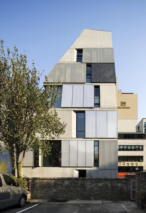
"The purpose of the design is to respect the mutual territory of surrounding buildings," the architects told Dezeen.
"Each has a right to enjoy sunlight and privacy. It is similar to the coexistence and symbiosis of sunflowers, which turn the same way to get sunlight."
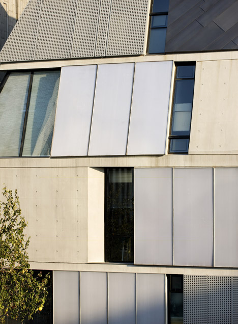
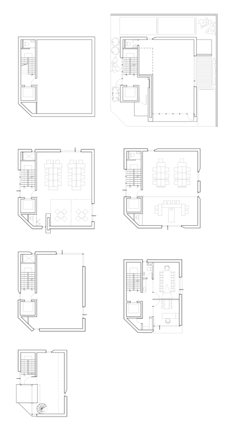
The building occupies a 99-square-metre footprint. It accommodates a basement and six storeys, which get progressively more private as they taper in.
The first floor has a showroom, while the levels above contains offices, and the smallest floor at the top is occupied by the company directors.
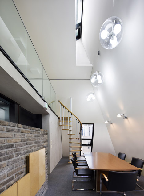
A simple layout will allow the office to adapt to a variety of functions in the future. The architects felt this was important, since the building is located in an area characterised by multi-use blocks, where shops, offices and apartments are housed in one structure.
"After the company grows and moves, they want the office to be used as a commercial building for lease," the team told Dezeen. "They hope it can accommodate various uses, with the flexibility to accept any programme."
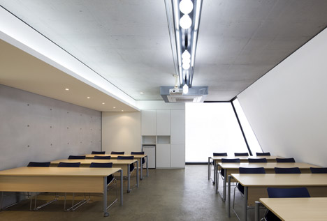
A slab-wall construction eliminated the need for columns inside, so each floor's layout can be rearranged as needed.
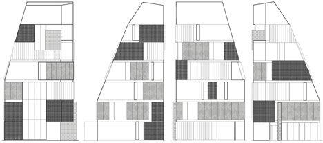
The cladding has been designed as a patchwork of removable panels, which can be changed as the building evolves. These panels are made from a variety of materials including glass, polycarbonate, copper plate and punched-steel plate.
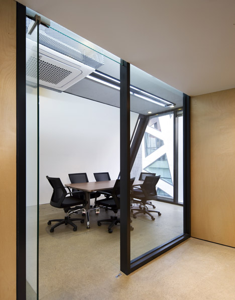
"We tried to design the exterior skin to react to changing programmes, whether it be an office, cafe, shop or residence," said the architects. "It is not a fixed element."
Roof lights were added to bring light into the building's more enclosed spaces, and stairs were arranged next to a triple-height section of glazing to allow more light to pass between the floors.
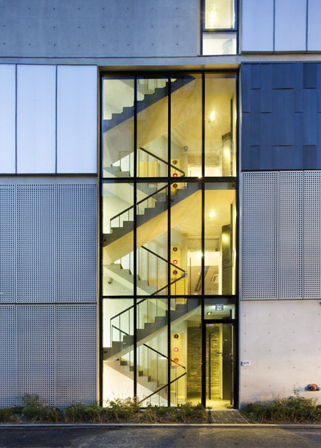
"We designed the stairs as a transparent space, so that every floor feels enough openness," added the architects, who completed construction for the building in six months.
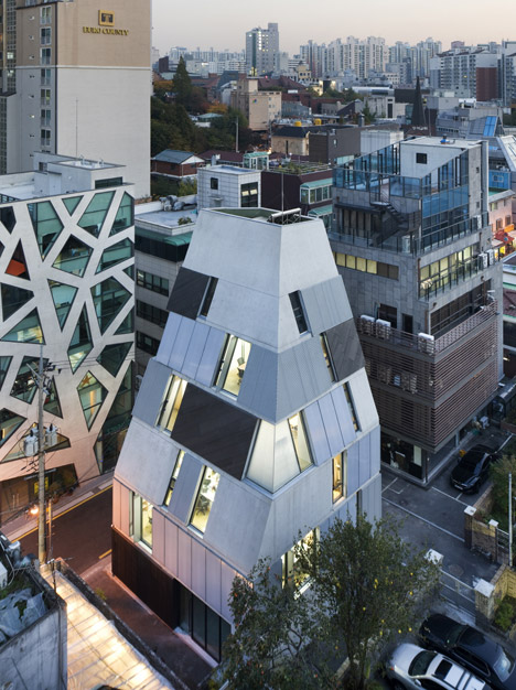
"It is also possible to swap external panels for glazing in the future, in order to make the building more transparent," they added.
"Just as elements of nature grow and evolve, adapting themselves to various environments, we hope this building adapts flexibly in the jungle of the modern city."
The dense urban environment and strict building regulations in Seoul have prompted a range of responses from architects. Examples include a housing block with a tapering roof and carefully positioned windows and balconies, and an office block with a bowed concrete facade to accommodate more floorspace.
Photography is by Park Wan-soon.
Project credits:
Architects: Dongjin Kim. L'EAU Design Company
Design team: Sanghak Lee, Teayeon Kim, Jueun Park, Sowon Beak
Construction: E-ECO Construction
