Omgeving's black brick library in Zoersel is subdivided into smaller blocks
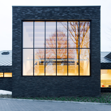
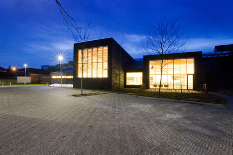
The front and rear facades of this library in Zoersel, Belgium, have been divided up into house-sized volumes to help the large building fit into its residential context (+ slideshow).
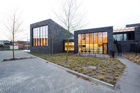
Bibliotheek Zoersel was designed by Antwerp studio Omgeving for a plot in the town's historic centre, which is undergoing major redevelopment following the introduction of a bypass that has displaced the majority of heavy traffic to the outskirts.
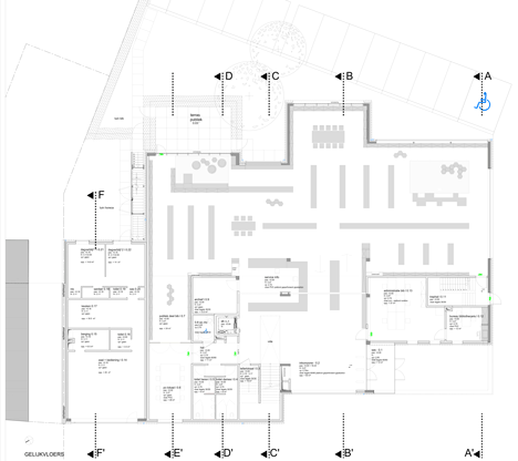
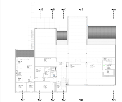
As well as a library, the building accommodates multi-purpose events spaces, a computer room and a cafe that operates separately to the rest of the facility. There is also an apartment occupied by the building's caretaker.
The municipality requested a design that balances the building's large-scale public function with its context on a street lined with terraced houses. It also wanted to project a welcoming feel towards the town's inhabitants.
"The library is supposed to be oriented towards the community and the idea was to create a place to hang out, more like an urban living room than a typical library," architect Karol Grygolec told Dezeen.
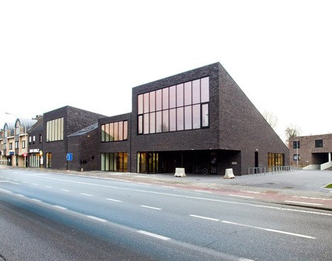
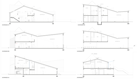
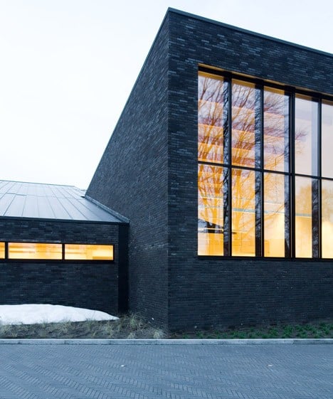
The building is subdivided into volumes with different heights that help to break up its overall mass. Sloping roofs and windows at the front and rear of each block enhance the impression that the library is composed of several separate structures.
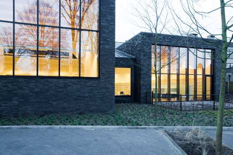
"Considering the location, the building's volume is quite large and perhaps seems a bit alien or different from the other typologies around it," said Grygolec. "Our main goal, therefore, was to play around with the perception of scale."
"Through the subdivision into parcels, that resemble the width of typical Belgian terraced houses, we tried to fit the building into the morphology of the town."
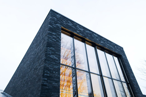
Dark brick was used to give the building's exterior a homogenous aesthetic that unites the various volumes.
"We felt brick was very typical of Flanders architecture," added Grygolec, referencing the local vernacular. "But we wanted to use black brick to give the impression that this building is different or special in some way."
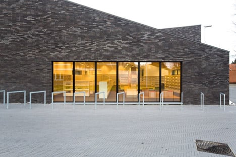
Some of the bricks are glazed, while others have a deliberately rough finish to give the surfaces a more interesting texture that varies depending on the prevailing weather conditions.
Recessed sections in the facades contain openings that guide visitors toward the interior, where the building's true scale becomes apparent.
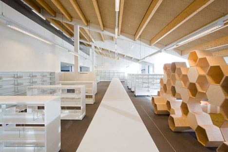
The ground floor is predominantly open-plan, creating a generous space with a ceiling that expresses the slanted composition of the individual roofs.
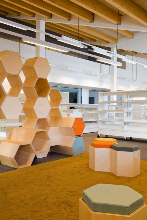
The angled ceilings provide varying levels of intimacy within the interior.
A children's area is situated beneath a lower portion to give it a cosier scale, while a table for group reading is positioned in a much higher space culminating in a window that looks out onto the nearby trees.
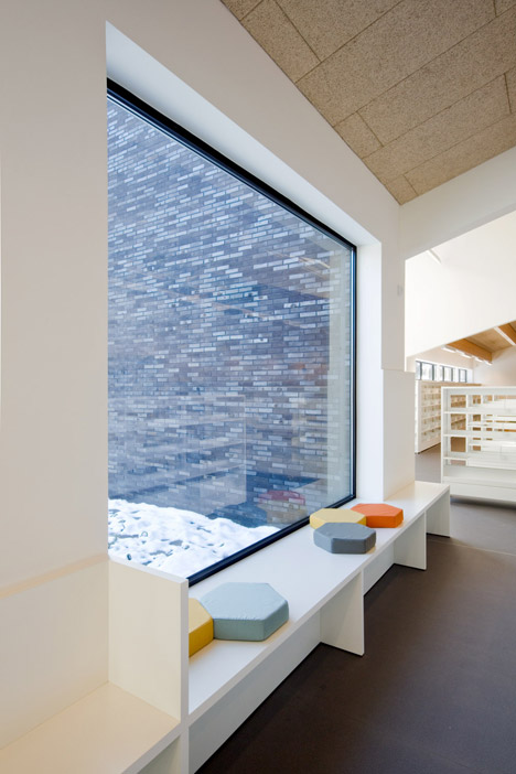
Omgeving was also responsible for designing some of the furniture in the library, including a modular bookcase made from hexagonal plywood units.
Children can climb on the bookcase to look for books positioned in open shelves or sit on the extruded surfaces to read. Matching poufs provide additional seating that can be moved around and stored inside the shelving unit when not in use.
Photography is by Yannick Milpas.
Project credits:
Architects: Omgeving Architecture
Interior and furniture design: Omgeving Architecture
Architectural project team: Evy Depauw, Karol Grygolec, Kaat Balcaen, Tristan Verleyen, Otsoe Verdonckt
Landscape project team: Luc Wallays, Peter Seynaeve, Koen Moelants, Steven Petit,
Civil engineers: Arcadis
Contractor: Van Roey
