Metal and glass facets surround World Maritime University's new harbourside home
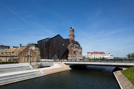
Architecture firms Terroir and Kim Utzon Arkitekter have created a new building for the World Maritime University in Malmö, Sweden, featuring a jagged facade of glass and aluminium (+ slideshow).
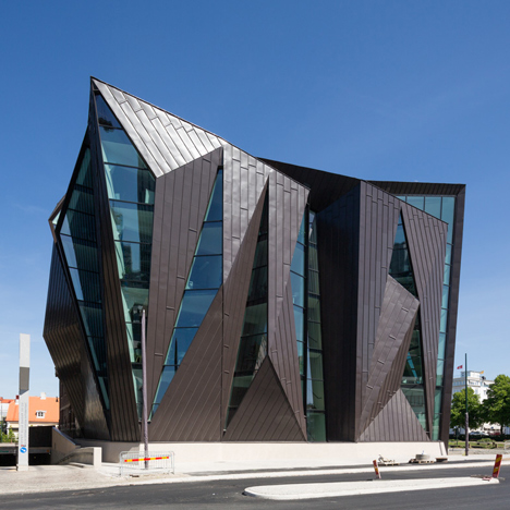
The project involved the renovation and extension of a century-old harbour master's building, creating approximately 6,000 square metres of teaching and office spaces for an institution focusing on maritime education and research.
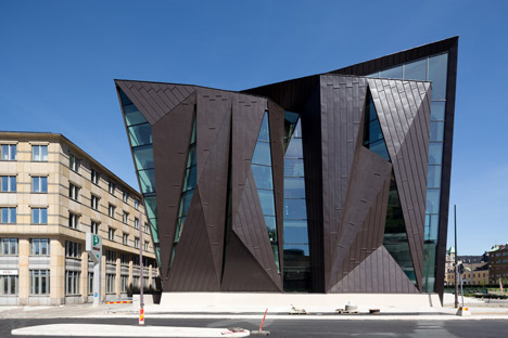
The existing building – known as the Tornhuset – was completed in 1910 as the main office for Malmö's harbour administration. It was built in the docklands area to offer a panoramic view of shipping activity in the harbour and the Öresund strait.
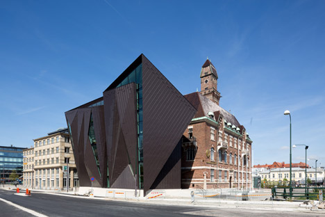
Terroir and Kim Utzon Arkitekter won an international competition in 2011 to create a new facility on the same site, with a design based on the idea of a "hinge" that connects the old town with the harbour.
"The conception of the building as a hinge prompted us to explore a folded plate language for the new building," said the architects, "such that it could act as a hinge in the city and also a hinge between itself and the original Tornhuset."
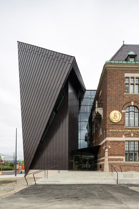
Angular lines defining the old building's gabled roof informed the design of the faceted extension, which projects outwards from the vacant space in the Tornhuset's L-shaped plan.
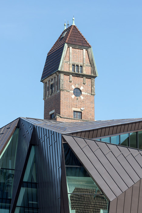
"The form of the project emerged from a fascination with the roof of the original Tornhuset, which at first glance looks conventional, but is an unexpected formal play based in a simple gable logic," the architects added.
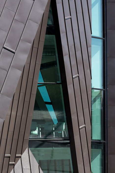
"We adopted a similar strategy, laying out a series of formal alignments with the existing building that were then elaborated upon in response to the need for views and also light penetration to the spaces within – all while presenting a largely solid form in elevation," they added.
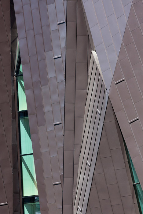
Sheet aluminium was used to clad the entirety of the non-glazed surfaces – a reference to the painted metal commonly found in architecture from the home countries of both design teams. Its colour creates a visual connection with the roof of the existing building.
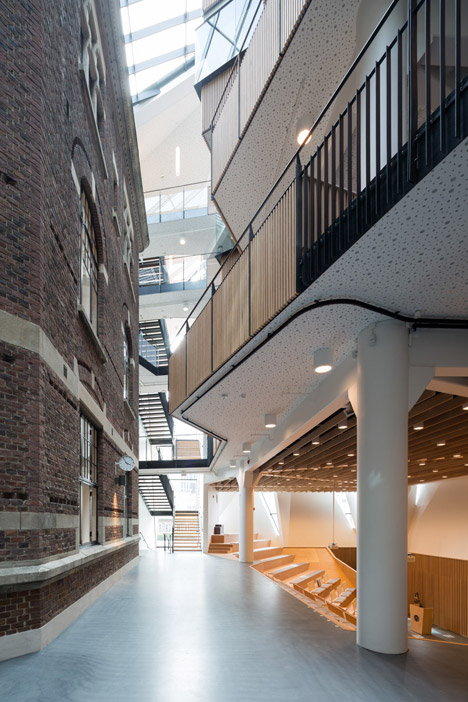
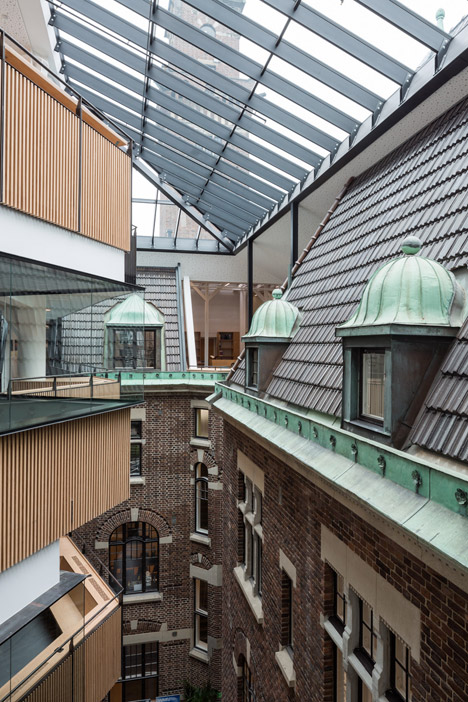
The original Tornhuset remains largely intact and contains the majority of the offices. The extension is tacked onto its exterior and the void between the two structures houses circulation and social areas.
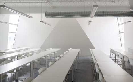
Teaching spaces are accommodated in the extension, including a sunken auditorium at ground floor level that is open to and accessible from the full-height atrium.
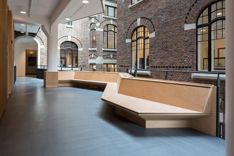
In this central area, the exterior facade of the Tornhuset can still be seen and its cranked form connects with the extension's irregular inner surface, which incorporates balconies and breakout areas spread over three storeys that jut out over the atrium.
Sections have been removed from the upper storey of the original roof to accommodate openings, connecting a library on this level with the atrium. Short bridges span the gap between the old and new structures.
Large slanted panels of glazing inserted into the roof fill the central void with natural light and the vertical stack of floors in the extension is set back on each level to ensure the maximum amount of light is able to enter.
Photography is by Torben Eskerod.