Boro Hotel interior designed as a mash-up of Copenhagen, Seville and New York City
New York architecture firm Grzywinski+Pons aimed to create a space that is "as warm and cheerful as it is urban" when planning the interior of this hotel in Queens (+ slideshow).
Situated in the neighbourhood of Dutch Kills, the Boro Hotel was previously a disused building that had never been occupied.
"The story of the structure is an interesting one," principal architect Matthew Grzywinski told Dezeen.
"The building was built kind of as nothing – the zoning was changing so the previous owner built without a plan of what to do with the building so to not lose the opportunity to capture and sell on that area."
With a small amount of time given to complete the project, Grzywinski+Pons decided to focus their efforts on the interior architecture.
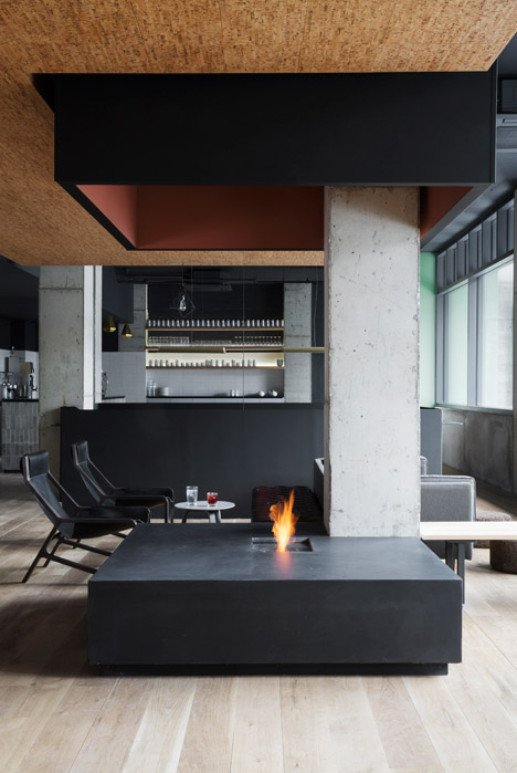
"We treated the unfinished structure like a found object," said the architect. "We approached the program almost as though we were converting a disused industrial space to a new use."
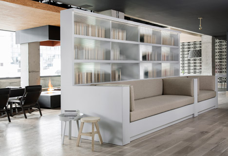
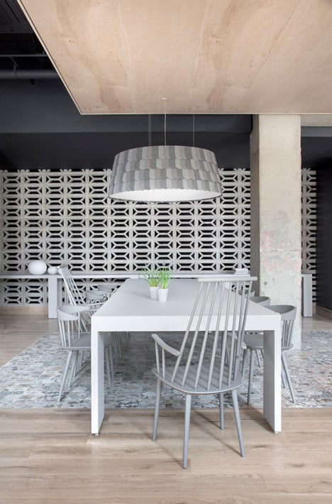
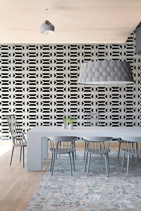
Embracing the elements of the inherited space, the architects used the existing cast-in-place concrete and cinder blocks as the framework of their design.
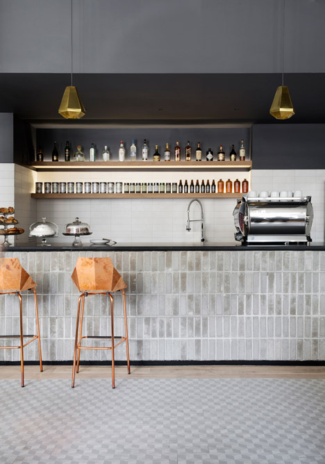
"We tried to exploit what was good about what we acquired without being slavishly thematic to a purely industrial or warehouse look," explained Grzywinski. "Upon this mantle we layered our palette of materials while extolling the virtues of the site including its light, soaring ceilings and unrivalled views of Manhattan."
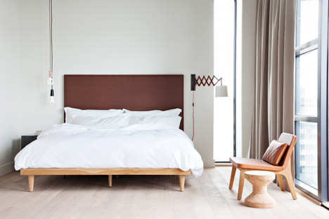
Hand-scraped oak was used for the flooring, whilst the wainscoting and soffits are constructed from painted pallet wood. Leather, cork and sisal finishes were also included.
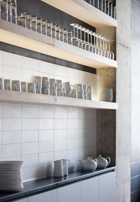
"We were very conscious of using finishes that would yield a warm and happy environment even while acquiring a rich patina through time and use," Grzywinski said.
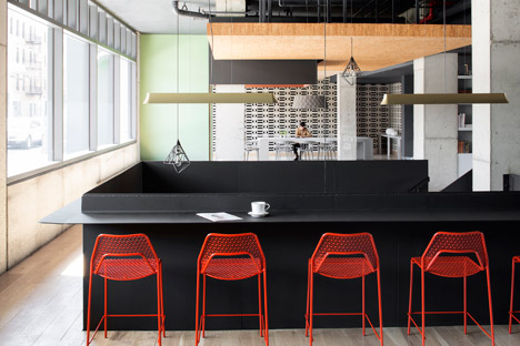
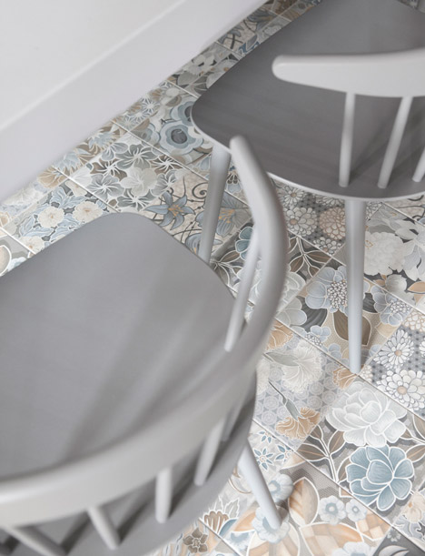
Tiles in geometric and floral patterns were added within the guest bathrooms and on the ground floor, and a contrasting colour palette aims to "create disparity between foreground and background".
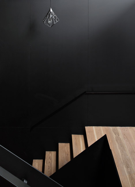
"The driving factor for a lot of the interior was to make it a warm and happy place to stay, but erring on the side of chic versus cosy," said the architect. "Someone said it was like a mash up of Copenhagen, Seville and New York City, which we took as a compliment."
Related content: see more stories about hotels
A large communal table that acts as a reception desk is situated on the ground floor, along with a bar-cum-cafe and seating area.
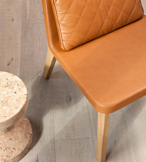
"On the ground floor we tried to erase the division and the hierarchy implied by the traditional reception desk," Grzywinski said. "The check-in process capitalises on mobile technology to liberate that service from any particular piece of furniture."
Grzywinski+Pons has previously redesigned the a lobby of a London hotel – ripping out the "sterile" interior to reveal its industrial fittings. The studio also applied shimmering aluminium panels to the exterior of a country house in upstate New York.
Photography is by Floto + Warner.