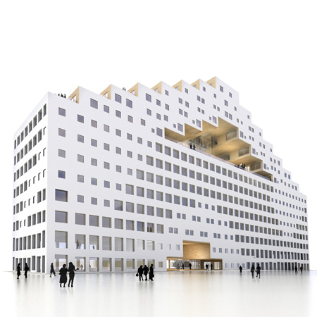
DnB NOR Headquarters by A-Lab
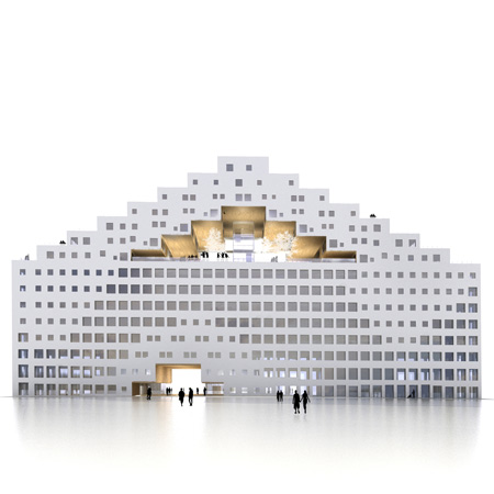
As part of a waterfront development for Oslo called Bjørvika Barcode, Norwegian architects A-Lab have designed an office and residential building with a covered garden punched through the middle.
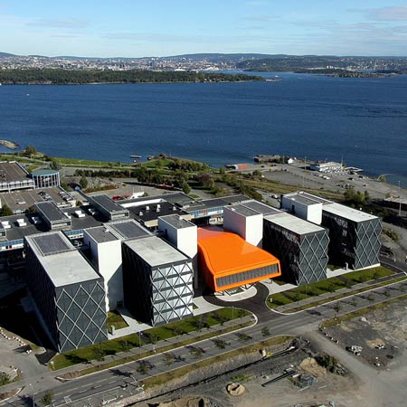
The project is one of three buildings to form the new headquarters of a Norwegian bank, with the other two designed by Dutch architects MVRDV and Norwegian studio Dark Arkitekter.
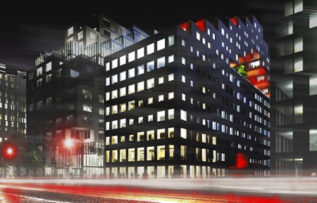
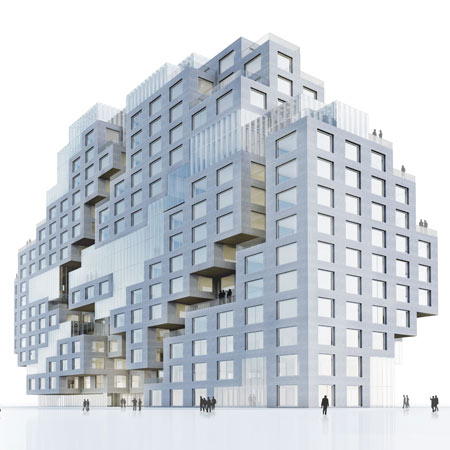
A-Lab's building will feature eight storeys of offices topped by seven floors of staggered apartments in a pixellated formation.
Construction is due for completion in 2014.
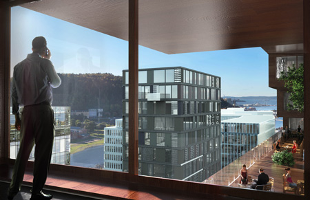
See also: DnB NOR headquarters by MVRDV
The information that follows is from A-Lab:
DnB NOR, B-building
BJØRVIKA BARCODE
In 2003 MVRDV (NL) / a-lab (NO) / Dark architects (NO) , won the competition for Oslo's new waterfront development along Bjørvika with the design of the "BJØRVIKA BARCODE" for Oslo S Utvikling (OSU).
a-lab has built the first building of the master-plan, the Oslo Headquarters of PricewaterhouseCoopers – PWC in 2009.
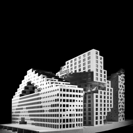
With construction already underway, the second a-lab project in the Barcode is part of the currently largest single commercial commission in Norway : the headquarters of Norwegian financial institution DnB NOR, a cluster of 3 buildings of the Barcode. with approx. 70.000 m2 above ground. Each building is being besigned by one of the 3 original masterplan winners : MVRDV who is responsible for the design of the A-building, Dark for the C-building & A-lab for the B-building.
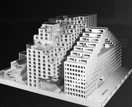
DnB NOR Headquarters B-Building | a-lab
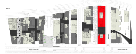
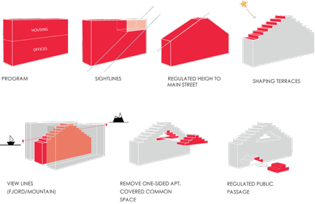
The barcode master plan offers very specific constrains and limitations for the building. The envelope in is cut out as a strip 21x105 with a maximum height of 54m2.
A-lab’s part of the DNB project consists of a mix-use building of 15 stories: 8 floors of DnB NOR offices, topped with living units, in a total of 22.000 m2.
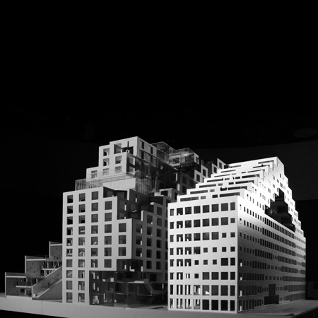
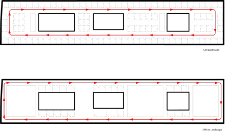
The design addresses this program by efficiently compacting flexible office spaces, and optimizing the views and outdoor spaces of housing units, organized around a raised covered garden. The planning of the office levels allows different combinations of layouts, from open landscape to office cells - the possibility of variation of the circulation path (along cores or facades) guarantees efficiency in the different solutions, as well as the best working conditions according to the strict Norwegian regulations for the working environment.
Click for larger image
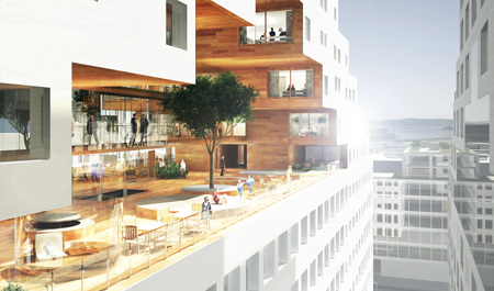
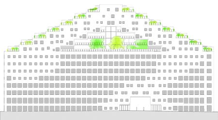
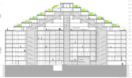
Contrasting with the enveloped "machine" underneath, the housing units rest on 1.000 m2 of common open areas, a garden/terrace elevated from the street level. With it's panoramic elevator and open bridges, this green foyer acts as a buffer that every resident crosses.

Click for larger image
Opening in both ends to terraces overlooking the Oslo Fjord to the south or the cityscape towards the north and east, the covered garden is the result of an uncompromising real estate strategy of the Barcode Plan: one-sided apartments are not allowed - raising the environmental standards and the living qualities in the new city waterfront.

Click for larger image
The result was equally uncompromised, with one gesture the housing area only facing the long facades was removed, creating the garden and adding two more "inner facades". These give the opportunity to open an extra window to the outside garden and to the views of the Fjord or the city - Oslo being relatively low-rise.

Click for larger image
With a similar gesture, removing a section of the main mass on the two first levels allows for both the planed public passage through all Barcode buildings, as well as the entrance to the housing units - connecting them directly to Oslo Central Station and the city's central arteries.
Click for larger image
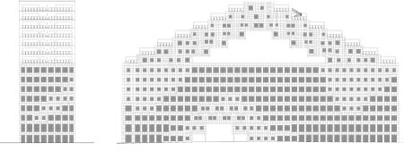
The pragmatic/idealistic duality between the nature of the office levels and the housing gives the building its unique character. The facade composition is an interpretation of this duality. Planed for optimal daylight and environmental performance, the openings grid "flexes" in the points of higher effort.
Click for larger image
Theses points/areas reveal not only structural but "conceptual" effort as well, representing the areas where ideas confered activity on the shape of the initial block.
Click for larger image
Taking the body analogy one step further, the materiality of the building can be analyzed in its three layers as skin, muscle and bone. The outer layer is natural white marble, standing for the initial "untouched" shape.
Click for larger image
All the volumes removed from this shape reveal the Norwegian wood, as the muscle.

Click for larger image
The covered garden opening cuts though the middle of the building, exposing its steel structure.
Click for larger image
Ecological design is entirely organic and sustainable only when all the strategies according to the energy, water, materials, indoor comfort and flexibility are regarded collectively as part of an overall strategy in a building lifecycle. In addition to ecological sustainability is also part of social and economic sustainability as part of the strategy in a successful project.

Click for larger image
a-lab wish to promote sustainable building among the population by using green building strategies and ensuring sustainable living practices in wish B-building is an example.
See also:
.
 |
 |
 |