Messner Architects completes a top-heavy mini-market in an Italian alpine village
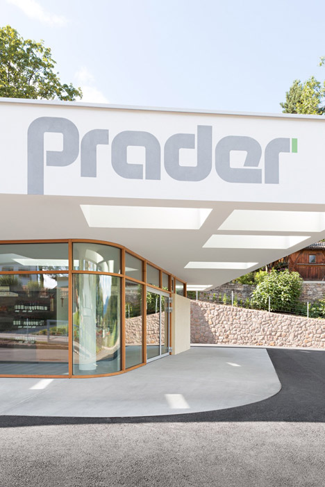
This mini-market in the Italian mountain village of Collalbo is topped with an oversized roof that makes it look like a petrol station (+ slideshow).
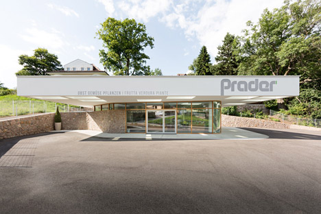
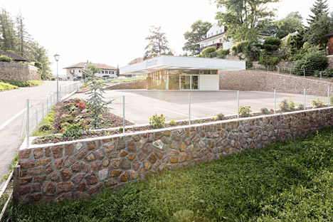
Local studio Messner Architects designed the mini-market for a plot surrounded by meadows and houses typical of this Alpine region in South Tyrol near Italy's northern border.
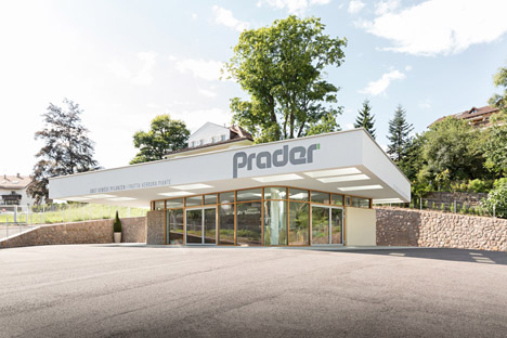
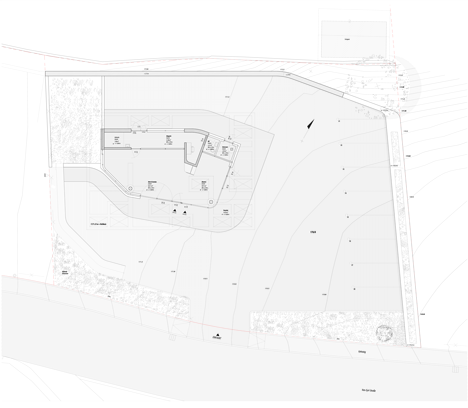
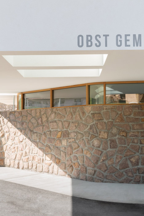
Situated at the back of its plot, away from a road that leads towards the village, the shop is flanked by a stone retaining wall that extends along the edges of the site.
It is positioned in a corner of the site to leave the rest of the space clear for car parking, while a gap between the rear of the building and the stone wall conceals an entrance for deliveries.
A large roof that projects outwards on all sides enhances the building's presence when seen from the street and is branded on the front with the client's logo, creating an aesthetic similar to a petrol station.
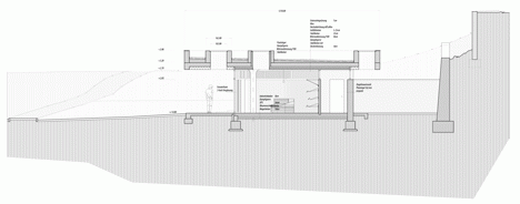
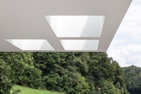
Holes in the edges of the roof allow daylight to penetrate through the structure. Similar glazed openings in the shop's ceiling enhance the bright feel of the interior and augment the impression that the roof is a single volume detached from the rest of the structure.
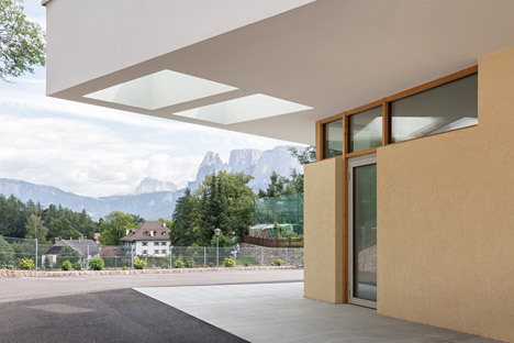
"The roof rests on the building like a heavy slab, forming a covered forecourt to provide market-like situations," said the architects. "Generous cut-outs let the light trickle down through the flat roof, revealing it almost floating."
On the south-west edge of the building, the stone retaining wall curves round to form part of the elevation. Full-height glazing that abuts this surface creates a transparent and welcoming frontage for the shop.
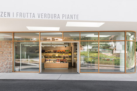
The glazing wraps around a curved corner before terminating at a solid wall that encloses a boiler room and a toilet.
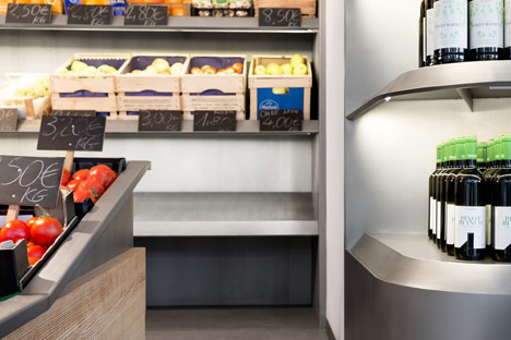
Most of the internal floor space is used to display the shop's produce, including fruit, vegetables and flowers. Behind a wall at the rear is a storage area for stock and a small office.

The office and a refrigeration space are enclosed within structural cores that combine with three pillars towards the edges of the interior to support the cantilevered roof. This composition means the entire facade is non-load-bearing and facilitates the extensive use of glass.
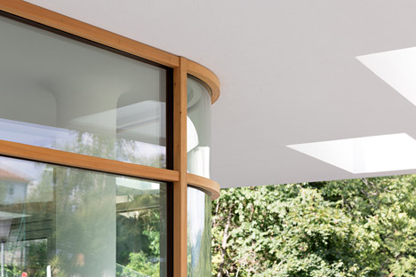
The curving surfaces designed to create a seamless connection between the boundary wall and the building combine with the glazing to help integrate the structure into its site.
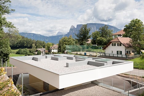
"While the roof's stringent body contrasts with the gentle lines of the surroundings, the outer walls melt with the landscape, becoming part of it," the architects added. "The constraints between the outside, the covered forecourt and the inside blur."
The curving forms continue inside the shop, where columns merge with the ceiling and stainless steel shelves feature rounded corners. Rough-sawn larch wood used for the counter introduces a warm, natural texture to the interior.
Photography is by Meraner & Hauser.
Project credits:
Design team: David Messner, Verena Messner, Angelika Mair (interior design)
Structural analysis: Karl Angerer
