
MS café by Wunderteam
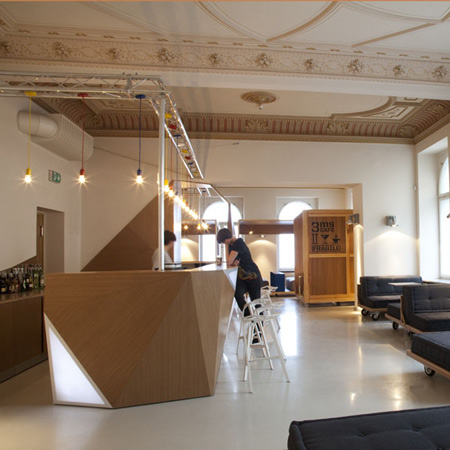
Polish design studio Wunderteam have completed a café with a faceted wooden bar, situated on the ground floor of the Muzeum Sztuki in Lodz, Poland.
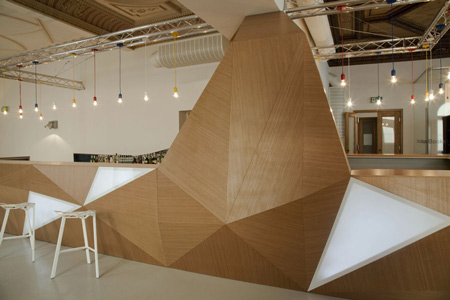
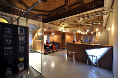
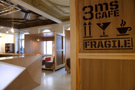
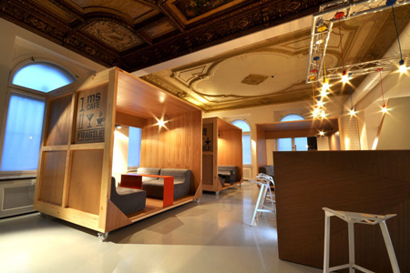
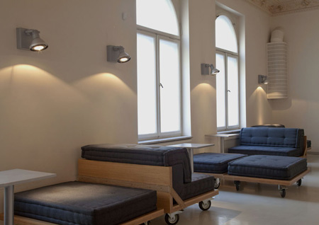
Called MS Café, the space features mobile wooden booths on wheels.
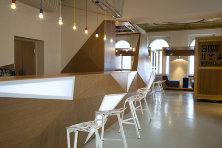
The bar itself is made of wooden triangular planes with back-lit plexiglass panels.
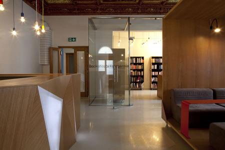
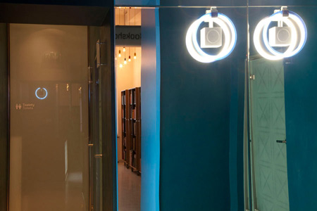
The space also incorporates a bookshop, which is enclosed in a glass room.
The following information is from Wunderteam:
Conversion design of the main building of the Museum of Art (ms) located at 36 Wi_ckowskiego Street in Lodz
The Museum of Art in Lodz has an avant-garde tradition. It contains 19th and 20th century art, at the same time being contained in an 19th century middle-class palace. In order to modernize the ground floor of the building and adapt it for new functions, it was necessary to pay respect both to the avant-garde tradition, as well as the building’s historic function. The previous functional division of the rooms at the Museum’s entrance (porter’s room, narrow stairwell, cloakroom) failed to create an impression of accessibility.
The Museum also lacked a common space as a venue for social life. The objective was to create a place with its own personality, encouraging people to stay in the museum after an exhibition, discuss their views and share their opinions. This visual policy employed in our design becomes clear already at the building’s façade at Wi_ckowskiego Street, into which a glassed-in entrance was incorporated without violating the building’s historic structure. This made the Museum stand out among the other buildings, simultaneously indicating that its interior may hide “the other”, something that transcends the common perception of reality.
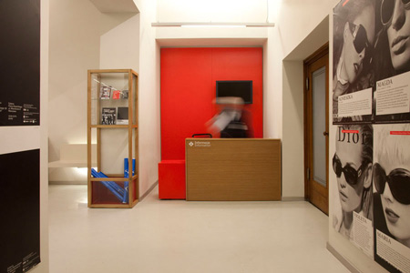
After entering the gateway passage, the viewer is directed by means of clear signs towards the exhibition (right) or the cafeteria and bookshop (left). In addition, specific places are identified visually by means of sparingly used color and light. The clear division of space should make it easy for the viewer to understand it and use its functions intuitively. Opposite the exhibition entrance, there is an information and ticket desk, designed with a strong note of red, providing a powerful counterpoint to the rest of the interior.
The cloakroom and the museum pass office are linked with a shared counter. Clothing is stored in slide closets with glass fronts. This practical solution prevents disorder, but also gives ample access to daylight. Spread over an entire wall next to the cloakroom, a mirror multiplies and optically enlarges the meager space.
The greatest challenge was the area of the building where we placed the cafeteria and bookshop. This space includes a glassed-in box with a bookshop opening into the club, two rooms belonging to the club/cafeteria, the bar’s facilities, as well as a cloakroom and toilets. The cafeteria is also open outside of the Museum’s exhibition hours, hence the need for a separate entrance to this part of the building.
We used simple materials, such as plywood, metal and glass, which stemmed from our original concept, i.e. finding a way to emphasize the beauty of the palace’s historic interiors, without imitating their style.
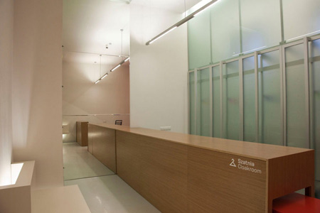
We employed contrast, juxtaposing the 19th century interior with contemporary design. We were also looking for direct references to the museum as a building and came up with an interior that would resemble a forgotten art warehouse, containing mobile furniture, reminiscent of transport crates used to carry works of art, carts, platforms, etc., as well as the “crystalline” form of the bar.
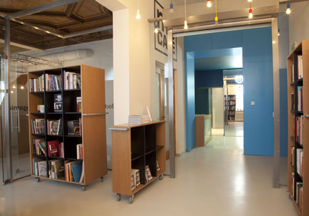
The latter was the most difficult element of the entire design, both for us and the carpenters. We wanted to build a structure that resembles a fragment of some mysterious sculpture – a form that grows right out of the floor and walls. At the same time, the bar was supposed to be comfortable and visually attractive. We managed to build a “broken” crystalline structure out of plywood and lit-up Plexiglas, simultaneously respecting the principles of ergonomics.
Oh, and one more thing: the result is a perfect match for the bar stools designed by Konstantin Grcic... All of the elements incorporated into the design allude to the Museum’s collection. However, these analogies are indirect and implicit, creating their own visual world of signs consistent with the universe of art collected in the Museum.
See also:
.
 |
 |
 |
| Goldberger by Tervhivatal |
Headvertising office by Corvin Cristian | More interior stories |