Paulo Mendes da Rocha and Metro add pastel tones and concrete to Aesop's São Paulo store
Paulo Mendes da Rocha and Metro Associated Architects teamed up to design Aesop's first outpost in Latin America store, pairing exposed concrete with handmade tiles (+ slideshow).
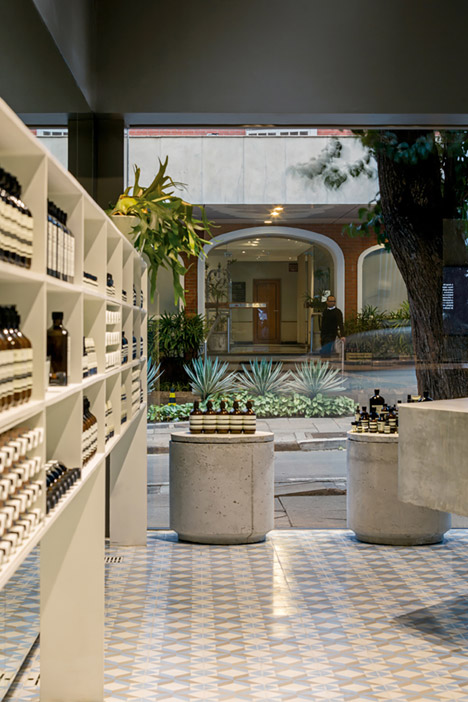
The interior of the Aesop store in São Paulo was designed in a collaborative effort between Brazilian architect and winner of both the Pritzker and Mies van der Rohe prizes Paulo Mendes da Rocha and local studio Metro Associated Architects.
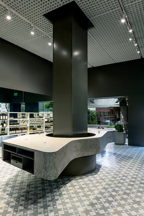
A wavy concrete countertop used as a product-testing area wraps around a structural column in the centre of the shop, which is largely open plan aside from a small storeroom to the rear.
The polished concrete counter and three small concrete plinths contrast with the pale pastel-toned floor, which is made from encaustic tiles, produced by hand using different colours of clay. The tiles are more common in domestic spaces and are especially popular in Barcelona residences.
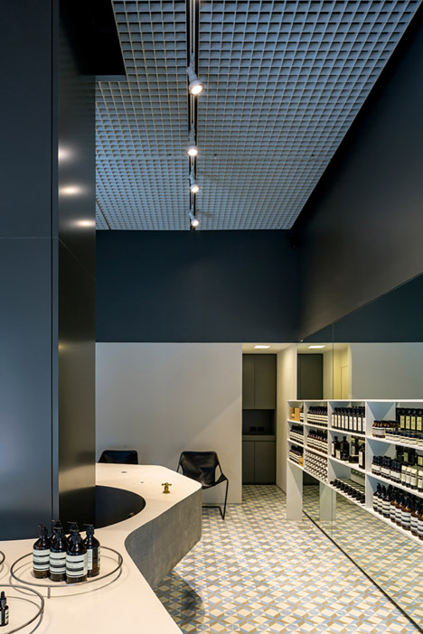
"The robust materials used in the store's construction are contrasted and complemented by handmade patterned cement tiles traditionally used for domestic flooring," said the architects.
"The materials chosen such as concrete, steel, glass and paint are common and frequently used in civil construction, but are given a unique and differentiated characteristic due to careful detailing and consequent demand for impeccable finishing in order to reach the desired results," they added.
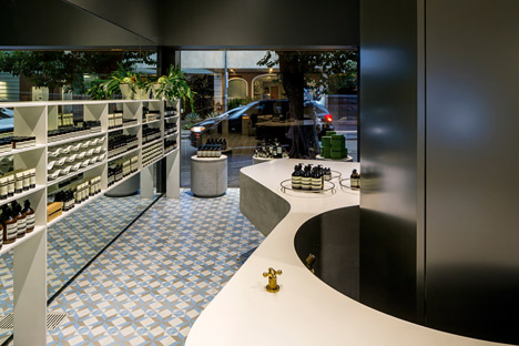
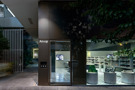
The store sits on the corner of a block on Oscar Freire Street, a high-end shopping street named after the doctor responsible for developing the Brazilian city's first mortuary.
"The architectural concept was based on the desire to create an ample but simple setting, free of partitioning and offering total transparency to the street through large glass panes," said the team.
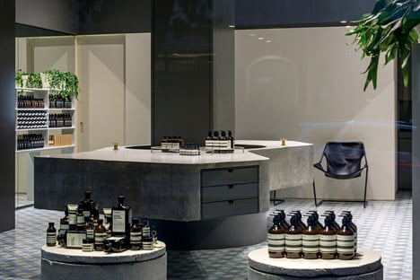
The brand's medicinal-style bottles are displayed on the three short cylindrical plinths in the front. The cast-concrete podiums are speckled by the air bubbles trapped during the casting process, giving them a rugged appearance.
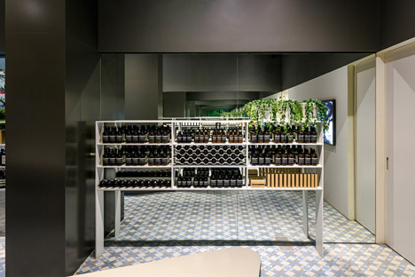
Further products are lined up on shelving against a mirrored wall that helps to create the illusion of greater space.
Each of Aesop's stores feature individual interiors – Dennis Paphitis, founder of the skincare brand, told Dezeen "there's a direct correlation between interesting, captivating store spaces and customer traffic within a store."
Materials used are often indigenous to the region such as Kerstin Thompson Architects' perforated gum wood details for a store in Melbourne or make cultural references specific to the country as in the case of a branch in Stockholm inspired by the work of Danish filmmaker Lars von Trier.
Others have referred to the laboratory processes involved in the making of the products, like Ciguë's Nottingham store above a record shop featuring distillation apparatus.
The brand's UK headquarters recently moved into new premises in London – a former warehouse in Bloomsbury with a pared-back aesthetic. The work was carried out by Post-Office, the British studio who converted a doctors surgery into Dezeen's former offices in Stoke Newington, London.
Project credits:
Architects: Paulo Mendes da Rocha, Metro Associated Architects
Project team: Martin Corullon, Gustavo Cedroni, Helena Cavalheiro, Marina Ioshii, Rafael de Sousa, Marina Pereira, Isadora Schneider and Marina Cecchi