Lukstudio repeats gift-box motif throughout Shanghai macaron shop
The decorative gift boxes used to package macarons at this Shanghai patisserie provided the inspiration for the translucent semi-circular details that spread across its walls and ceiling (+ slideshow).
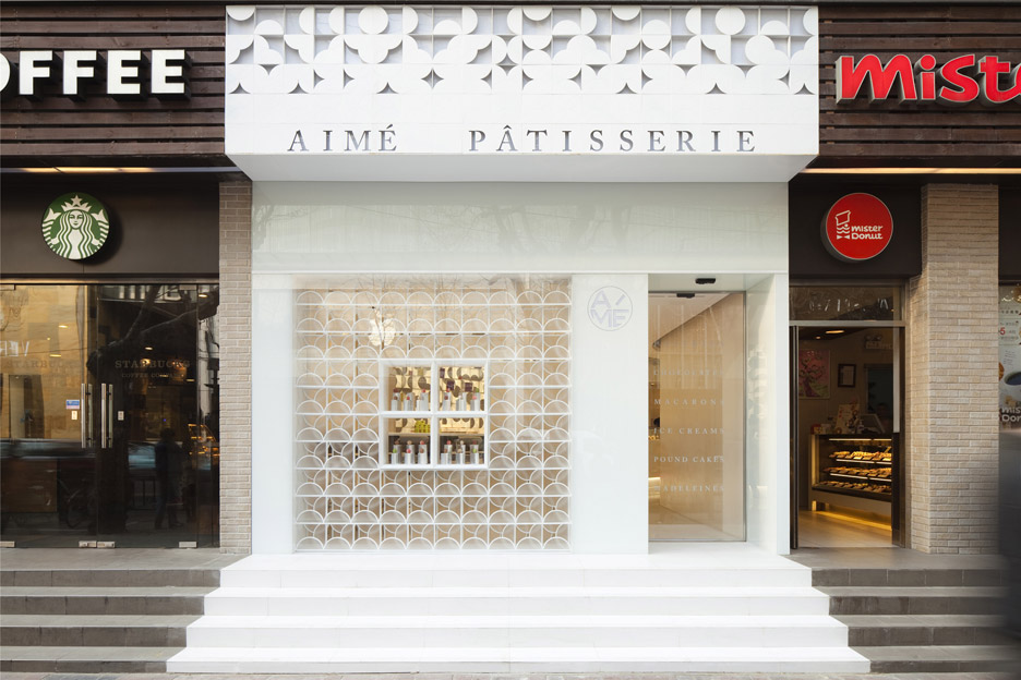
Designed by local studio Lukstudio – which also recently completed a Chinese restaurant interior – the Aimé Pâtisserie sits among several popular coffee and doughnut franchises on the city's busy Huaihai Road.
To help it to stand out, the team decided to "dress up" the building with a bright white facade that takes its design cues from the curved cardboard and translucent tissue paper often used for packaging sweet treats.
"The design challenge of the store was to make it stand out from the immediate chaos," said the team. "Our strategy is to dress this newcomer up as a white present."
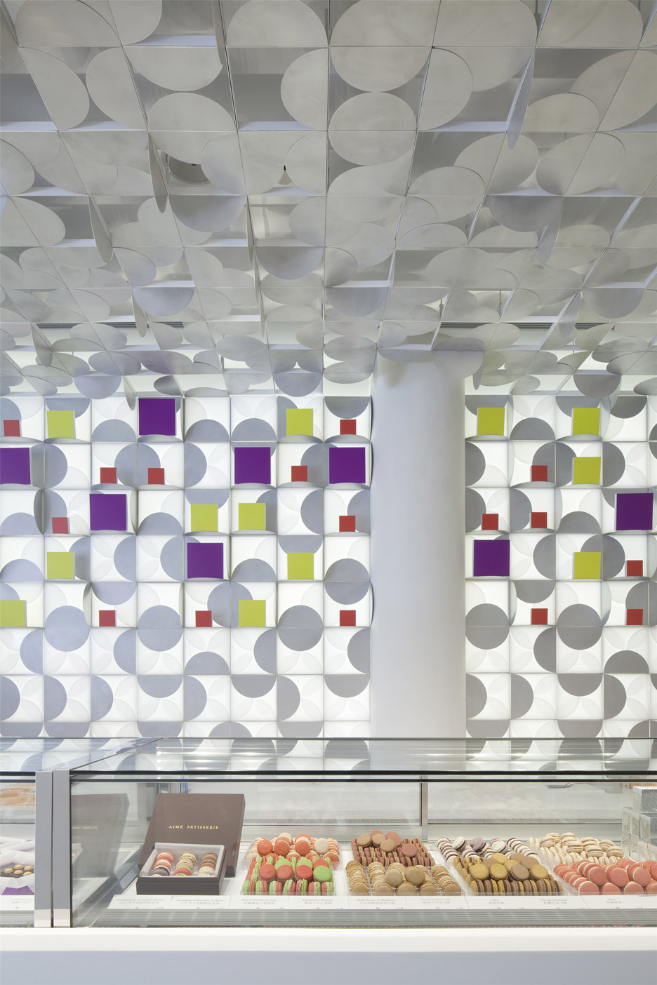
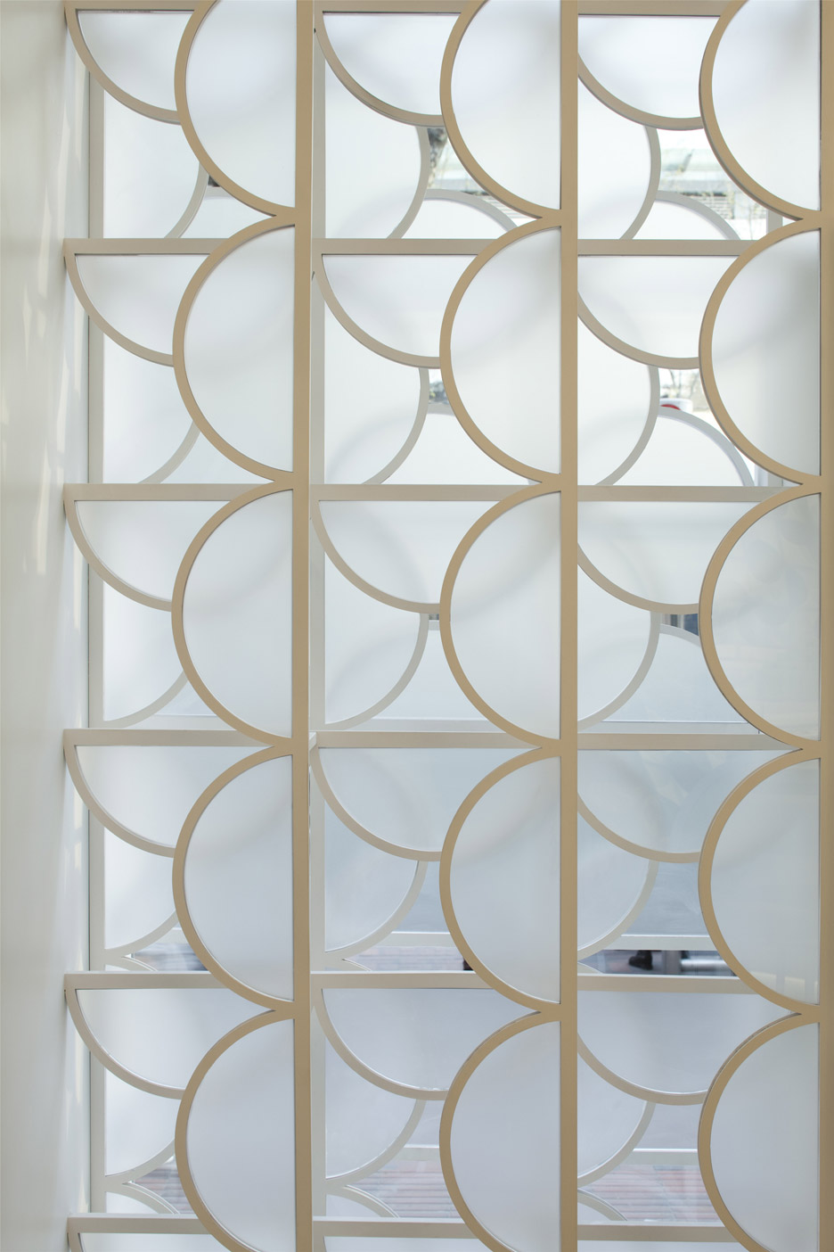
"The unwrapping experience of the Aimé gift box is translated into the physical store," they continued. "The idea of layering appears when we lift one semicircular translucent paper after another to discover the colourful macarons within."
"This opening sequence gives form to the overhead storefront design, while the window display made of four translucent layers attracts passersby to explore inside the store."
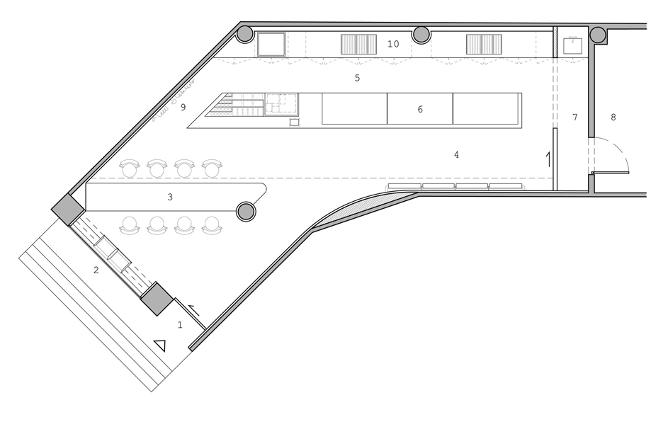
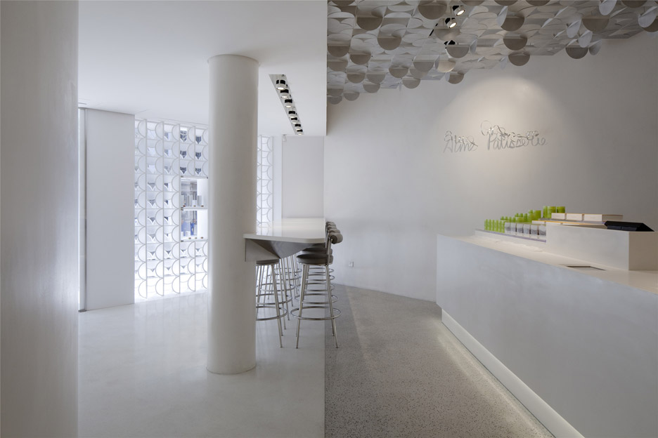
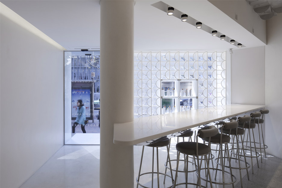
The store has an L-shaped layout that divides it into two zones: a foyer with bar seating at the front and a display counter at the back.
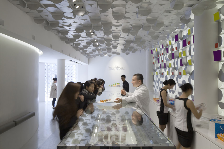
While the ceiling towards the front of the store is lowered and without decoration, the section towards back features the same repetitive detailing as the facade.
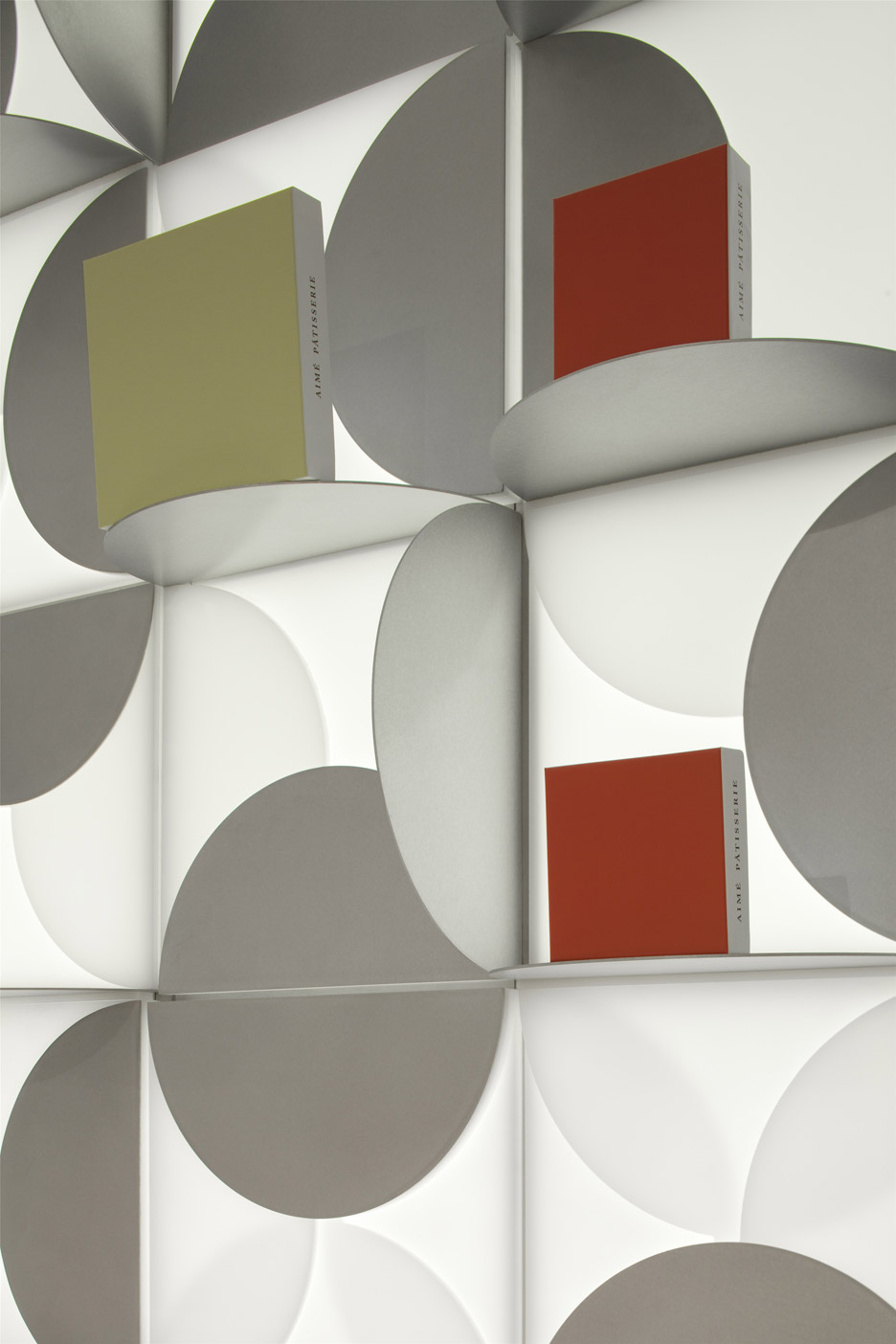
"A lowered ceiling towards the front compresses views of the ceiling towards the back and frames the illuminated feature wall to capture the curious minds," said the team. "Every step forward heightens the discovery of the playful interior."
Gift boxes are presented against the illuminated rear wall, adding splashes of colour to the otherwise white space. In front, macarons and other baked goods are encased below a nine-metre-long glass counter.
Shanghai studio Linehouse previously designed the interior for another Chinese patisserie, using a cage-like grid of brass poles, while Atelier Moderno and Anne Sophie Goneau displayed colourful macarons against a stark monochromatic backdrop for a bakery in Montreal.
Photography is by Peter Dixie/Lotan Architectural Photography.
